Declares information related for rendering the custom content in the UI.
Add-ons have the ability to control the UI components for user to view the custom content.
When a user clicks the title of the corresponding custom content in the search result.
/my-general-page will be rendered in a iframe with following context parameters being passed.
content.plugin: The content type key of the content. eg: ac:addon-key:module-key
content.id: The id of the content
content.version: The version of the content
space.key: The key of the space which content is contained in
Note, that if an optional custom value is defined in the url string, such as {ac.customData} in the example above, it will be substituted with the value
of the ac.customData parameter that will be taken from the Confluence's current URL. Add-on developers can specify any number of custom parameters, provided that they
have names that follow this convention: ac.parameter_name.
If more than one custom parameter with the same name is defined in Confluence's current URL, only the first value will be used.
For additional information on custom parameters see Context Parameters.
Context Parameters
View components support Confluence context parameters. When rendering the view component
the context variables will be passed to the URL that is defined in the corresponding view component module.
You can retrieve the content or space information with these parameters via Confluence REST API
and render it according to your needs.
Please consult Context Parameters for what parameters are currently supported.
Properties
contentViewComponent
Type
Required
Yes
Description
Defines a module for viewing custom content.
The module referenced must be a generalPage.
The view component is displayed in these places:
Search result
When a user clicks the title of a custom content entry in site search result.
Space List View result
When a user clicks the title of a custom content entry in the space list view.
Page List View result
When a user clicks the title of a custom content entry in the page list view.
A reference to a module defined in either this or another add-on
Defines an icon that is used for custom content items in the create dialog.
The icon resource provided in this field must be larger or equals to 48x48 pixels.
It will fallback to item icon if this field is not specified.
In that case, please ensure the item icon is larger or equals to 48x48 pixels.
Defines an icon that used for displaying list of custom content items in:
Space sidebar if this custom content is allowed to be contained in space.
The icon resource provided in this field must be larger or equals to 20x20 pixels.
It will fallback to item icon if this field is not specified.
In that case, please ensure the item icon is larger or equals to 20x20 pixels.
An add-on can specify multiple content relationships for generating the breadcrumbs.
Suppose we have ac:add-on-key:employee defined with following breadcrumbs setting:
And we have following custom content created in the Confluence:
Example custom content for building search breadcrumbs
Content ID
Content Type
Title
1
ac:add-on-key:organization
Company A
2
ac:add-on-key:organization
Company B
3
ac:add-on-key:employee
Charlie
By using the Relation API we can create following relations between these content:
Charlie works for Company A: PUT /rest/relation/worksFor/from/content/3/to/content/1
Charlie works for Company B: PUT /rest/relation/worksFor/from/content/3/to/content/2
Since we have let ac:add-on-key:employee to use worksFor relation to generate the breadcrumbs.
Confluence will fetch the relations that were created under name worksFor,
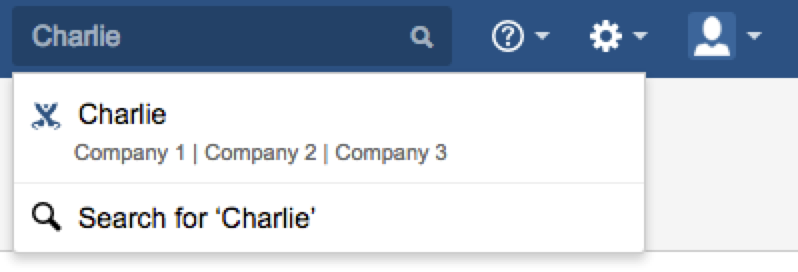
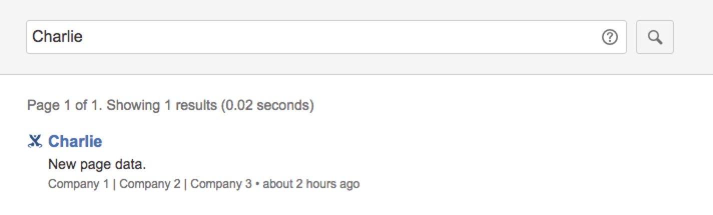
then display the titles in the creation order of their relations in the search result like this:
Similarly the site search will display the breadcrumbs as well:
Properties
relations
Type
Description
Defines the list of content relations used for generating breadcrumbs
Following sorting orders will apply:
Relationships defined in different names: Sorted by the order defined in this field
Relationships defined in the same name: Sorted by creation time of the relation
editComponent
Type
Description
Defines a module for adding or editing custom content.
The module referenced must be a generalPage.
Following context variable will be provided to the edit component URL
customcontent.create: Indicates whether user is creating or editing a piece of custom content
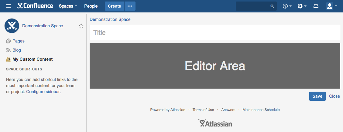
Confluence will provide the breadcrumbs, title input, submit and cancel button on the edit component.
Add-on needs to supply the editor area like the screenshot shown below in a general page module.
Please refer to the Custom Content JavaScript API
for how to intercept the edit component events and override the default behavior.
A reference to a module defined in either this or another add-on
The add-on key that referenced module was defined in.
If not present, the module is assumed to be defined within the same add-on.
editComponentCancelButtonLabel
Type
Description
Defines the label for cancel button on edit component
Represents a string that can be resolved via a localization properties file. You can use the same i18n Property key
and value in multiple places if you like, but identical keys must have identical values.
Example
1
2
3
4
{
  "value": "My text"
}
Properties
value
Type
Max length
1500
Required
Yes
Description
The human-readable default value. This will be used if no translation exists.
Only the following HTML tags are supported: b, i, strong, em, and code.
i18n
Type
Max length
300
Description
The localization key for the human-readable value.
Translations for the keys are defined at the top level of the
add-on descriptor.
editComponentSubmitButtonLabel
Type
Description
Defines the label for submit button on edit component
Represents a string that can be resolved via a localization properties file. You can use the same i18n Property key
and value in multiple places if you like, but identical keys must have identical values.
Example
1
2
3
4
{
  "value": "My text"
}
Properties
value
Type
Max length
1500
Required
Yes
Description
The human-readable default value. This will be used if no translation exists.
Only the following HTML tags are supported: b, i, strong, em, and code.
i18n
Type
Max length
300
Description
The localization key for the human-readable value.
Translations for the keys are defined at the top level of the
add-on descriptor.
editComponentTitlePlaceholder
Type
Description
Defines a placeholder for title input box that will be used in the edit component.
Following variables will be replaced at runtime:
{spaceName}: Name of the current space
{spaceKey}: Key of the current space
{contentTypeName}: Name of the current custom content
For example:
"What do you want to know about {SpaceName}" will become "What do you want to know about Demonstration Space"
if user is creating a new piece of custom content in "Demonstration Space" space.
Represents a string that can be resolved via a localization properties file. You can use the same i18n Property key
and value in multiple places if you like, but identical keys must have identical values.
Example
1
2
3
4
{
  "value": "My text"
}
Properties
value
Type
Max length
1500
Required
Yes
Description
The human-readable default value. This will be used if no translation exists.
Only the following HTML tags are supported: b, i, strong, em, and code.
i18n
Type
Max length
300
Description
The localization key for the human-readable value.
Translations for the keys are defined at the top level of the
add-on descriptor.
listViewComponent
Type
Description
Defines a module that will be used when a user clicks the navigation link displayed in the space sidebar.
The module referenced must be a generalPage.
A default list view will be provided if no view component was specified in this field.
A reference to a module defined in either this or another add-on