Glances style guide
Glance types
Glances are clickable. When clicked, the glance will open the sidebar view state.
Entity glance
Entity glances are used to describe the integration and the entity, or content, inside the glance.
- Left icon:
- Option 1: An icon representing the integration brand.
- Option 2: An icon representing the function.
- Description: Identifies the entities contained within the Glance (for example: Tweets, rather than "Twitter").
- Right icon: Only used to describe status of integration (for example: a weather icon, sun or cloud, to indicate sentiment)
Icon + HTML + icon (optional)

Status glance
A status glance is used show the status of an integration, usually combined with a count, description and lozenge or icon.
- Left icon:
- Option 1: An icon representing the integration brand.
- Option 2: An icon representing the function.
- Description:
- Number (bold)
- Entity (regular)
- Right lozenge/icon: Only used to draw the user's attention to something time critical.
Icon + HTML + lozenge (optional, see design.atlassian.com/2.2/product/components/lozenges/)

Call to action glance
Call to action glances are used when intending for the user to complete a task (for example: configure or authenticate).
- Left Icon:
- Option 1: An icon representing the integration brand.
- Option 2: An icon representing the function.
- Description:
- Regular text that indicates an action e.g. "configure".
Icon + HTML

UI specifications
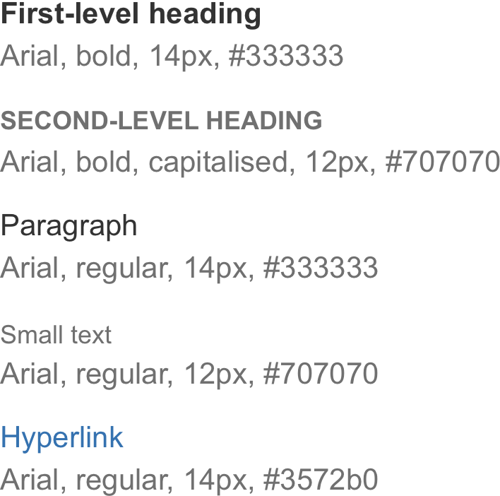
Typography
Semantic hierarchy:
General text formatting:
- Bold is only used for numbers.
- Regular text is used for descriptions and all other text.
- Never use italics.
Iconography
Icons provide visual identification to function and branding. Glance icons are used to clearly differentiate from other glances.
 16 x 16 px
Lozenges
Lozenges are used to highlight the status of an entity. Atlassian uses specific colors to denote recognizable meaning across all products.
positive - For example: success, confirmation.
warning - Requires user attention, help users avoid error situations.
alert - Requires urgent user attention and action.
Rate this page: