Dialog
Ending Connect support
Bitbucket Cloud is gradually ending support for Connect apps.
New Bitbucket apps built with Connect can no longer be registered or installed on workspaces as of Februrary 2, 2026.
Forge is now the Atlassian Cloud's primary platform for extensions. Get started with Forge
The Dialog module provides a mechanism for launching an app's modules as modal dialogs from within an app's iframe.
A modal dialog displays information without requiring the user to leave the current page. The dialog is opened over the entire window, rather than within the iframe itself.
Styling your dialog to look like a standard Atlassian dialog
By default the dialog iframe is undecorated. It's up to the developer to style the dialog.
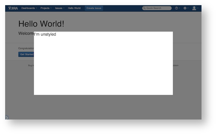
In order to maintain a consistent look and feel between the host application and the app, we encourage app developers to style their dialogs to match Atlassian's Design Guidelines for modal dialogs.
To do that, you'll need to add the AUI styles to your dialog. For more information, read about the Atlassian User Interface dialog component.
Classes
DialogButton
A dialog button that can be controlled with JavaScript
DialogOptions
Properties
| Name | Type | Description |
|---|---|---|
key | String | The module key of the page you want to open as a dialog |
size | String | Opens the dialog at a preset size: small, medium, large, x-large, or maximum (full screen) |
width | Number | String | overrides size, defines the width as a percentage (append a % to the number) or pixels |
height | Number | String | overrides size, defines the height as a percentage (append a % to the number) or pixels |
chrome | Boolean | (optional) opens the dialog with heading and buttons |
header | String | (optional) text to display in the header if opening a dialog with Chrome |
submitText | String | (optional) text for the submit button if opening a dialog with Chrome |
cancelText | String | (optional) text for the cancel button if opening a dialog with Chrome |
Methods
close (data)
Closes the currently open dialog. Optionally pass data to listeners of the dialog.close. This will only close a dialog that has been opened by your app. You can register for close events using the dialog.close event and the events module.
Parameters
| Name | Type | Description |
|---|---|---|
data | Object | An object to be emitted on dialog close |
Example
1
2AP.require('dialog', function(dialog){
  dialog.close({foo: 'bar'});
});
create options
Creates a dialog for a web-item or page module key
Parameters
| Name | Type | Description |
|---|---|---|
options | DialogOptions | configuration object of dialog options |
Example
1
2AP.require('dialog', function(dialog){
  dialog.create({
    key: 'my-module-key',
    width: '500px',
    height: '200px'
  });
});
getButton() → {DialogButton}
Returns the button that was requested (either submit or cancel).
Returns: DialogButton
Example
1
2AP.require('dialog', function(dialog){
  dialog.getButton('submit');
});
onDialogMessage (String, Function)
Register callbacks responding to messages from the host dialog, such as submit or cancel.
Parameters
| Name | Type | Description |
|---|---|---|
String | button either cancel or submit | |
Function | callback function |
Rate this page: