Ending Connect support
You can no longer publish Connect apps on the Atlassian Marketplace. All new extensibility features will be delivered only on Forge.
Refer to this blog post for our timeline to end Connect support.
Have an existing Connect app? You can incrementally migrate it to Forge.
Dialog
The Dialog module provides a mechanism for launching an add-on's modules as modal dialogs from within an add-on's iframe. A modal dialog displays information without requiring the user to leave the current page. The dialog is opened over the entire window, rather than within the iframe itself.
Styling your dialog to look like a standard Atlassian dialog
By default the dialog iframe is undecorated. It's up to you to style the dialog.
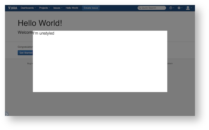
In order to maintain a consistent look and feel between the host application and the add-on, we encourage you to style your dialogs to match Atlassian's Design Guidelines for modal dialogs. To do that, you'll need to add the AUI styles to your dialog. For more information, read about the Atlassian User Interface dialog component.
Methods
create (options)
Creates a dialog for a common dialog, page or web-item module key.
Parameters
| Name | Type | Description |
|---|---|---|
| options | Dialog~DialogOptions | configuration object of dialog options. |
Returns
Dialog object allowing for callback registrations
Example
1
2AP.dialog.create({
  key: 'my-module-key',
  width: '500px',
  height: '200px',
  chrome: true,
  buttons: [
    {
      text: 'my button',
      identifier: 'my_unique_identifier'
    }
  ]
}).on("close", callbackFunc);
close (data)
Closes the currently open dialog. Optionally pass data to listeners of the dialog.close event. This will only close a dialog that has been opened by your add-on. You can register for close events using the dialog.close event and the events module.
Parameters
| Name | Type | Description |
|---|---|---|
| data | Object | An object to be emitted on dialog close. |
Example
1
2AP.dialog.close({foo: 'bar'});
getCustomData (callback)
Passes the custom data Object to the specified callback function.
Parameters
| Name | Type | Description |
|---|---|---|
| callback | function | Callback method to be executed with the custom data. |
Example
1
2AP.dialog.getCustomData(function (customData) {
  console.log(customData);
});
getButton()
Returns the button that was requested (either cancel or submit). If the requested button does not exist, an empty Object will be returned instead.
Returns
Example
1
2AP.dialog.getButton('submit');
disableCloseOnSubmit()
Stop the dialog from closing when the submit button is clicked
Example
1
2AP.dialog.disableCloseOnSubmit();
AP.events.on('dialog.button.click', function(data){
  if(data.button.name === 'submit') {
    console.log('submit button pressed');
  }
}
createButton()
Creates a dialog button that can be controlled with javascript
Returns
Example
1
2AP.dialog.createButton({
  text: 'button text',
  identifier: 'button.1'
}).bind(function mycallback(){});
isCloseOnEscape (callback)
Queries the value of the 'closeOnEscape' property.
Parameters
| Name | Type | Description |
|---|---|---|
| callback | function | function to receive the 'closeOnEscape' value. |
Example
1
2AP.dialog.isCloseOnEscape(function(enabled){
  if(enabled){
    // close on escape is true
  }
});
Rate this page: