Modal
t.modal(opts)
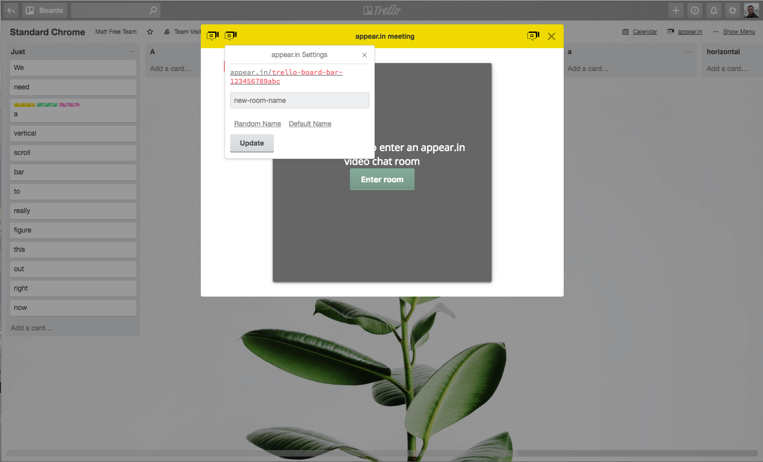
In certain cases, your Power-Up might need to show UI that requires taking up a large portion of the screen. When you need something more than t.popup(opts) or t.boardBar(opts) can provide, you can use t.modal. This lets you display an iframe directly on top of Trello. The modal comes in two widths, fullscreen: true as seen below:
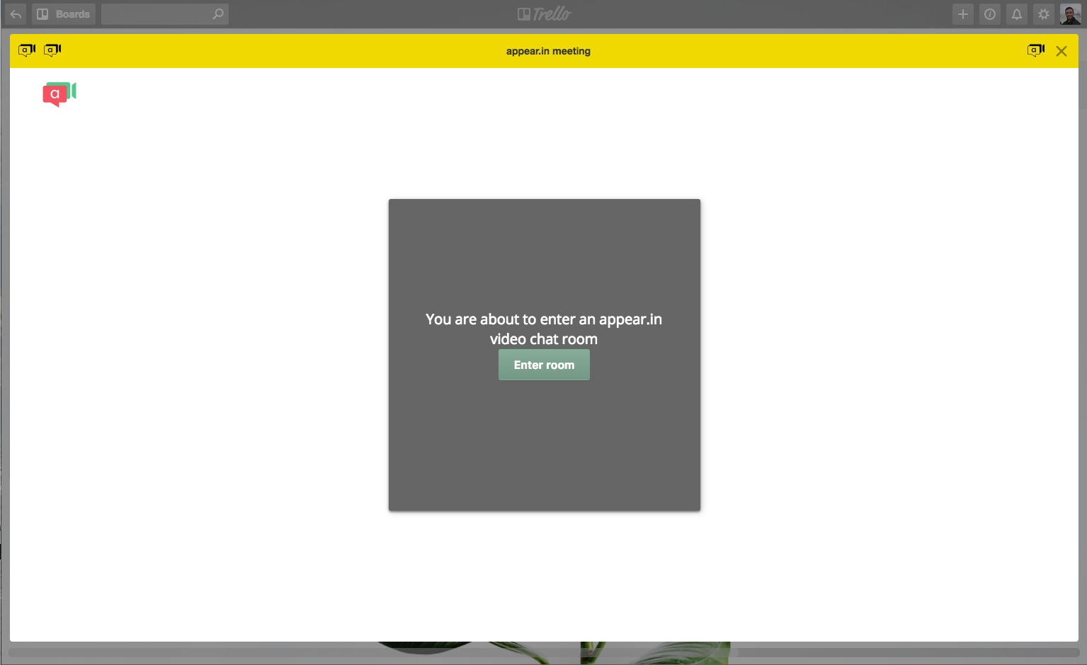
And fullscreen: false looks like:
Options
| Key | Valid Values | Description |
|---|---|---|
| url string | Any valid URL. | The URL of the page to be shown inside of the iframe. |
| accentColor string | Hex color value or a Trello Brand Color. | Color to be used on top of modal design. |
| height integer | Positive integer. | Height of the modal. |
| fullscreen boolean | True or False | Determines whether the modal should be full width or not. |
| callback function | Function that runs. optional | The function to be called if the user closes the modal. |
| title string | Any string. optional | String to be displayed in header of modal. |
| actions array | Array of action items (as described below). optional | Buttons to be displayed in header of modal. |
| args object | Object of key / values to be passed as query parameters to iframe optional | Can be accessed from the iframe using t.arg(key) |
The actions parameter above accepts an array of no more than three action objects with the which have the following values:
| Key | Valid Value | Description |
|---|---|---|
| icon string | Valid URL of image. | Icon to be displayed. |
| callback function | Callable function. | The function to be called when a user clicks on the icon. |
| alt string | Any string | The string to be used as the alt value for the <img> tag. |
| position string | left or right | Determines whether the icon should be displayed on the left or right side of the modal header. |
| url string | An https:// url | An optional URL to open in a new tab when the user clicks the action icon. |
Here is an example call to t.modal:
1
2t.modal({
  // the url to load for the iframe
  url: './modal.html',
  // optional arguments to be passed to the iframe as query parameters
  // access later with t.arg('text')
  args: { text: 'Hello' },
  // optional color for header chrome
  accentColor: '#F2D600',
  // initial height for iframe
  height: 500, // not used if fullscreen is true
  // whether the modal should stretch to take up the whole screen
  fullscreen: true,
  // optional function to be called if user closes modal (via `X` or escape, etc)
  callback: () => console.log('Goodbye.'),
  // optional title for header chrome
  title: 'appear.in meeting',
  // optional action buttons for header chrome
  // max 3, up to 1 on right side
  actions: [{
    icon: './images/icon.svg',
    url: 'https://google.com',
    alt: 'Leftmost',
    position: 'left',
  }, {
    icon: './images/icon.svg',
    callback: (tr) => tr.popup({
      title: tr.localizeKey('appear_in_settings'),
      url: 'settings.html',
      height: 164,
    }),
    alt: 'Second from left',
    position: 'left',
  }, {
    icon: './images/icon.svg',
    callback: () => console.log(':tada:'),
    alt: 'Right side',
    position: 'right',
  }],
})
t.closeModal()
If you have a modal open, you can call t.closeModal() to close it.
1
2t.closeModal();
t.updateModal(opts)
If you have a modal open, you can update parts of it using t.updateModal({options}).
Options
| Name | Value |
|---|---|
| accentColor string | A valid hex color (eg, 9900CC) to update the modal header's background color to. |
| actions array of objects | An array of action objects. |
| fullscreen boolean | A boolean used to determine whether the modal should be fullscreen or not. |
| title string | The string to update the modal's header to. |
And here is an example of how you would update a modal that is already opened:
1
2let updateObject = {
  fullscreen: false,
  accentColor: "9900CC",
  actions: [{
    icon: './images/icon.svg',
    url: 'https://google.com',
    alt: 'Leftmost',
    position: 'left',
  }],
  title: "My New Title",
}

t.updateModal(updateObject);
Rate this page: