Popup
t.popup(opts)
The real workhorse of the UI controls available to your Power-Up, the popup lets you present options or controls to the user without disrupting their context. Popups can be stacked, meaning you can have users navigate through more than one if necessary and a back control comes built in. You can control the height of a popup, but the width is fixed by Trello.
There are several types of popups that you can use:
Popup List
The simplest kind of popup displays a list of options. Each option has text and a callback function to be run if the option is clicked. The screenshot below shows how the Card Snooze Power-Up makes use of the popup list to show a list of initial options for snoozing a card.
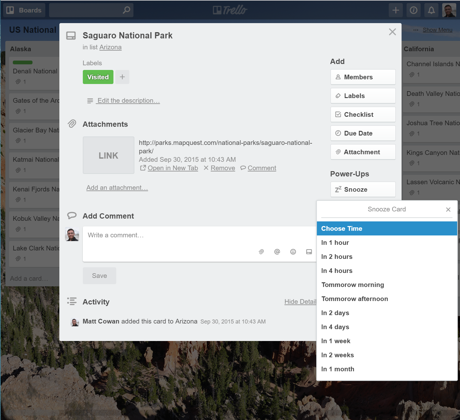
1
2var GRAY_ICON = 'https://cdn.hyperdev.com/us-east-1%3A3d31b21c-01a0-4da2-8827-4bc6e88b7618%2Ficon-gray.svg';

var btnCallback = function (t, opts) {
  return t.popup({
    title: 'Snooze Card',
    items: [{
      text: 'Choose Time',
      callback: function (t, opts) { ... }
    }, {
      text: 'In 1 hour',
      callback: function (t, opts) { ... }
    }, {
      text: 'In 2 hours',
      callback: function (t, opts) { ... }
    }]
  });
};

window.TrelloPowerUp.initialize({
  'card-buttons': function (t, opts) {
    return [{
      icon: GRAY_ICON,
      text: 'Snooze',
      callback: btnCallback
    }];
  }
});
Popup Search
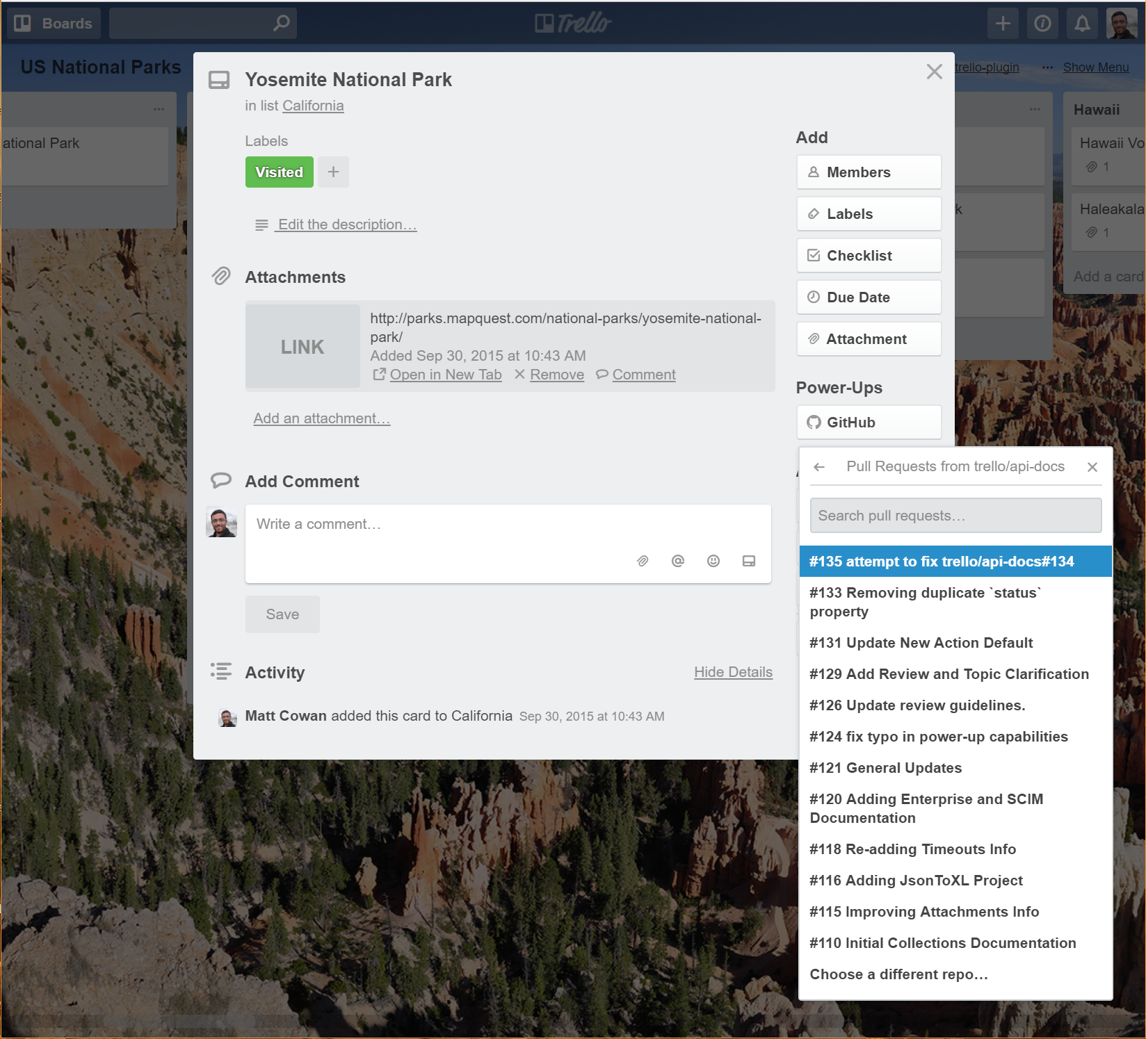
When the list of options grows to long, its probably time to switch to a search popup. These popups can either take a long static list of prepopulated options and will perform client side search for you, or can take a function to be called as the user types which performs the search and returns the resulting options. The screenshot below shows the GitHub Power-Up using this functionality to provide a means of searching for a pull request to attach to the card
Options
| Key | Value | Description |
|---|---|---|
| title | String | Displayed at the top of the popup. |
| items | Array of Objects or Function that returns a Promise | Each object in the array should contain a text key and either a callback or url key or both.text - String - Will be searched by Trello when the user enters a value into the text field.callback - Function - Called by Trello it when the user clicks the item.url - String - Trello will open the URL when the user selects the item.alwaysVisible - Boolean (optional) - Determines whether the item should always be displayed, regardless of whether it matches the search, or not.For dynamic searching, you can pass the items key a function that will be called when the user begins typing. It should resolve to an array containing objects with the keys defined above. |
| search | Object | Should be an object that contains the following keys (all optional):count - Integer - Determines the number of items to display when searchingplaceholder - String - Text to display in search text input when it is empty.empty - String - Text to display when a user is searching but not results found.searching - String - The value to display when the search function is being executed.debounce - Integer - When doing dynamic search, the number of milliseconds to wait after the user has stopped typing before calling the search function. Defaults to 300, also the minimum value. |
An example of client side search, where you have the full list of items ready before calling t.popup:
1
2var GRAY_ICON = 'https://cdn.hyperdev.com/us-east-1%3A3d31b21c-01a0-4da2-8827-4bc6e88b7618%2Ficon-gray.svg';

var btnCallback = function (t, opts) {
  return t.popup({
    title: 'Pull Requests',
    items: [{
      text: '#135 attempt to fix trello/api-docs#134',
      callback: function (t, opts) { ... },
      url: 'https://github.com/trello/api-docs/pull/135'
    }, {
      text: '#133 Removing duplicate `status` property',
      callback: function (t, opts) { ... },
      url: 'https://github.com/trello/api-docs/pull/133'
    }, {
      text: '#131 Update New Action Default',
      callback: function (t, opts) { ... }
      url: 'https://github.com/trello/api-docs/pull/131'
    }, {
      alwaysVisible: true, // non-search option, always shown
      text: 'Choose a different repo...',
      callback: function (t, opts) { ... }
    }],
    search: {
      count: 10, // number of items to display at a time
      placeholder: 'Search pull requests',
      empty: 'No pull requests found'
    }
  });
};

window.TrelloPowerUp.initialize({
  'card-buttons': function (t, opts) {
    return [{
      icon: GRAY_ICON,
      text: 'GitHub',
      callback: btnCallback
    }];
  }
});
An example of dynamic search:
1
2var GRAY_ICON = 'https://cdn.hyperdev.com/us-east-1%3A3d31b21c-01a0-4da2-8827-4bc6e88b7618%2Ficon-gray.svg';

var Promise = window.TrelloPowerUp.Promise;

var btnCallback = function (t, opts) {
  return t.popup({
    title: 'Pull Requests',
    items: function (t, options) {
      // use options.search which is the search text entered so far
      // return a Promise that resolves to an array of items
      // similar to the items you provided in the client side version above
      return new Promise(function (resolve) {
        // you'd probably be making a network request at this point
        resolve([{
          text: 'Result 1',
          callback: function (t, opts) { ... }
        }, {
          text: 'Result 2',
          callback: function (t, opts) { ... }
        }]);
      });
    },
    search: {
      // optional # of ms to debounce search to
      // defaults to 300, override must be larger than 300
      debounce: 300,
      placeholder: 'Search pull requests',
      empty: 'No pull requests found',
      searching: 'Searching GitHub...'
    }
  });
};

window.TrelloPowerUp.initialize({
  'card-buttons': function (t, opts) {
    return [{
      icon: GRAY_ICON,
      text: 'GitHub',
      callback: btnCallback
    }];
  }
});
iframe Popup
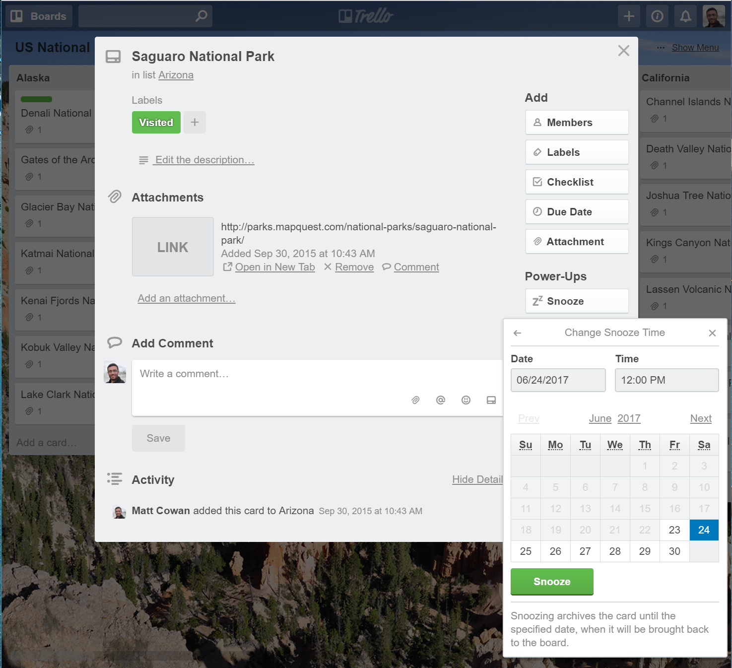
Additionally, you can have the popup load an iframe, giving you full control over the content and functionality. The screenshot below again shows the Card Snooze Power-Up and how it uses an iframe Popup to let the user pick a specific date and time to snooze the card until.
1
2var GRAY_ICON = 'https://cdn.hyperdev.com/us-east-1%3A3d31b21c-01a0-4da2-8827-4bc6e88b7618%2Ficon-gray.svg';

var btnCallback = function (t, opts) {
  return t.popup({
    title: 'Change Snooze Time',
    url: './snooze-time.html',
    args: { myArgs: 'You can access these with t.arg()' },
    height: 278 // initial height, can be changed later
  });
};

window.TrelloPowerUp.initialize({
  'card-buttons': function (t, opts) {
    return [{
      icon: GRAY_ICON,
      text: 'Snooze',
      callback: btnCallback
    }];
  }
});
Datetime Popup
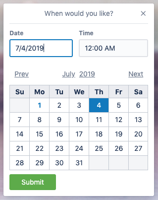
If you need to prompt a user to enter a date and time or just a date, you can make use of the date and datetime popup types. Here is an example of the datetime popup in action:
And here is the code required to open the popup:
1
2t.popup({
  type: 'date' | 'datetime',
  title: String,
  callback: function(t, opts) // opts.date is an ISOString
  date?: Date,
  minDate?: Date,
  maxDate?: Date,
})
The function you provide for the callback will be called at the point in time that the user has clicked "Submit" and the options passed to the function will include a key for date that is the ISOString for the datetime they have chosen.
The date option allows you to pass in a default date that the picker will be pre-filled with. The date option expects a native Javascript date to be passed in.
Likewise minDate and maxDate are optional arguments that should be native Javascript dates. These will be the minimum and maximum dates that the user is allowed to choose from.
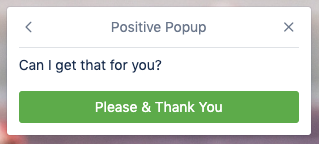
Confirm Popup
The following code can be used to prompt the user to confirm/cancel an action:
1
2t.popup({
  type: 'confirm',
  title: String,
  message: String,
  confirmText: String,
  onConfirm: function(t, opts),
  confirmStyle?: 'primary' | 'danger',
  cancelText?: String,
  onCancel?: function(t, opts),
})
The onConfirm and onCancel functions will be called at the point in time that the user clicks on an option in the dialog. The confirmStyle allows you to match Trello's confirm dialog and color the button either green (primary) or red (danger).
Here is a screenshot of the dialog in action:
t.closePopup()
Close an open popup.
1
2t.closePopup();
Troubleshooting Tips
When using t.popup(), you may encounter an error that looks like this:
1
2Unknown element for popover. Make sure you are using the most local context (t) to the request, as well as awaiting the request to open the popover.
If opening a popover relative to content in your own iframe, you may pass a mouseEvent option when calling the popup function.
This error can commonly occur when using t.popup() inside a t.<something>().then()... pattern, such as:
1
2callback: function (t) {
  t.card("checklists").then((data) => {
    t.popup({...}); // this can error
  });
},
In cases like this, your power-up can lose its t context inside promises. To fix this, you should be using async and await on the function returning the promise.
1
2callback: async function (t) {
  await t.card("checklists").then((data) => {
    t.popup({...}); // no more error!
  });
},
Rate this page: