Extending the image properties dialog
Applicable: | This tutorial applies to Confluence 5.1. |
Level of experience: | Intermediate. Our tutorials are classified as 'beginner', 'intermediate' and 'advanced'. This one is at 'intermediate' level, so you will need to have developed a few plugins before to follow it. |
Time estimate: | It will take you approximately 1 hour to complete this tutorial. |
The source code of the plugin used in this tutorial is hosted on Bitbucket: confluence-image-hover-effects-demo-plugin.
Overview
The Image Properties dialog in Confluence 5.1 and later is launched from the property panel displayed when a particular image is selected in the Confluence editor. Additional panels can be added to this dialog to affect the current image in different custom ways.
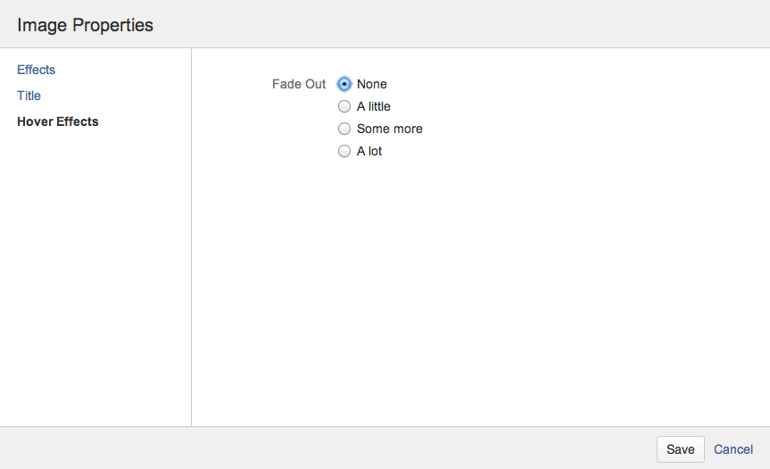
This plugin inserts a new tab called "Hover Effects" in the Image Properties dialog. Clicking on this tab launches the demo panel, which contains several hover effect options that can be applied to the current image. From this starting point, it is possible to create more advanced customisations for the Image Properties dialog.
Screenshot: The demo 'Hover Effects' panel
In order to do this, you will create a Confluence plugin, which will consist of the following components:
- A Google Closure "Soy" template for rendering the panel's HTML markup.
- A JavaScript file to initialise and provide the logic for the panel.
- A CSS file that applies the hover effects.
- An internationalisation (i18n) properties file, to provide default English text for the panel
- A plugin XML descriptor file which registers all the plugin modules with Confluence.
The extension point used by this plugin is only available in Confluence 5.1 and later.
Step 1. Create the Plugin Project
The Atlassian Plugin SDK provides a number of atlas-create-application-plugin commands you can use to generate stub code for your plugin.
- Run the atlas-create-confluence-plugincommand and enter the following information when prompted:
-
- group-id:
com.atlassian.plugins.tutorial - artifact-id:
confluence-image-hover-effects-demo-plugin - version:
1.0 - package:
com.atlassian.plugins.tutorial
- group-id:
- Open the
pom.xmlfile that was generated by the previous step, and update the information in this file to match your organisation and project name. - Remove
src/main/javaand any other Java code in the generated project. This plugin will not contain any Java code.
Step 2. Create a Soy template for the custom panel
In the src/main/resources/ directory, create a new directory for your plugin resources called templates.
Create a new Soy template - src/main/resources/templates/hover-effects-panel.soy, with the following content:
1
2{namespace Confluence.Templates.ImageProperties.HoverEffects}

/**
 * @param fadeSelection id of the fade option that should be selected
 */
{template .panel}
    <form class="aui">
        <fieldset class="group">
            <legend><span>{getText('image.hover.effects.fade.label')}</span></legend>
            <div class="radio">
                <input class="radio" type="radio" name="fade" id="fade-none"
                    {if not $fadeSelection} checked="checked"{/if}>
                <label for="fade-none">{getText('image.hover.effects.fade.none')}</label>
            </div>
            <div class="radio">
                <input class="radio" type="radio" name="fade" id="fade-low"
                    {if $fadeSelection == 'fade-low'} checked="checked"{/if}>
                <label for="fade-low">{getText('image.hover.effects.fade.low')}</label>
            </div>
            <div class="radio">
                <input class="radio" type="radio" name="fade" id="fade-medium"
                    {if $fadeSelection == 'fade-medium'} checked="checked"{/if}>
                <label for="fade-medium">{getText('image.hover.effects.fade.medium')}</label>
            </div>
            <div class="radio">
                <input class="radio" type="radio" name="fade" id="fade-high"
                    {if $fadeSelection == 'fade-high'} checked="checked"{/if}>
                <label for="fade-high">{getText('image.hover.effects.fade.high')}</label>
            </div>
        </fieldset>
    </form>
{/template}
The template should contain the markup you want to appear in the panel you're going to add to the Image Properties dialog. In this case, we display a form field with a label that has an i18n key of 'image.hover.effects.fade.label' and some radio button options. You can also see that this template accepts a parameter 'fadeSelection', which is used to determine which radio button should be selected by default.
Step 3. Create a JavaScript file to initialise the panel and implement the logic
-
Create a JavaScript file -
src/main/resources/js/hover-effects-panel.js, with the following content:1 2
AJS.toInit(function($) { var webItemLinkId = 'image-hover-effects'; var panelClass = 'image-hover-effects'; var $img; var $panelContent; AJS.bind('dialog-created.image-properties', function(event, data) { $img = $(data.img); var match = $img.attr('class').match(/hover-(fade-(low|medium|high))/); var fadeSelection = match ? match[1] : ''; $panelContent = $(Confluence.Templates.ImageProperties.HoverEffects.panel({ fadeSelection: fadeSelection })); Confluence.Editor.ImageProps.registerPanel(webItemLinkId, $panelContent, panelClass, saveFn); }); function saveFn() { var fadeSelection = $panelContent.find('input[name="fade"]:checked').attr('id'); $img.removeClass('hover-fade-low hover-fade-medium hover-fade-high'); if (fadeSelection !== 'fade-none') { $img.addClass('hover-' + fadeSelection); } } });
AJS.toInit wraps the function containing all of the logic to initialise our panel. The function is passed a reference to jQuery and executed when the DOM is ready.
We have to wait until the Image Properties dialog has been created before we can add our panel. This is done by binding to the dialog-created.image-properties event and then calling Confluence.Editor.ImageProps.registerPanel from our event handler. Confluence.Editor.ImageProps.registerPanel accepts the following parameters:
linkId:This identifies the tab to associate your panel with, it must match the linkId that you specify when adding the web item in Step 6.panelContent:This should be a jQuery object containing the contents of your panel. On line 10 we call the template defined in Step 2 and create a jQuery object from the generated markup.panelClass:This class will be added to the panel's HTML element.saveFn:This is a JavaScript function that will be executed every time the save button of the Image Properties dialog is clicked, regardless of whether or not the user has interacted with this particular panel.
In this implementation we add a class to the image if one of the hover effect radio buttons has been selected. While initialising the panel, we also check whether the selected image has a class to indicate a specific hover effect - and if so, that effect is passed as a parameter to the Soy template so that the correct radio button is selected by default.
The save function passed to Confluence.Editor.ImageProps.registerPanel can optionally return a jQuery Deferred object. Doing so indicates that the panel's save function is asynchronous - a common example is a save function that sends an AJAX request. The Deferred object must be resolved for the dialog to close.
Step 4. Create CSS and i18n files to provide styling and text for the panel
-
Create
src/main/resources/css/hover-effects.csscontaining the following CSS rules to apply the hover effects:1 2
.hover-fade-low:hover { opacity: 0.8; } .hover-fade-medium:hover { opacity: 0.6; } .hover-fade-high:hover { opacity: 0.4; } -
Create
src/main/resources/i18n.propertieswith the following content to supply all the text shown on the panel:1 2
image.hover.effects.panel.title=Hover Effects image.hover.effects.fade.label=Fade Out image.hover.effects.fade.none=None image.hover.effects.fade.low=A little image.hover.effects.fade.medium=Some more image.hover.effects.fade.high=A lot
Step 5. Register the plugin modules in the XML plugin descriptor
-
In the plugin XML descriptor file,
src/main/resources/atlassian-plugin.xml, we need to register a web-item to add the 'Hover Effects' tab to the dialog as well as our i18n, JavaScript, Soy and CSS files. This should be done as follows:1 2
<atlassian-plugin key="${project.groupId}.${project.artifactId}" name="${project.name}" plugins-version="2"> <plugin-info> <description>${project.description}</description> <version>${project.version}</version> <vendor name="${project.organization.name}" url="${project.organization.url}" /> </plugin-info> <resource type="i18n" name="i18n" location="i18n"/> <!-- resources needed to edit image hover effects in the editor --> <web-resource key="image-hover-effects-panel-resources" name="Image Hover Effects property panel resources"> <!-- transform Soy templates into JS --> <transformation extension="soy"> <transformer key="soyTransformer"/> </transformation> <resource type="download" name="hover-effects-panel-soy.js" location="/templates/hover-effects-panel.soy"/> <resource type="download" name="hover-effects-panel.js" location="/js/hover-effects-panel.js"/> <!-- we need the editor resources to be loaded before these ones --> <dependency>confluence.web.resources:page-editor</dependency> <context>editor</context> </web-resource> <!-- resources needed to show image hover effects when viewing content --> <web-resource key="image-hover-effects-page-resources" name="Image Hover Effects page resources"> <resource type="download" name="hover-effects.css" location="/css/hover-effects.css"/> <context>viewcontent</context> </web-resource> <web-item key="image-hover-effects-panel" name="Image Hover Effects panel web-item" section="system.editor.image.properties.tabs" weight="30"> <description>Displays a panel for choosing image hover effects in the Image Properties dialog</description> <label key="image.hover.effects.panel.title"/> <link linkId="image-hover-effects"/> <!-- has to match the webItemLinkId specified in the panel JS file --> </web-item> </atlassian-plugin>
The important parts of the plugin descriptor are as follows:
- The web-item creates a new tab in the Image Properties dialog, which allows the new panel to appear. The
linkIdattribute on the link (in this case "image-hover-effects") must match the linkId parameter passed toConfluence.Editor.ImageProps.registerPanelin Step 3. - The web-resource that includes the Soy template must have the Soy transformer to work properly.
- Both web-resources define a
contextthat determines whether or not the resource is loaded on a particular Confluence page. - The i18n resource declaration references the path to the i18n file without a "properties" suffix.
Step 6. Install into Confluence
You can start an instance of Confluence with atlas-run, or build the plugin with atlas-package and install it into your existing Confluence instance.
The result when opening the Image Properties dialog via the editor in Confluence should look like the screenshot below.
Screenshot: The demo 'Hover Effects' panel
Troubleshooting
If the new item does not appear on the left-side of the Image Properties dialog, ensure you have the web-item correctly registered in atlassian-plugin.xml. Ensure you have installed the plugin in Confluence and that the plugin is enabled.
If the panel is not working properly, check for JavaScript errors in the debugging console in your browser. Firebug or the WebKit inspector may help you debug your code and track down the problem.
Because your JS code is loaded the "editor" context, it will be included with the "batch.js" file which includes "editor" in the URL.
Rate this page: