Ending Connect support
You can no longer publish Connect apps on the Atlassian Marketplace. All new extensibility features will be delivered only on Forge.
Refer to this blog post for our timeline to end Connect support.
Have an existing Connect app? You can incrementally migrate it to Forge.
Custom Content
Want to quickly build your UI?
Confluence Custom Content in Forge lets you quickly build user interfaces consistent to Atlassian Design using pre-built components.
Already have a Connect app? Start adding Forge features in less than an hour.
You can declare custom content in Confluence. This content behaves like built-in Confluence content types, such as page, blog post, or comment.
Custom content can be:
- Created, retrieved, updated or deleted using the Confluence REST API.
- Indexed as a built-in content type and rendered in quick search and site-wide search.
- Viewed in a customized viewer supplied by the add-on.
- Listed in the space custom content list screen or page custom content list screen.
You can also find a step by step tutorial series covering all the aspects of custom content here: Custom Content with Confluence Connect
1 2{ "modules": { "customContent": [ { "uiSupport": { "contentViewComponent": { "addonKey": "addon-key", "moduleKey": "dialog-module-key" }, "icons": { "item": { "width": 16, "height": 16, "url": "/item.png" } } }, "apiSupport": { "bodyType": "storage", "supportedContainerTypes": [ "page", "space" ], "supportedChildTypes": [ "attachment", "comment" ], "supportedSpacePermissions": [], "preventDuplicateTitle": false, "indexing": { "enabled": true } }, "name": { "value": "My Content Type Name" }, "key": "my-custom-content" } ] } }
Create custom content via the Confluence REST API
The above snippet defines your custom content: my-custom-content. You can create a new piece of content with this type by posting the following JSON to the Confluence /rest/api/content endpoint.
1 2{ "type":"ac:my-addon-key:my-custom-content", "title":"My content title", "space":{ "key":"ds" }, "body":{ "storage":{ "value":"This is my content body", "representation":"storage" } } }
The content type key
The content type key for custom content is defined in 3 parts:
ac
This is always the same, indicating that this content type is defined in a Connect add-on.my-addon-key
The key of the Connect add-on.my-custom-content
The key of the module which defines the custom content.
For example:
Content type key ac:my-addon-key:my-custom-content should be used for creating custom content that's defined in a Connect add-on with the key of my-addon-key and module key of my-custom-content
Properties
apiSupport
|
Type | Custom Content API Support |
|
Required |
Yes |
|
Description |
This property allows you to specify the container types your custom content can appear in, and its supported child content types. It also allows you to enable indexing of your custom content. This property allows you to specify the container types your custom content can appear in, and its supported child content types. It also allows you to enable indexing of your custom content.
In the above example, you'll see we specify content type keys in the Built-in content types exampleThe following snippet shows the content type we're defining can:
Custom content exampleThe following snippet shows the content type we're defining can:
Raw body type custom content exampleYou can define custom content to support a content body with a type ofraw.This is useful when you want to store, for example, stringified JSON to the content.
Content with a raw body looks like this:
|
Properties
supportedContainerTypes
|
bodyType
|
Type | string |
|
Defaults to |
storage |
|
Allowed values |
|
|
Description |
Defines the content body type of this custom content. Currently supported content body types are:
|
indexing
|
Type | Macro Parameter Indexing |
|
Description |
Defines how this content type will be indexed Defines how this macro parameter will be indexed for site search
The macro parameter indexing property allows apps to hook into the mechanism by which Confluence populates its search index for site search. Each time macro is created or updated in Confluence, the value that is stored in the macro parameter will be added to the search index. The value of this macro parameter will also be used in displaying the excerpt text for search result. This is useful when the body of the macro is not searchable, for example: macros with |
preventDuplicateTitle
|
Type | boolean |
|
Defaults to |
false |
|
Description |
Defines whether Confluence should prevent content with duplicate title from being created in the same space or container. |
supportedChildTypes
|
Type | [string,...] |
|
Description |
Defines types that can be contained in this custom content.
|
supportedSpacePermissions
|
Type | [string,...] |
|
Description |
Defines the space permissions that this custom content supports.
Allowable values are : Otherwise the default permissions will be used. |
key
Type | string |
Max length | 100 |
Required | Yes |
Pattern | ^[a-zA-Z0-9-]+$ |
Description | A key to identify this module. This key must be unique relative to the add on, with the exception of Confluence macros: Their keys need to be globally unique. Keys must only contain alphanumeric characters and dashes. The key is used to generate the url to your add-on's module. The url is generated as a combination of your add-on key and module key. |
Example
For example, an add-on which looks like:
1
2{
    "key": "my-addon",
    "modules": {
        "configurePage": {
            "key": "configure-me",
        }
    }
}
Will have a configuration page module with a URL of /plugins/servlet/ac/my-addon/configure-me.
name
Type | i18n Property |
Required | Yes |
Description |
A human readable name. Represents a string that can be resolved via a localization properties file. You can use the same |
Example
1
2{
  "value": "My text"
}
Properties
value |
| ||||||||
i18n |
|
uiSupport
|
Type | Custom Content UI Support |
|
Required |
Yes |
|
Description |
Declares information for rendering the custom content in the UI. Declares information related for rendering the custom content in the UI.
View component exampleSuppose we already defined a general page module like following:
And also the general page is used as a view component in ui support section.
When a user clicks the title of the corresponding custom content in the search result.
{ac.customData} in the example above, it will be substituted with the value
of the ac.customData parameter that will be taken from the Confluence's current URL. Add-on developers can specify any number of custom parameters, provided that they
have names that follow this convention: ac.parameter_name.
If more than one custom parameter with the same name is defined in Confluence's current URL, only the first value will be used.
For additional information on custom parameters see Context Parameters.
Context ParametersView components support Confluence context parameters. When rendering the view component the context variables will be passed to the URL that is defined in the corresponding view component module.You can retrieve the content or space information with these parameters via Confluence REST API and render it according to your needs. Please consult Context Parameters for what parameters are currently supported. |
Properties
contentViewComponent
|
icons
|
Type | Custom Content Icons |
|
Required |
Yes |
|
Description |
Defines icons used for displaying the content. Defines icons that used for displaying the custom content.
|
breadcrumbs
|
Type | Custom Content Breadcrumbs | ||||||||||||
|
Description |
Defines the breadcrumbs used in
Defines the breadcrumbs for this content Use Relation API to generate breadcrumbsAn add-on can specify multiple content relationships for generating the breadcrumbs. Suppose we haveac:add-on-key:employee defined with following breadcrumbs setting:
And we have following custom content created in the Confluence:
|
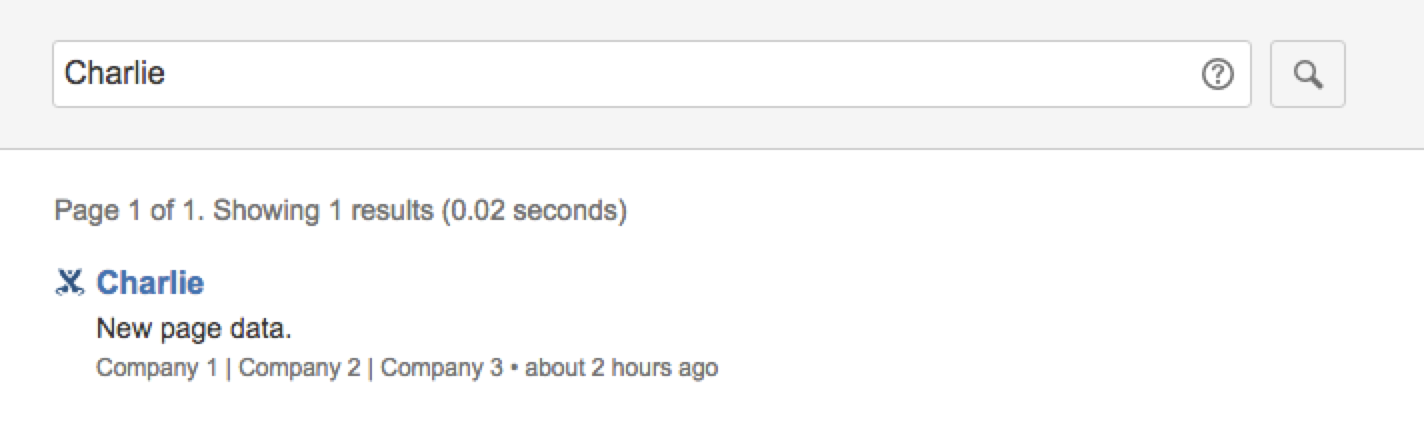
By using the Relation API we can create following relations between these content:
- Charlie works for Company A : PUT /rest/relation/worksFor/from/content/3/to/content/1
- Charlie works for Company B : PUT /rest/relation/worksFor/from/content/3/to/content/2
Since we have let ac:add-on-key:employee to use worksFor relation to generate the breadcrumbs. Confluence will fetch the relations that were created under name worksFor, then display the titles in the creation order of their relations in the search result like this:
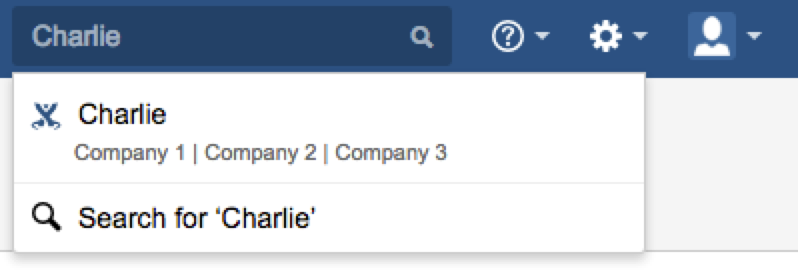
Similarly the site search will display the breadcrumbs as well:
editComponent
|
Type | Module Reference |
|
Description |
Defines a module for adding or editing custom content.
Confluence will provide the breadcrumbs, title input, submit and cancel button on the edit component.
Add-on needs to supply the editor area like the screenshot shown below in a general page module.
A reference to a module defined in either this or another add-on
|

editComponentCancelButtonLabel
|
Type | i18n Property |
|
Description |
Defines the label for cancel button on edit component Represents a string that can be resolved via a localization properties file. You can use the same Example
|
editComponentSubmitButtonLabel
|
Type | i18n Property |
|
Description |
Defines the label for submit button on edit component Represents a string that can be resolved via a localization properties file. You can use the same Example
|
editComponentTitlePlaceholder
|
Type | i18n Property |
|
Description |
Defines a placeholder for title input box that will be used in the edit component. Following variables will be replaced at runtime:
For example: Represents a string that can be resolved via a localization properties file. You can use the same Example
|
listViewComponent
|
Type | Module Reference |
|
Description |
Defines a module that will be used when a user clicks the navigation link displayed in the space sidebar. A reference to a module defined in either this or another add-on
|
description
|
Type | i18n Property |
|
Description |
The description of the custom content Represents a string that can be resolved via a localization properties file. You can use the same Example
|
Properties
value
|
i18n
|
Type | string |
|
Max length |
300 |
|
Description |
The localization key for the human-readable value. Translations for the keys are defined at the top level of the add-on descriptor. |
Rate this page: