- Admin Page
- Administration UI locations
- Background Script
- Build
- Dashboard Item
- Deployment
- Development Tool
- Devops Components
- Dialog
- Entity Property
- Feature Flag
- Global Permission
- Issue Content
- Issue Context
- Issue Field
- Issue Glance
- Issue view UI locations
- JQL Functions
- Keyboard Shortcut
- New issue view UI locations
- Operations Information
- Page
- Project Admin Tab Panel
- Project Page
- Project Permission
- Project settings UI locations
- Project sidebar
- Remote Link
- Report
- Search Request View
- Security Information
- Tab Panel
- Time Tracking Provider
- User profile menu
- Web Item
- Web Panel
- Web Section
- Webhook
- Workflow Condition
- Workflow Post Function
- Workflow Validator
Ending Connect support
You can no longer publish Connect apps on the Atlassian Marketplace. All new extensibility features will be delivered only on Forge.
Refer to this blog post for our timeline to end Connect support.
Have an existing Connect app? You can incrementally migrate it to Forge.
New issue view UI locations
The most common location to add content from your app is on Jira's issue view. In the new Jira issue view, there are three main ways for you to add content: add issue content, a glance, and a collapsible panel. You can also create a view that users can switch to in the activity section of the issue, and include items within the issue actions menu.
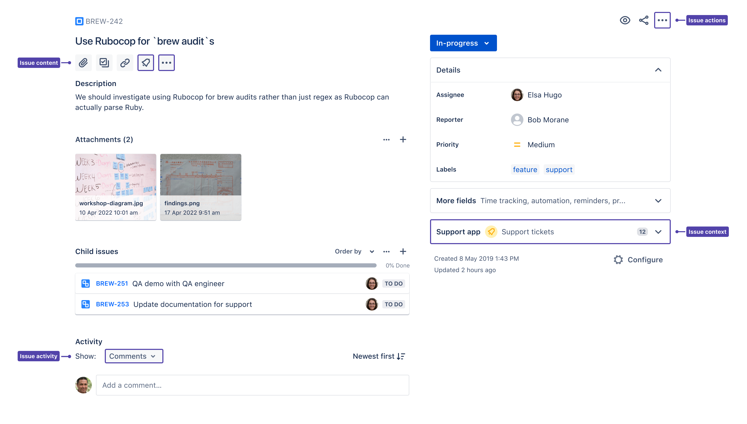
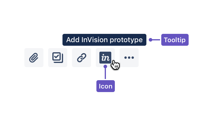
Issue content
The issue content module lets you create an experience where users can add content or media from your app via a quick-add button. The content they add helps to describe the Jira issue. The new Jira issue view has a standard set of quick-add buttons to add attachments, subtasks, and linked issues, and you can add content from your app to this list.
If your app lets users embed a diagram, for example, or link to a design prototype or external document, you should use a quick-add button.
Properties
Properties for issue content are defined in the documentation for the issue content module.
Sample descriptor JSON
1
2{
  "modules": {
    "jiraIssueContents": [
      {
        "icon": {
          "width": 24,
          "height": 24,
          "url": "/my_icon.svg"
        },
        "target": {
          "type": "web_panel",
          "url": "/url_to_panel_content_page.htm"
        },
        "tooltip": {
          "value": "This is a tooltip"
        },
        "name": {
          "value": "My Issue Content Panel"
        },
        "key": "my-issue-content-panel"
      }
    ]
  }
}
Quick-add button backwards compatibility
The quick-add pattern is backwards compatible with the atl.jira.view.issue.left.context location, but we strongly recommend you create or update your app using the Atlassian Connect issue content module to provide a high quality user experience.
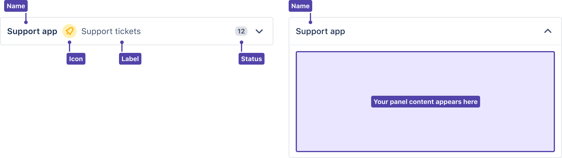
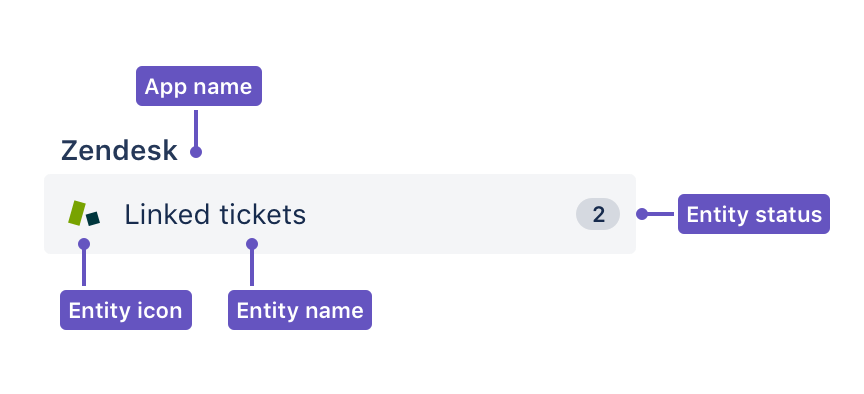
Issue Context
The Issue Context module lets you define a collapsible panel under your fields on the right side of the issue view. These panels give your users a quick way to get information related to the issue from your app. Users can expand these panels to view app information or collapse them if they don’t need it.
Properties
Properties for glances are defined in the documentation for the issue context module.
Sample descriptor JSON
1
2{
  "modules": {
    "jiraIssueContexts": [
      {
        "icon": {
          "width": 24,
          "height": 24,
          "url": "my_icon.svg"
        },
        "content": {
          "type": "label",
          "label": {
            "value": "my label"
          }
        },
        "target": {
          "type": "web_panel",
          "url": "/panel_url"
        },
        "name": {
          "value": "My Issue Context panel"
        },
        "key": "my-issue-context"
      }
    ]
  }
}
Issue context on mobile and desktop native apps
Jira Cloud is available on iOS, Android and Mac with modules available for app developers. There are ecosystem APIs on these apps and plans to support more. Issue context panels built for web are automatically supported on mobile, however, make sure the UI is mobile and desktop friendly. See Developing apps for Jira Cloud mobile and desktop native apps for guidance on creating a mobile- and desktop-friendly UI.
Glance
Glances are special user interface elements that appear in the right sidebar of the issue view under the status, and alongside other fields like assignee, priority, and labels. They provide a quick way for a user to get an overview of some information provided by your app that relates to the issue. A user can interact with a glance to open its detail view to get more information from your app.
Properties
Properties for glances are defined in the documentation for the issue glance module.
Sample descriptor JSON
1
2{
  "modules": {
    "jiraIssueGlances": [
      {
        "icon": {
          "width": 24,
          "height": 24,
          "url": "my_icon.svg"
        },
        "content": {
          "type": "label",
          "label": {
            "value": "my label"
          }
        },
        "target": {
          "type": "web_panel",
          "url": "/panel_url"
        },
        "name": {
          "value": "My Issue Glance"
        },
        "key": "my-issue-glance"
      }
    ]
  }
}
Glance backwards compatibility
Glances are backwards compatible with the atl.jira.view.issue.right.context location, but we strongly recommend you create or update your app using the Atlassian Connect issue glance module to provide a high quality user experience.
Glances on mobile and desktop native apps
Jira Cloud is available on iOS, Android and Mac with modules available for app developers. There are ecosystem APIs on these apps and plans to support more. Glances built for web are automatically supported on mobile, however, make sure the UI is mobile and desktop friendly. See Developing apps for Jira Cloud mobile and desktop native apps for guidance on creating a mobile- and desktop-friendly UI.
Issue actions and activity
The new issue view is backwards-compatible with the existing issue actions and issue activity locations. See issue view UI locations for more info on issue actions, and the tab panel module for info on issue activity.
Rate this page: