Ending Connect support
You can no longer publish Connect apps on the Atlassian Marketplace. All new extensibility features will be delivered only on Forge.
Refer to this blog post for our timeline to end Connect support.
Have an existing Connect app? You can incrementally migrate it to Forge.
Issue view design guidelines
New Jira issue view
These design guidelines relate to the new Jira issue view, which is currently only available to some Jira Software users. New modules and extension patterns on this page only relate to Jira Software right now, but we'll be adding them to Jira Service Desk in the near future.
When developing an app for the Jira issue view, it's important to create an experience that's intuitive and consistent with Jira's default behaviors. This will ensure users know what to expect when they interact with your app, and can quickly start using it. These guidelines and resources will help you craft an experience that maximizes adoption and ongoing use of your app.
Here's the issue view showing its extension patterns. We'll explore each of these below.
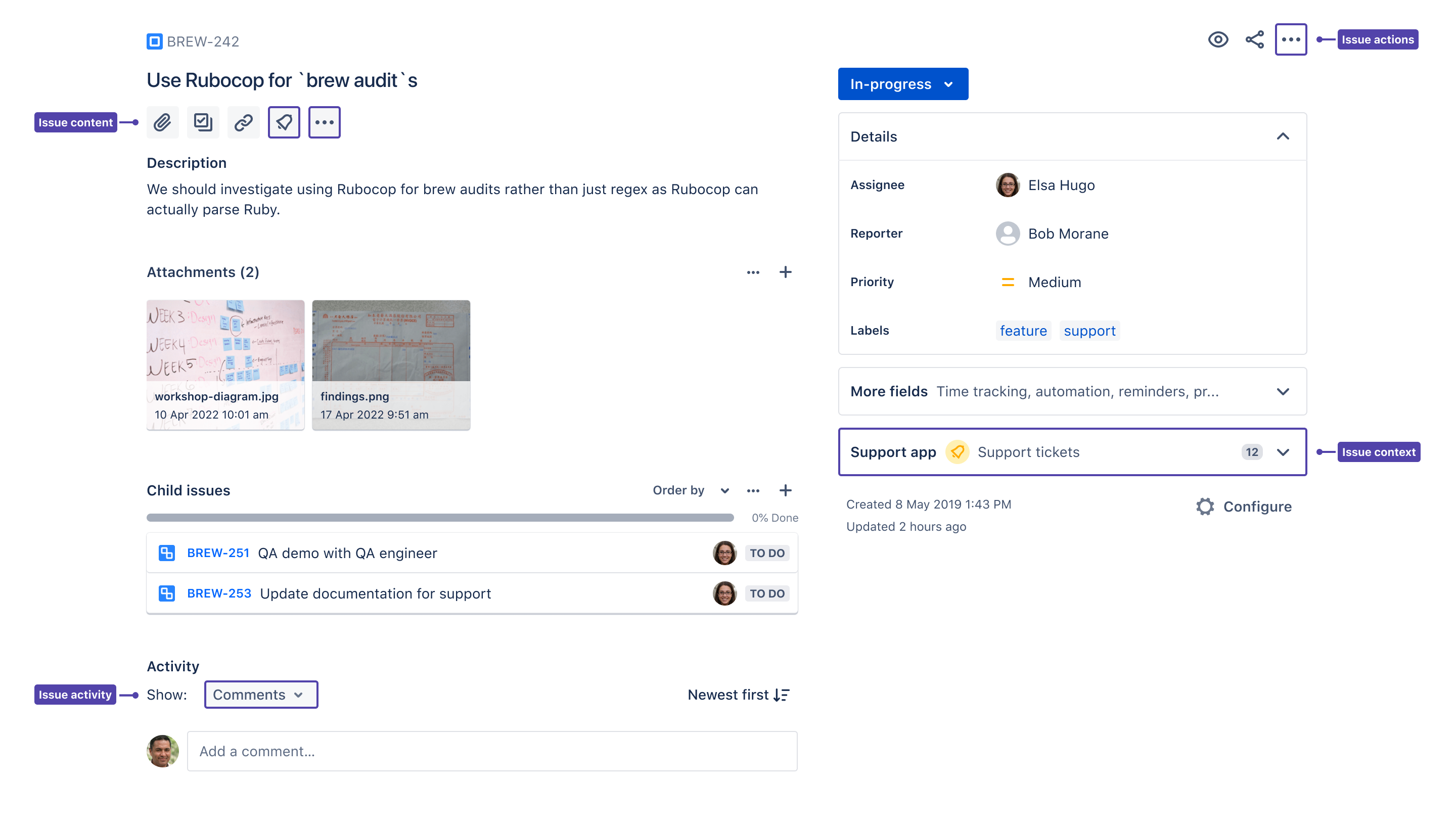
The issue view is displayed in a number of different locations in Jira. When your app extends the Jira issue view, it'll appear consistently across the board, backlog, issue navigator, full-page, and any new issue view locations we build in the future. Your app may also appear on the issue views of the mobile and desktop native Jira Cloud clients.
Issue content
The Issue Content module lets you define a quick-add button, which then enables users to add content or media from your app that helps describe a Jira issue. The new Jira issue view has a standard set of quick-add buttons to add attachments, subtasks, and linked issues, and you can add content from your app to this list.
When to use
The quick-add buttons work best when your app lets users add content to a Jira issue. If your app provides features like embedding a diagram, or linking to a design prototype or external document, use a quick-add button.
Do use a quick-add button if your app:
- is providing content or media that helps describe the work on the issue.
- requires some user action, or an interstitial (in-between) step before displaying content.
Don't use a quick-add button if your app:
- doesn't provide any function that helps a user to describe or resolve the issue.
User experience
Defining a quick-add button
Apps can define a button that, when clicked, will trigger an event prompting Jira to display a web panel with content defined by your app.
To define the button, you'll need to provide an icon and a tooltip that's shown when a user hovers over your app's button.
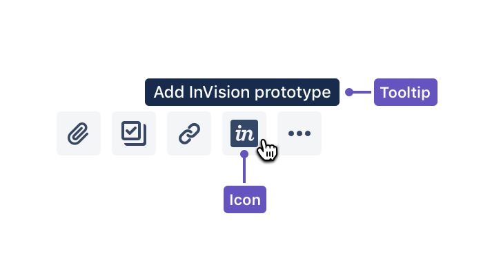
Icon
Your icon should be:
- an SVG (preferred) or PNG in a square aspect ratio, at a minimum 24x24 pixels. A generic fallback icon will be displayed if you don't provide one.
- an icon your users would recognise as part of your app. Ensure it illustrates your app's quick-add action or represents your app's brand.
Don't use icons provided by Atlassian, Atlaskit, or in the Atlassian Design Guidelines. Icons used to represent other features or functionality in Atlassian products should not be used by apps.
Tooltip
Your tooltip should:
- describe the action that occurs when a user clicks your app's button. For example, “Add diagram” is more useful and descriptive than displaying the name or brand of your app.
- be consistent with the tooltips for Jira's standard quick-add buttons: Add attachment, Create subtask, and Link issue.
We recommend you also provide translations for your tooltip in the languages your app supports.
Adding a web panel to an issue with the quick-add button
A user will click your app's quick-add button to display content on an issue. Once content is added to your issue content web panel for an issue by one user, it'll appear for all users who view that issue. Any user that meets your app's conditions will be able to interact with your web panel.
Using the ISSUE_QUICK_ADD_CLICKED event
You can use the JavaScript API to listen for the ISSUE_QUICK_ADD_CLICKED event that's sent when a user clicks on your app's quick-add button. Use this to design an experience where you want a user to input, select, or review information before interacting with your web panel.
For example, say you're building an app to add a diagram to an issue. When a user clicks your quick-add button, you could open a dialog where a user can select from a list of diagrams provided by your app. When the user successfully selects a diagram, you could then decide to show that diagram within your web panel.
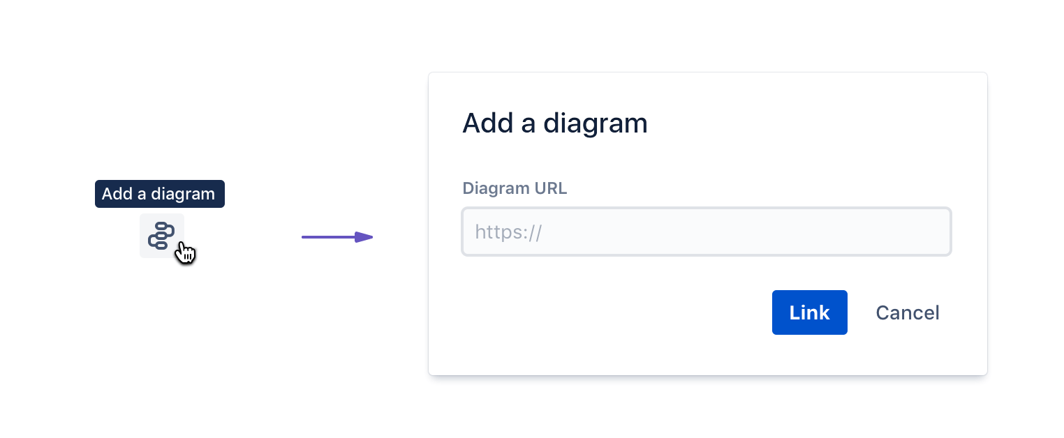
An example of how you achieve this experience is provided from the Issue Content module documentation.
1
2AP.events.on('ISSUE_QUICK_ADD_CLICKED', function(event){
  AP.dialog.create({
        key: 'sized-panel',
        width: '500px',
        height: '200px',
        chrome: true,
        header: JSON.stringify(event)
  });
});
Removing a web panel from an issue
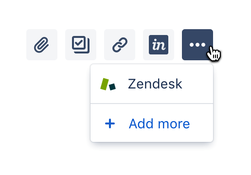
Users can remove content in your web panel by clicking the more icon (•••) above the panel and selecting Remove.
Design principles
Be useful
Because apps using the quick-add buttons have to be explicitly added by a user, it's important that your app has a compelling value proposition. The more useful people find your app, the more engagement and usage your app will receive (and the more likely someone will be to purchase).
Apps using the quick-add buttons should never display irrelevant or empty content. They should always be designed with the goal of adding richness and depth to the description of an issue.
Embrace content
Jira users expect that actions in the quick-add buttons will help them quickly describe an issue with rich content and media, like attachments, subtasks, and linked issues.
Your app experience should feel familiar and align with how standard Jira features behave. We've found that apps that feel integrated and behave similarly to Jira's inbuilt functions get more repeat engagement from users, because the app behaves in a way the user expects it to.
Use space wisely
Depending on the work and the type of team, Jira issues can contain a large amount of information. Be considerate in your use of space and how your app relates to other elements on the issue view.
Think about the information density and hierarchy of your design relative to other elements in the issue view. Align colours, typography and other elements with those provided in the Atlassian Design Guidelines to make your app feel more integrated with the issue view.
Special features
We've implemented some special features to improve discoverability of and engagement with apps that use the quick-add buttons.
Install apps from every issue
It's easier than ever for users to discover your app on the marketplace. The quick-add icons provide users with a shortcut to discover and install new apps, without leaving the context of their work. This option is available to anyone who has permission to install and manage apps on a site.
New apps available notification
This functionality is planned.
Jira users can easily discover and interact with your apps once they're installed. Users will see a notification dot appear on the set of quick-add buttons when a new app is installed. This notification appears for every user until they open the menu.
We've seen from our experiments that this significantly increases engagement with newly installed apps, so people are more likely to use (and buy) your app.
Personalised quick-add buttons
This functionality is planned.
The behavior of each user drives how your app's quick-add button is displayed. If your app's quick-add button is used frequently by a user, Jira will optimize its position by showing it alongside the standard quick-add buttons for adding attachments, subtasks, and linked issues. If the quick-add button for an app isn't frequently used, it's shown in an overflow menu (•••) next to the other quick-add buttons.
Well-designed apps that follow our best practices should see more repeat engagement from Jira users.
Issue context
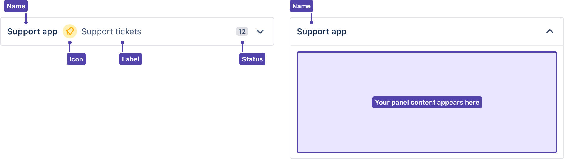
The Issue Context module lets you define a collapsible panel under your fields on the right side of the issue view. These panels give your users a quick way to get information related to the issue from your app. Users can expand these panels to view app information or collapse them if they don’t need it.
When to use
The panels work best when your app provides secondary or supporting information that would give a user more context on an issue.
Do use these panels if:
- your app provides secondary contextual information related to an issue.
- you want to add app information to the right side of the issue view.
- you want to add information that can be shown or hidden, depending on what your users prefer.
Don't use these panels if:
- you want to add app information to the left side of the issue view.
User experience
Defining issue context
Your app can define an issue context panel that'll appear on every issue in Jira for users that meet your app's conditions.
You can define multiple issue context panels in your descriptor, but Jira will only display the first panel returned (after any conditions have been evaluated).
Read Using multiple issue context panels in the issue view for more details on how we recommend you design an experience using multiple panels.
App icon
Your icon should be:
- an SVG (preferred) or PNG in a square aspect ratio, at a minimum 24x24 pixels. A generic fallback icon will be displayed if you don't provide one.
- an icon that represents or relates to the information that you're displaying in your panel.
Don't use icons provided by Atlassian, Atlaskit, or in the Atlassian Design Guidelines. Icons used to represent other features or functionality in Atlassian products should not be used by apps.
Entity name
This should describe the entity, objects, or actions associated with the target of your panel. The description should set a user's expectation for what will be displayed when a user interacts with your panel.
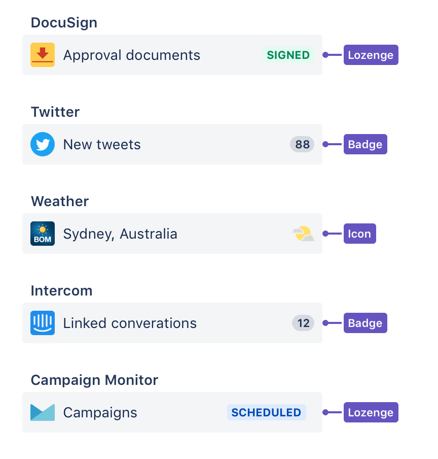
Entity status
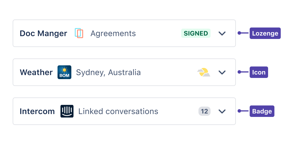
You can optionally display a representation of status for your entity. You can choose between an icon, lozenge or badge.
- Icon – Should be an SVG (preferred) or PNG in a square aspect ratio, at a minimum 24x24 pixels.
- Lozenge – You should supply content to be displayed inside of your lozenge, and define an appropriate appearance option (
default,success,removed,inprogress,new, ormoved). - Badge - You must supply a positive integer. Integers greater than 99 will be shown in the user interface as "99+".
Interacting with a panel
Users can expand or collapse the panel to either show or hide information from your app. This lets your users view your app’s information side-by-side with other issue fields. When a user expands or collapses a panel, the panel will remember that for every issue in the project.
The panel will expand until it reaches the height of the content inside it. If the content’s height is taller than the browser’s height, you’ll be able to scroll within your panel. If this happens, you’ll still be able to scroll through the ride side of the issue view to see other fields and groups.
Design principles
Only show what’s relevant
Use issue context panels when you have a specific use case for your app. Your app should have a few critical functions related to interacting with a Jira issue. Having multiple flows within the confined space of an issue context panel can be confusing and annoying.
Apps using issue context panels should never display irrelevant or empty content. They be designed to always add useful functionality.
Need more complexity? Consider using a content panel, which is wider by default and doesn’t have a border.
Mind your vertical height
The issue context panel wraps around your app content. If you have a lot of content, the issue context panel will scroll. If your app has multiple screens or flows with different heights, the panel can jump around on the screen as the height of the content changes. You may set an app height to avoid this, but be mindful of a double scroll bar appearing.
Have a lot of content? Consider calling a modal dialog, which allows scrolling and has a fixed position in the browser, or a content panel, which is wider by default and doesn’t have a border.
Avoid sticky headers and footers
If your app needs a lot of navigation or controls, it might not be concise enough for an issue context panel. The panel header, used for expanding and collapsing, sticks to the right scroll area on an issue. Having another sticky header in the panel can use valuable space.
Issue context panels wrap to the height of your app and appear with other context groups on the right side of an issue. This can make sticky footers challenging to control.
Want to have fixed elements? Consider calling a modal dialog, which has a fixed size and position in the browser.
Consider the other elements of an issue
Depending on the work and the type of team, Jira issues can contain a lot of information. Consider your use of space and how your app relates to other elements on the issue view.
Think about your design’s information density and hierarchy relative to other elements of the issue view. Align colors, typography, and other elements with those provided in the Atlassian Design Guidelines to better integrate your app with the issue view.
Check the mobile experience
By default, issue context panels appear in Jira native and desktop client apps. Double-check if your app has the experience you want. Learn more about developing for mobile and desktop clients.
Issue glance
Glances, defined using the Issue Glance module, are special user interface elements that appear in the right sidebar of the issue view under the status, and alongside other fields like assignee, priority, and labels. They provide a quick way for a user to get an overview of some information, provided by your app, that relates to an issue. A user can open a glance to view more detailed information from your app.
When to use
Glances are best used when your app is providing secondary or supporting information that would give a user more context on an issue. Use glances when you can provide a view or window into information from within your app. You may want the status component of a glance to draw attention to a user that they need to click to open your glance.
As glances appear next to other fields, like assignee or priority, reflect on how well your app would sit alongside these items.
Do use a glance if your app:
- is providing secondary contextual information related to an issue
- if you expect users to interact with your app infrequently
User experience
Defining a glance
Your app can define a glance that'll appear on every issue in Jira for users that meet your app's conditions.
You can define multiple glance modules in your descriptor, but Jira will only display the first glance module returned (after any conditions have been evaluated).
Read Using multiple glances in the issue view for more details on how we recommend you design an experience using multiple glances.
App icon
Your icon should be:
- an SVG (preferred) or PNG in a square aspect ratio, at a minimum 24x24 pixels. A generic fallback icon will be displayed if you don't provide one.
- an icon that represents or relates to the information that you're displaying in your glance.
Don't use icons provided by Atlassian, Atlaskit, or in the Atlassian Design Guidelines. Icons used to represent other features or functionality in Atlassian products should not be used by apps.
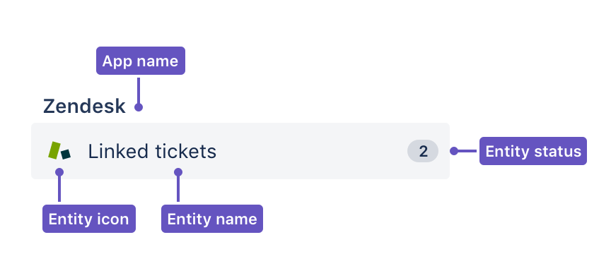
Entity name
This should describe the entity, objects, or actions associated with the target of your glance. The description should set a user's expectation for what will be displayed when a user interacts with your glance.
Entity status
You can optionally display a representation of status for your entity. You can choose between an icon, lozenge or badge.
- Icon – Should be an SVG (preferred) or PNG in a square aspect ratio, at a minimum 24x24 pixels.
- Lozenge – You should supply content to be displayed inside of your lozenge, and define an appropriate appearance option (
default,success,removed,inprogress,new, ormoved). - Badge - You must supply a positive integer. Integers greater than 99 will be shown in the user interface as "99+".
Interacting with a glance
When a user clicks your glance to see more information, it'll animate a panel over the right sidebar of the issue view. The user can then click the back button to close your app's panel. This lets the user view your app's content side-by-side with the description, attachments, and other issue content.
-Use the sidebar panel if your app is providing an experience where a user needs to view your app's content side-by-side with the description, attachments, or other issue content.
The sidebar panel is reset every time the user loads the issue detail view. Meaning, if they have the sidebar panel open and refresh the issue or view another issue, it'll be closed and the glance summary is shown.
Issue activity
The activity feed shows a list of changes, updates, and comments on an issue, and related information. You can define a new view that users can switch to in the activity feed using the jiraIssueTabPanels tab panel module.
When to use
Users expect the activity view to show information, usually ordered by time, that's related to either your app or other information on the issue. If your app is providing an integration with another system or entity, it may make sense for you to define a custom activity view.
For example, if your app is a customer support product, you may want to show related activity from your product.
User experience
Interacting with an app's activity view
By default the activity feed will show comments. A user can click on a drop-down menu near the activity feed to switch views and see information related to history and transitions, and a custom view defined by your app.
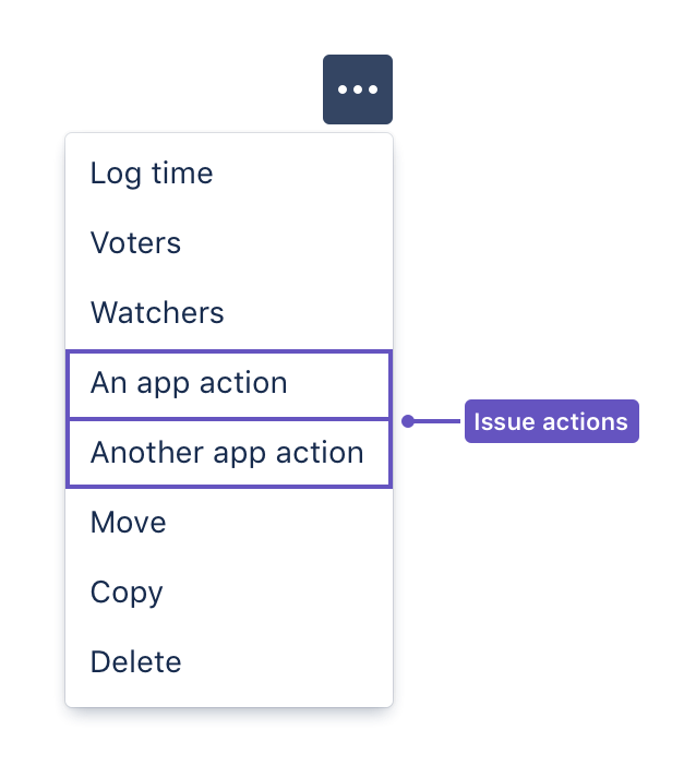
Issue actions
Issue actions, like sharing or exporting an issue, are implemented via buttons at the top right of the issue view. You can extend issue actions either by adding a new web item next to the issue actions, or by inserting a new web section or web item in the more actions (•••) menu.
Your app can add an issue action by using the Web item module with the operations-top-level location.
When to use
Issue actions are ideal for triggering dialogs provided by your app that allow users to perform an action on the issue that's supported by your app. Issue actions should be used for top-level actions that affect an issue.
Rate this page: