Ending Connect support
You can no longer publish Connect apps on the Atlassian Marketplace. All new extensibility features will be delivered only on Forge.
Refer to this blog post for our timeline to end Connect support.
Have an existing Connect app? You can incrementally migrate it to Forge.
Navigation design guidelines
Jira’s navigation system enables users to move between screens to complete tasks. Not all tasks require users to navigate between multiple screens. In fact, the new navigation system enables more tasks to be done with fewer screen transitions. With that in mind, it’s important to remember that not all apps need to expose entry points in the navigation. Apps with a deeper information architecture may also choose to leverage the contextual sidebar pattern. Apps aren’t required to use the contextual sidebar and can build their own navigation. But there are benefits, including a more familiar experience for users, Single Page App (SPA) transitions, and Server Side Rendered (SSR) navigation. These guidelines and resources will help you craft your app in a way that's consistent with Jira’s core experiences, reducing friction and maximizing the ongoing use of your app.
Menu items in the navigation system
Menu items in the navigation create entry points into your app. The navigation system includes extension points for the:
- Top menu
- Company-managed projects sidebar
- Company-managed project settings
- Jira settings
- User profile menu
Extension points for team-managed projects are coming soon.
We strongly encourage you to design your app for project-centric or user-centric experiences. This means the primary method of navigating to your app's content should be via the project sidebar or user profile menu.
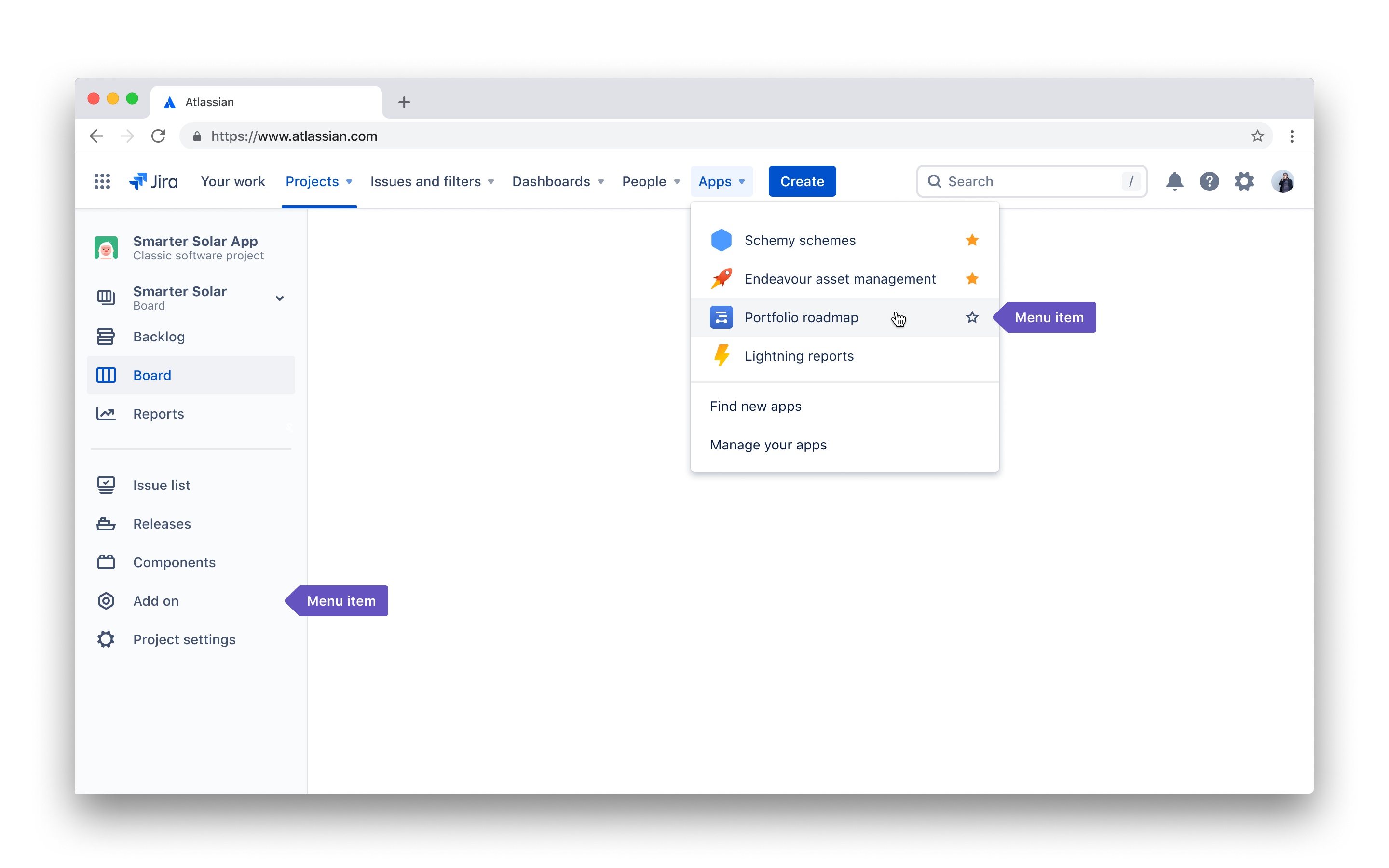
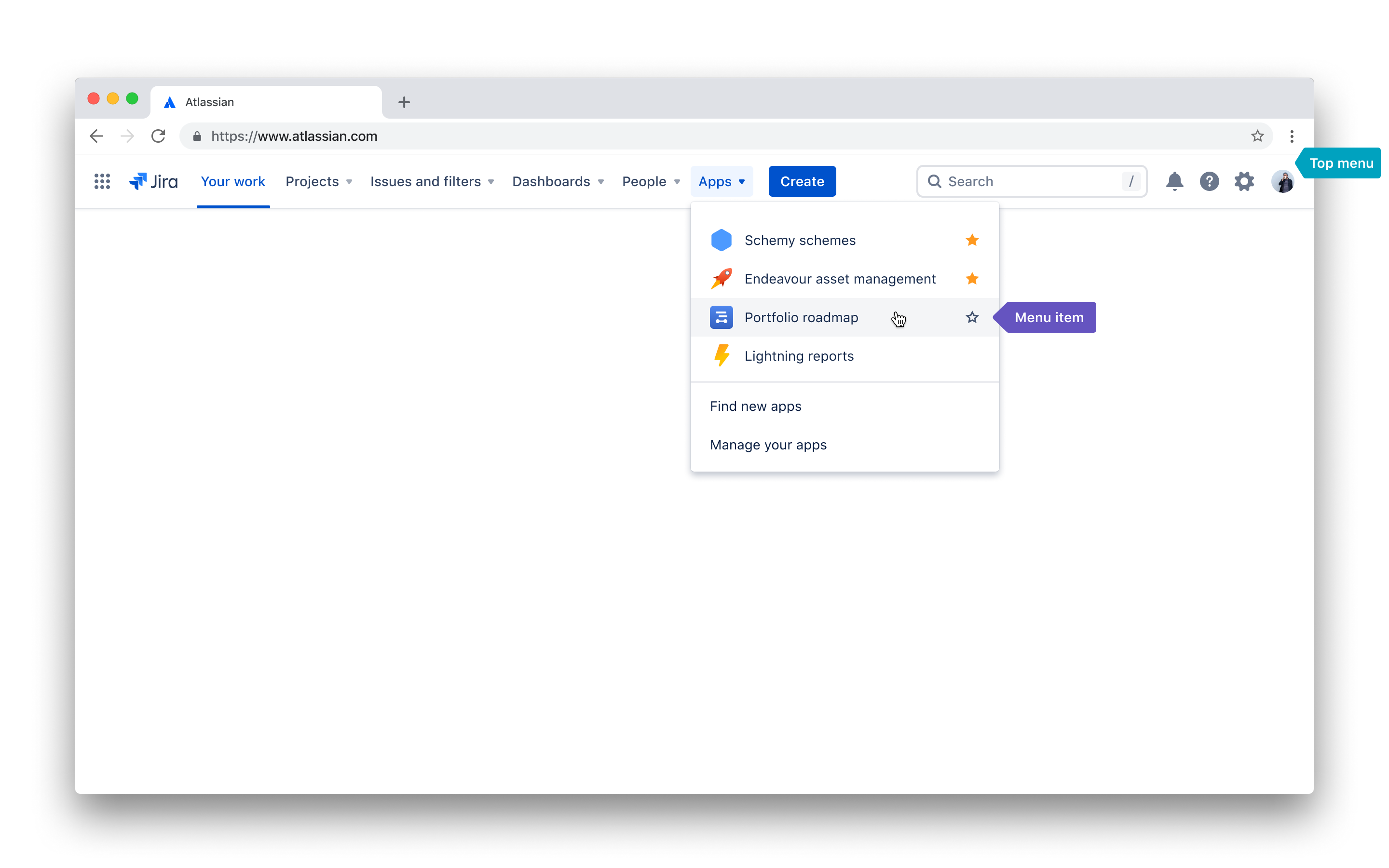
Top menu
The top menu is persistent throughout Jira. Apps with global experiences (spanning multiple projects) should add a menu item within the Apps submenu. A menu item provides users with a single entry point into the app experience. The Apps submenu is always visible and includes a link to the Atlassian Marketplace.
When to use it
The top menu works best for larger apps with full-page experiences that span multiple projects or entities. For example, reporting on multiple projects.
Do add an entry to the top menu if your app:
- has a global context, spanning multiple projects or entities.
- requires a full-page experience.
Don’t add an entry point to the top menu if:
- your app triggers an action, modal, or dialogue.
- a menu item for your app already exists in the top menu.
User experience
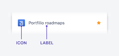
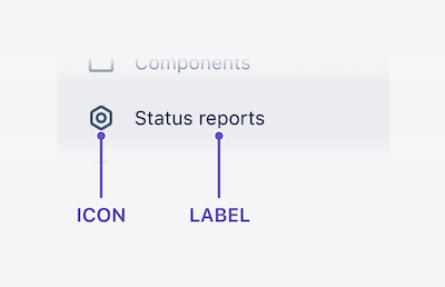
Icon
Apps are encouraged to embrace their branding and provide a colored icon for the navigation item. Your icon should be:
- a colored
SVG(preferred) orPNGin a square aspect ratio, at a minimum 24 x 24 pixels. A generic fallback icon will be displayed if you don't provide one. - an icon your users would recognize as part of your app. Ensure it illustrates your app's core functionality or represents your app's brand.
Don't use icons provided by Atlassian, AtlasKit, or the Atlassian Design Guidelines. Icons used to represent features or functionality in Atlassian products should not be used by apps.
Label
Labels are key to users finding their way. Your label should:
- be a text string that users recognize as your brand.
- describe the functionality within your app.
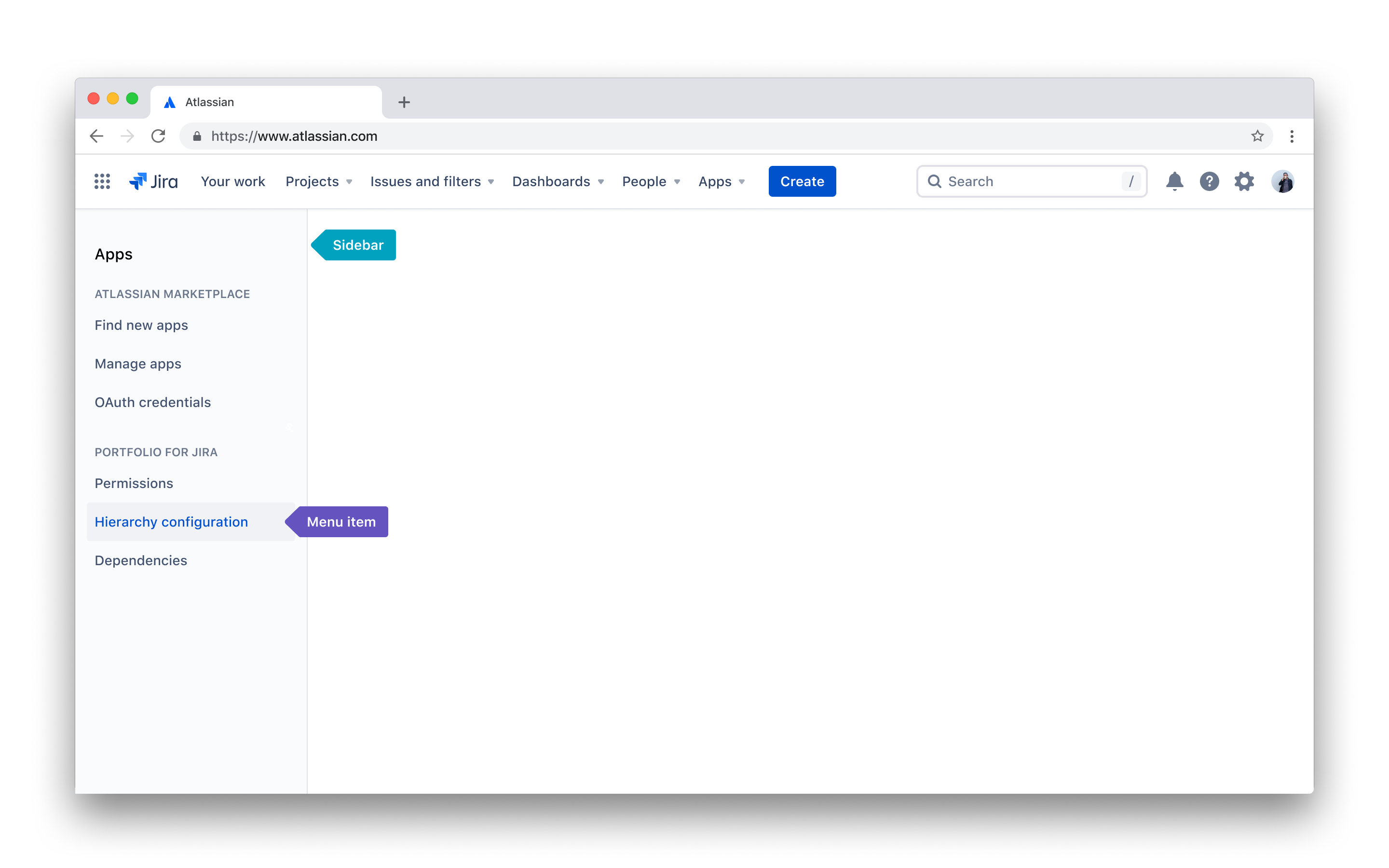
Company-managed projects sidebar
Most users do their work in the project context, whether it’s on the board, queue, or issue view. Adding menu items to the company-managed project sidebar brings your app closer to where users do their work.
Your app menu item can be a single link (recommended) or open a sidebar nest. Sidebar nests are useful for apps that have a deep information architecture (see contextual sidebar).
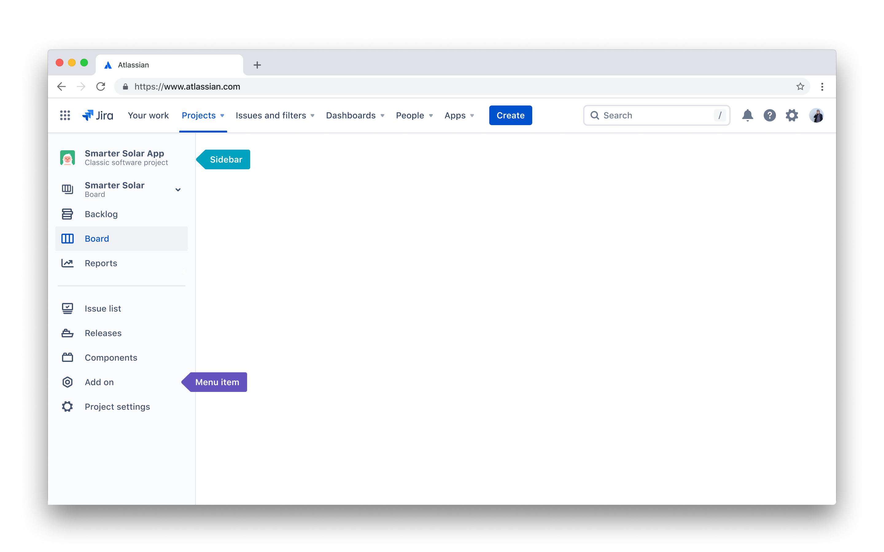
When to use it
Menu items in the company-managed project sidebar are for apps with a project-scoped experiences.
Do add an entry to the company-managed project sidebar if your app:
- is project-scoped.
Don’t add an entry point to the company-managed project sidebar if:
- a menu item for your app already exists in the company-managed project sidebar.
User experience
Icon
Apps can provide their own icon for container navigation. Icons should be colored N500 (#42526E). If you provide a colored icon a series of filters will be applied to change the color. Your icon should be:
- an
SVG(preferred) orPNGin a square aspect ratio, at a minimum 24 x 24 pixels. A generic fallback icon will be displayed if you don't provide one. - an icon your users would recognize as part of your app. Ensure it illustrates your app's core functionality or represents your app's brand (note, however, that any colors will be removed).
Don't use icons provided by Atlassian, AtlasKit, or in the Atlassian Design Guidelines. Icons used to represent other features or functionality in Atlassian products should not be used by apps.
Label
Labels are key to users finding their way. Your label should:
- be a text string that users recognize as part of your brand.
- describe the functionality within your app.
Company-managed projects settings
Apps can add settings menus to the project settings sidebar. These will appear at
the bottom of the sidebar. Apps should avoid adding multiple menu items to the project sidebar. If there is a requirement for multiple pages we suggest using in-app navigation for deeper pages. This will make it easier for users to get choose where to navigate (using a progressive disclosure pattern).
When to use it
Apps that require configurations that are unique to the project context may want to add an item to the project settings sidebar.
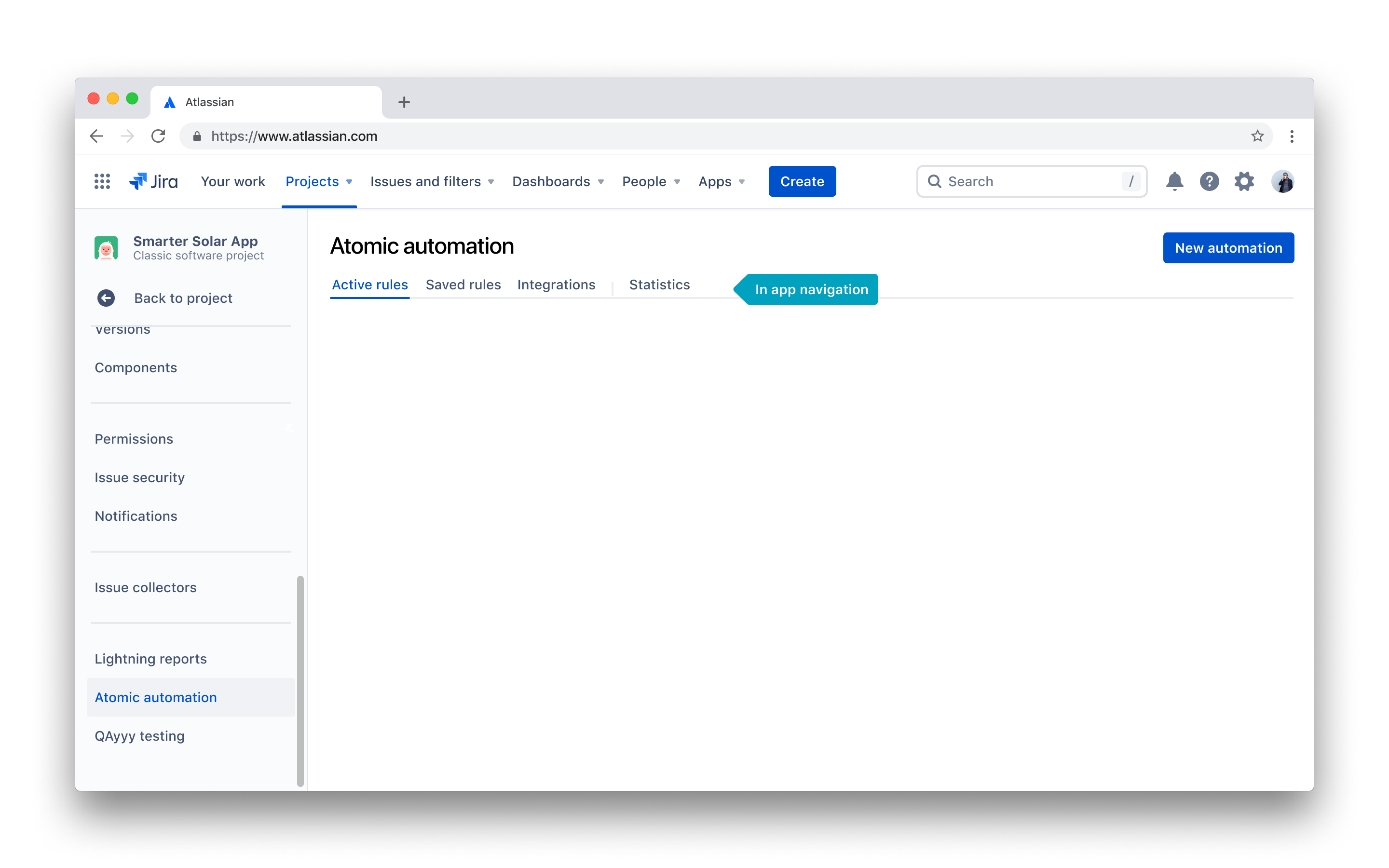
Jira settings
If your app needs to provide a configuration on the administration screen, we recommend adding a link and page to the apps section of Jira settings.
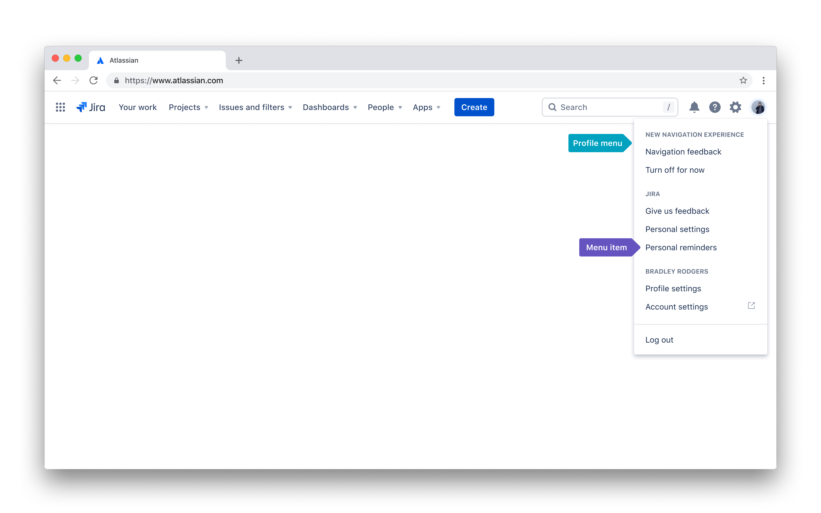
User profile menu
The Jira Cloud user profile menu is the recommended location for any view your app provides that has a user context. This means that your app will display information or make actions available that are specific to the current user.
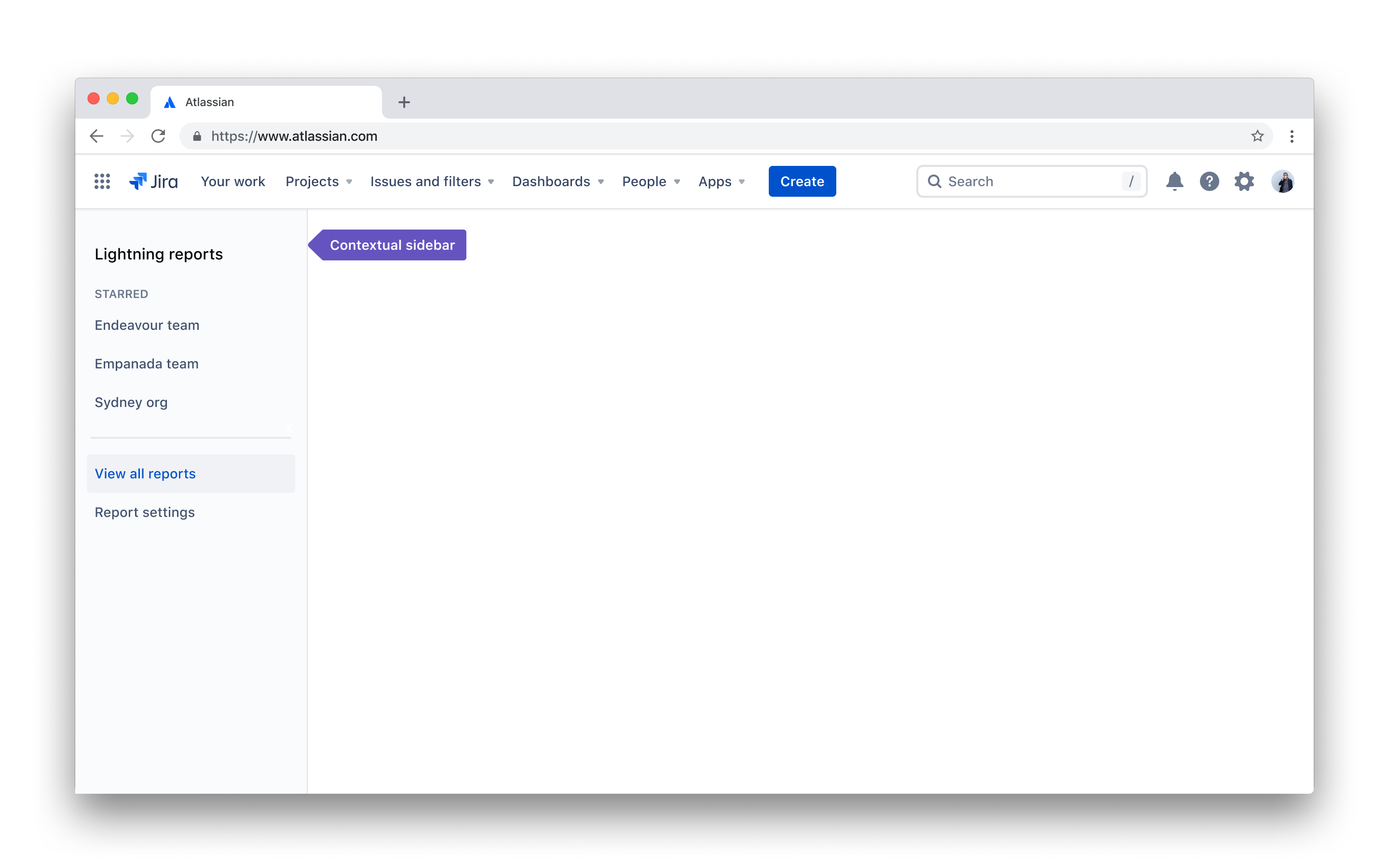
Contextual sidebar
There are two types of contextual sidebars which are based on the location of your app:
- Apps located in the top or profile menu can add their own contextual sidebar.
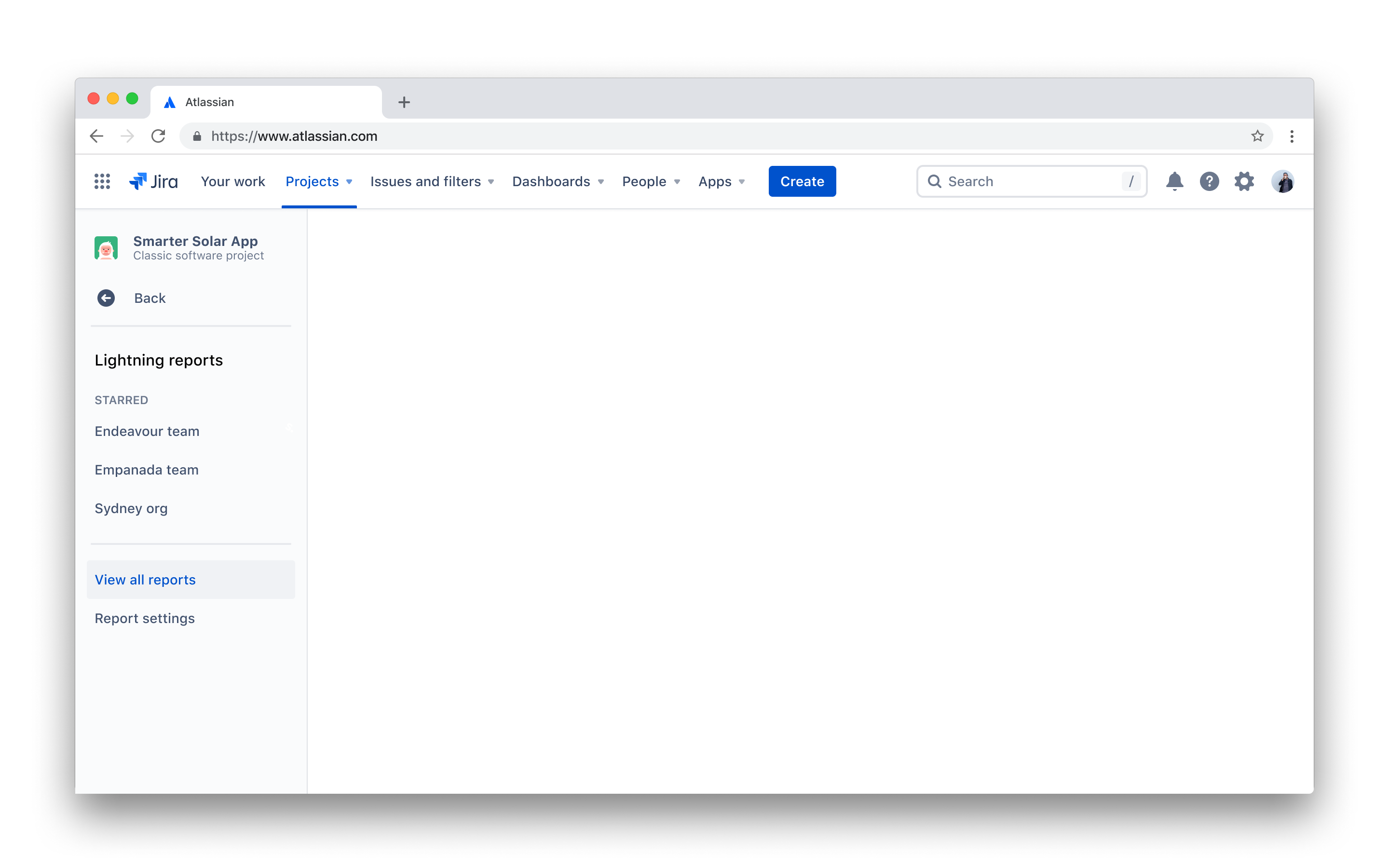
- Apps located in the company-managed project, company-managed settings, or Jira settings sidebars can add a sidebar nest that slides over the top of Jira’s contextual sidebar.
Using Atlassian contextual sidebars gives apps an experience and performance advantage. Contextual sidebars are within the Jira SPA (Single Page Application) allowing for smoother transitions between pages. We also SSR (Server Side Render) our sidebar which provides a quicker time to render.
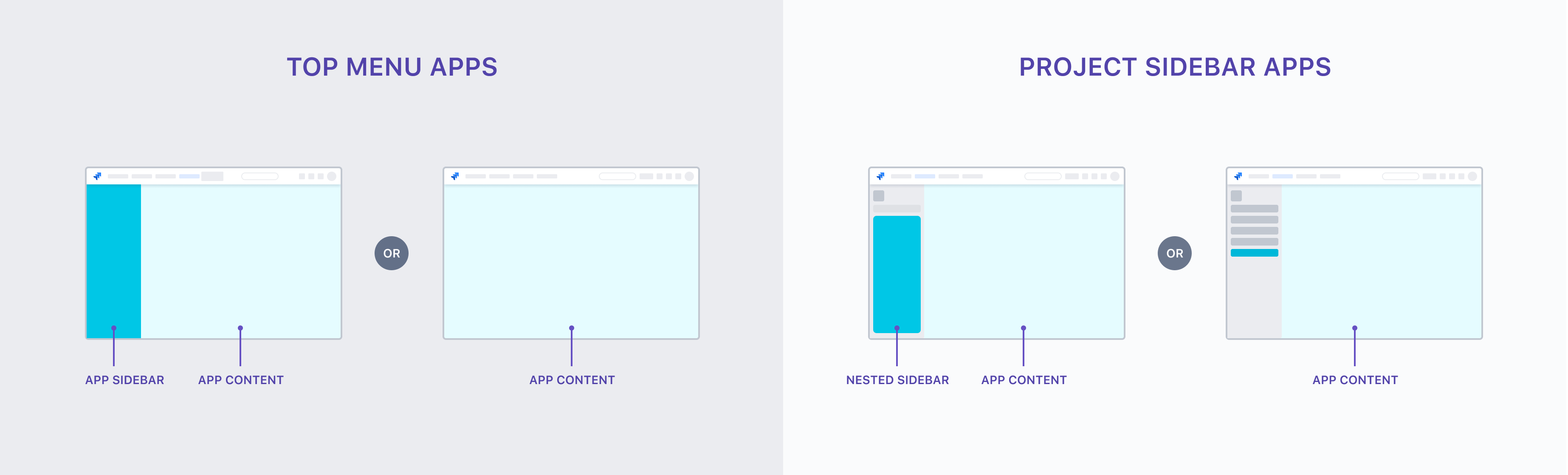
Contextual sidebars for apps in the top menu
A contextual app sidebar appears within the full-page experience of an app. It only appears when users enter the app from the top menu (see top menu for more). Apps can build the contextual sidebar using headers, dividers and list items. Apps are not required to have a contextual sidebar and some apps may benefit from having a full-width experience.
The first list item should be the landing page for users- they’ll land here when they enter the app. Use titles to group and separate menu items. Dividers separate core features from secondary navigation items, but should be used sparingly. Use only a divider or a title to group content, never use both.
Contextual sidebars for apps in the project and settings sidebar
When the entry point for your app is in an existing sidebar, your contextual sidebar will appear as a nested pattern. The nesting pattern covers the main sidebar.
We strongly encourage you to avoid using the nesting pattern. A new pattern, with fewer negative effects on the user experience, will replace the nesting pattern in the future.
Rate this page: