Sidebar style guide
Sidebar types
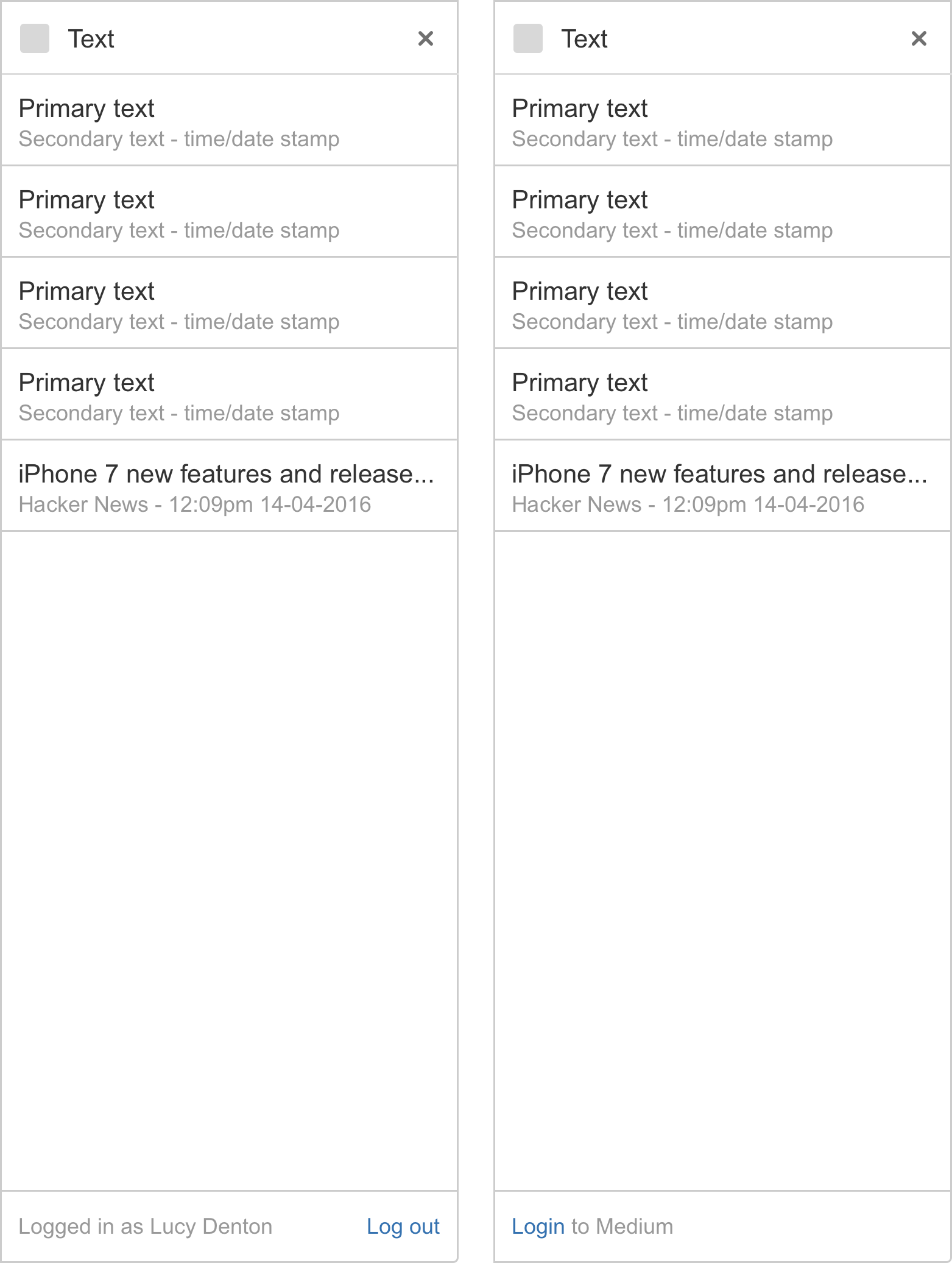
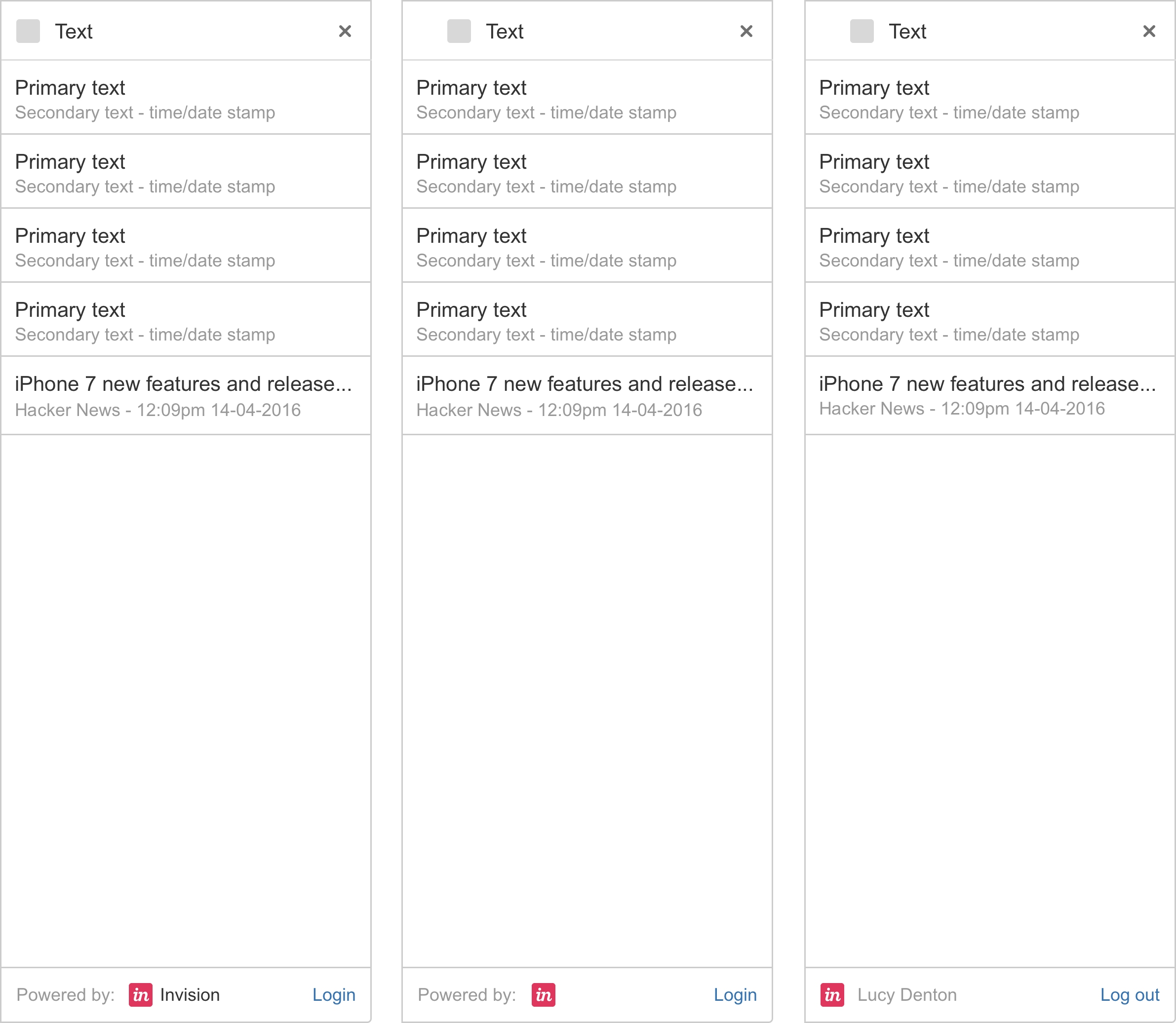
List view
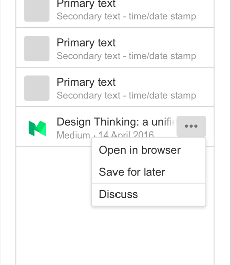
Users click the glance to open the list view. The list view is used to display a list of important objects as cards. For example: a list of links or files, notifications, or activities. Cards are clickable, on click they may navigate to a full view sidebar (below) or the application itself (out of HipChat).
Content
There are four variations of list views and will always contain a H1 with meta details: (Choose one that fits your purpose)
Small icon | No icon
| Large icon
| Large icon (description/key value pair)
|
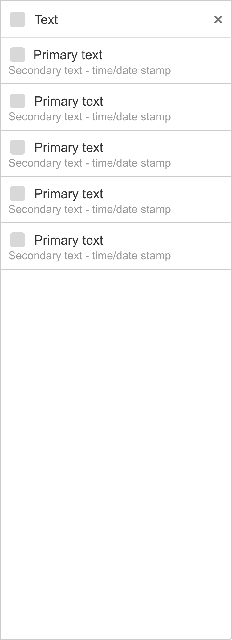
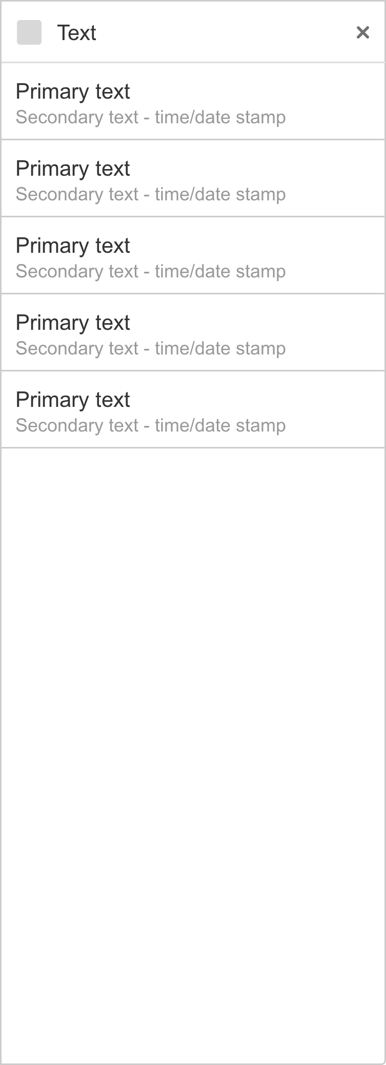
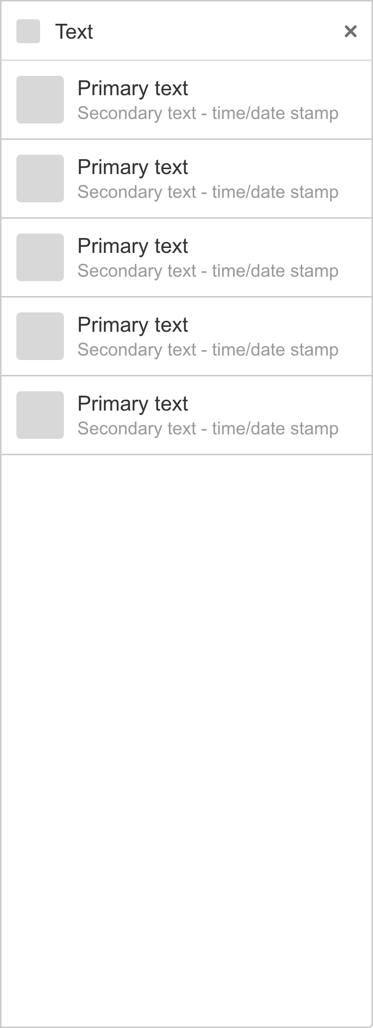
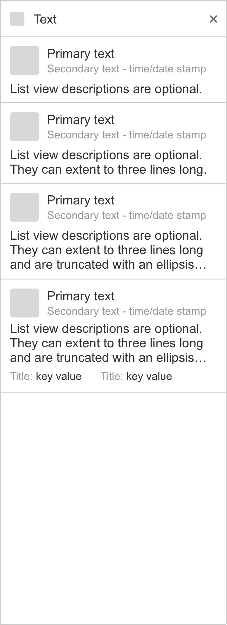
- Primary text is the title of the object.
- Secondary text is meta text, such as a date or timestamp, users name, a source location, etc.
- Description text can be up to three lines long. This could be the beginning of an article, an issue summary, a comment, etc.
- Icons are used to represent the object.
- Key value pairs, a title a related text, are used to show some attribute relating to the object.
Actions
List view cards can posses actions within a button shown on hover.
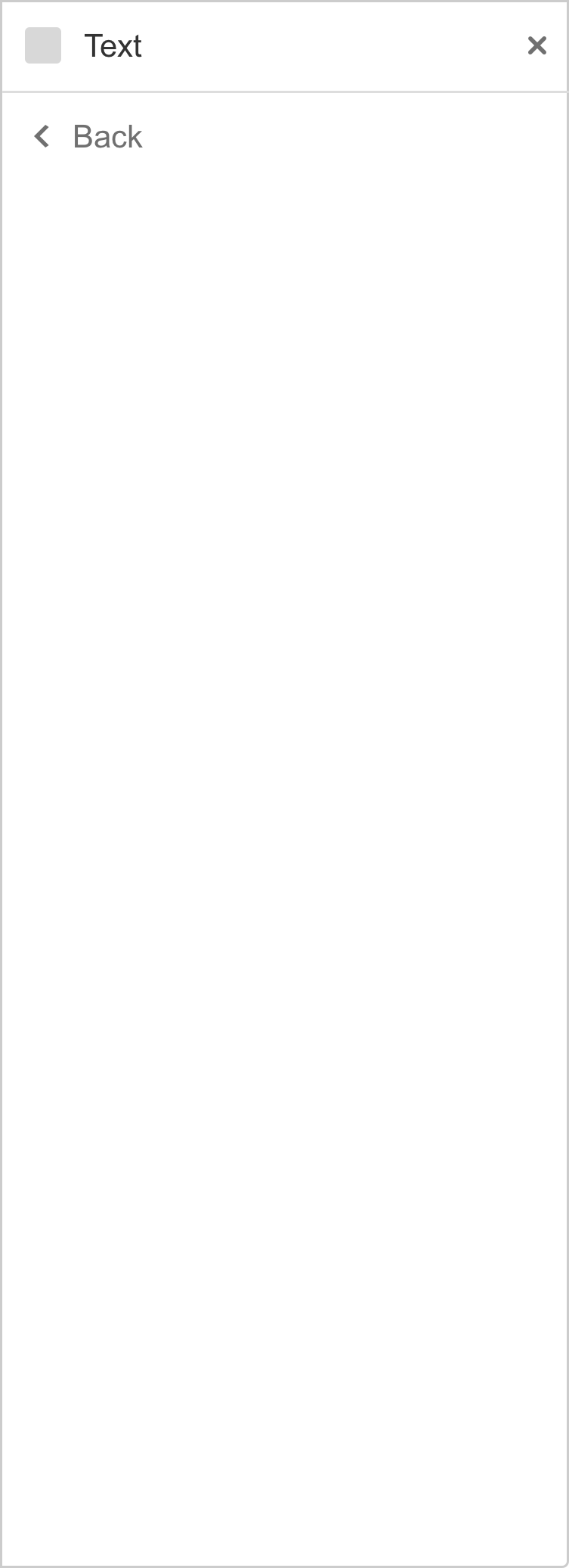
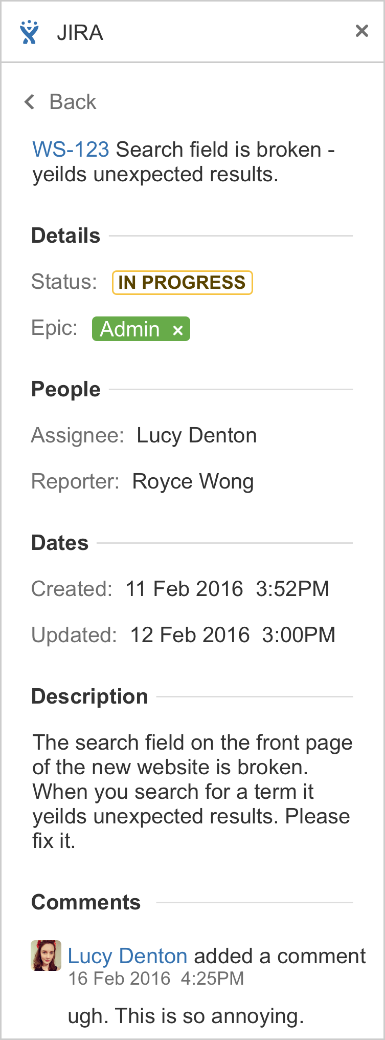
Full view
Full views are used to display more detailed information that wouldn't fit into a chat card. These are typically comprised of different elements. Full views can be directly navigated from the glance or the card.
Use a full view layout when displaying information that:
- Comprises multiple data types.
- Does not require direct comparison (a user is not directly comparing images or text).
- Is more than three lines of text, images, links, or key value pairs.
Content
Full views must have a back button to navigate back to the list view or glance.
 |
Example: JIRA full view shows a single issues details. |
Patterns
Below are common patterns that add-ons may require, and how HipChat Connect treats them.
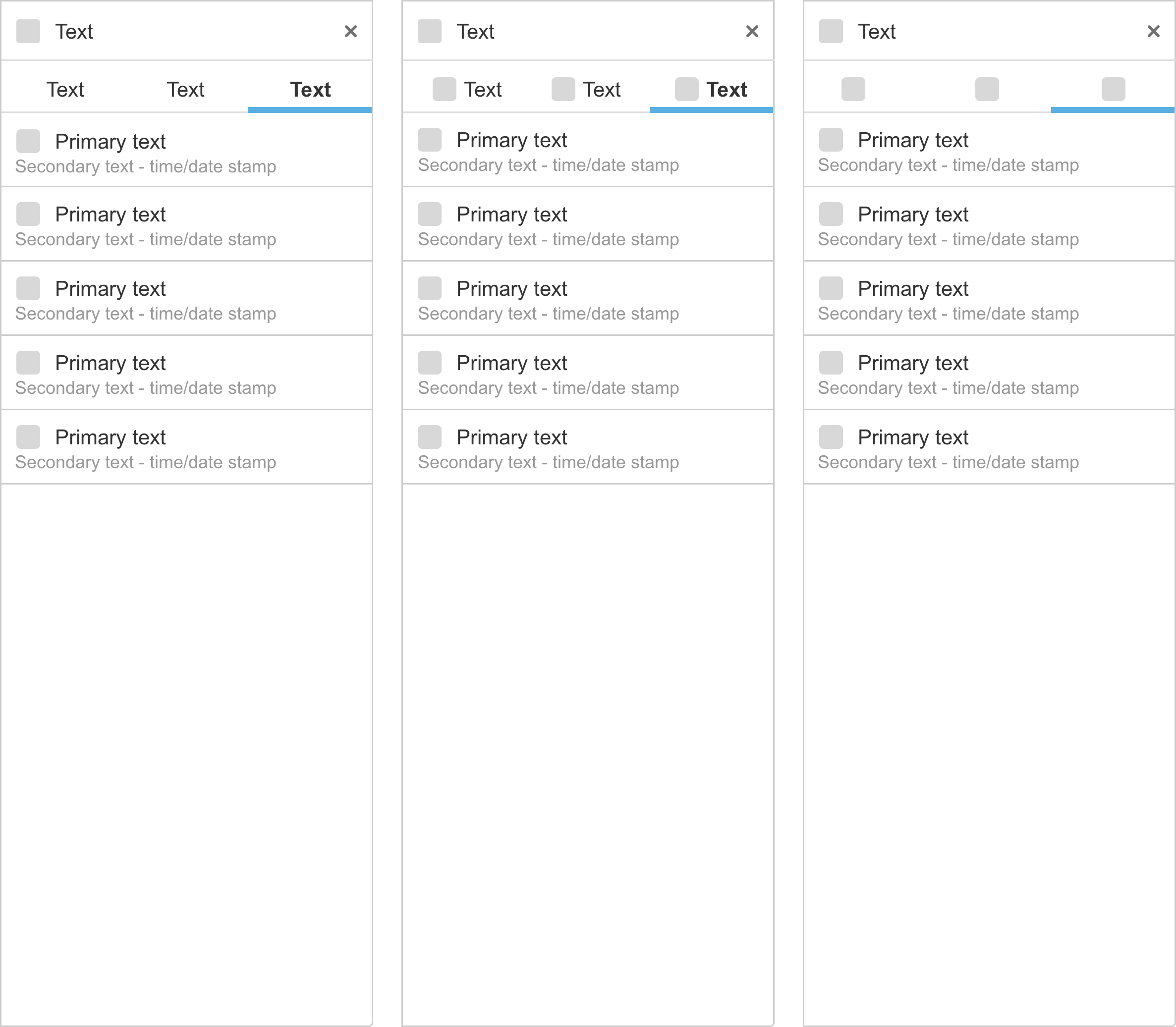
Navigation - tabs
Horizontal tabs are used to filter content. Tab titles can consist of text, text + icon, or icon only.
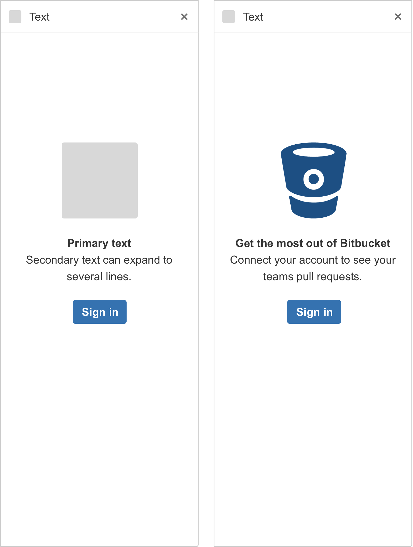
Blank state, and login
When the user is required to log into their account to use the integration, they open the glance to see the following blank state prompting them to login. Clicking the button sends the user to the application itself to login. They are then directed back to HipChat from the application.
Account presence - login and logout
The login and logout option are displayed at the bottom of the sidebar. This is only shown in the sidebar view when the glance is opened. For example, if the user navigates from a list view to a detailed view, the login and logout option do not need to be displayed in the full view.
Branding
If, for example, the glance icon does not represent the product brand, HipChat Connect enables a second branding option. This consists of a brand icon + 'powered by', followed by the brand name.
UI specifications
Typography
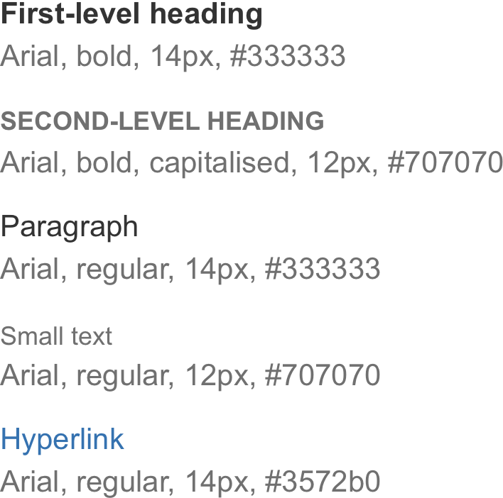
General text formatting:
- Bold is only used for numbers.
- Regular text is used for descriptions and all other text.
- Never use italics.
Rate this page: