board-buttons
Board buttons enable developers to bring features of their Power-Up to the entire Board or to give users control over settings that affect the Power-Up as a whole. For example, the Calendar Power-Up displays due dates of all cards on the board in a calendar view and allows users to make date modifications while in that view.
If you need one or more buttons available on the board, as its name might imply, this is the capability you are looking for.
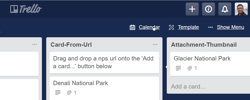
Here's how the Calendar Power-Up gets the button you see below:
Options
You should return an array of button objects or a Promise that resolves to one. A button object has the following properties:
| Property | Type | Notes |
|---|---|---|
| icon | Object | Object with urls for icons to be displayed on light and dark backgrounds. More info below. |
| text | String | The name of the button, keep it short and sweet |
| condition | String | When the button should be displayed. One of: admin - User is an admin of the boardedit - User can edit the boardreadOnly - User can not edit the board.signedIn - User is logged into Trello.signedOut - User is not logged into Trello.always - Always show.The default is edit |
| callback | Function | Optional function that will be called on click of the button |
| url | String | Optional href for the button |
| target | String | Optional with use of url property to add a target to the anchor tag |
Example Code
1
2var WHITE_ICON = 'https://cdn.hyperdev.com/us-east-1%3A3d31b21c-01a0-4da2-8827-4bc6e88b7618%2Ficon-white.svg';
var BLACK_ICON = 'https://cdn.hyperdev.com/us-east-1%3A3d31b21c-01a0-4da2-8827-4bc6e88b7618%2Ficon-black.svg';

var onBtnClick = function (t, opts) {
  console.log('Someone clicked the button');
};

window.TrelloPowerUp.initialize({
  'board-buttons': function (t, opts) {
    return [{
      // we can either provide a button that has a callback function
      icon: {
        dark: WHITE_ICON,
        light: BLACK_ICON
      },
      text: 'Callback',
      callback: onBtnClick,
      condition: 'edit'
    }, {
      // or we can also have a button that is just a simple url
      // clicking it will open a new tab at the provided url
      icon: {
        dark: WHITE_ICON,
        light: BLACK_ICON
      },
      text: 'URL',
      condition: 'always',
      url: 'https://trello.com/inspiration',
      target: 'Inspiring Boards' // optional target for above url
    }];
  }
});
Icons
Backgrounds on Trello boards range in their colors and can make it hard for certain icons to be readable. When a user adds a board background, Trello computes whether the background is light or dark, and displays foreground board icons and text (such as board buttons) in an opposite luminance to create contrast. Therefore, a Power-Up needs to be able to provide icons for both background scenarios. The icon parameter accepts an object with two keys - dark and light, referring to the background. Each key should have a URL for its value that corresponds to an icon variant that contrasts with the key: dark should be a light icon and light should be a dark one.
For example:
1
2// an example board button object
{
  icon: {
    dark: "https://example.com/a-white-icon.png",
    light: "https://example.com/a-black-icon.png"
  },
  text: "My Board Button",
  callback: function(t) { console.log('clicked'); }
}
Rate this page: