Last updated Mar 9, 2026
card-back-section
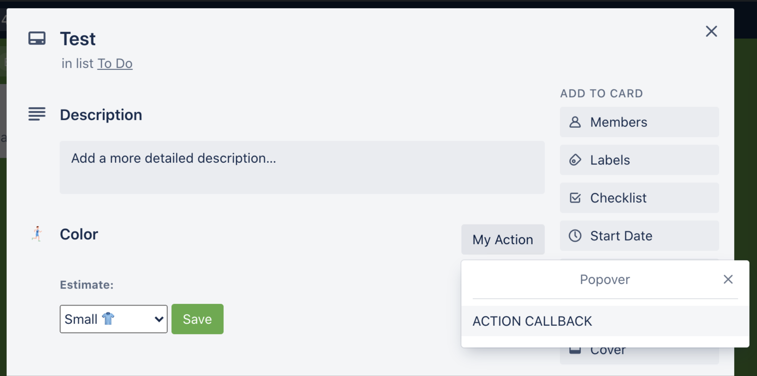
A card back section is an iframe that gets rendered on the back of a card, above the attachments section. You give the section a title and icon, and tell Trello what page to load into the iframe.
Your Power-Up can have only one card back section and a maximum height of 1500 pixels.
card-back-section iframes are reloaded whenever pluginData is changed on
the card via t.set().
Card back sections shouldn't be used to display information regarding the attachments on the card–for that, you can use attachment-sections.

Options
| Key | Value | Description |
|---|---|---|
| title | String | Rendered by Trello above the iframe. |
| icon required | String | Expected to be an icon that will be rendered to the left of your title on the card back. |
| content | Object | The object passed in here should have the following three keys and values: - type - String - Only iframe is supported.- url - String - The URL of the page to be loaded as an iframe.- height - Integer - The height to make the iframe; max height is 1500 pixels. |
| action | Object | An action object as described below. User is shown action on the right above the card back section. |
The action parameter above accepts an object with the following values:
| Key | Value | Description |
|---|---|---|
| text required | String | Text to be displayed in action button. |
| callback required | Function | The function to be called when a user clicks on the action button. |
Example Code
1
2var GRAY_ICON = 'https://cdn.hyperdev.com/us-east-1%3A3d31b21c-01a0-4da2-8827-4bc6e88b7618%2Ficon-gray.svg';

window.TrelloPowerUp.initialize({
  'card-back-section': function(t, options){
    return {
      title: 'My Card Back Section',
      icon: GRAY_ICON, // Must be a gray icon, colored icons not allowed.
      content: {
        type: 'iframe',
        url: t.signUrl('./section.html'),
        height: 230, // Max height is 1500.
      },
      action: {
        text: 'My Action',
        callback: (t) => t.popup(...),
      }
    };
  }
});
Rate this page: