Messages
You can send messages to HipChat rooms as text, html, or cards.
| Type | Description |
|---|---|
| Text |
|
| HTML |
The HTML will be curated by HipChat. Allowed HTML tags: a, b, i, strong, em, br, img, pre, code, lists, tables |
| Card | Your add-on sends JSON data to HipChat, which is rendered client side by the HipChat App, e.g.
|


Sending a message
Make sure to read HipChat REST API to understand how to generate access tokens and request security scopes, required to be able to send a message.
To send a message, your add-on must use the send_notification REST API:
Property
|
Required?
|
Type
|
Description
|
|---|---|---|---|
| color | Optional | STRING | Background color for message. Valid values: Defaults to |
| message | Required | STRING | The message body (text or HTML) Valid length range: |
| notify | Optional | STR | BOO | Whether this message should trigger a user notification (change the tab color, play a sound, notify mobile phones, etc). Each recipient's notification preferences are taken into account. Defaults to |
| message_format | Optional | STRING | Determines how the message is treated by our server and rendered inside HipChat applications
Valid values: Defaults to This only applies to how the 'message' field is rendered in clients when a card is not present or supported. |
| card | Optional | OBJECT | The card in a JSON format. Note: HTML fields in cards are limited to are a, b, i, strong, and span tags. |
Markup for Notifications and Private Messages
A subset of HTML can be used for the send_notification REST API and the private_message_user REST API:
| Tag | Attributes | Restrictions |
|---|---|---|
a | href, rel, data-target, data-target-options | |
img | src, alt, width, height, align, style | |
td | colspan, rowspan, valign | |
tr | valign | |
th | colspan, rowspan, valign | |
span |
| font-weight, color, text-decoration, height, width |
Using Cards
Card types
| Style | Usage | Sample |
|---|---|---|
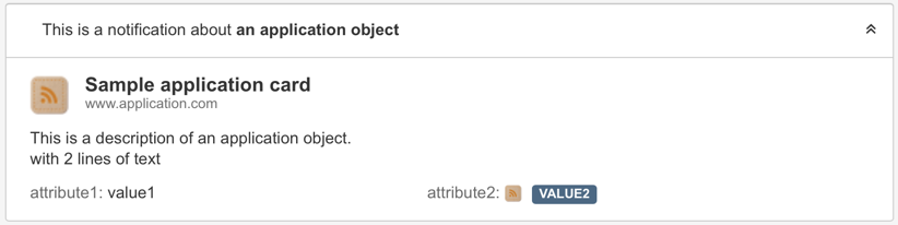
| Application | Use application cards to send information about an application object. You can include attributes as name/value pairs. Clicking on the card's title opens the provided url in a new browser tab. |
|
| Activity | Use activity cards to notify users of changes to an application object. For example: "the issue X was transitioned to done." Users can expand the activity card to view the enclosed application card. Clicking on the card's title opens the provided url in a new browser tab. | Collapsed by default: 
Expanded:
|
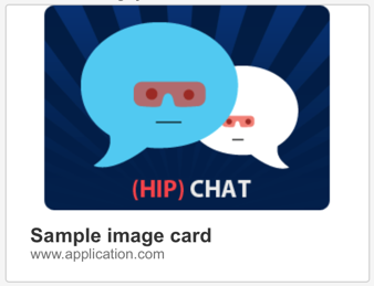
| Image | Use image cards to send images. Clicking on the card's title opens the provided url in a new browser tab. |
|
| Link | Use link cards to send information about a web page with content. The card can include a short description, as well as a thumbnail. Clicking on the card's title opens the provided url in a new browser tab. | 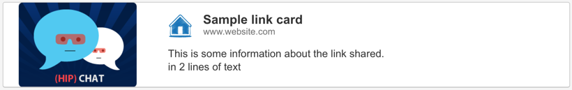
|
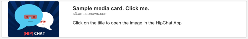
| Media | Use media card to send content which should be open in HipChat's media viewer. This is useful for images or Youtube/Vimeo videos. |
|

Opening Dialogs and Sidebar Views from Cards or HTML messages
The HTML elements in cards (description and activity) and HTML messages can not only contain links that take you to external pages, they can contain links that bring up a Modal Dialog or a Sidebar view.
Using Markup in a card
If you intend to use markup in a message, you specify the description in the html format:
1
2"description": {
  "format": "html",
  "value": "Markup goes here <a href="#">...</a>"
}
Linking to a Dialog or Sidebar View from Markup
There are two additional attributes that you can set on the <a> tag to bring up a dialog or sidebar when that link gets selected:
| data-target | The key of the dialog or sidebar. If you have a declared a dialog in the descriptor with
|
| data-target-options | This attribute is optional, and allows you to
The format is (see Dialog for more details about the
An example for the Declare your dialog as:
Descriptor
The you can use the following JSON fragment in
Using these
|
Example Card
1 2{ "style": "link", "url": "http://i0.kym-cdn.com/photos/images/newsfeed/000/131/786/tumblr_ljkeuyjp1a1qafrh6.gif", "id": "fee4d9a3-685d-4cbd-abaa-c8850d9b1960", "title": "Sint odio soluta consequatur.", "description": { "format": "html", "value": "<b>Add-on link:</b> <a href='#' data-target='hctester.dialog.simple' data-target-options='{\"options\":{\"title\":\"Custom Title\"}, \"parameters\":{\"from\":\"link\"}}'>Open Dialog with parameters</a>" }, "icon": { "url": "http://icons.iconarchive.com/icons/designbolts/hand-stitched/24/RSS-icon.png" }, "date": 1443057955792 }
Linking to a Dialog or Sidebar View from card URL attributes
In places like the card title, where the URL is just an attribute, you can link to other modules like dialogs, sidebar views and external pages by using the HipChat Custom URL scheme. The key of the target module is specified in a query parameter called target:
1
2hipchat://www.hipchat.com/room/1828035?target=my-addon-sidebar
This format also allows you to link to other rooms and to open a dialog or sidebar there.
The host must match www.hipchat.com or the actual hostname of a HipChat Server instance.
Example Card with HipChat Native link
1
2{
  "style": "media",
  "id": "6492f0a6-9fa0-48cd-a3dc-2b19a0036e99",
  "url": "hipchat://www.hipchat.com/room/1828035?target=my-addon-sidebar",
  "title": "Click me to open the sidebar",
  "description": {
    "value": "Click on the title to open a sidebar that belongs to the add-on",
    "format": "text"
  },
  "thumbnail": {
    "url": "https://s3.amazonaws.com/uploads.hipchat.com/6/26/z6i8a5djb9mvq7m/bonochat.png",
    "url@2x": "https://s3.amazonaws.com/uploads.hipchat.com/6/26/z6i8a5djb9mvq7m/bonochat.png",
    "width": 3313,
    "height": 577
  }
}
Rate this page: