Sidebar
Views are a means of displaying custom HTML content in the HipChat sidebar. There are two sidebar states - list view and full view.
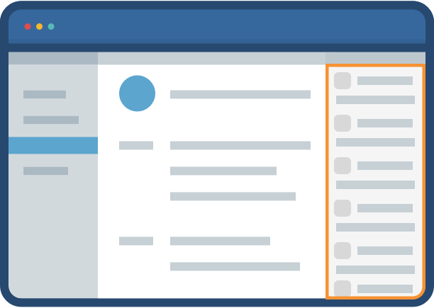
List views
List views are used to display a list of important objects or cards:
- Displaying a list of cards (e.g. the list of open incidents currently managed by this room's team members)
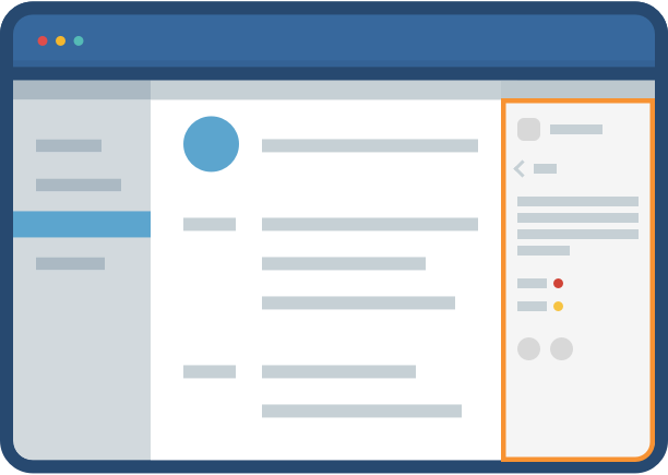
Full views
Full views are used to display more detailed information - like a single issue. Views allow users to take specialized actions, and are often a jumping off point to the application itself. Full views are typically used to:
- Display more information about an object or card (e.g. more detail about an incident which was sent to the room as a HipChat Card).
- Allow users to take specialized actions (e.g. acknowledge an incident).
Sidebar styleguide
Declaring a Sidebar View
To declare a Sidebar View, your add-on must first declare a web panel in its descriptor:
1
2"capabilities": {
    ...,
    "webPanel": [
        {
            "key": "myaddon-sidebar",
            "name": {
                "value": "My Add-on Sidebar"
            },
            "location": "hipchat.sidebar.right",
            "url": "{{localBaseUrl}}/sidebar"
        }
    ]
}
Implementing a Sidebar View
AUI - Atlassian user interface
Opening a Sidebar View
A Sidebar View can be opened from multiple locations:
From a Glance
When a user clicks on a HipChat Glance, HipChat opens a Sidebar View. Your add-on declares the target Sidebar in the Glance descriptor entry:
1
2"capabilities": {
    ...,
    "glance": [
        {
            ...
            "key": "myaddon-glance",
            "target": "myaddon-sidebar", --> Sidebar View Key
            ...
        }
    ]
}
From an action
Open a sidebar view from a message action or input action:
1
2"capabilities": {
    ...,
    "action": [
        {
            "key": "myaddon-action-opendialog",
            "name": {
                "value": "Open dialog"
            },
            "target": "myaddon-sidebar",            --> must match the key from the Sidebar View web panel
            "location": "hipchat.message.action"    --> Or hipchat.input.action
        }
    ]
}
From JavaScript
Open a sidebar from JavaScript (e.g. from another sidebar):
1
2AP.require('sidebar', function(sidebar) {
  sidebar.openView({
    key: 'myaddon-sidebar-key',        // references the key of the webPanel in the descriptor
    parameters: {
      greetings: 'from somewhere else' // parameters to be passed to the sidebar view
    }
  });
}
AUI For HipChat VERSION 0.0.3
AUI for HipChat is a tailor-made frontend library for creating a HipChat Connect user interface according to the HipChat Connect Design Guidelines. The library is a customized distribution of the Atlassian User Interface (AUI) Library. It includes many components from AUI in order to provide a seamless experience for HipChat users. It also includes custom components built specifically for the HipChat Sidebar view.
Getting Started
AUI for HipChat is available on the AUI CDN and can be included directly in your HTML documents.
1
2<!DOCTYPE html>
<html>
    <head>
        <link rel="stylesheet" href="//aui-cdn.atlassian.com/aui-hipchat/0.0.3/css/aui-hipchat.min.css"></link>
        <script type="text/javascript" src="//code.jquery.com/jquery-2.2.2.min.js"></script>
        <script type="text/javascript" src="//aui-cdn.atlassian.com/aui-hipchat/0.0.3/js/aui-hipchat.min.js"></script>
    </head>
    <body>
    </body>
</html>
Note that Javascript ordering is important and aui-hipchat.min.js must be included after jquery.
Atlassian Connect Express for HipChat
Atlassian Connect Express (ACE) for HipChat is a HipChat library that makes building an add-on relatively simple, as it generates most of the plumbing for you. This library uses AUI for HipChat by linking to the CDN.
HipChat Atlassian User Interface Documentation
The components that are provided as part of AUI for HipChat that aren't already provided by AUI are referenced below.
Main layout
Use the <section> and <footer> tags as follows for the main layout.
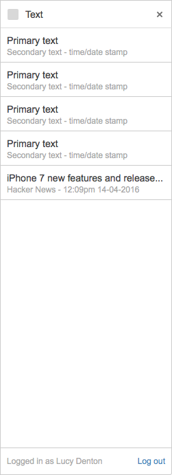
1
2
3
4
5
6
7
8
9
10<body>
    <section class="aui-connect-page" role="main">
        <section class="aui-connect-content">
        </section>
    </section>
    <footer class="aui-connect-footer">
        <span>Logged in as …</span> <a href="#">Log out</a>
    </footer>
</body>
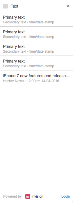
Branding
1
2<body>
    <footer class="aui-connect-footer">
            <span>Powered by: <img class="text-icon" src="/static/css/invision.png" width="12" height="12" /> Invision</span> <a class="pull-right" href="#">Login</a>
    </footer>
</body>
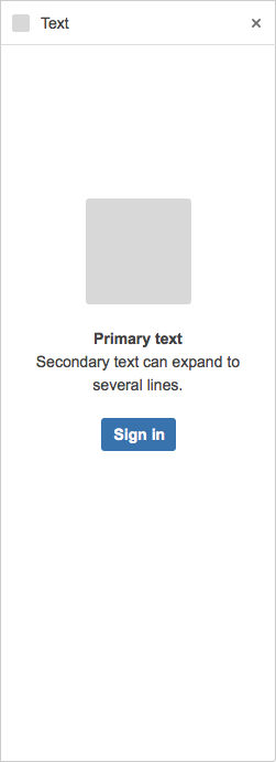
Focused layout
Use the focussed layout when the content should be centered on the page. Login pages are suited to this layout.
1
2
3
4
5
6
7
8
9
10
11
12
13<section class="aui-connect-page aui-connect-page-focused" role="main">
    <section class="aui-connect-content">
        <div class="aui-connect-content-inner">
                <img src="/splash_image.png">
                <h1>Get the most out of [integration]</h1>
                <p>Connect your account with …</p>
                <div class="aui-buttons">
                    <button class="aui-button aui-button-primary">Sign In</button>
            </div>
        </div>
    </section>
</section>
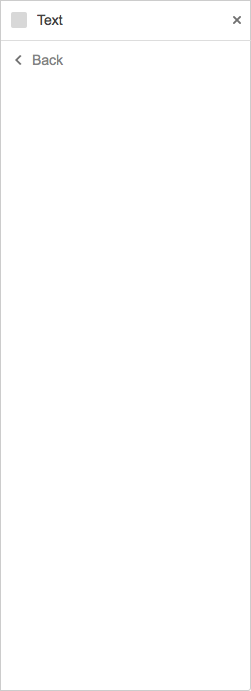
Back link
If your sidebar has multiple pages, you can add a back button using the following code:
1
2<section class="aui-connect-page" role="main">
    <section class="aui-connect-content">
        <a class="aui-connect-back" onclick="history.back()">Back</a>
        [remainder of your page here]
    </section>
</section>
Navigation
horizontal page navigation
The following horizontal page navigation works best when the headings are short.
1
2<nav class="aui-navgroup aui-navgroup-horizontal">
    <div class="aui-navgroup-inner">
        <div class="aui-navgroup-primary">
            <ul class="aui-nav">
                <li class="aui-nav-selected">
                    <a href="#item-1">Item 1</a>
                </li>
                <li>
                    <a href="#list-example">List</a>
                </li>
            </ul>
        </div>
    </div>
</nav>
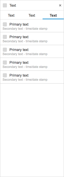
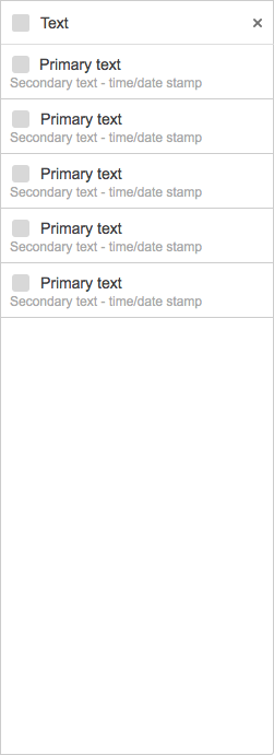
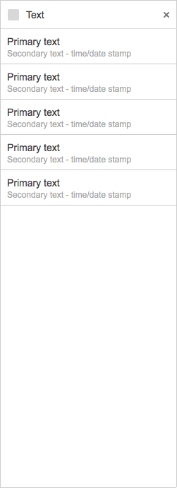
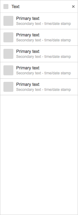
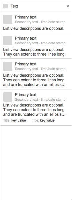
Lists
The following horizontal page navigation works best when the headings are short.
1
2<section class="aui-connect-page" role="main">
   <section class="aui-connect-content with-list">
      <ol class="aui-connect-list">
         <li class="aui-connect-list-item">
            <span class="aui-avatar aui-avatar-xsmall">
               <span class="aui-avatar-inner">
                  <img style="background-color: #ccc;">
               </span>
            </span>
            <span class="aui-connect-list-item-title">Primary text</span>
            <ul class="aui-connect-list-item-attributes">
               <li>Secondary text</li>
               <li>2016-10-20 02:30 PM</li>
            </ul>
            <div class="aui-connect-list-item-description">
               List view descriptions are optional.
            </div>
         </li>
         <li class="aui-connect-list-item">
            <span class="aui-avatar aui-avatar-xsmall">
               <span class="aui-avatar-inner">
                  <img style="background-color: #ccc;">
               </span>
            </span>
            <span class="aui-connect-list-item-title">Primary text that is really really really really really really long</span>
            <ul class="aui-connect-list-item-attributes">
               <li>Secondary text</li>
               <li>2016-10-20 02:30 PM</li>
            </ul>
         </li>
         <li class="aui-connect-list-item">
            <div class="aui-connect-list-item-actions">
               <button class="aui-dropdown2-trigger aui-button aui-dropdown2-trigger-arrowless" aria-owns="list-item-1"
                     aria-haspopup="true" id="list-item-1-action-menu" data-no-focus="true">
                  <span class="aui-icon aui-icon-small aui-iconfont-more"></span>
               </button>
               <div id="list-item-1" class="aui-style-default aui-dropdown2 aui-connect-list-item-action">
                  <ul class="aui-list-truncate">
                     <li><a href="#">Menu item 1</a></li>
                     <li><a href="#">Menu item 2</a></li>
                  </ul>
               </div>
            </div>
            <span class="aui-avatar aui-avatar-xsmall">
               <span class="aui-avatar-inner">
                  <img style="background-color: #ccc;">
               </span>
            </span>
            <span class="aui-connect-list-item-title">A list item with an action menu</span>
            <ul class="aui-connect-list-item-attributes">
               <li>Secondary text</li>
               <li>2016-10-20 02:30 PM</li>
            </ul>
         </li>
         <li class="aui-connect-list-item">
            <span class="aui-avatar aui-avatar-medium">
               <span class="aui-avatar-inner">
                  <img style="background-color: #ccc;">
               </span>
            </span>
            <span class="aui-connect-list-item-title">Primary text with a larger avatar</span>
            <ul class="aui-connect-list-item-attributes">
               <li>Secondary text</li>
               <li>2016-10-20 02:30 PM</li>
            </ul>
            <div class="aui-connect-list-item-description">
               List view descriptions are optional. They can extend to three lines long.
            </div>
         </li>
         <li class="aui-connect-list-item">
            <span class="aui-connect-list-item-title">Primary text with no avatar</span>
            <ul class="aui-connect-list-item-attributes">
               <li>Secondary text</li>
               <li>2016-10-20 02:30 PM</li>
            </ul>
         </li>
      </ol>
   </section>
</section>
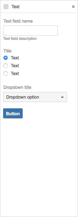
Forms
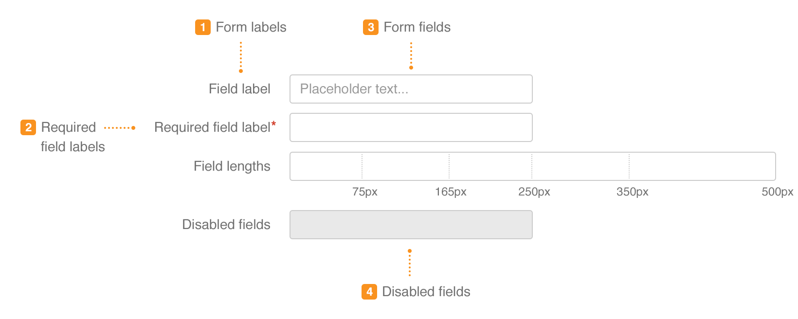
Use the 'top-label' class on your <forms> (see also AUI forms).
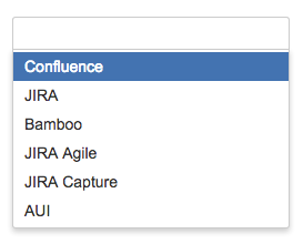
1
2<form class="aui top-label">
   <div class="field-group">
      <label for="email">Email</label>
      <input class="text medium-field" type="text" name="email" id="email" />
      <div class="description">Your primary email address</div>
   </div>
    <fieldset class="group">
                   <legend><span>Color</span></legend>
                   <div class="radio">
                       <input class="radio" type="radio" checked="checked"
                              name="color" id="color-blue">
                       <label for="color-blue">Blue</label>
                   </div>
                   <div class="radio">
                       <input class="radio" type="radio"
                              name="color" id="color-green">
                       <label for="color-green">Green</label>
                   </div>
                   <div class="radio">
                       <input class="radio" type="radio"
                              name="color" id="color-red">
                       <label for="color-red">Red</label>
                   </div>
    </fieldset>
    <div class="field-group">
       <label for="product">Product</label>
           <select name="product" id="product">
           <option value="CONF">Confluence</option>
           <option value="JIRA">JIRA</option>
           <option value="BAM">Bamboo</option>
           <option value="JAG">JIRA Agile</option>
           <option value="CAP">JIRA Capture</option>
           <option value="AUI">AUI</option>
       </select>
    </div>
   <div class="buttons-container">
      <div class="buttons">
         <button class="button submit" type="submit">Save</button>
         <a class="cancel" href="/sidebar">Cancel</a>
      </div>
   </div>
</form>
Supported AUI components
In addition to the custom components provided above, AUI for HipChat also includes selected components from the AUI library (version 5.9). The components that have been provided are:
| Component | Designs | Details |
|---|---|---|
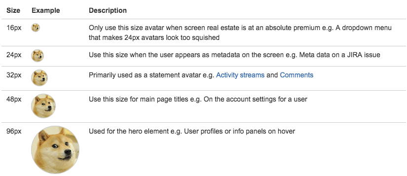
| Avatars |
| Inherited - see https://docs.atlassian.com/aui/latest/docs/avatars.html |
| Badges |
| Inherited - see https://docs.atlassian.com/aui/latest/docs/badges.html. |
| Buttons |
| Inherited - see https://docs.atlassian.com/aui/latest/docs/buttons.html. |
| Dropdown 2 |
| Inherited - see https://docs.atlassian.com/aui/latest/docs/dropdown2.html. |
| Forms |
| Inherited - see https://docs.atlassian.com/aui/latest/docs/forms.html. |
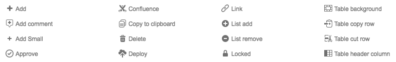
| Icons |
| Inherited - see https://docs.atlassian.com/aui/latest/docs/icons.html. |
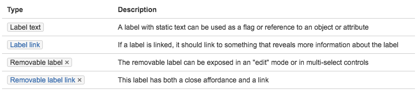
| Labels |
| Inherited - see https://docs.atlassian.com/aui/latest/docs/labels.html. |
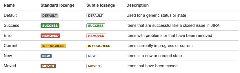
| Lozenges |
| Inherited - see https://docs.atlassian.com/aui/latest/docs/lozenges.html. |
| Select2 |
| Inherited - see https://docs.atlassian.com/aui/latest/docs/auiselect2.html. |
| Toggle button |
| Future functionality. |
| Tooltips |
| Inherited - see https://docs.atlassian.com/aui/latest/docs/tooltips.html. |


Rate this page: