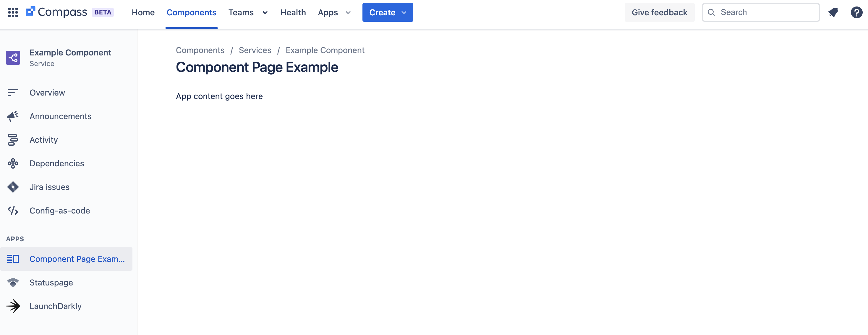
Compass component page
The compass:componentPage module adds an item to the left navigation on the Compass component details page.

Properties
displayConditions
| Property | Type | Required | Description |
|---|---|---|---|
key |
| Yes |
A key for the module, which other modules can refer to. Must be unique within the manifest. Regex: |
resource | string | If using Custom UI or modern versions of UI Kit | The key of a static resources entry that your module will display. See resources for more details. |
render | 'native' | If using modern versions of UI Kit | Indicates the module uses UI Kit. |
resolver | { function: string } or{ endpoint: string } |
Set the Set the | |
title | string or i18n object | Yes |
The title of the component page, which is displayed on the left navigation and at the top of the page. The |
icon | string |
The icon displayed next to the For Custom UI and UI Kit apps, the If no icon is provided, or if there's an issue preventing the icon from loading, a generic app icon will be displayed. | |
displayConditions | object | A list of component types for which the module should be displayed, for example:
componentTypes: [APPLICATION, SERVICE]If displayConditions is omitted, the module is displayed for all component types. | |
fullscreen | boolean | Whether the component page will occupy the full screen width. The default value is false. |
i18n object
| Key | Type | Required | Description |
|---|---|---|---|
i18n | string | Yes | A key referencing a translated string in the translation files. For more details, see Translations. |
Extension context
UI Kit and Custom UI
Use the useProductContext hook to access the extension context in UI Kit or getContext bridge method in Custom UI.
| Property | Type | Description |
|---|---|---|
type | string | The type of the module (compass:componentPage) |
componentId | string | The unique Atlassian resource identifier (ari) for the component. |
Rate this page: