- ADF renderer
- Atlassian icon (Preview)
- Atlassian tile (Preview)
- Badge
- Bleed (Preview)
- Box
- Breadcrumbs (Preview)
- Button
- Button group
- Calendar
- Chart - Bar
- Chart - Donut
- Chart - Horizontal bar
- Chart - Horizontal stack bar
- Chart - Line
- Chart - Pie
- Chart - Stack bar
- Checkbox
- Checkbox group
- Code
- Code block
- Comment
- Comment editor
- Chromeless editor
- Date picker
- Dynamic table
- Empty state
- File card (Preview)
- File picker (Preview)
- Form
- Frame
- Heading
- Icon
- Image
- Inline
- Inline edit
- Link
- List
- Lozenge
- Modal
- Popup
- Pagination (Preview)
- Pressable
- Progress bar
- Progress tracker
- Radio
- Radio group
- Range
- Section message
- Select
- Spinner
- Stack
- Tabs
- Tag
- Tag group
- Text
- Text area
- Text field
- Time picker
- Tile (Preview)
- Toggle
- Tooltip
- User
- User group
- User picker
- XCSS
Heading
To add the Heading component to your app:
1
2import { Heading } from '@forge/react';
Description
A heading is a typography component used to display text in different sizes and formats.
Props
| Name | Type | Required | Description |
|---|---|---|---|
size | "large" | "medium" | "small" | "xxlarge" | "xlarge" | "xsmall" | "xxsmall" | No | Heading size. This value is detached from the specific heading level applied to allow for more flexibility. Note: The functionality of the as prop is being updated and should no longer be used to determine heading sizes. To avoid breaking changes, migrate to using the size prop. For more details, please refer to the Changelog. |
as | "h1" | "h2" | "h3" | "h4" | "h5" | "h6" | "div" | "span" | No | Renders the component as the specified DOM element, overriding the default element set by the size prop. The visual appearance remains consistent with the size setting, regardless of the DOM element used. Note: The functionality of the as prop is being updated and should no longer be used to determine heading sizes. To avoid breaking changes, migrate to using the size prop. For more details, please refer to the Changelog. |
children | string | No | The text of the heading. |
color | "color.text" | "color.text.inverse" | "color.text.warning.inverse" | No | Text color of the heading. Defaults to color.text. Use color.text.inverse for a light text color over a dark background. Use color.text.warning.inverse for a dark text color over a warning background. |
id | string | No | Unique identifier for the heading DOM element. |
Examples
Basic
Use a Heading component for all page titles and subheadings to introduce content. Headings are sized to contrast with content, increase visual hierarchy, and help readers easily understand the structure of content.
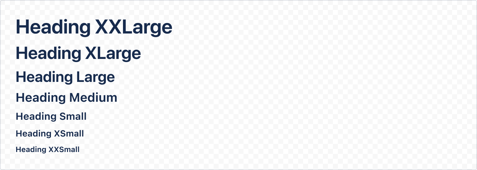
1
2import { Stack, Heading } from "@forge/react";

const HeadingBasicExample = () => {
  return (
    <Stack space="space.100">
      <Heading size="xxlarge">Heading XXLarge</Heading>
      <Heading size="xlarge">Heading XLarge</Heading>
      <Heading size="large">Heading Large</Heading>
      <Heading size="medium">Heading Medium</Heading>
      <Heading size="small">Heading Small</Heading>
      <Heading size="xsmall">Heading XSmall</Heading>
      <Heading size="xxsmall">Heading XXSmall</Heading>
    </Stack>
  );
};
Mapping to HTML heading elements
The size provided automatically maps to specific HTML heading elements. xxlarge and xlarge both render a <h1>, large renders a <h2>, medium renders a <h3>, and so on.
This mapping can be overridden using the as prop.

1
2import { Stack, Heading } from "@forge/react";

const HeadingCustomHtmlExample = () => {
  return (
    <Stack testId="headings" space="space.100">
      <Heading size="medium" as="h1">
        Medium heading that will render as a h1
      </Heading>
    </Stack>
  );
};
Color
Heading uses the color.text token which automatically switches colors to be legible across both light and dark modes.
Heading will automatically apply the correct inverse color token if placed within a box component with a bold background color.
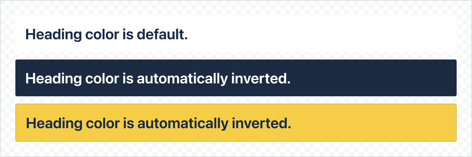
1
2import { Box, Heading, Stack } from "@forge/react";

const HeadingInverseExample = () => {
  return (
    <Stack space="space.100">
      <Box backgroundColor="elevation.surface" padding="space.200">
        <Heading size="large">Heading color is default.</Heading>
      </Box>
      <Box backgroundColor="color.background.brand.boldest" padding="space.200">
        <Heading size="large">Heading color is automatically inverted.</Heading>
      </Box>
      <Box backgroundColor="color.background.warning.bold" padding="space.200">
        <Heading size="large">Heading color is automatically inverted.</Heading>
      </Box>
    </Stack>
  );
};
To invert the heading color manually when not using a box component, use the color prop to apply either color.text.inverse or color.text.warning.inverse depending on the surface. Beyond this, heading color cannot be customised.
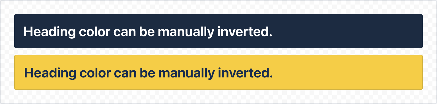
1
2import { Box, Heading, Stack, xcss } from "@forge/react";

const HeadingManualInverseExample = () => {
  return (
    <Stack space="space.100">
      {/* Purposefully using xcss in order to show manually setting Heading color */}
      <Box xcss={containerStylesBrandBoldest}>
        <Heading size="large" color="color.text.inverse">
          Heading color can be manually inverted.
        </Heading>
      </Box>
      <Box xcss={containerStylesWarningBold}>
        <Heading size="large" color="color.text.warning.inverse">
          Heading color can be manually inverted.
        </Heading>
      </Box>
    </Stack>
  );
};

const containerStylesBrandBoldest = xcss({
  padding: 'space.200',
  backgroundColor: 'color.background.brand.boldest',
});

const containerStylesWarningBold = xcss({
  padding: 'space.200',
  backgroundColor: 'color.background.warning.bold',
});
Accessibility considerations
When using the Heading component, we recommend keeping the following accessibility considerations in mind:
-
Consistent and clear hierarchy helps people navigate the page. Use headings and titles to outline the page so people can understand the page structure.
-
The most important heading has the rank 1 (
<h1>), the least important heading has the rank 6 (<h6>). Headings with an equal or higher rank start a new section, headings with a lower rank start new subsections that are part of the higher ranked section. There should only be one rank 1 (<h1>) heading per page which explains the main purpose of the page. -
Never skip lower heading levels. For example, a
<h2>should not be followed by an<h4>. It should be followed by an<h3>(for a lower section in the hierarchy), or another<h2>(for a section of the same level of importance). It is ok to skip ranks when closing subsections, for instance, a<h2>beginning a new section, can follow a<h4>as it closes the previous section. -
Text should be a minimum of 3:1 color contrast when it is 24px or larger, and 4.5:1 color contrast when it is under 24px. Use
color="color.text.inverse"for headings placed on a dark surface for better color contrast.
Rate this page: