This section describes a Forge preview feature. Preview features are deemed stable; however, they remain under active development and may be subject to shorter deprecation windows. Preview features are suitable for early adopters in production environments.
We release preview features so partners and developers can study, test, and integrate them prior to General Availability (GA). For more information, see Forge release phases: EAP, Preview, and GA.
Tag
To add the Tag component to your app:
1
2import { Tag } from '@forge/react';
Description
A visual indicator for UI objects, which is useful for quick recognition and navigation.
Props
| Name | Type | Required | Description |
|---|---|---|---|
children | string | Yes | The text content to display. |
color | string | The color of the tag. Valid values are grey-light, grey, blue, blue-light, green, green-light, purple, purple-light, red, red-light, teal, teal-light, yellow, yellow-light. |
Example
Color property
Customize the color of the Tag component based on your specific needs and preferences, allowing for clear visual distinctions and effective communication within your application.
The examples of tags in the provided image are intended solely as recommendations.
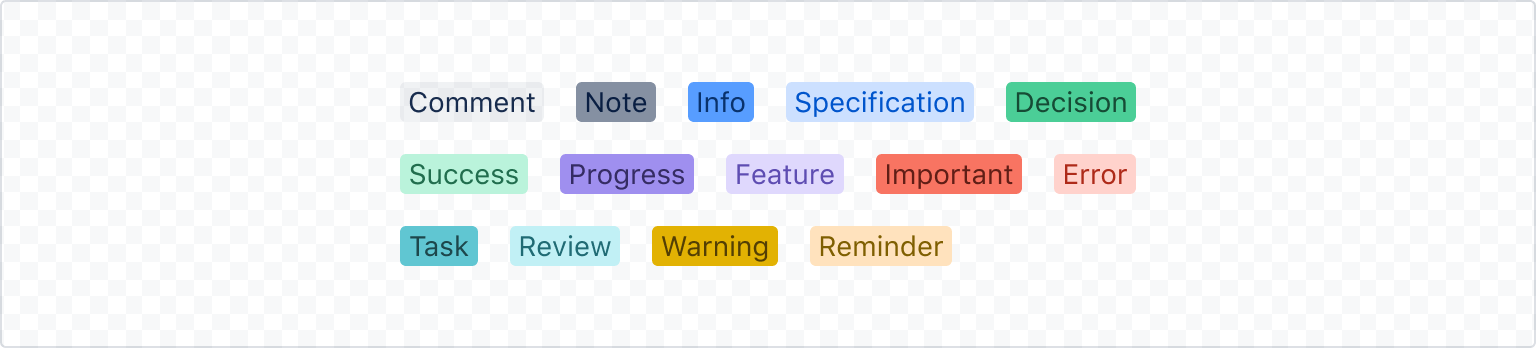
1 2<Tag color="grey-light">Comment</Tag> <Tag color="grey">Note</Tag> <Tag color="blue">Info</Tag> <Tag color="blue-light">Specification</Tag> <Tag color="green">Decision</Tag> <Tag color="green-light">Success</Tag> <Tag color="purple">Progress</Tag> <Tag color="purple-light">Feature</Tag> <Tag color="red">Important</Tag> <Tag color="red-light">Error</Tag> <Tag color="teal">Task</Tag> <Tag color="teal-light">Review</Tag> <Tag color="yellow">Warning</Tag> <Tag color="yellow-light">Reminder</Tag>
Rate this page: