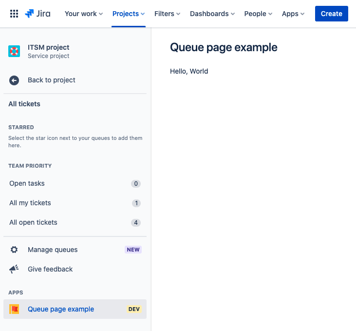
Jira Service Management queue page
The jiraServiceManagement:queuePage module adds an item in the Apps section. You can find the
Apps section in the left navigation of Queues in a service project. When the item is clicked,
content is rendered on a new Jira page.
This module can be used in Jira Service Management.
The page URL is constructed in the following format:
/jira/servicedesk/projects/{projectKey}/queues/apps/{appId}/{envId}
Unlicensed user access: This module does not support interaction with anonymous users, customer accounts, or unlicensed accounts.

Properties
| Property | Type | Required | Description |
|---|---|---|---|
key |
| Yes |
A key for the module, which other modules can refer to. Must be unique within the manifest. Regex: |
resource | string | If using Custom UI or modern versions of UI Kit | The key of a static resources entry that your module will display. See resources for more details. |
render | 'native' | If using modern versions of UI Kit | Indicates the module uses UI Kit. |
resolver | { function: string } or{ endpoint: string } |
Set the Set the | |
title | string or i18n object | Yes |
The title of the project page, which is displayed at the top of the page. The title also
appears as an item in the The |
icon | string |
The icon displayed next to the For Custom UI and UI Kit apps, the If no icon is provided, or if there's an issue preventing the icon from loading, a generic app icon will be displayed. | |
layout |
UI Kit:
native)
| The layout of the service management queue page that defines whether a page is rendered with default controls (native), lays out the entire viewport with a margin on the left and breadcrumbs (basic for UI Kit), or is left blank allowing for full customization (blank for Custom UI). |
i18n object
| Key | Type | Required | Description |
|---|---|---|---|
i18n | string | Yes | A key referencing a translated string in the translation files. For more details, see Translations. |
Extension context
UI Kit and Custom UI
Use the useProductContext hook to access the extension context in UI Kit or getContext bridge method in Custom UI.
| Property | Type | Description |
|---|---|---|
type | string | The type of the module. |
project.id | string | The id of the project where the module is rendered. |
project.key | string | The key of the project where the module is rendered. |
location | string | The full URL of the host page where this module is displayed. |
Rate this page: