Macro
With the release of @forge/react version 11.0.0, enhancements have been made
to the useConfig hook to improve performance in macro config apps when receiving configuration value changes.
Confluence macro config apps relying on the useProductContext
hook or view.getContext() need to
transition to the useConfig hook before upgrading to
@forge/react version 11.0.0 or higher in order to properly access the latest values after the configuration updates.
Confluence macro config apps using the useConfig hook
should upgrade to @forge/react version 11.0.0 for improved performance.
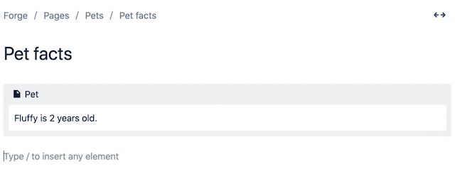
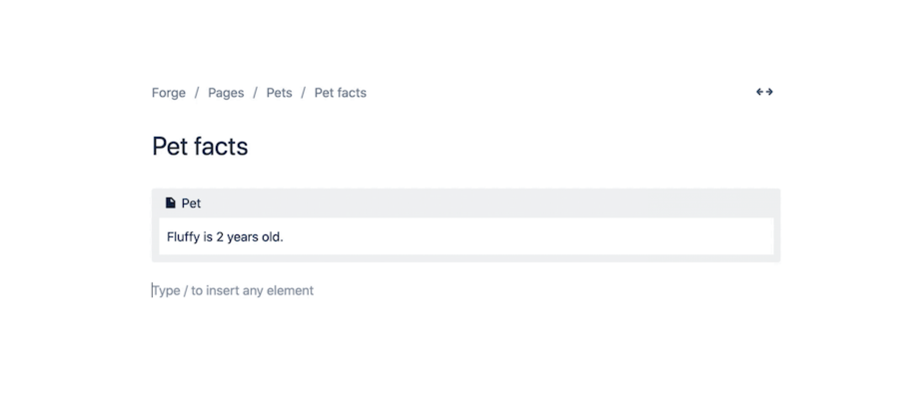
The macro module inserts dynamic content into the user interface via an editor. Editor macros are
only compatible with the Atlassian editor. All cloud sites use the Atlassian editor by default.
The macro module works in Confluence, where the macro is inserted by typing / and selecting
from the quick insert menu of the editor. The macro module is implemented by a Forge function.
On apps that use Custom UI, module content is displayed inside a special Forge iframe which has the sandbox attribute configured. This means that HTML links (for example, <a href="https://domain.tld/path">...</a>) in this iframe won't be clickable. To make them clickable, use the router.navigate API from the @forge/bridge package.

Manifest structure
1
2modules {}
└─ macro []
   ├─ key (string) [Mandatory]
   ├─ resource (string) [Mandatory]
   ├─ render (string) [Optional]
   ├─ resolver {} [Optional]
   ├─ viewportSize (string) [Optional]
   ├─ title (string | i18n) [Mandatory]
   ├─ icon (string) [Optional]
   ├─ categories (string[]) [Optional]
   ├─ unlicesedAccess (List<string>) [Optional]
   ├─ description (string | i18n) [Optional]
   ├─ hidden (boolean) [Optional]
   └─ config (boolean | {} | config object) [Optional]
     ├─ icon (string) [Optional]
     ├─ title (string | i18n) [Optional]
     ├─ resource (string) [Mandatory]
     ├─ render (string) [Optional]
     ├─ viewportSize (string) [Optional]
     └─ openOnInsert (boolean) [Optional]
   ├─ adfExport {} [Optional]
   ├─ layout (string) [Optional]
   └─ autoConvert [] [Optional]
     └─ matchers [] [Mandatory]
        └─ pattern (string) [Mandatory]

resources []
├─ key (string) [Mandatory]
└─ path (string) [Mandatory]
Properties
| Property | Type | Required | Description |
|---|---|---|---|
key |
| Yes |
A key for the module, which other modules can refer to. Must be unique within the manifest. Regex: |
resource | string | If using Custom UI or modern versions of UI Kit | The key of a static resources entry that your module will display. See resources for more details. |
render | 'native' | If using modern versions of UI Kit | Indicates the module uses UI Kit. |
resolver | { function: string } or{ endpoint: string } |
Set the Set the | |
viewportSize | 'small', 'medium', 'large', 'xlarge' or 'max' | The display size of resource. Can only be set if the module is using the resource property. Remove this property to enable automatic resizing of the module. | |
title | string or i18n object | Yes |
The title of the macro. In Confluence, this is displayed in the editor. The |
icon | string |
The icon displayed next to the For Custom UI and UI Kit apps, the If no icon is provided, or if there's an issue preventing the icon from loading, a generic app icon will be displayed. | |
categories | string[] | The categories of the macro. In Confluence, this is used for categorisation in the macro browser.
| |
description | string or i18n object |
The description of the macro. In Confluence, this is displayed in the editor. The | |
hidden | boolean |
Defaults to Existing macros on pages continue to render normally, even when this property is set to | |
config | boolean, { function: string }, { openOnInsert: boolean } or config object |
Set Set Set
| |
config.icon | string |
The icon displayed next to the title in the custom config modal.
For Custom UI and UI Kit apps, the If no icon is provided, or if there's an issue preventing the icon from loading, a generic app icon will be displayed. | |
config.title | string or i18n object | A title for the config. If the viewport size is fullscreen*, then the title rendered in the modal header will be this title. | |
config.resource | string | Required if using Custom UI or the latest version of UI Kit. | A reference to the static resources entry that your context menu app wants to display. See resources for more details. |
config.render | 'native' | Yes for UI Kit | Indicates the module uses UI Kit. |
config.viewportSize | 'small', 'medium', 'large', 'xlarge', 'max' or 'fullscreen'* | The display size of resource. Can only be set if the module is using the resource property. Remove this property to enable automatic resizing of the module. | |
config.openOnInsert | boolean | Defaults to false for classic configuration, defaults to true for custom configuration. An optional configuration to control if the classic configuration sidepanel or the custom configuration modal is automatically opened when first inserted. | |
adfExport | { function: string } | For UI Kit and Custom UI use only. Contains a function property, which references the function module that defines the export view of the macro, specified in Atlassian document format.
The specified function can consume the exportType directly from the function's payload in order to specify different views per export type. The exportType can be one of pdf, word, or other. See this tutorial for more information.
| |
layout | 'block', 'inline' or 'bodied' |
| |
autoConvert | autoConvert object | Inserts a macro into the editor when a recognised URL is pasted in by the user. See Macro autoconvert. | |
autoConvert.matchers | [matcher, ...] | Yes, if using autoConvert | The list of patterns that define what URLs should be matched. |
autoConvert.matchers.pattern | string | Yes, if using autoConvert |
A string that defines a specific URL pattern to be matched, using wildcards for variable
parts of the URL, such as unique IDs.
|
emitsReadyEvent | boolean | No | Defaults to false. An optional configuration to notify Confluence that the macro will send a emitReadyEvent when it has completed loading and is ready for export or further processing. This should be used with view.emitReadyEvent(). See the view bridge function for more information. |
unlicensedAccess | List<string> |
A list of unlicensed user types that can access this module. Valid values are: unlicensed (Guests Users), and anonymous. For more information, see
Access to Forge apps for unlicensed Confluence users.
|
*
fullscreen viewport sizing is now available as part of our Early Access Program (EAP). This allows your macro configuration modal to fill the entire viewport. You can also provide a title and an icon to display in the header. To start testing, sign up here.
By signing up for this Early Access Program (“EAP”), you acknowledge that use of the Forge Full Page Modals is governed by the Atlassian Developer Terms. The Forge Full Page Modals are considered “Early Access Materials”, as set forth in Section 10 of the Atlassian Developer Terms and is subject to applicable terms, conditions, and disclaimers.
For more details, see Forge EAP, Preview, and GA.
i18n object
| Key | Type | Required | Description |
|---|---|---|---|
i18n | string | Yes | A key referencing a translated string in the translation files. For more details, see Translations. |
Extension context
UI Kit and Custom UI
| Property | Type | Description |
|---|---|---|
type | string | The type of the module (macro). |
content.id | string | A string that represents the unique identifier of the content object. |
content.type | "page", "blogpost" or "space" | A string that represents the type of the content object. |
content.subtype | string or null | A string that represents the subtype of the content object. null is returned if subtype does not apply. |
space.id | string | A string that represents the unique identifier of the space object. |
space.key | string | A string that represents the unique key of the space object. |
isEditing | boolean | Indicates whether the macro is opened in the editor or not. |
references | ReferenceEntity[] | An array of reference entities (if any). Reference entities are a list of any other ADF nodes on the page that are referenced by this macro. |
config | object | The configuration parameters saved in this macro. |
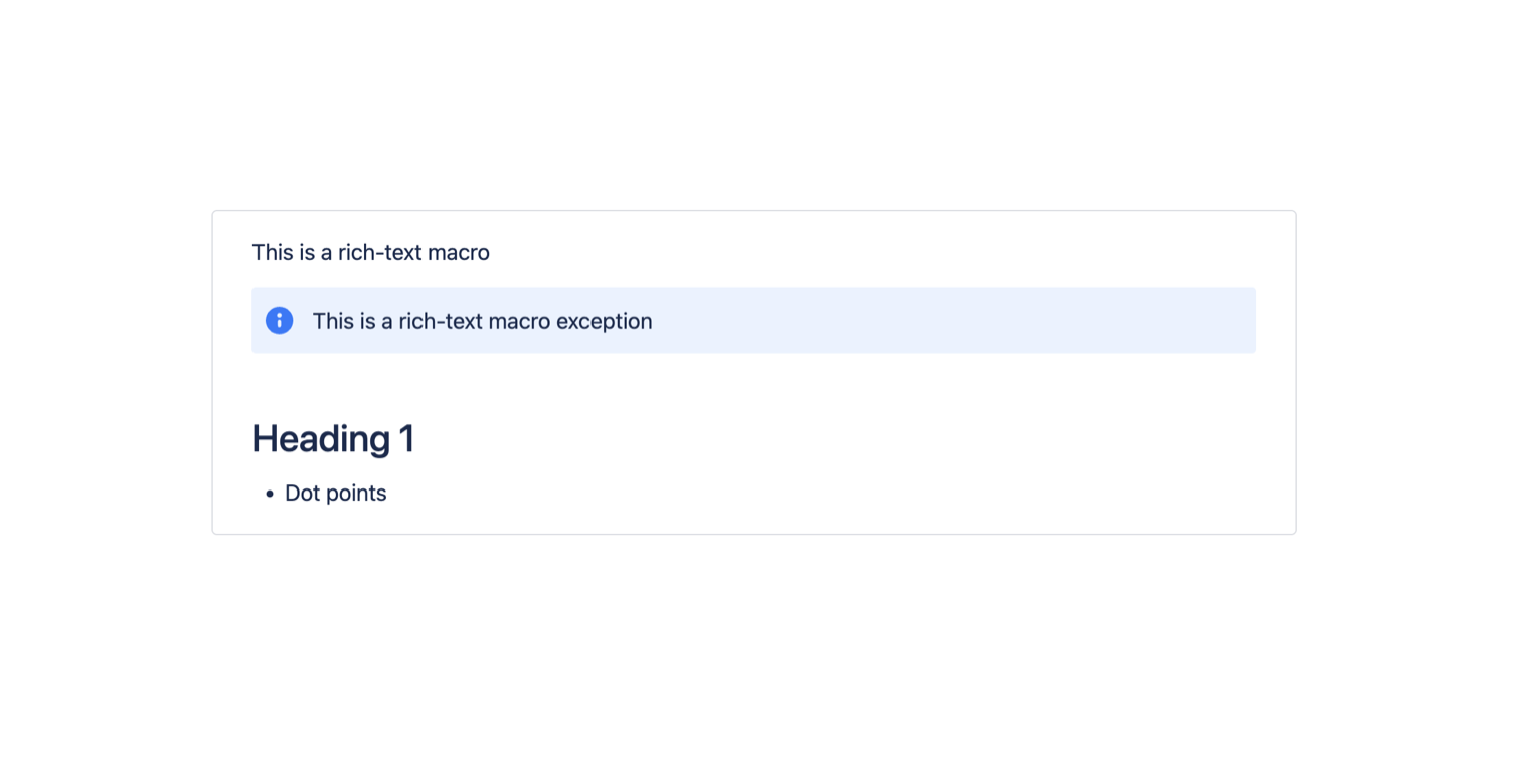
macro.body | ADF document | The rich text body of the macro. Available for layout: bodied macros only. |
autoConvertLink | string | The link pasted by a user that has matched an AutoConvert app. |
template.id | string | A string that represents the unique identifier of the template. This value is only available when the macro is in a saved template. |
Macro autoconvert
Macro autoconvert allows your app to automatically insert a macro into the editor when a user pastes
a recognized URL. This is achieved by defining URL patterns in the manifest using the matchers
property. These matchersare registered in the editor when the app is installed.
Example
1
2modules:
  macro:
    - key: autoconvert-app
      resource: main
      render: native
      resolver:
        function: resolver
      title: Forge app for autoconvert
      description: Example for autoconvert manifest
      autoConvert:
        matchers:
          - pattern: https://www.example.com/*/about
          - pattern: https://www.example.com/*/music
          - pattern: https://*.example.com/*/movies/*
          - pattern: https://example.com/gifs/*/
          - pattern: http://*.example.com/media/*/.gif
          - pattern: customScheme:\\example:custom
          - pattern: customScheme:example:*
  function:
    - key: resolver
      handler: index.handler
resources:
  - key: main
    path: src/frontend/index.jsx
app:
  id: "<your app id>"
The URL patterns use wildcards to match parts of the URL that can vary, such as unique IDs. Wildcards are
defined using *.
Use a new * for each segment in the URL you want a wildcard for. For example, https://www.example.com/* will match https://www.example.com/about but will not match https://www.example.com/about/contact. To match this path as well you need to include https://www.example.com/*/* as one of your matchers.
You'll need to define a separate matcher for each relevant internet protocol, such as http and https.
Creating custom URL schemes is also supported. For example, customScheme:* can be used to match any URL that starts with that custom scheme such ascustomScheme:\\example:custom. Any custom schemes will have to be registered on the system they will be used on, such as iOS, Windows or Android. Either :\\ or just : can be used as the initial separator in the URL scheme then : thereon.
Example patterns
Wildcard path
1
2- "pattern": "https://www.example.com/*/about"
Wildcard in subdomain
1
2- "pattern": "https://www.*.example.com/help"
Matching wildcard paths
1
2- "pattern": "https://bitbucket.org/*/*/*"
Matching custom URL schemes
1
2- "pattern": "customScheme:example:custom"
- "pattern": "customScheme:\\example:custom"
Matching custom URL scheme wildcard
1
2- "pattern": "customScheme:example:*"
- "pattern": "customScheme:\\example:*"
When a pasted URL matches a defined pattern, the macro is created in the editor, and the URL is
captured and inserted as a parameter into the macro body. This parameter can be accessed using the
autoConvertLink property.
Example app: Macro autoconvert for UI Kit
Learn how to configure auto convert in your manifest.yml file, including pattern matching and setting permissions for API calls.
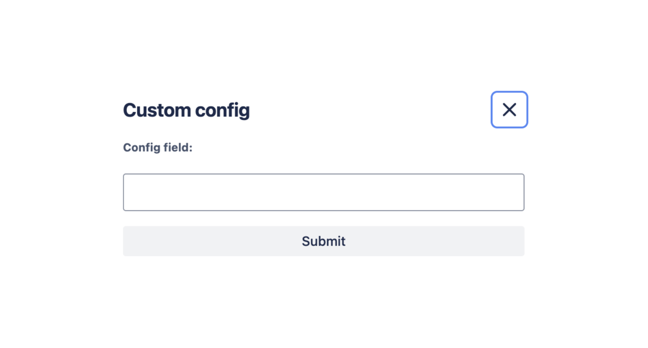
Macro custom configuration
Extension context in the macro editor
There are two additional extension context parameters available when you are in macro configuration editor context.
| Parameter | Type | Details |
|---|---|---|
macro.isConfiguring | boolean | true if the currently rendered resource is the config resource, false if it is the macro's default resource |
macro.isInserting | boolean | true if a new macro is being inserted, false if an existing macro is being edited |
Options for submitting the configuration
This table details the options supported by view.submit() in the context of custom macro configuration.
| Parameter | Type | Required | Details | Code |
|---|---|---|---|---|
config | Config payload | Yes | Sets the config properties of the macro. |
view.submit({
  config: {
    param1: "test",
    param2: [1, 2, 3]
  }
})
|
body | ADF document | No | Sets the rich text body of the macro. Can only be used with layout: bodied macros. |
view.submit({
  config: {},
  body: {
    type: "doc",
    version: 1,
    content: [
      // ADF content
    ]
  }
})
|
keepEditing | boolean | No | Defaults to false, which automatically closes the config modal on submit. Set this to true to keep the modal open. |
view.submit({
  config: {},
  keepEditing: true
})
|
Supported config payload format
The config payload only supports values that can be serialised to JSON.
The following types are allowed on the payload:
undefinedstringnumberbooleanobject(can contain any of the allowed types, including nested objects)array(can contain strings, numbers, booleans, and objects; all items in the array must be of the same type).
The following types are not allowed:
- Nested arrays (arrays as direct children of arrays)
null- Any data types that are not serializable to JSON (e.g.
Map,Set, etc.)
If you want greater control over the storage format of your configuration, such as being able to store nested arrays and nulls, we recommend serializing your configuration to JSON upfront, and storing it as a string.
Error code guide
This table details the possible error codes that may be thrown by view.submit():
| Error code | Details |
|---|---|
INVALID_PAYLOAD | The top-level parameter passed to view.submit() must be an object. |
INVALID_CONFIG | The config prop provided must be an object that is compliant with the config payload format above. |
INVALID_EXTENSION_TYPE | When providing a body, the macro must be a rich text macro (layout: "bodied"). |
INVALID_BODY | The provided body is not a valid ADF document node. |
MACRO_NOT_FOUND | The macro that you are attempting to update no longer exists. It may have been deleted by another user editing the page. |
Tutorials
Rate this page:


