- Action validator (Preview)
- Admin page
- Backlog action
- Board action
- Command palette (Preview)
- Custom field
- Custom field type
- Dashboard background script
- Dashboard gadget
- Entity property
- Entity property set
- Full page (Preview)
- Global background script (Preview)
- Global page
- Global permission
- Issue action
- Issue activity
- Issue context
- Issue glance
- Issue navigator action (Preview)
- Issue panel
- Issue view background script
- JQL function
- Personal settings page (Preview)
- Project page
- Project permission
- Project settings page
- Sprint action
- Time tracking provider (Preview)
- UI modifications
- Workflow validator (Preview)
- Workflow condition (Preview)
- Workflow post function (Preview)
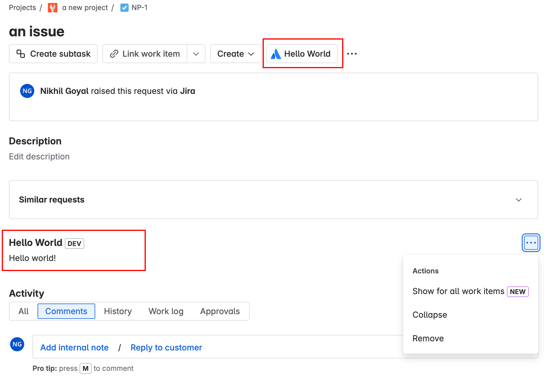
Jira issue panel
The jira:issuePanel module adds an issue panel to a Jira issue when a configured button is clicked.
The content of the module is shown above the Activity panel on a Jira issue.
This module can be used in Jira and Jira Service Management. It works in the new issue view but not the old issue view.
Manifest example
1
2modules:
  jira:issuePanel:
    - key: hello-world-issue-panel
      resource: main
      resolver:
        function: resolver
      render: native
      title: Hello World!
      icon: https://developer.atlassian.com/platform/forge/images/icons/issue-panel-icon.svg
Properties
| Property | Type | Required | Description |
|---|---|---|---|
key |
| Yes |
A key for the module, which other modules can refer to. Must be unique within the manifest. Regex: |
resource | string | If using Custom UI or modern versions of UI Kit | The key of a static resources entry that your module will display. See resources for more details. |
render | 'native' | If using modern versions of UI Kit | Indicates the module uses UI Kit. |
resolver | { function: string } or{ endpoint: string } |
Set the Set the | |
viewportSize | 'small', 'medium', 'large' or 'xlarge' | The display size of resource. Can only be set if the module is using the resource property. Remove this property to enable automatic resizing of the module. | |
title | string or i18n object | Yes |
The title of the issue panel, which is displayed above the panel. The title also appears in the ••• menu that’s clicked to display the issue panel. The |
icon | string | Yes |
The icon that will be displayed as a button. When the button is clicked, an issue panel is added to the issue view. For Custom UI and UI Kit apps, the If no icon is provided, or if there's an issue preventing the icon from loading, a generic app icon will be displayed. |
allowMultiple |
|
Controls whether or not multiple instances of the issue panel are shown when clicking the issue panel button repeatedly. Defaults to If set to | |
displayConditions | object | The object that defines whether or not a module is displayed in the UI of the app. See display conditions. | |
unlicensedAccess | List<string> | A list of unlicensed user types that can access this module. Valid values are: unlicensed, customer, and anonymous. For more information, see
Access to Forge apps for unlicensed users. |
i18n object
| Key | Type | Required | Description |
|---|---|---|---|
i18n | string | Yes | A key referencing a translated string in the translation files. For more details, see Translations. |
Extension data
UI Kit and Custom UI
Use the useProductContext hook to access the extension context in UI Kit or getContext bridge method in Custom UI.
| Property | Type | Description |
|---|---|---|
type | string | The type of the module. |
issue.id | string | The id of the issue on which the module is rendered. |
issue.key | string | The key of the issue on which the module is rendered. |
issue.type | string | The type of the issue on which the module is rendered. |
issue.typeId | string | The id of the type of the issue on which the module is rendered. |
project.id | string | The id of the project where the module is rendered. |
project.key | string | The key of the project where the module is rendered. |
project.type | string | The type of the project where the module is rendered. |
isNewToIssue | boolean | Defines if the panel was just added to the issue. |
location | string | The full URL of the host page where this module is displayed. |
Extension context
| Property | Type | Description |
|---|---|---|
type | string | The type of the module. |
Platform context
| Property | Type/value | Description |
|---|---|---|
issueId | string | The ID of the issue on which the module is rendered. |
issueKey | string | The key of the issue on which the module is rendered. |
issueType | string | The type of the issue on which the module is rendered. |
issueTypeId | string | The ID of the type of the issue on which the module is rendered. |
projectId | string | The ID of the project where the module is rendered. |
projectKey | string | The key of the project where the module is rendered. |
projectType | string | The type of the project where which the module is rendered. |
isNewToIssue | boolean | Defines if the panel was just added to the issue. |
Dynamic module (Preview)
This module can also be declared as a dynamic module. However, this capability is currently available as a Forge preview feature.
For more details, see Dynamic Modules.
Code examples
The following examples show Dynamic Module implementations specific to this module. For more detailed information about the API used in these examples (including error handling information), see Dynamic Modules API.
Create a dynamic issue panel module
1
2import { asApp } from "@forge/api";
const payload = {
  "type": "jira:issuePanel",
  "data": {
    "icon": "https://developer.atlassian.com/platform/forge/images/icons/issue-panel-icon.svg",
    "resolver": {
      "function": "resolver"
    },
    "resource": "main",
    "render": "native",
    "title": "Issue Panel"
  }
}
const response = await asApp().requestAtlassian(`/forge/installation/v2/dynamic/module/`, {
  headers: {
    'Content-Type': 'application/json'
  },
  method: 'POST',
  body: JSON.stringify(payload),
});
const body = await response.text();
console.log(`Response: ${response.status} ${body}`);
Update a dynamic issue panel module
1
2import { asApp } from "@forge/api";
const key = "issue-panel";
const payload = {
  "type": "jira:issuePanel",
  "data": {
    "icon": "https://developer.atlassian.com/platform/forge/images/icons/issue-panel-icon.svg",
    "resolver": {
      "function": "resolver"
    },
    "resource": "main",
    "render": "native",
    "title": "Issue Panel"
  }
}
const response = await asApp().requestAtlassian(`/forge/installation/v2/dynamic/module/${key}`, {
  headers: {
    'Content-Type': 'application/json'
  },
  method: 'PUT',
  body: JSON.stringify(payload)
});
const body = await response.text();
console.log(`Response: ${response.status} ${body}`);
Events
Apps can receive frontend events that will notify your app when an issue has been changed. These events are triggered when an issue is updated or commented on, and are only available for Jira issue view modules.
1
2import { events } from "@forge/bridge";
events.on("JIRA_ISSUE_CHANGED", (data) => {
  console.log("JIRA_ISSUE_CHANGED (Forge)", data);
});
However, if you have multiple issue view modules in your app, you should use the Jira issue view background script module or its Connect counterpart. This will give you a central place for fetching issue details, thus reducing the number of network requests and improving the user experience. Fetching issue details separately for every module would introduce unnecessary overhead and degrade performance.
Data shape
1
2{
  "issueId": string,
  "projectId": string,
  "changes":[{
    "changeType": "updated" | "commented",
    "atlassianId": string
  }]
}
| Property | Description |
|---|---|
issueId | ID of the issue the app is rendered on. |
projectId | ID of the project the issue belongs to. |
changes | List of issue changes
|
Limitations
There is a delay between the moment the issue is modified and when the event is emitted. It might take up to a few seconds.
Rate this page: