- ADF renderer
- Atlassian icon (Preview)
- Atlassian tile (Preview)
- Badge
- Bleed (Preview)
- Box
- Breadcrumbs (Preview)
- Button
- Button group
- Calendar
- Chart - Bar
- Chart - Donut
- Chart - Horizontal bar
- Chart - Horizontal stack bar
- Chart - Line
- Chart - Pie
- Chart - Stack bar
- Checkbox
- Checkbox group
- Code
- Code block
- Comment
- Comment editor
- Chromeless editor
- Date picker
- Dynamic table
- Empty state
- File card (Preview)
- File picker (Preview)
- Form
- Frame
- Heading
- Icon
- Image
- Inline
- Inline edit
- Link
- List
- Lozenge
- Modal
- Popup
- Pagination (Preview)
- Pressable
- Progress bar
- Progress tracker
- Radio
- Radio group
- Range
- Section message
- Select
- Spinner
- Stack
- Tabs
- Tag
- Tag group
- Text
- Text area
- Text field
- Time picker
- Tile (Preview)
- Toggle
- Tooltip
- User
- User group
- User picker
- XCSS
Last updated Jan 29, 2024
Radio group
To add the RadioGroup component to your app:
1
2import { RadioGroup } from '@forge/react';
Description
A radio group presents a list of options where only one choice can be selected.
Props
| Name | Type | Required | Available in macro config | Description |
|---|---|---|---|---|
options | Array<Option> | Array<{ isDisabled: boolean; label: string; name: string; value: string; }> | Yes | Yes | An array of objects, each object is mapped onto a Radio element within the group. Name must be unique to the group. |
value | string | null | No | No | Once set, controls the selected value on the RadioGroup. |
defaultValue | string | null | No | Yes | Sets the initial selected value on the RadioGroup. |
isDisabled | boolean | No | No | Sets the disabled state of all Radio elements in the group. Overrides the isDisabled setting of all child Radio items. |
isRequired | boolean | No | Yes | Sets the required state of all Radio elements in the group. Should only be set when using within a Form component. |
isInvalid | boolean | No | No | Sets the invalid state of all Radio elements in the group. |
onInvalid | () => void | No | No | Function that gets fired after each invalid event. |
onChange | (e: ChangeEvent) => void | No | No | Function that gets fired after each change event. |
name | string | Required for macro configuration, not required for other extension points | Yes | Sets the name prop on each of the Radio elements in the group. |
Examples
Default
The default form of a radio group.
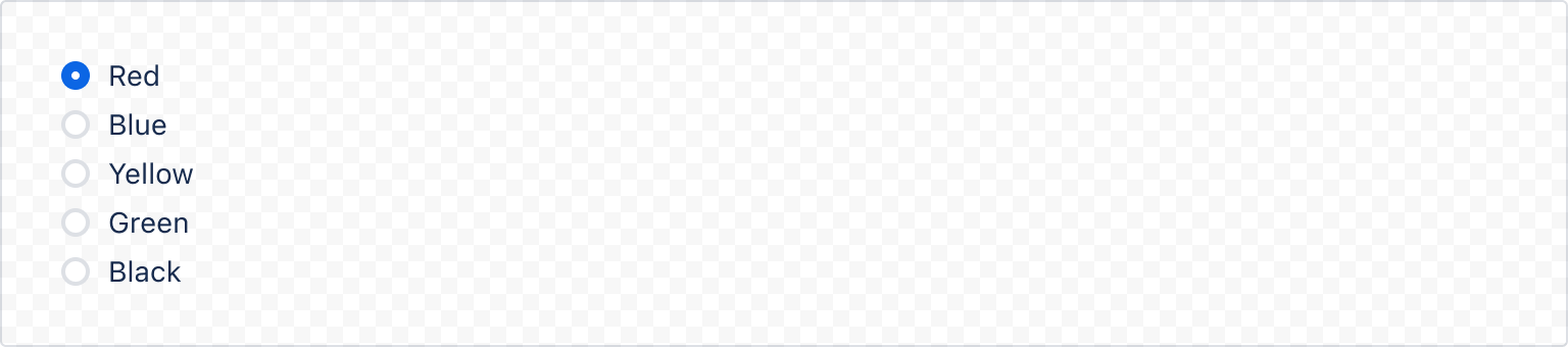
1
2const options = [
  { name: 'color', value: 'red', label: 'Red' },
  { name: 'color', value: 'blue', label: 'Blue' },
  { name: 'color', value: 'yellow', label: 'Yellow' },
  { name: 'color', value: 'green', label: 'Green' },
  { name: 'color', value: 'black', label: 'Black' },
];

const RadioGroupDefaultExample = () => {
  return (
    <RadioGroup options={options} value="red" />
  );
};
States
Disabled
isDisabled can be used to disable the entire radio group.

1
2const options = [
  { name: 'color', value: 'red', label: 'Red' },
  { name: 'color', value: 'blue', label: 'Blue' },
  { name: 'color', value: 'yellow', label: 'Yellow' },
  { name: 'color', value: 'green', label: 'Green' },
  { name: 'color', value: 'black', label: 'Black' },
];

const RadioGroupDisabledExample = () => {
  return (
    <RadioGroup options={options} isDisabled={true}/>
  );
};
Required
For required fields, always add RequiredAsterisk component next to the label. Use the ErrorMessage or ValidationMessage components for displaying a validation message.
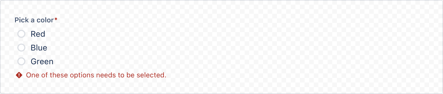
1
2import { useForm, RadioGroup, Label, Form, FormSection, RequiredAsterisk } from '@forge/react';

const options = [
  { name: 'color', value: 'red', label: 'Red' },
  { name: 'color', value: 'blue', label: 'Blue' },
  { name: 'color', value: 'green', label: 'Green' },
];

const RadioGroupRequiredExample = () => {
  const { register, getFieldId, formState, handleSubmit } = useForm();

  return (
    <Form onSubmit={handleSubmit((values) => console.log(values))}>
      <FormSection>
        <Label labelFor={getFieldId("color")}>
          Pick a color <RequiredAsterisk />
        </Label>
        <RadioGroup
          options={options}
          {...register("color", { required: true })}
        />
        {formState.errors.color && (
          <ErrorMessage>One of these options needs to be selected</ErrorMessage>
        )}
      </FormSection>
      <Button type="submit">Submit</Button>
    </Form>
  );
};
Accessibility considerations
When using the RadioGroup component, we recommend keeping the following accessibility considerations in mind:
- Include error messages for required or invalid radio fields. For example, "Please select an option".
- Never preselect a high-risk option, especially if the radio is related to payment, privacy or security. Use the lowest-risk, lowest-change option as the default to ensure that users don’t accidentally opt in when submitting forms.
- Don’t use a disabled radio button if it needs to remain in the tab order. Instead, use validation so that screen reader users can perceive the radio button and hear an error message explaining why that option cannot currently be selected.
Rate this page: