- ADF renderer
- Atlassian icon (Preview)
- Atlassian tile (Preview)
- Badge
- Bleed (Preview)
- Box
- Breadcrumbs (Preview)
- Button
- Button group
- Calendar
- Chart - Bar
- Chart - Donut
- Chart - Horizontal bar
- Chart - Horizontal stack bar
- Chart - Line
- Chart - Pie
- Chart - Stack bar
- Checkbox
- Checkbox group
- Code
- Code block
- Comment
- Comment editor
- Chromeless editor
- Date picker
- Dynamic table
- Empty state
- File card (Preview)
- File picker (Preview)
- Form
- Frame
- Heading
- Icon
- Image
- Inline
- Inline edit
- Link
- List
- Lozenge
- Modal
- Popup
- Pagination (Preview)
- Pressable
- Progress bar
- Progress tracker
- Radio
- Radio group
- Range
- Router (Preview)
- Section message
- Select
- Spinner
- Stack
- Tabs
- Tag
- Tag group
- Text
- Text area
- Text field
- Time picker
- Tile (Preview)
- Toggle
- Tooltip
- User
- User group
- User picker
- XCSS
Last updated Jan 29, 2024
Radio
To add the Radio component to your app:
1
2import { Radio } from '@forge/react';
Description
A radio input allows users to select only one option from a number of choices. Radio is generally displayed in a radio group.
Props
| Name | Type | Required | Description |
|---|---|---|---|
isChecked | boolean | No | Set the field as checked. |
isDisabled | boolean | No | Makes a Radio field unselectable when true. Overridden by isDisabled prop of RadioGroup. |
isInvalid | boolean | No | Marks this as an invalid field. |
isRequired | boolean | No | Marks this as a required field. |
label | string | No | The label value for the input. |
onChange | (e: ChangeEvent) => void | No | An event handler, passed into the props of each Radio Component instantiated within RadioGroup. |
value | string | No | Field value. |
Examples
Default
The default way to present a single option from a list.
In most situations where you want to present a list of mutually exclusive options, you will want to use a RadioGroup.

1
2const RadioDefaultExample = () => {
  return (
    <Radio
      name="radio-default"
      value="radio"
      label="Default radio"
    />
  );
};
States
Disabled radio
Use isDisabled to disable a radio option.

1
2const RadioDisabledExample = () => {
  return (
    <Radio
      name="radio-disabled"
      value="radio"
      label="Disabled radio"
      isDisabled={true}
    />
  );
};
Invalid radio
Use isInvalid for situations where the selected field is invalid or incorrect. Remember to provide useful validation messages to help people understand how to proceed.
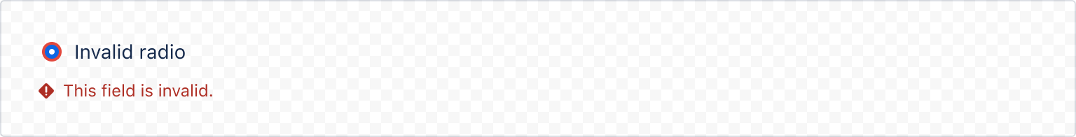
1
2import { Radio, ErrorMessage } from "@forge/react";

const RadioInvalidExample = () => {
  return (
    <Radio
      name="radio-invalid"
      value="radio"
      label="Invalid radio"
      isInvalid
      isChecked
    />
    <ErrorMessage>This field is invalid</ErrorMessage>
  );
};
Accessibility considerations
When using the Radio component, we recommend keeping the following accessibility considerations in mind:
- Include error messages for required or invalid radio fields. For example, "Please select an option".
- Never preselect a high-risk option, especially if the radio is related to payment, privacy or security. Use the lowest-risk, lowest-change option as the default to ensure that users don’t accidentally opt in when submitting forms.
- Don’t use a disabled radio button if it needs to remain in the tab order. Instead, use validation so that screen reader users can perceive the radio button and hear an error message explaining why that option cannot currently be selected.
Rate this page: