- ADF renderer
- Atlassian icon (Preview)
- Atlassian tile (Preview)
- Badge
- Bleed (Preview)
- Box
- Breadcrumbs (Preview)
- Button
- Button group
- Calendar
- Chart - Bar
- Chart - Donut
- Chart - Horizontal bar
- Chart - Horizontal stack bar
- Chart - Line
- Chart - Pie
- Chart - Stack bar
- Checkbox
- Checkbox group
- Code
- Code block
- Comment
- Comment editor
- Chromeless editor
- Date picker
- Dynamic table
- Empty state
- File card (Preview)
- File picker (Preview)
- Form
- Frame
- Heading
- Icon
- Image
- Inline
- Inline edit
- Link
- List
- Lozenge
- Modal
- Popup
- Pagination (Preview)
- Pressable
- Progress bar
- Progress tracker
- Radio
- Radio group
- Range
- Router (Preview)
- Section message
- Select
- Spinner
- Stack
- Tabs
- Tag
- Tag group
- Text
- Text area
- Text field
- Time picker
- Tile (Preview)
- Toggle
- Tooltip
- User
- User group
- User picker
- XCSS
Checkbox
To add the Checkbox component to your app:
1
2import { Checkbox } from '@forge/react';
Description
A checkbox is an input control that allows a user to select one or more options from a number of choices.
Props
| Name | Type | Required | Description |
|---|---|---|---|
id | string | No | The ID assigned to the input. |
isRequired | boolean | No | Marks the field as required & changes the label style. |
defaultChecked | boolean | No | Sets whether the checkbox begins as checked or unchecked. |
isChecked | boolean | No | Sets whether the checkbox is checked or unchecked. |
isIndeterminate | boolean | No | Sets whether the checkbox is indeterminate. This only affects the style and does not modify the isChecked property. |
isDisabled | boolean | No | Sets whether the checkbox is disabled. Don’t use a disabled checkbox if it needs to remain in the tab order for assistive technologies. |
isInvalid | boolean | No | Marks the field as invalid. Changes style of unchecked component. |
label | string | No | The label to be displayed to the right of the checkbox. The label is part of the clickable element to select the checkbox. |
name | string | No | The name of the submitted field in a checkbox. |
onChange | (e: ChangeEvent) => void | No | Function that is called whenever the state of the checkbox changes. It will be called with an event object. Use currentTarget to get value, name and checked. |
value | string | number | No | The value to be used in the checkbox input. This is the value that will be returned on form submission. |
Examples
Default
The default checkbox input includes a selected and unselected state.
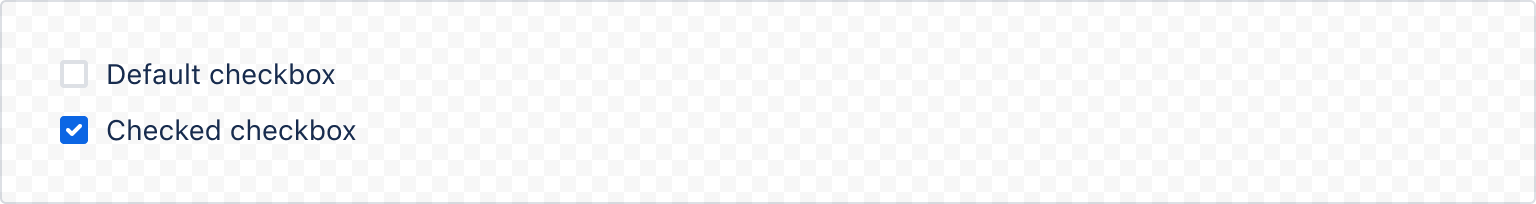
1
2const CheckboxDefaultExample = () => {
  return (
    <>
      <Checkbox value="default" label="Default checkbox" />
      <Checkbox value="checked" label="Checked checkbox" isChecked />
    </>
  );
};
Controlled
onChange
In a controlled checkbox, the checked state is managed by the React component. Set isChecked to select the checkbox and use the onChange handler to change the value.

1
2const CheckboxControlledExample = () => {
  const [isChecked, setIsChecked] = useState(true);
  const onChange = (event) => {
    setIsChecked(event.target.checked);
  }

  return (
    <Checkbox
      value="checkbox"
      label="Controlled checkbox"
      isChecked={isChecked}
      onChange={onChange}
    />
  );
};
States
Required
Use isRequired to make the checkbox required.

1
2import { Checkbox, RequiredAsterisk } from "@forge/react";

const CheckboxRequiredExample = () => {
  return (
    <Checkbox
      name="terms-and-conditions"
      value="terms-and-conditions"
      label="By checking this box you agree to the terms and conditions"
      isRequired
    />
  );
};
Indeterminate
Use isIndeterminate to show partially checked states.
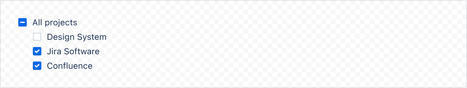
1
2import { Checkbox, Box } from "@forge/react";

const CheckboxIndeterminateCheckbox = () => {
  return (
    <>
      <Checkbox
        label="All projects"
        isIndeterminate
        isChecked
        />
      <Box xcss={{ marginLeft: "space.300" }}>
        <Checkbox label="Design System" />
        <Checkbox label="Jira Software" />
        <Checkbox label="Confluence"/>
      </Box>
    </>
  );
}
Disabled
Use isDisabled to disable a checkbox when another action has to be completed before the checkbox is usable.

1
2const CheckboxDisabledExample = () => {
  return (
    <Checkbox
      name="checkbox"
      value="checkbox"
      label="Disabled checkbox"
      isDisabled
    />
  );
};
Invalid
Use isInvalid when a user fails to select a required checkbox.
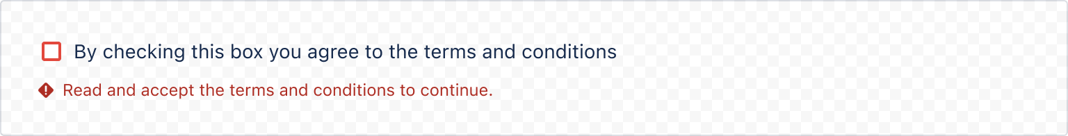
1
2import { Checkbox, ErrorMessage } from "@forge/react";

const CheckboxInvalidExample = () => {
  return (
    <>
      <Checkbox
        name="checkbox"
        value="checkbox"
        label="By checking this box you agree to the terms and conditions"
        isRequired
        isInvalid
      />
      <ErrorMessage>Read and accept the terms and conditions to continue.</ErrorMessage>
    </>
  );
};
Checkbox group with label
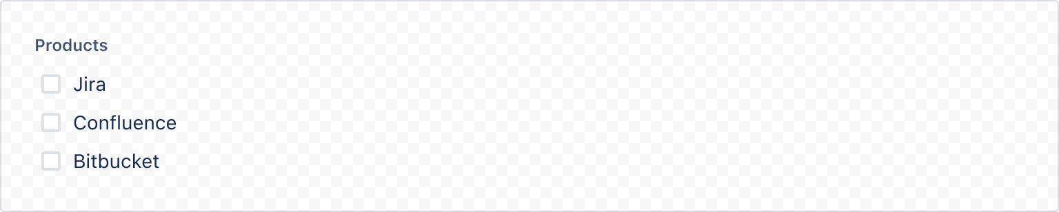
1
2import { Checkbox, Label } from "@forge/react";

const CheckboxGroupWithLabelExample = () => {
  return (
    <>
      <Label>Products</Label>
      <Checkbox label="Jira" />
      <Checkbox label="Confluence" />
      <Checkbox label="Bitbucket"/>
    </>
  );
};
Accessibility considerations
When using the Checkbox component, we recommend keeping the following accessibility considerations in mind:
- Include error messages for required or invalid checkbox fields (for example, "Please select an option").
- Don’t use a disabled checkbox if it needs to remain in the tab order. Instead, use form validation so that screen reader users can perceive the checkbox and hear an error message explaining why that option cannot currently be selected.
Rate this page: