- ADF renderer
- Atlassian icon (Preview)
- Atlassian tile (Preview)
- Badge
- Bleed (Preview)
- Box
- Breadcrumbs (Preview)
- Button
- Button group
- Calendar
- Chart - Bar
- Chart - Donut
- Chart - Horizontal bar
- Chart - Horizontal stack bar
- Chart - Line
- Chart - Pie
- Chart - Stack bar
- Checkbox
- Checkbox group
- Code
- Code block
- Comment
- Comment editor
- Chromeless editor
- Date picker
- Dynamic table
- Empty state
- File card (Preview)
- File picker (Preview)
- Form
- Frame
- Heading
- Icon
- Image
- Inline
- Inline edit
- Link
- List
- Lozenge
- Modal
- Popup
- Pagination (Preview)
- Pressable
- Progress bar
- Progress tracker
- Radio
- Radio group
- Range
- Section message
- Select
- Spinner
- Stack
- Tabs
- Tag
- Tag group
- Text
- Text area
- Text field
- Time picker
- Tile (Preview)
- Toggle
- Tooltip
- User
- User group
- User picker
- XCSS
Toggle
To add the Toggle component to your app:
1
2import { Toggle } from '@forge/react';
Description
A toggle is used to view or switch between enabled or disabled states.
Props
| Name | Type | Required | Description |
|---|---|---|---|
defaultChecked | boolean | No | Whether the toggle is initially checked or not. After the initial interaction, whether the component is checked or not is controlled by the component. |
id | string | No | Use a pairing label with your toggle using id and labelFor
props to set the relationship. |
isChecked | boolean | No | If defined it takes precedence over defaultChecked and Toggle acts
as a controlled component. You can provide an onChange function to be notified of checked value changes. |
isDisabled | boolean | No | Sets if the toggle is disabled or not. This prevents any interaction. Keep in mind that disabled toggles will not be available to screen readers. |
label | string | No | Text to be used as aria-label of toggle component.
Use this when there is no visible label for the toggle. |
name | string | No | Descriptive name for value property to be submitted in a form. |
onBlur | (event: FocusEvent) => void | No | Handler to be called when toggle is unfocused. |
onChange | (event: ChangeEvent) => void | No | Handler to be called when native 'change' event happens internally. |
onFocus | (event: FocusEvent) => void | No | Handler to be called when toggle is focused. |
size | "regular" | "large" | No | Toggle size. |
value | string | No | Value to be submitted in a form. |
Examples
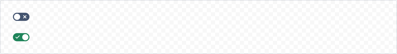
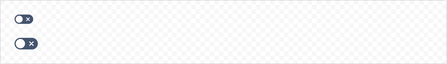
Default
The default form of a toggle.
1
2import { Label, Toggle } from "@forge/react";

export default function ToggleExample() {
  return (
    <Toggle id="toggle-default" />
  );
}
Controlled
onChange
Manage the checked state of the input by providing the isChecked prop. This requires an onChange handler to control the state value that you pass into the isChecked prop.

1
2import React, { useState } from "react";
import { Label, Toggle } from "@forge/react";

export default function ToggleControlledExample() {
  const [isChecked, setIsChecked] = useState(false);

  return (
    <>
      <Toggle
        id="toggle"
        onChange={() => setIsChecked((prev) => !prev)}
        isChecked={isChecked}
       />
      <Label labelFor="toggle">Field label</Label>
    </>
  );
}
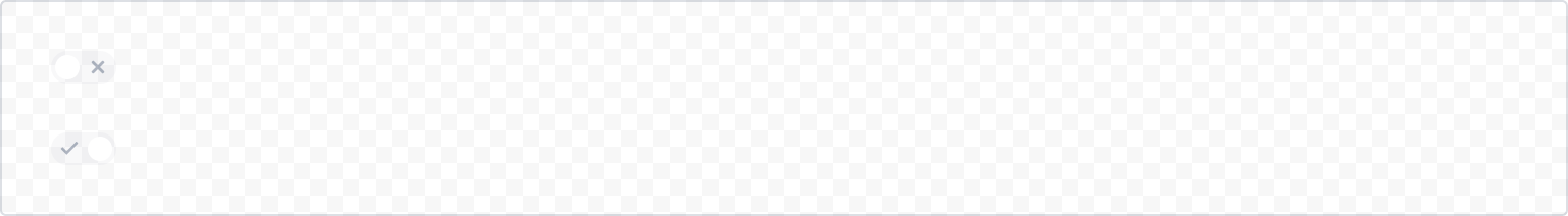
States
Disabled
When a selection has already been made outside of the current context that negates the need for the toggle, you can use the disabled state.
1
2export default function ToggleDisabledExample() {
  return (
    <Toggle id="toggle-disabled" isDisabled defaultChecked />
  );
}
Size
To call attention to a specific action, use a large toggle.
1
2export default function ToggleLargeExample() {
  return (
    <Toggle size="large" />
  );
}
Toggle with hidden label
Always use the label prop when there isn't a visible label that you can pair the toggle with.

1
2export default function ToggleLabelExample() {
  return (
    <Toggle id="toggle-default" label="This label is hidden" />
  );
}
Accessibility considerations
When using the Toggle component, we recommend to keep the following accessibility considerations in mind:
- If you're using a disabled toggle, include information explaining why the option isn't available. You can also use visually hidden to tell people who use screen readers that there is an option that isn't available to them.
- Avoid changing the toggle label based on the on or off state. The label should be the same regardless of the current toggle setting.
- Label your toggle using a
Labelcomponent that properly describes yourTogglecomponent.
Rate this page: