- ADF renderer
- Atlassian icon (Preview)
- Atlassian tile (Preview)
- Badge
- Bleed (Preview)
- Box
- Breadcrumbs (Preview)
- Button
- Button group
- Calendar
- Chart - Bar
- Chart - Donut
- Chart - Horizontal bar
- Chart - Horizontal stack bar
- Chart - Line
- Chart - Pie
- Chart - Stack bar
- Checkbox
- Checkbox group
- Code
- Code block
- Comment
- Comment editor
- Chromeless editor
- Date picker
- Dynamic table
- Empty state
- File card (Preview)
- File picker (Preview)
- Form
- Frame
- Heading
- Icon
- Image
- Inline
- Inline edit
- Link
- List
- Lozenge
- Modal
- Popup
- Pagination (Preview)
- Pressable
- Progress bar
- Progress tracker
- Radio
- Radio group
- Range
- Router (Preview)
- Section message
- Select
- Spinner
- Stack
- Tabs
- Tag
- Tag group
- Text
- Text area
- Text field
- Time picker
- Tile (Preview)
- Toggle
- Tooltip
- User
- User group
- User picker
- XCSS
Last updated Jan 29, 2024
Tooltip
To add the Tooltip component to your app:
1
2import { Tooltip } from '@forge/react';
Description
A Tooltip is a floating, non-actionable label used to explain a user interface element or feature.
Props
Name | Type | Required | Description |
|---|---|---|---|
children | ForgeElement | Yes | Elements to be wrapped by the tooltip. |
position | "mouse" | "auto" | "auto-start" | "auto-end" | "top" | "bottom" | "left" | "right" | "top-start" | "top-end" | "bottom-start" | "bottom-end" | "right-start" | "right-end" | "left-start" | "left-end" | No | Where the tooltip should appear relative to its target. If set to mouse the tooltip will display next to the mouse pointer instead. Make sure to utilize the mousePosition if you want to customize where the tooltip will show in relation to the mouse. |
mousePosition | "auto" | "auto-start" | "auto-end" | "top" | "bottom" | "left" | "right" | "top-start" | "top-end" | "bottom-start" | "bottom-end" | "right-start" | "right-end" | "left-start" | "left-end" | No | Where the tooltip should appear relative to the mouse pointer. Only used when the position prop is set to mouse. When interacting with the target element using the keyboard will use this position against the target element instead. |
content | string | Yes | The content of the tooltip. |
truncate | boolean | No | Show only one line of text, and truncate when too long. Default is false. |
delay | number | No | Time in milliseconds to wait before showing and hiding the tooltip. Default is 300. |
Examples
Default
The default form of a tooltip.
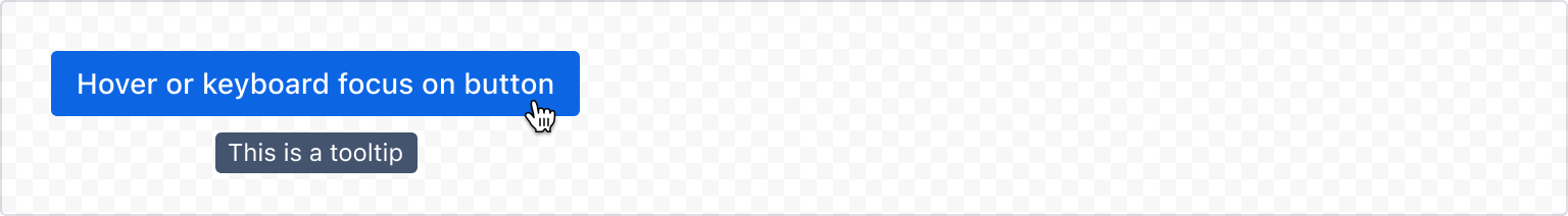
1
2const TooltipDefaultExample = () => {
  return (
    <Tooltip content="This is a tooltip">
      <Button apperance="primary">Hover or keyboard focus on button</Button>
    </Tooltip>
  );
};
Positioning
Position
Use the position prop to set a preferred position (auto, top, right, left, or bottom). The tooltip will move automatically if it is near the edge of the screen.
Using a position of auto will place the tooltip on the side with the most space available.
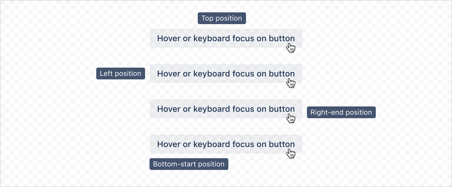
1
2const TooltipPositionExample = () => {
  return (
    <Tooltip content="Top position" position="top">
      <Button>Hover or keyboard focus on button</Button>
    </Tooltip>
  );
};
Mouse position
If set to mouse, the tooltip will display next to the mouse pointer. Use mousePosition if you want to customise where the tooltip shows in relation to the mouse.
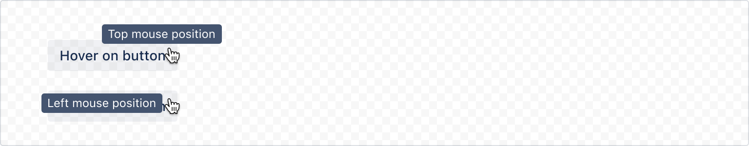
1
2const TooltipMousePositionExample = () => {
  return (
    <Tooltip content="Top mouse position" position="mouse" mousePosition="top">
      <Button>Hover on button</Button>
    </Tooltip>
  );
};
Accessibility considerations
When using the Tooltip component, we recommend keeping the following accessibility considerations in mind:
- Never put links or other interactive components in tooltips because this isn't accessible or usable. Tooltips should only include short, informative text.
- Don't put essential information in a tooltip. Tooltips have low discoverability and have usability issues on devices without hover interactions.
- Never put a tooltip on a disabled button. This is inaccessible and unsupported.
- Avoid truncating tooltip text as people will not be able to visually read the message.
Rate this page: