- ADF renderer
- Atlassian icon (Preview)
- Atlassian tile (Preview)
- Badge
- Bleed (Preview)
- Box
- Breadcrumbs (Preview)
- Button
- Button group
- Calendar
- Chart - Bar
- Chart - Donut
- Chart - Horizontal bar
- Chart - Horizontal stack bar
- Chart - Line
- Chart - Pie
- Chart - Stack bar
- Checkbox
- Checkbox group
- Code
- Code block
- Comment
- Comment editor
- Chromeless editor
- Date picker
- Dynamic table
- Empty state
- File card (Preview)
- File picker (Preview)
- Form
- Frame
- Heading
- Icon
- Image
- Inline
- Inline edit
- Link
- List
- Lozenge
- Modal
- Popup
- Pagination (Preview)
- Pressable
- Progress bar
- Progress tracker
- Radio
- Radio group
- Range
- Router (Preview)
- Section message
- Select
- Spinner
- Stack
- Tabs
- Tag
- Tag group
- Text
- Text area
- Text field
- Time picker
- Tile (Preview)
- Toggle
- Tooltip
- User
- User group
- User picker
- XCSS
Dynamic table
To add the DynamicTable component to your app:
1
2import { DynamicTable } from "@forge/react";
Description
A dynamic table displays rows of data with built-in pagination, sorting, and re-ordering functionality.
Props
| Name | Type | Required | Description |
|---|---|---|---|
caption | string | No | Caption for the table styled as a heading. |
defaultPage | number | No | Default page dynamic table should show when initially rendering. |
defaultSortKey | string | No | Default column sort key that the rows should be sorted by. Corresponds to the key's defined in the head prop. |
defaultSortOrder | "ASC" | "DESC" | No | Default column sort order used when initially rendering. Defaults to ASC. |
emptyView | React.ReactNode | string | No | Shown when the table has no rows. |
head | HeadType | No | Head row to be placed in the table. Contains list of cells, where each cell creates a new table column. |
highlightedRowIndex | number | number[] | No | Highlight row(s) of the table. Note that row indexes start from 0. |
isFixedSize | boolean | No | Displays columns as their initial width regardless of the content that loads in. |
isLoading | boolean | No | Displays a loading spinner overlaid on top of the current page. |
isRankable | boolean | No | Enables drag & drop sorting of table rows when the table is unsorted. |
Label | string | No | Used to provide a better description of the table for users with assistive technologies. Rather than a screen reader speaking "Table", passing in a label allows a custom message like "Sample Numerical Data table". |
loadingSpinnerSize | "small" | "large" | No | Configuration of the loading spinner shown when isLoading is true. Defaults to large when a page has more than two rows, else small. |
onRankEnd |
(rankEnd: RankEnd) => void
, where RankEnd is defined as:{ sourceIndex: number; sourceKey: string; destination?: { index: number; afterKey?: string; beforeKey?: string; }; }
| No | Callback fired when a drop of a row has completed. |
onRankStart | (rankStart: { index: number; key: string; }) => void | No | Callback fired when a drag of a row has started. |
onSetPage | (page: number) => void | No | Callback fired when the table page has changed. Useful when wanting to control dynamic table. |
page | number | No | Page the table should show. Useful when wanting to control dynamic table. |
paginationi18n | I18nShape | Labels for the previous and next buttons used in pagination. Defaults to previous and next. | |
rows | RowType[] | No | Rows to be placed in the table. Each row contains cells which should map to the ones defined in the head. Ensure each cell has a unique key per column - this is used for both reconciliation of lists and column sorting. |
rowsPerPage | number | No | Controls how many rows should be displayed per page. If set, also turns on pagination if there is more than one page to show. |
sortKey | string | No | Column key that the rows should be sorted by. Corresponds to the keys defined in the head prop. Useful when wanting to control dynamic table. |
sortOrder | "ASC" | "DESC" | No | Column sort order. Useful when wanting to control dynamic table. |
Some of the above props require inputs of specifically-typed objects defined for inputs to this component. See below section for their properties.
Types
Below are some helper types defined for the DynamicTable component. They should be inputted into DynamicTable as objects with the properties specified below each corresponding type.
RowType
The type of each row within a table.
| Name | Type | Required | Description |
|---|---|---|---|
cells | RowCellType[] | Yes | Cells to be placed in this row. |
key | string | No | The key of this row. Note that this property is required for ranking to function. |
isHighlighted | boolean | No | Highlights the row. Should be used to draw attention to a row, not to indicate selection. |
RowCellType
The type of each cell within a row.
| Name | Type | Required | Description |
|---|---|---|---|
key | string | number | No | Key to resolve sorting this cell in its column. Ensure each cell has a unique key per column as this is used for both reconciliation of lists and column sorting. |
colSpan | number | No | The number of columns a cell should span. Defaults to 1, and maxes out at the total column width of the table. |
content | React.ReactNode | string | No | The content of the cell. |
HeadType
The type of the head row within a table.
| Name | Type | Required | Description |
|---|---|---|---|
cells | HeadCellType[] | Yes | Cells to be placed in this row. |
HeadCellType
The type of each cell within a header.
It contains all of RowCellType's properties, as well as the following:
| Name | Type | Required | Description |
|---|---|---|---|
isSortable | boolean | No | Whether the column the cell sits above is sortable. |
width | number | No | The width of the cell as a percentage. |
shouldTruncate | boolean | No | Whether the text in the cell will truncate or not if constrained. |
I18nShape
Labels for the buttons used in pagination.
| Name | Type | Required | Description |
|---|---|---|---|
prev | string | Yes | Accessible label applied to the previous page button in the pagination component. |
next | string | Yes | Accessible label applied to the next page button in the pagination component. |
label | string | Yes | Accessible label applied to the current page button in the pagination component. |
pageLabel | string | No | Accessible label for the individual page numbers. The page number is automatically appended to the pageLabel. For Example, pageLabel="página" will render aria-label="página 1" as the label for page 1. |
Examples
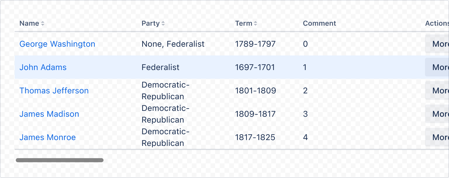
Unless specified otherwise, examples below use the following data model in their tables for easier readability.
1
2const createKey = (input) => {
  return input ? input.replace(/^(the|a|an)/, "").replace(/\s/g, "") : input;
};

// applied as rows in the form
export const rows = presidents.map((president, index) => ({
  key: `row-${index}-${president.name}`,
  cells: [
    {
      key: createKey(president.name),
      content: <Link href="">{president.name}</Link>,
    },
    {
      key: createKey(president.party),
      content: president.party,
    },
    {
      key: president.id,
      content: president.term,
    },
  ],
}));

export const head = {
  cells: [
    {
      key: "name",
      content: "Name",
      isSortable: true,
    },
    {
      key: "party",
      content: "Party",
      shouldTruncate: true,
      isSortable: true,
    },
    {
      key: "term",
      content: "Term",
      shouldTruncate: true,
      isSortable: true,
    },
  ],
};
Data used are as below:
1
2export const presidents = [
  {
    id: 1,
    name: "George Washington",
    party: "None, Federalist",
    term: "1789-1797",
  },
  {
    id: 2,
    name: "John Adams",
    party: "Federalist",
    term: "1697-1701",
  },
  {
    id: 3,
    name: "Thomas Jefferson",
    party: "Democratic-Republican",
    term: "1801-1809",
  },
  {
    id: 4,
    name: "James Madison",
    party: "Democratic-Republican",
    term: "1809-1817",
  },
  {
    id: 5,
    name: "James Monroe",
    party: "Democratic-Republican",
    term: "1817-1825",
  },
  {
    id: 6,
    name: "John Quincy Adams",
    party: "Democratic-Republican",
    term: "1825-1829",
  },
  {
    id: 7,
    name: "Andrew Jackson",
    party: "Democrat",
    term: "1829-1837",
  },
  {
    id: 8,
    name: "Martin van Buren",
    party: "Democrat",
    term: "1837-1841",
  },
  {
    id: 9,
    name: "William H. Harrison",
    party: "Whig",
    term: "1841",
  },
  {
    id: 10,
    name: "John Tyler",
    party: "Whig",
    term: "1841-1845",
  },
  {
    id: 11,
    name: "James K. Polk",
    party: "Democrat",
    term: "1845-1849",
  },
];
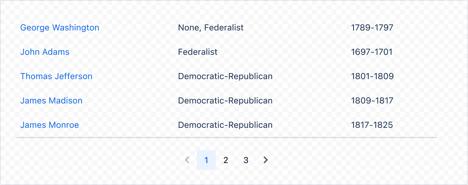
Default
Dynamic table manages sorting, pagination, loading, and drag and drop state management by default.
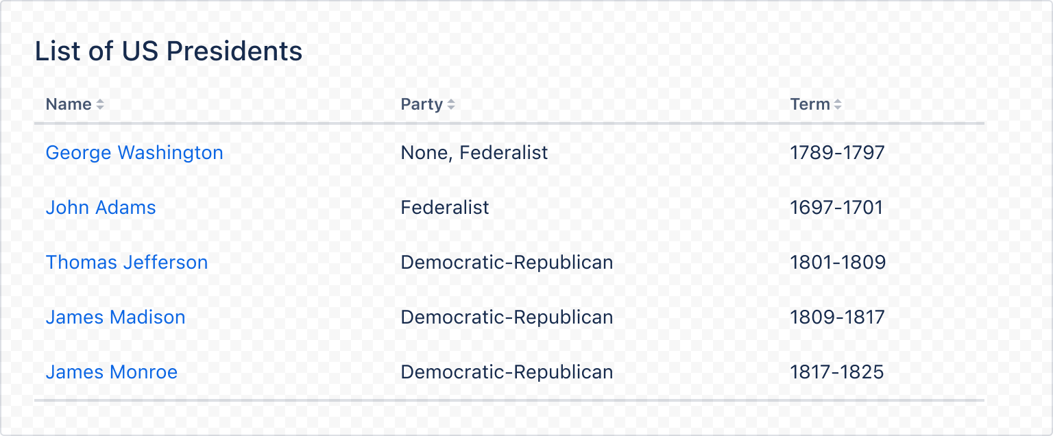
1
2import { DynamicTable } from "@forge/react";
import { head, rows } from "./data";

export default function Table() {
  return (
    <DynamicTable caption="List of US Presidents" head={head} rows={rows} />
  );
}
Sorting
Sorting a dynamic table is done based on the key set on each cell. You can sort the table via directly interacting with the table headers, or through the sortKey, sortOrder, defaultSortKey and defaultSortOrder properties.
The content of a cell does not affect its sorted order. The below example is sorted by parties after clicking on the "Party" header.
1
2import { DynamicTable } from "@forge/react";
import { head, rows } from "./data";

export default function TableSorted() {
  return <DynamicTable rowsPerPage={5} head={head} rows={rows} />;
}
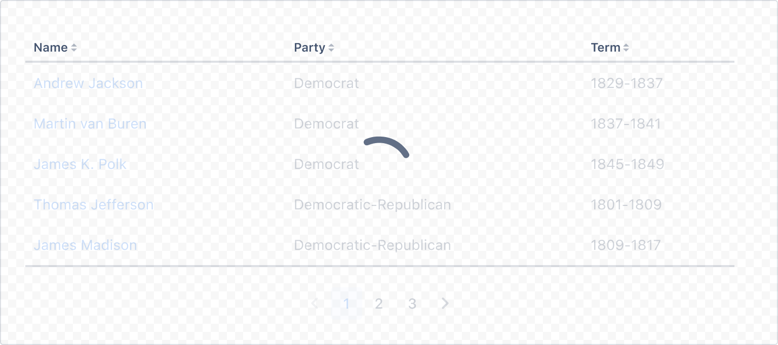
Loading states
Dynamic table uses a spinner to denote loading state. This is toggled by the isLoading prop.
Table content is set to 20% opacity in this loading state.
1
2import { DynamicTable } from "@forge/react";
import { head, rows } from "./data";

export default function TableLoading() {
  return (
    <DynamicTable isLoading={true} head={head} rows={rows} rowsPerPage={5} />
  );
}
Empty view
Use the emptyView prop to show an empty view in the dynamic table. Empty views communicate that the table has no content to show. If there is an action that a user must take to create or show table content, add this to the empty view.
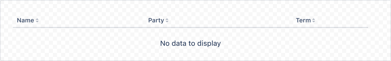
1
2import { DynamicTable } from "@forge/react";
import { head } from "./data";

export default function TableEmpty() {
  return <DynamicTable head={head} emptyView="No data to display" />;
}
Headless
Dynamic table can render without a table header if no head is supplied.
1
2import { DynamicTable } from "@forge/react";
import { rows } from "./data";

export default function TableHeadless() {
  return <DynamicTable rows={rows} rowsPerPage={5} />;
}
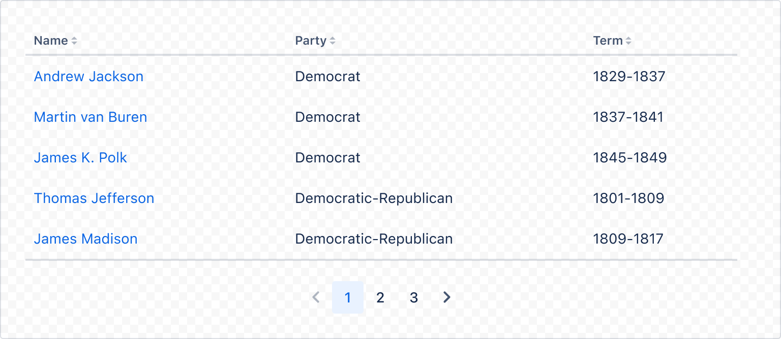
Pagination
Pagination is enabled or disabled by setting or unsetting the rowsPerPage prop. If the rowsPerPage prop is set and there is more than one page of content, the pagination component is added below the table.
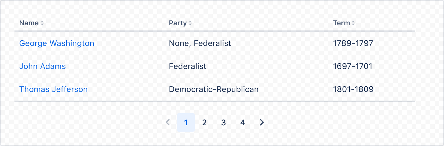
1
2import { DynamicTable } from "@forge/react";
import { head, rows } from "./data";

export default function TableSorted() {
  return <DynamicTable rowsPerPage={3} head={head} rows={rows} />;
}
Drag and drop
Drag and drop functionality is built into dynamic table and is enabled using the isRankable prop. This allows you to drag rows and rank them in different orders.
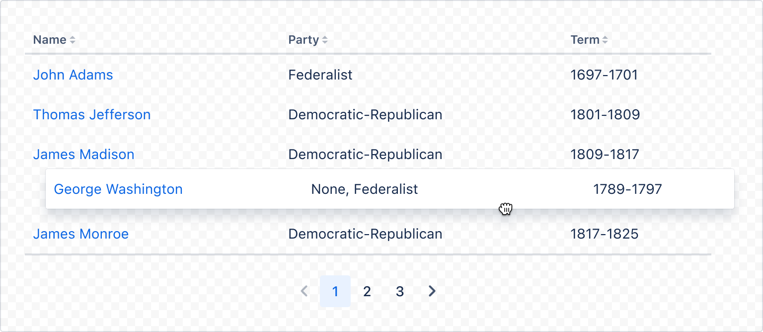
1
2import { DynamicTable } from "@forge/react";
import { rows } from "./data";

export default function TableDragAndDrop() {
  return <DynamicTable head={head} rows={rows} rowsPerPage={5} isRankable />;
}
Overflow
Larger tables or tables that cannot be constrained easily can use horizontal scroll. This isn't supported directly by dynamic table, but the component can be easily extended to support this.
Be mindful that horizontally scrolling tables can cause accessibility issues if there isn't enough visual affordance to indicate that the table has a scroll. For this reason, we recommend finding ways to simplify the table before opting for a horizontal scroll solution.
1
2import { DynamicTable, Box, xcss } from "@forge/react";
import { rows } from "./data";

const overflowStyles = xcss({
  overflowX: "auto",
});

const wrapperStyles = xcss({
  width: "1000px",
});

export default function TableOverflow() {
  return (
    <Box xcss={overflowStyles}>
      <Box xcss={wrapperStyles}>
        <DynamicTable head={head} rows={rows} rowsPerPage={5} isRankable />
      </Box>
    </Box>
  );
}
Custom column span
Individual cells can utilise colSpan to allow them to spill into other columns.
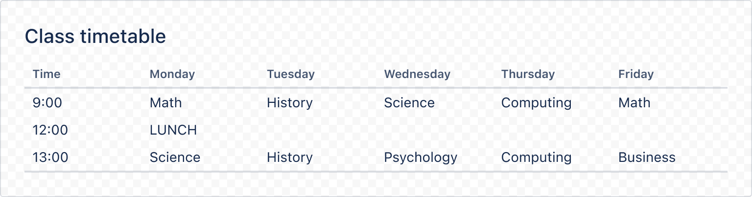
1
2import { DynamicTable } from "@forge/react";
const days = ["Time", "Monday", "Tuesday", "Wednesday", "Thursday", "Friday"];

const head = {
  cells: days.map((day) => ({
    key: day,
    content: day,
  })),
};

const rows = [
  {
    key: `morning-row`,
    cells: ["9:00", "Math", "History", "Science", "Computing", "Math"].map(
      (content, index) => ({
        key: index,
        content,
      })
    ),
  },
  {
    key: "midday-row",
    cells: [
      {
        key: 0,
        content: "12:00",
      },
      {
        key: 1,
        content: "LUNCH",
        colSpan: 5,
      },
    ],
  },
  {
    key: "afternoon-row",
    cells: [
      "13:00",
      "Science",
      "History",
      "Psychology",
      "Computing",
      "Business",
    ].map((content, index) => ({
      key: index,
      content,
    })),
  },
];

const CustomColSpanExample = () => (
  <DynamicTable caption="Class timetable" head={head} rows={rows} />
);
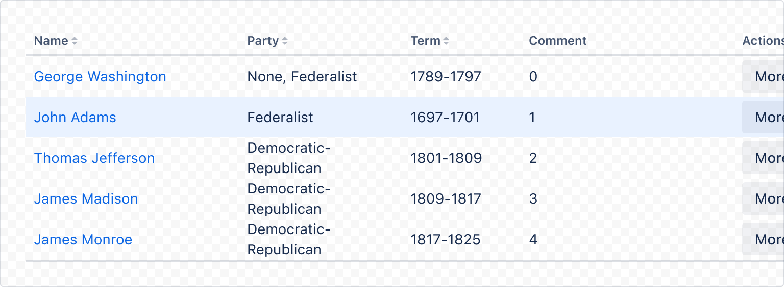
Highlighted row
Rows can be highlighted to provide additional visual prominence to a row. For example, use highlighted rows when rows are added. This should not be used to reflect selection.
1
2import { DynamicTable } from "@forge/react";
import { head, rows } from "./data";

export default function TableHighlighted() {
  return (
    <DynamicTable
      head={head}
      rows={rows}
      rowsPerPage={5}
      highlightedRowIndex={[0, 1]}
    />
  );
}
Accessibility considerations
When using the DynamicTable component, we recommend keeping the following accessibility considerations in mind:
- Use tables to make content easier to read.
- Use only relevant text or data so that it’s easy to understand.
- Clearly label columns with simple language. This makes it easier to understand and eases screen reader navigation.
- Provide a description for complex tables. This helps the user gain context about the data. It also helps people with screen readers have an overview of the table.
Rate this page: