- ADF renderer
- Atlassian icon (Preview)
- Atlassian tile (Preview)
- Badge
- Bleed (Preview)
- Box
- Breadcrumbs (Preview)
- Button
- Button group
- Calendar
- Chart - Bar
- Chart - Donut
- Chart - Horizontal bar
- Chart - Horizontal stack bar
- Chart - Line
- Chart - Pie
- Chart - Stack bar
- Checkbox
- Checkbox group
- Code
- Code block
- Comment
- Comment editor
- Chromeless editor
- Date picker
- Dynamic table
- Empty state
- File card (Preview)
- File picker (Preview)
- Form
- Frame
- Heading
- Icon
- Image
- Inline
- Inline edit
- Link
- List
- Lozenge
- Modal
- Popup
- Pagination (Preview)
- Pressable
- Progress bar
- Progress tracker
- Radio
- Radio group
- Range
- Router (Preview)
- Section message
- Select
- Spinner
- Stack
- Tabs
- Tag
- Tag group
- Text
- Text area
- Text field
- Time picker
- Tile (Preview)
- Toggle
- Tooltip
- User
- User group
- User picker
- XCSS
Text area
To add the TextArea component to your app:
1
2import { TextArea } from '@forge/react';
Description
A text area lets users enter long form text which spans over multiple lines.
Props
| Name | Type | Required | Available in macro config | Description |
|---|---|---|---|---|
appearance | "standard" | "subtle" | "none" | No | No | Controls the appearance of the field.
subtle shows styling on hover.
none prevents all field styling.
Take care when using the none appearance as this doesn't include accessible interactions. |
aria-invalid | boolean | "false" | "true" | "grammar" | "spelling" | No | No | Indicates the entered value does not conform to the format expected by the application. |
aria-labelledby | string | No | No | Identifies the element (or elements) that labels the current element. |
defaultValue | string | No | Yes | The default value of the text area. |
id | string | No | No | Used to specify a unique ID for the current element. |
isCompact | boolean | No | No | Sets whether the field should expand to fill available horizontal space. |
isDisabled | boolean | No | No | Sets the field as uneditable, with a changed hover state. |
isInvalid | boolean | No | No | Sets styling to indicate that the input is invalid. |
isMonospaced | boolean | No | No | Sets the content text value to monospace. |
isReadOnly | boolean | No | No | If true, prevents the value of the input from being edited. |
isRequired | boolean | No | Yes | Sets whether the field is required for form that the field is part of. |
maxHeight | string | No | No | The maximum height of the text area. |
maxLength | number | No | No | Specifies the maximum number of characters allowed in the input area. |
minimumRows | number | No | No | The minimum number of rows of text to display. |
minLength | number | No | No | Specifies the minimum number of characters required in the input area. |
name | string | Required for macro configuration, not required for other extension points | Yes | Name of the input form control. |
onBlur | (e: FocusEvent) => void | No | No | Handler to be called when the input is blurred. |
onChange | (e: ChangeEvent) => void | No | No | Handler to be called when the input changes. |
onFocus | (e: FocusEvent) => void | No | No | Handler to be called when the input is focused. |
placeholder | string | No | Yes | The placeholder within the text area. |
resize | "none" | "auto" | "vertical" | "horizontal" | "smart" | No | No | Enables resizing of the text area. The default setting is smart.
auto enables resizing in both directions.
horizontal enables resizing only along the X axis.
vertical enables resizing only along the Y axis.
smart vertically grows and shrinks the text area automatically to wrap your input text.
none explicitly disallows resizing of the text area. |
spellCheck | boolean | No | No | Enables native spell check on the textarea element. |
value | string | No | No | The value of the text area. |
Examples
Default
The default text area.
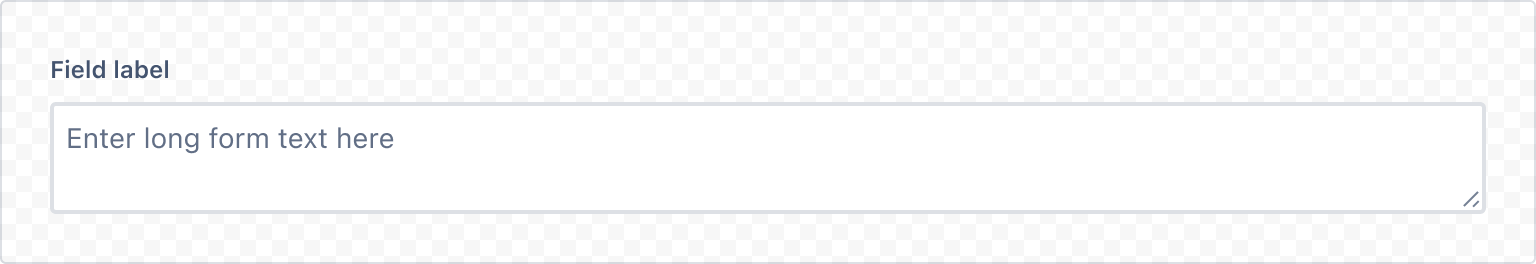
1
2import { TextArea, Label } from '@forge/react';

export const TextAreaExample = () => (
  <>
    <Label labelFor="area">Field label</Label>
    <TextArea
      id="area"
      placeholder="Enter long form text here"
      name="area"
    />
  </>
);
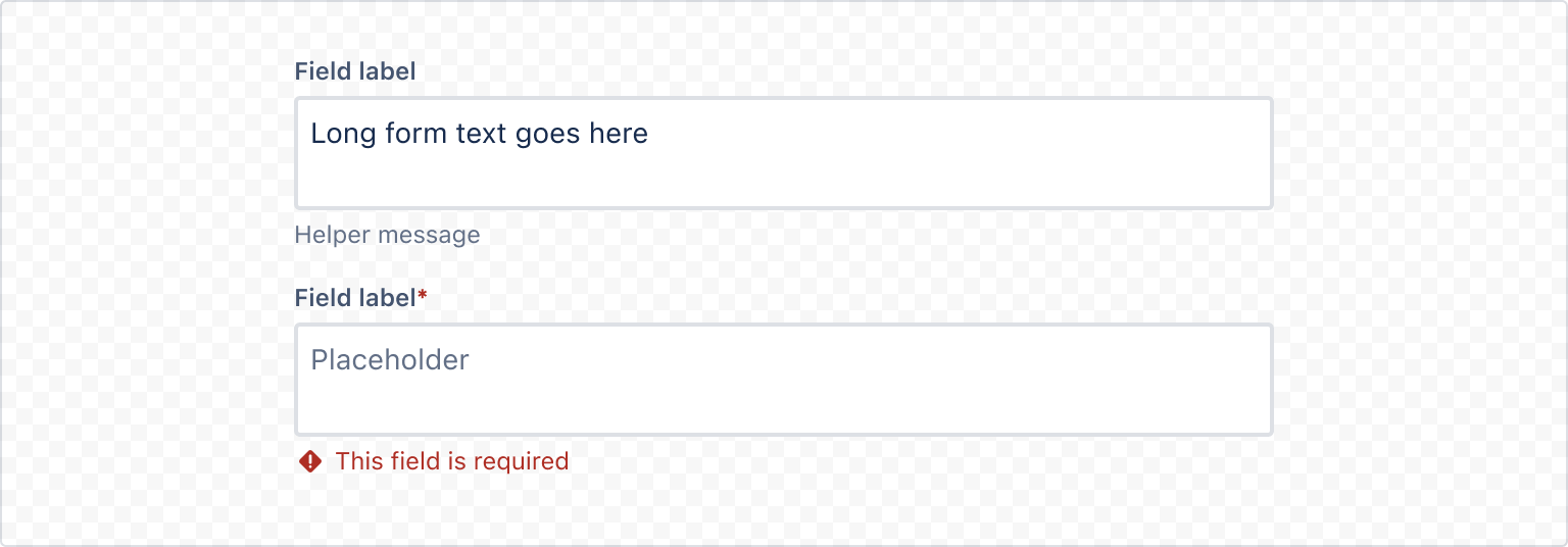
Field label and message
Always use a label component for each field and associate the label to the field properly. Use the HelperMessage component for any optional field-related message.
Required field label
For required fields, always add RequiredAsterisk component next to the label.
Validation
Use ErrorMessage or ValidationMessage components to display validation-related messages.
Appearance
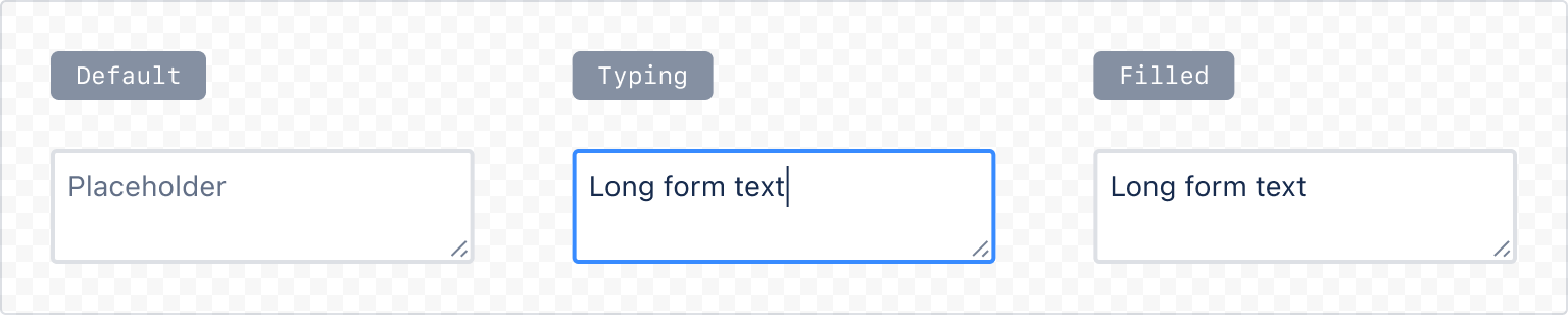
Standard
The default text area appearance.
1
2export const TextAreaStandard = () => {
  return (
    <TextArea
      appearance="standard"
      placeholder="Placeholder"
      name="area"
    />
  );
}
Subtle
A text area that's transparent until interaction or error.

1
2export const TextAreaSubtle = () => {
  return (
    <TextArea
      appearance="subtle"
      placeholder="Placeholder"
      name="area"
    />
  );
}
Resize
Use the resize prop to set whether the text area expands when the user enters text that exceeds the size of the text area.
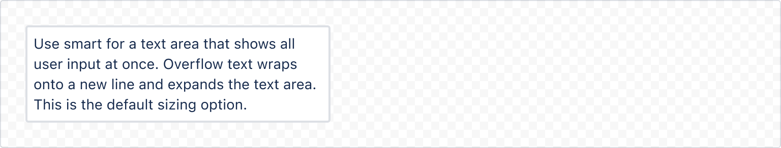
Smart
Use smart for a text area that shows all user input at once. Overflow text wraps onto a new line and expands the text area. This is the default sizing option.
1
2export const TextAreaSmartResizeExample = () => (
  <TextArea
    resize="smart"
    name="resize-smart"
  />
);
Auto
Use auto for a text area that will resize horizontally and vertically.
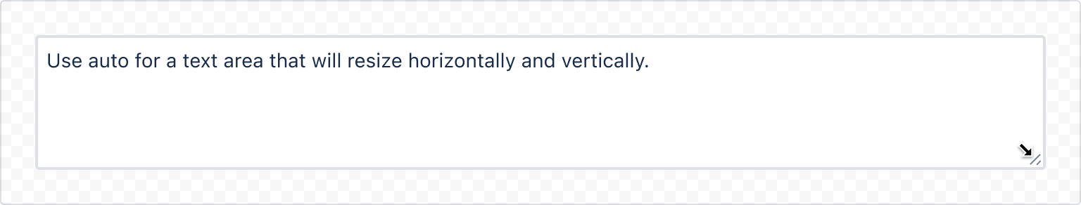
1
2export const TextAreaAutoResizeExample = () => (
  <TextArea
    resize="auto"
    name="resize-auto"
  />
);
Vertical / horizontal resize
Use vertical or horizontal for a text area that will resize either vertically only or horizontally only.
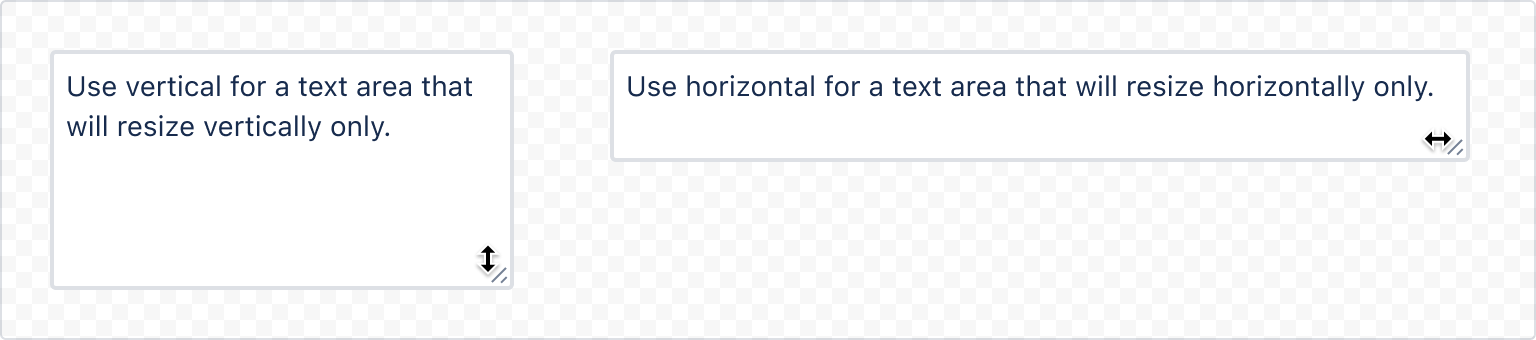
1
2export const TextAreaHorizontalResizeExample = () => (
  <TextArea
    resize="horizontal"
    name="resize-horizontal"
  />
);
1
2export const TextAreaVerticalResizeExample = () => (
  <TextArea
    resize="vertical"
    name="resize-vertical"
  />
);
Accessibility considerations
When using the TextArea component, we recommend keeping the following accessibility considerations in mind:
- Always use a label and associate the label to the field properly so that the text area is accessible to assistive technology.
- Avoid using placeholder text whenever possible. Make sure any critical information is communicated either in the field label or using helper text below the field. Search fields or brief examples are exceptions where placeholder text may be okay.
Rate this page: