- ADF renderer
- Atlassian icon (Preview)
- Atlassian tile (Preview)
- Badge
- Bleed (Preview)
- Box
- Breadcrumbs (Preview)
- Button
- Button group
- Calendar
- Chart - Bar
- Chart - Donut
- Chart - Horizontal bar
- Chart - Horizontal stack bar
- Chart - Line
- Chart - Pie
- Chart - Stack bar
- Checkbox
- Checkbox group
- Code
- Code block
- Comment
- Comment editor
- Chromeless editor
- Date picker
- Dynamic table
- Empty state
- File card (Preview)
- File picker (Preview)
- Form
- Frame
- Heading
- Icon
- Image
- Inline
- Inline edit
- Link
- List
- Lozenge
- Modal
- Popup
- Pagination (Preview)
- Pressable
- Progress bar
- Progress tracker
- Radio
- Radio group
- Range
- Router (Preview)
- Section message
- Select
- Spinner
- Stack
- Tabs
- Tag
- Tag group
- Text
- Text area
- Text field
- Time picker
- Tile (Preview)
- Toggle
- Tooltip
- User
- User group
- User picker
- XCSS
Last updated Feb 2, 2024
Button group
To add the ButtonGroup component to your app:
1
2import { ButtonGroup } from '@forge/react';
Description
A button group gives users access to frequently performed, related actions.
Props
| Name | Type | Required | Description |
|---|---|---|---|
appearance | "default" | "danger" | "link" | "primary" | "subtle" | "subtle-link" | "warning" | No | The appearance to apply to all buttons. |
children | Array<Button> | Yes | The buttons to render inside the button group. |
label | string | No | Refers to an aria-label attribute. Sets an accessible name for ButtonGroup wrapper to announce it to users of assistive technology. Usage of either this, or the titleId attribute is strongly recommended. |
titleId | string | No | ID referenced by the ButtonGroup wrapper's aria-labelledby attribute. This ID should be assigned to the group-button title element. Usage of either this, or the label attribute is strongly recommended. |
Examples
Appearance
Default
A button group displays multiple buttons together.
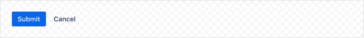
1
2import { Button, ButtonGroup } from '@forge/react';

const ButtonGroupDefaultExample = () => {
  return (
    <ButtonGroup label="Default button group">
      <Button appearance="primary">Submit</Button>
      <Button>Cancel</Button>
    </ButtonGroup>
  );
};
Primary
The appearance to apply to all buttons.
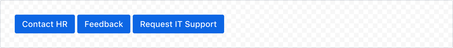
1
2import { Button, ButtonGroup } from '@forge/react';

const ButtonGroupAppearanceExample = () => {
  return (
    <ButtonGroup appearance="primary" label="Button group with appearance">
      <Button>Contact HR</Button>
      <Button>Feedback</Button>
      <Button>Request IT Support</Button>
    </ButtonGroup>
  );
};
For more examples, see the Button component.
Rate this page: