- ADF renderer
- Atlassian icon (Preview)
- Atlassian tile (Preview)
- Badge
- Bleed (Preview)
- Box
- Breadcrumbs (Preview)
- Button
- Button group
- Calendar
- Chart - Bar
- Chart - Donut
- Chart - Horizontal bar
- Chart - Horizontal stack bar
- Chart - Line
- Chart - Pie
- Chart - Stack bar
- Checkbox
- Checkbox group
- Code
- Code block
- Comment
- Comment editor
- Chromeless editor
- Date picker
- Dynamic table
- Empty state
- File card (Preview)
- File picker (Preview)
- Form
- Frame
- Heading
- Icon
- Image
- Inline
- Inline edit
- Link
- List
- Lozenge
- Modal
- Popup
- Pagination (Preview)
- Pressable
- Progress bar
- Progress tracker
- Radio
- Radio group
- Range
- Router (Preview)
- Section message
- Select
- Spinner
- Stack
- Tabs
- Tag
- Tag group
- Text
- Text area
- Text field
- Time picker
- Tile (Preview)
- Toggle
- Tooltip
- User
- User group
- User picker
- XCSS
Date picker
To add the DatePicker component to your app:
1
2import { DatePicker } from '@forge/react';
Description
A date picker allows the user to select a particular date.
Props
| Name | Type | Required | Available in macro config | Description |
|---|---|---|---|---|
appearance | "default" | "subtle" | "none" | No | No | Set the appearance of the picker. subtle will remove the borders, background, and icon. |
autoFocus | boolean | No | No | Set the picker to autofocus on mount. |
defaultIsOpen | boolean | No | No | The default for isOpen. Will be false if not provided. |
defaultValue | string | No | Yes | The default for value. This should be an ISO date. |
disabled | Array<string> | No | No | An array of ISO dates that should be disabled on the calendar. This does not affect what users can type into the picker. |
maxDate | string | No | No | The latest enabled date. Dates after this are disabled on the calendar. This does not affect what users can type into the picker. |
minDate | string | No | No | The earliest enabled date. Dates before this are disabled on the calendar. This does not affect what users can type into the picker. |
id | string | No | No | Sets the ID of the field. |
isDisabled | boolean | No | No | Set if the picker is disabled. |
isRequired | boolean | Only available for macro configuration, cannot be used for other extension points | Yes | Set if the picker is disabled. |
isOpen | boolean | No | No | Set if the picker is open. |
name | string | Required for macro configuration, not required for other extension points | Yes | The name of the field. |
nextMonthLabel | string | No | No | The aria-label attribute associated with the next-month arrow. Defaults to "Next month". |
onBlur | (e: BlurEvent) => void | No | No | Called when the field is blurred. |
onChange | (value: string) => void | No | No | Called when the value changes. The only argument is an ISO time or empty string. |
onFocus | (e: FocusEvent) => void | No | No | Called when the field is focused. |
previousMonthLabel | string | No | No | The aria-label attribute associated with the previous-month arrow. Defaults to "Previous month". |
shouldShowCalendarButton | boolean | No | No | Provides a functional calendar button that opens the calendar picker that lives on the right side of the date picker. Defaults to `false` |
spacing | "default" | "compact" | No | No | The spacing for the select control. |
value | string | No | No | The ISO time used as the input value. |
isInvalid | boolean | No | No | Set if the picker has an invalid value. |
dateFormat | string | No | No | Format the date with a string that is accepted by date-fn's format function. Note that this property only changes the displayed value, and that it does not affect the placeholder value nor the required format for manually-typed inputs. |
placeholder | string | No | Yes | Placeholder text displayed in input. |
locale | string | No | No | Locale used to format the date and calendar. See DateTimeFormat. Note that this affects the accepted format for the text input. |
weekStartDay | 0 | 1 |2 | 3 | 4 | 5 | 6 | No | No | Start day of the week for the calendar.0 Sunday (default value)1 Monday2 Tuesday3 Wednesday4 Thursday5 Friday6 Saturday |
Examples
Default
By default, selecting the date field opens the calendar view. The current date text is bold, underlined, and highlighted blue.
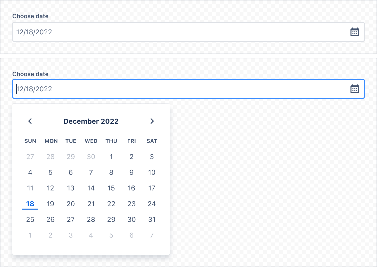
1
2const DatePickerDefaultExample = () => (
  <>
    <Label labelFor="default-date-picker-example">Choose date</Label>
    <DatePicker shouldShowCalendarButton id="default-date-picker-example" />
  </>
);
Field label and message
Always use a label component for each field and associate the label to the field properly. Use the HelperMessage component for any optional field-related message.
Required field label
For required fields, always add RequiredAsterisk component next to the label.
Validation
Use ErrorMessage or ValidationMessage components to display validation-related messages.
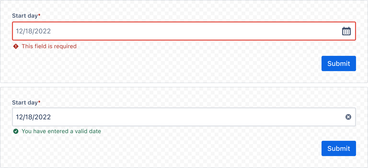
1
2import React from "react";
import { Form, FormSection, FormFooter, Label, DatePicker, Button, ErrorMessage, ValidMessage, RequiredAsterisk } from "@forge/react";


export const DatePickerFormExample = () => {
  const { register, handleSubmit, formState, getFieldId } = useForm();
  return (
    <Form
      onSubmit={handleSubmit((values) => console.log("form submitted", values))}
    >
      <FormSection>
        <Label labelFor={getFieldId("dateValue")}>
          Start day
          <RequiredAsterisk />
        </Label>
        <DatePicker shouldShowCalendarButton {...register("dateValue", { required: true })} />
        {formState.dirtyFields.dateValue && !formState.errors.dateValue && (
          <ValidMessage>You have entered a valid date</ValidMessage>
        )}
        {formState.errors.dateValue && (
          <ErrorMessage>This field is required</ErrorMessage>
        )}
      </FormSection>
      <FormFooter>
        <Button type="submit">Submit</Button>
      </FormFooter>
    </Form>
  );
};
Disabled dates
If a certain date is not a valid selection, you may disable it in the calendar shown to users. This does not restrict the dates that a user may type, so validation is necessary.
Specific dates
Use disabled to restrict selection of individual dates.
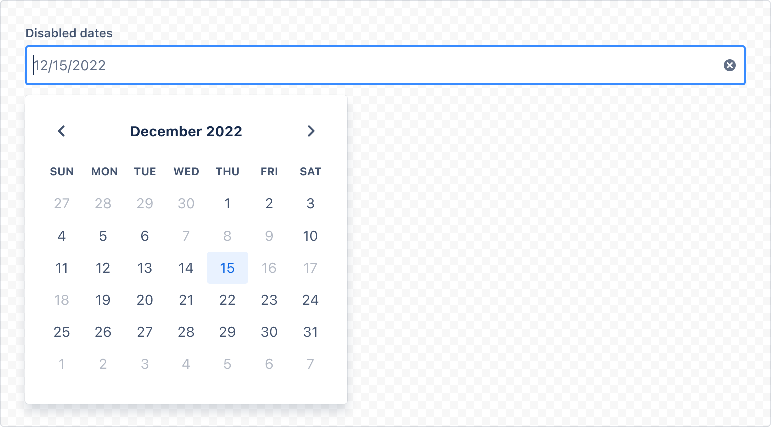
1
2import { DatePicker, Label } from "@forge/react";

const disabledDates = [
  '2022-12-07',
  '2022-12-08',
  '2022-12-09',
  '2022-12-16',
  '2022-12-17',
  '2022-12-18',
];

const DatePickerDisabledExample = () => (
  <>
    <Label labelFor="datepicker-disabled">Disabled Dates</Label>
    <DatePicker
      shouldShowCalendarButton
      defaultValue="2022-12-15"
      disabled={disabledDates}
      id="datepicker-disabled"
    />
  </>
);
Date ranges
Use minDate to set a minimum valid date and maxDate to set a maximum valid date. These can be used to define a valid date range.
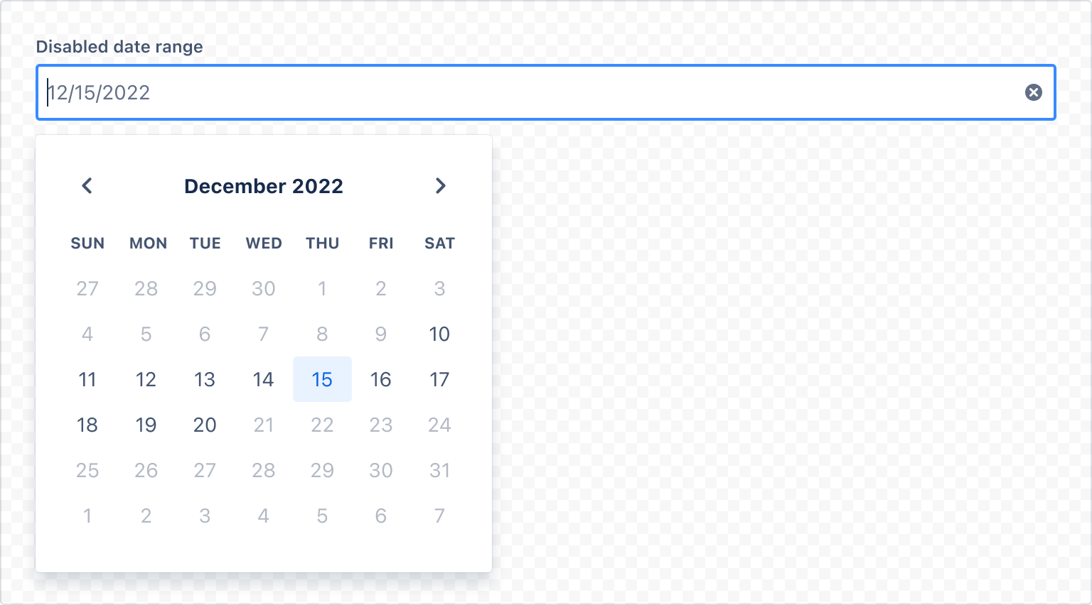
1
2import { DatePicker, Label } from "@forge/react";

const DatePickerDisableRangeExample = () => (
  <>
    <Label labelFor="datepicker-disabled-range">Disabled Date Range</Label>
    <DatePicker
      shouldShowCalendarButton
      defaultValue="2020-12-15"
      minDate="2022-12-10"
      maxDate="2022-12-20"
      id="datepicker-disabled-range"
    />
  </>
);
Internationalization
DatePicker supports internationalization through two props:
localeaffects language, format and, parsing.weekStartDaydetermines the first day of the week shown on the calendar.
Locale
Use locale to tailor UI copy to local audiences.
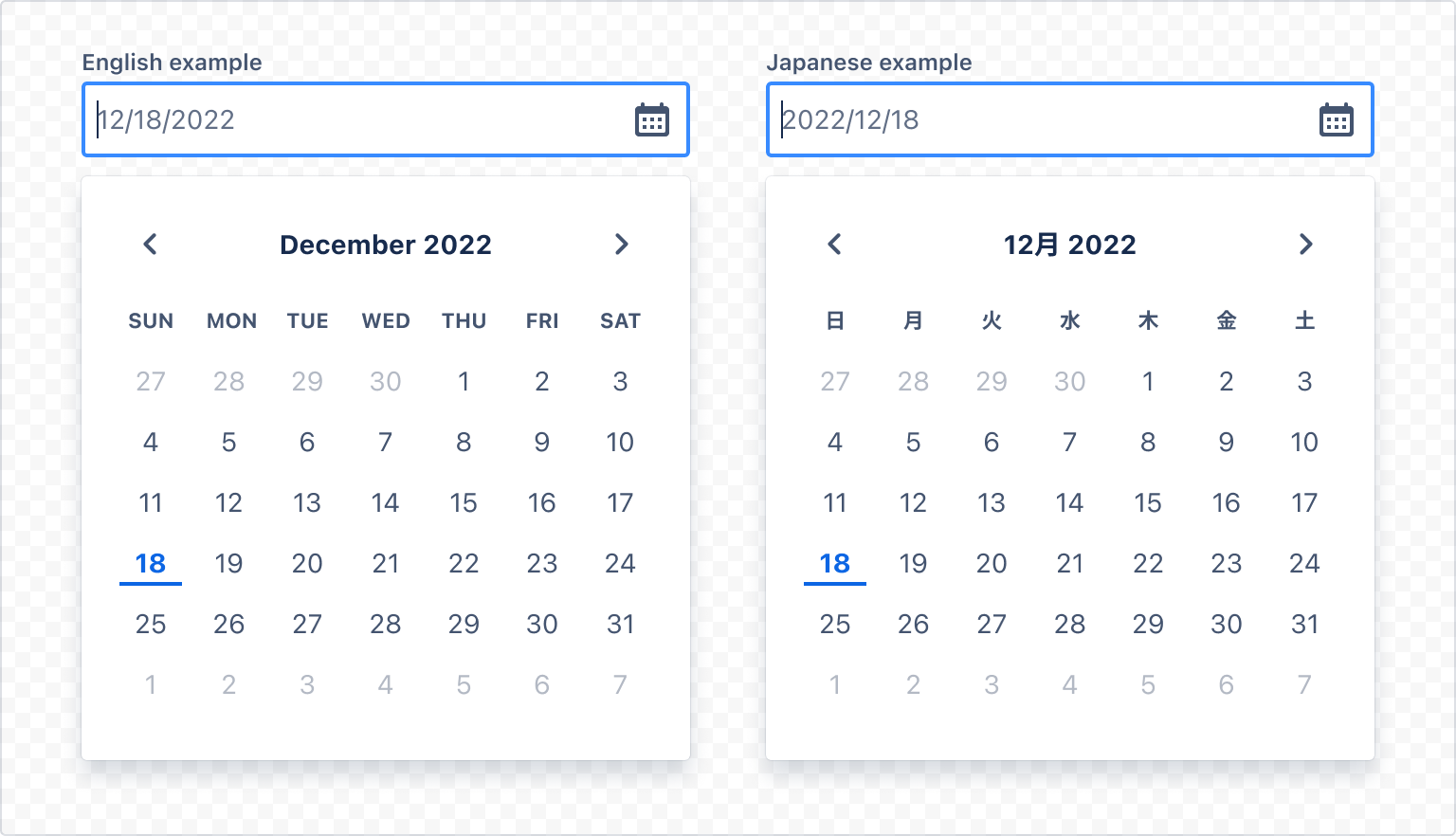
1
2import { DatePicker, Label } from "@forge/react";

const DatePickerLocaleExample = () => (
  <>
    <Label labelFor="datepicker-locale-en">English example</Label>
    <DatePicker
      shouldShowCalendarButton
      locale="en-US"
      id="datepicker-locale-en"
    />
    <Label labelFor="datepicker-locale-jp">Japanese example</Label>
    <DatePicker
      shouldShowCalendarButton
      locale="ja-JP"
      id="datepicker-locale-jp"
    />
  </>
);

export default DatePickerLocaleExample;
Week start day
Use weekStartDay to adjust which day of the week is shown first in the calendar. A value of 0 corresponds to Sunday (default), 1 to Monday, and so on.
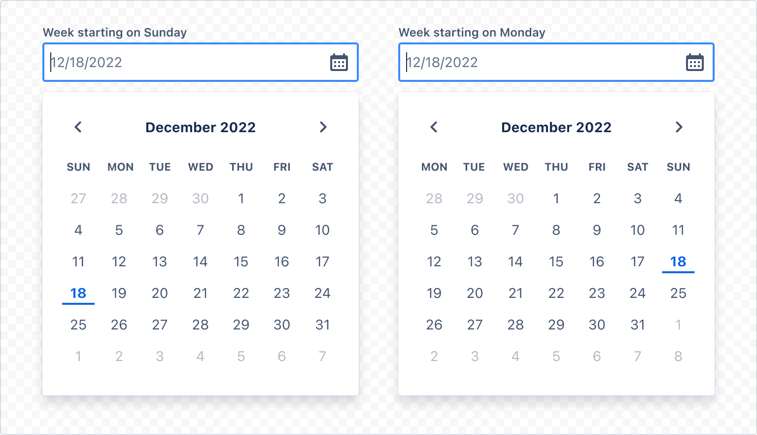
1
2import { DatePicker, Label } from "@forge/react";

const DatePickerWeekStartDayExample = () => (
  <>
    <Label labelFor="datepicker-sunday">Week starting on Sunday</Label>
    <DatePicker
      shouldShowCalendarButton
      weekStartDay={0}
      id="datepicker-sunday"
    />
    <Label labelFor="datepicker-monday">Week starting on Monday</Label>
    <DatePicker
      shouldShowCalendarButton
      weekStartDay={1}
      id="datepicker-monday"
    />
  </>
);
Date formats
You can customize the date format using the dateFormat prop. Formats are given as strings and use the syntax specified at Modern JavaScript date utility library.
Where possible, use locale for date formatting, instead of a custom format. Date formats should be informed by the user’s locale and the use case.
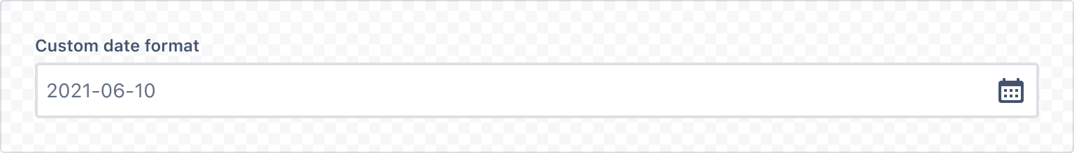
1
2import { DatePicker, Label } from "@forge/react";

const DatePickerFormattingExample = () => (
  <>
    <Label labelFor="datepicker-format">Custom Date Format</Label>
    <DatePicker
      shouldShowCalendarButton
      dateFormat="YYYY-MM-DD"
      placeholder="2021-06-10"
      id="datepicker-format"
    />
  </>
);
Accessibility considerations
When using the DatePicker component, we recommend keeping the following accessibility considerations in mind:
- Ensure that locale is appropriately set so that users see dates in a familiar format.
- Use a concise label to indicate what the date selection refers to.
- Allow multiple modes of data entry. Some users prefer entering date and time information by typing instead of selection, especially keyboard users.
- If some dates are disabled, provide accurate validation and error messaging for keyboard users, like "Please enter a future date."
- Use the
shouldShowCalendarButtonprop. It provides a button for users to show the calendar picker popup.
Rate this page: