- ADF renderer
- Atlassian icon (Preview)
- Atlassian tile (Preview)
- Badge
- Bleed (Preview)
- Box
- Breadcrumbs (Preview)
- Button
- Button group
- Calendar
- Chart - Bar
- Chart - Donut
- Chart - Horizontal bar
- Chart - Horizontal stack bar
- Chart - Line
- Chart - Pie
- Chart - Stack bar
- Checkbox
- Checkbox group
- Code
- Code block
- Comment
- Comment editor
- Chromeless editor
- Date picker
- Dynamic table
- Empty state
- File card (Preview)
- File picker (Preview)
- Form
- Frame
- Heading
- Icon
- Image
- Inline
- Inline edit
- Link
- List
- Lozenge
- Modal
- Popup
- Pagination (Preview)
- Pressable
- Progress bar
- Progress tracker
- Radio
- Radio group
- Range
- Section message
- Select
- Spinner
- Stack
- Tabs
- Tag
- Tag group
- Text
- Text area
- Text field
- Time picker
- Tile (Preview)
- Toggle
- Tooltip
- User
- User group
- User picker
- XCSS
Last updated Dec 15, 2025
Pressable
To add the Pressable component to your app:
1
2import { Pressable } from "@forge/react";
Description
A pressable is a primitive for building custom buttons.
Props
| Name | Type | Required | Description |
|---|---|---|---|
backgroundColor | Background color tokens | No | Token representing the background color with a built-in fallback value. |
children | string | ForgeElement | No | Elements to be rendered inside the pressable component. |
isDisabled | boolean | No | Disables the button. |
onClick | () => void | No | Handler called on click. |
padding | Space tokens | No | Tokens representing CSS shorthand for paddingBlock and paddingInline together. |
paddingBlock | Space tokens | No | Tokens representing CSS shorthand paddingBlock. |
paddingBlockEnd | Space tokens | No | Tokens representing CSS paddingBlockEnd. |
paddingBlockStart | Space tokens | No | Tokens representing CSS paddingBlockStart. |
paddingInline | Space tokens | No | Tokens representing CSS shorthand paddingInline. |
paddingInlineEnd | Space tokens | No | Tokens representing CSS paddingInlineEnd. |
paddingInlineStart | Space tokens | No | Tokens representing CSS paddingInlineStart. |
xcss | XCSSProp | No | Applies a subset of permitted styles using Atlassian Design System tokens. For a list of supported style properties on this component, see XCSS. |
Examples
Default
Pressable is unstyled by default, aside from basic focus styles.

1
2import { Pressable } from "@forge/react";

export const PressableExample = () => {
  const handleClick = () => {
    console.log("Clicked");
  };

  return <Pressable onClick={handleClick}>Pressable</Pressable>;
};
Basic styling with XCSS
Pressable can be styled using XCSS.
Ensure that the styling indicates the interaction state using :hover and :active pseudo-classes.
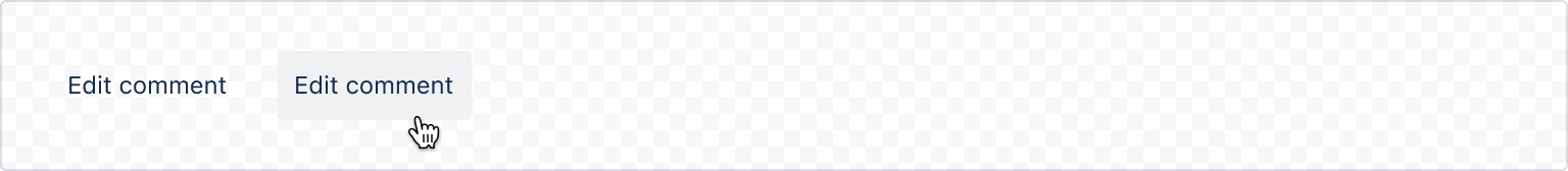
1
2import { Pressable, xcss } from "@forge/react";

const pressableStyles = xcss({
  color: "color.text.subtle",
  fontWeight: "font.weight.bold",
  borderRadius: "border.radius",

  ":hover": {
    backgroundColor: "color.background.neutral.subtle.hovered",
    color: "color.text",
  },
});

export const PressableExample = () => {
  const handleClick = () => {
    console.log("Clicked");
  };

  return (
    <Pressable
      onClick={handleClick}
      padding="space.100"
      backgroundColor="color.background.neutral.subtle"
      xcss={pressableStyles}
    >
      Edit comment
    </Pressable>
  );
};
Advanced styling
Use a combination of XCSS and other primitives for more complex designs.
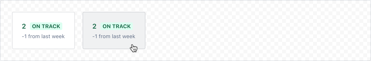
1
2const pressableStyles = xcss({
  minWidth: "150px",
  backgroundColor: "elevation.surface.raised",
  padding: "space.200",
  borderRadius: "border.radius",
  borderColor: "color.border",
  borderStyle: "solid",
  borderWidth: "border.width",
  ":hover": {
    backgroundColor: "color.background.neutral.subtle.hovered",
  },
  ":active": {
    backgroundColor: "color.background.neutral.subtle.pressed",
  },
});

export const PressableExample = () => {
  const handleClick = () => {
    console.log("click");
  };

  return (
    <Pressable xcss={pressableStyles} onClick={handleClick}>
      <Stack space="space.0" alignInline="start">
        <Inline space="space.100" alignBlock="center">
          <Text color="color.text.success" weight="bold" size="large">
            2
          </Text>
          <Lozenge appearance="success">on track</Lozenge>
        </Inline>
        <Text as="span" size="small" color="color.text.subtlest">
          -1 from last week
        </Text>
      </Stack>
    </Pressable>
  );
};
Accessibility considerations
- Avoid using
isDisabled. Disabled buttons are not reachable in the tab order and don’t receive hover, focus, or click events, making them entirely inaccessible to some people. Wherever possible, avoid usingisDisabledand instead use validation or other techniques to show users how to proceed. - Use clear labels for assistive technology. Pressable elements should always announce what action will happen once pressed, especially for elements with no visible label such as icon buttons.
Rate this page: