- ADF renderer
- Atlassian icon (Preview)
- Atlassian tile (Preview)
- Badge
- Bleed (Preview)
- Box
- Breadcrumbs (Preview)
- Button
- Button group
- Calendar
- Chart - Bar
- Chart - Donut
- Chart - Horizontal bar
- Chart - Horizontal stack bar
- Chart - Line
- Chart - Pie
- Chart - Stack bar
- Checkbox
- Checkbox group
- Code
- Code block
- Comment
- Comment editor
- Chromeless editor
- Date picker
- Dynamic table
- Empty state
- File card (Preview)
- File picker (Preview)
- Form
- Frame
- Heading
- Icon
- Image
- Inline
- Inline edit
- Link
- List
- Lozenge
- Modal
- Popup
- Pagination (Preview)
- Pressable
- Progress bar
- Progress tracker
- Radio
- Radio group
- Range
- Router (Preview)
- Section message
- Select
- Spinner
- Stack
- Tabs
- Tag
- Tag group
- Text
- Text area
- Text field
- Time picker
- Tile (Preview)
- Toggle
- Tooltip
- User
- User group
- User picker
- XCSS
Last updated Jan 29, 2024
Tabs
To add the Tabs, TabList, TabPanel, and Tab components to your app:
1
2import { Tabs, TabList, TabPanel, Tab } from "@forge/react";
Description
Tabs are used to organize content by grouping similar information on the same page. Tabs consist of a TabList and TabPanels, which list tab names and the content of tabs respectively.
Props
Tabs
Name | Type | Required | Description |
|---|---|---|---|
children | TabList | TabPanel | Yes | The children of Tabs. The first child should be a TabList filled with Tabs. Subsequent children should be TabPanels. There should be an equal amount of Tab for each TabPanel.
|
id | string | Yes | A unique ID that will be used to generate IDs for tabs and tab panels. This is required for accessibility purposes. |
defaultSelected | number | No | The index of the tab that will be selected by default when the component mounts. If not set, the first tab will be displayed by default. |
onChange | (index) => undefined | No | A callback function which will be fired when a tab is changed. It will be passed to the index of the selected tab and UIAnalyticsEvent. |
selected | number | No | The selected tab's index. If this prop is set, the component behaves as a controlled component. It will be up to you to listen to onChange. |
shouldUnmountTabPanelOnChange | boolean | No | Tabs by default leave tab panels mounted on the page after they have been selected. If you would like to unmount a tab panel when it is not selected, set this prop to be true. |
TabList
Name | Type | Required | Description |
|---|---|---|---|
children | ForgeElement | Yes | The children of the TabList component. The number of children must match the number of TabPanel components. Each child should be a Tab component, which defines the label for a corresponding TabPanel. While any ForgeElement can be wrapped around a Tab, only the Tab's direct children will be used as the tab label.
|
TabPanel
Name | Type | Required | Description |
|---|---|---|---|
children | ForgeElement | Yes | The children of TabPanel.
|
Tab
Name | Type | Required | Description |
|---|---|---|---|
children | string | Yes | The children of Tab.
|
Examples
Default
The default form of tabs.
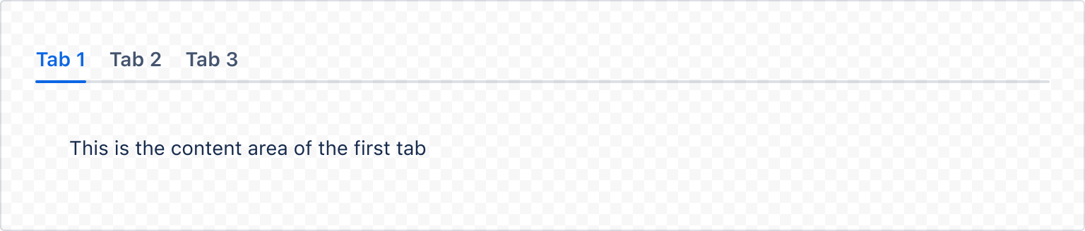
1
2import { Tabs, TabList, Tab, TabPanel, Box } from "@forge/react";

const TabsDefaultExample = () => {
  return (
    <Tabs id="default">
      <TabList>
        <Tab>Tab 1</Tab>
        <Tab>Tab 2</Tab>
        <Tab>Tab 3</Tab>
      </TabList>
      <TabPanel>
        <Box padding="space.300">
          This is the content area of the first tab.
        </Box>
      </TabPanel>
      <TabPanel>
        <Box padding="space.300">
          This is the content area of the second tab.
        </Box>
      </TabPanel>
      <TabPanel>
        <Box padding="space.300">
          This is the content area of the third tab.
        </Box>
      </TabPanel>
    </Tabs>
  );
};
Controlled
Tabs can be used as a controlled component.
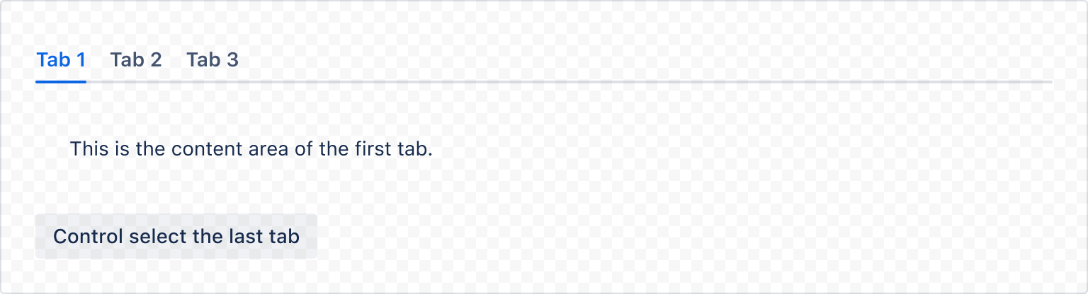
1
2const TabsControlledExample = () => {
  const [selected, setSelected] = useState(0);

  const handleUpdate = (index) => setSelected(index);

  return (
    <>
      <Tabs id="controlled" onChange={handleUpdate} selected={selected}>
        <TabList>
          <Tab>Tab 1</Tab>
          <Tab>Tab 2</Tab>
          <Tab>Tab 3</Tab>
        </TabList>
        <TabPanel>
          <Box padding="space.300">
            This is the content area of the first tab.
          </Box>
        </TabPanel>
        <TabPanel>
          <Box padding="space.300">
            This is the content area of the second tab.
          </Box>
        </TabPanel>
        <TabPanel>
          <Box padding="space.300">
            This is the content area of the third tab.
          </Box>
        </TabPanel>
      </Tabs>
      <Button onClick={() => handleUpdate(2)}>Select the last tab</Button>
    </>
  );
};
Customize tab
Wrap a tab
You can wrap a tab in other presentational components. In this example we have added a tooltip to each tab.
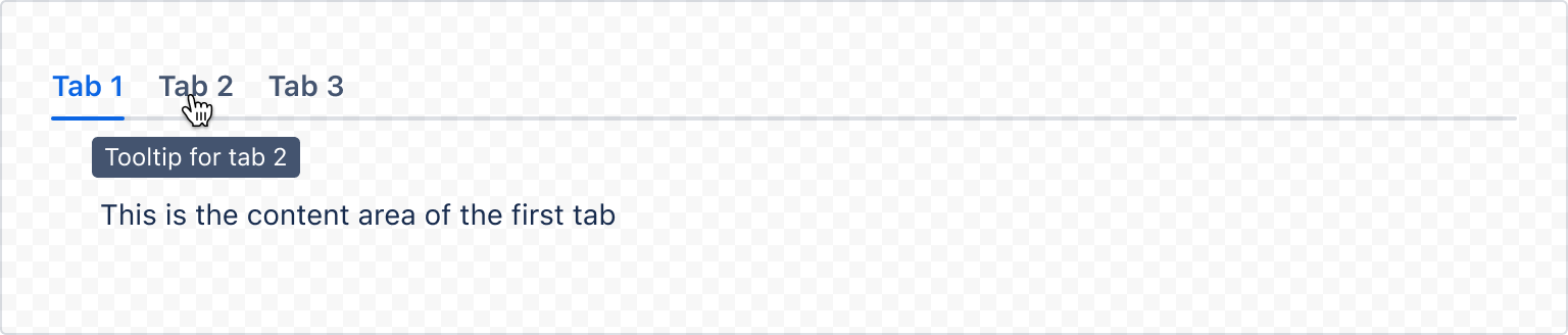
1
2const TabWrappingExample = () => {
  return (
    <Tabs id="tabs-wrapping">
      <TabList>
        <Tooltip content="Tooltip for tab 1">
          <Tab>Tab 1</Tab>
        </Tooltip>
        <Tooltip content="Tooltip for tab 2">
          <Tab>Tab 2</Tab>
        </Tooltip>
        <Tooltip content="Tooltip for tab 3">
          <Tab>Tab 3</Tab>
        </Tooltip>
      </TabList>
      <TabPanel>
        <Box padding="space.300">
          This is the content area of the first tab.
        </Box>
      </TabPanel>
      <TabPanel>
        <Box padding="space.300">
          This is the content area of the second tab.
        </Box>
      </TabPanel>
      <TabPanel>
        <Box padding="space.300">
          This is the content area of the third tab.
        </Box>
      </TabPanel>
    </Tabs>
  );
};
Rate this page: