- ADF renderer
- Atlassian icon (Preview)
- Atlassian tile (Preview)
- Badge
- Bleed (Preview)
- Box
- Breadcrumbs (Preview)
- Button
- Button group
- Calendar
- Chart - Bar
- Chart - Donut
- Chart - Horizontal bar
- Chart - Horizontal stack bar
- Chart - Line
- Chart - Pie
- Chart - Stack bar
- Checkbox
- Checkbox group
- Code
- Code block
- Comment
- Comment editor
- Chromeless editor
- Date picker
- Dynamic table
- Empty state
- File card (Preview)
- File picker (Preview)
- Form
- Frame
- Heading
- Icon
- Image
- Inline
- Inline edit
- Link
- List
- Lozenge
- Modal
- Popup
- Pagination (Preview)
- Pressable
- Progress bar
- Progress tracker
- Radio
- Radio group
- Range
- Router (Preview)
- Section message
- Select
- Spinner
- Stack
- Tabs
- Tag
- Tag group
- Text
- Text area
- Text field
- Time picker
- Tile (Preview)
- Toggle
- Tooltip
- User
- User group
- User picker
- XCSS
Section message
To add the SectionMessage and SectionMessageAction component to your app:
1
2import { SectionMessage, SectionMessageAction } from '@forge/react';
Description
A section message is used to alert users to a particular section of the screen.
Props
Section message
| Name | Type | Required | Description |
|---|---|---|---|
children | ForgeElement | Yes | The main content of the section message. |
appearance | "information" | "warning" | "error" | "success" | "discovery" | No | The appearance styling of the section message. |
title | string | No | The heading of the section message. |
actions | SectionMessageAction | SectionMessageAction[] | No | Actions for the user to take after reading the section message. An array of one or more SectionMessageAction React elements, which are applied as link buttons. Middle dots are automatically added between multiple link buttons, so no elements should be present between multiple actions. In general, avoid using more than two actions. |
Section message action
| Name | Type | Required | Description |
|---|---|---|---|
children | string | Yes | The text that needs to be displayed for section message action. |
onClick | (e: MouseEvent) => void | No | Click handler which will be attached to the rendered link button. |
href | string | No | The heading of the section message. |
Examples
Appearance
Information
The information section message is the default appearance used to signify a change in state or important information.
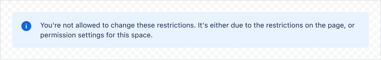
1
2const SectionMessageExample = () => (
  <SectionMessage appearance="information">
    <Text>
      You're not allowed to change these restrictions. It's either due to the
      restrictions on the page, or permission settings for this space.
    </Text>
  </SectionMessage>
);
Warning
Use a warning section message to help people:
- Avoid errors.
- Manage authentication issues.
- Take the steps needed to avoid potentially dangerous actions.
- Feel certain they're making the decision, for example, in confirmation modals.
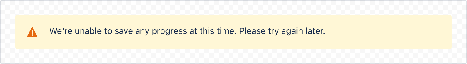
1
2const SectionMessageWarningExample = () => (
  <SectionMessage appearance="warning">
    <Text>
      We're unable to save any progress at this time. Please try again later.
    </Text>
  </SectionMessage>
);
Error
Use an error section message to let people know when:
- Something destructive or critical has happened.
- Access has been denied.
- There are connectivity issues.
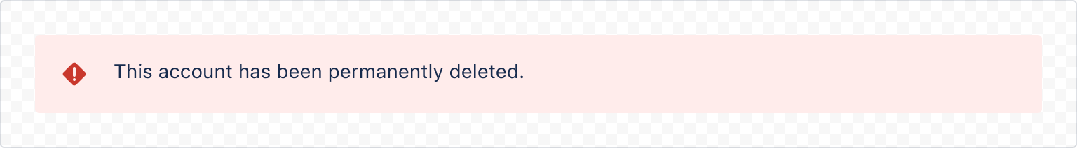
1
2const SectionMessageErrorExample = () => (
  <SectionMessage appearance="error">
    <Text>This account has been permanently deleted.</Text>
  </SectionMessage>
);
Success
Use a success section message to let the user know that an action or event has happened successfully.
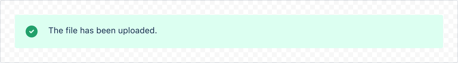
1
2const SectionMessageSuccessExample = () => (
  <SectionMessage appearance="success">
    <Text>The file has been uploaded.</Text>
  </SectionMessage>
);
Discovery
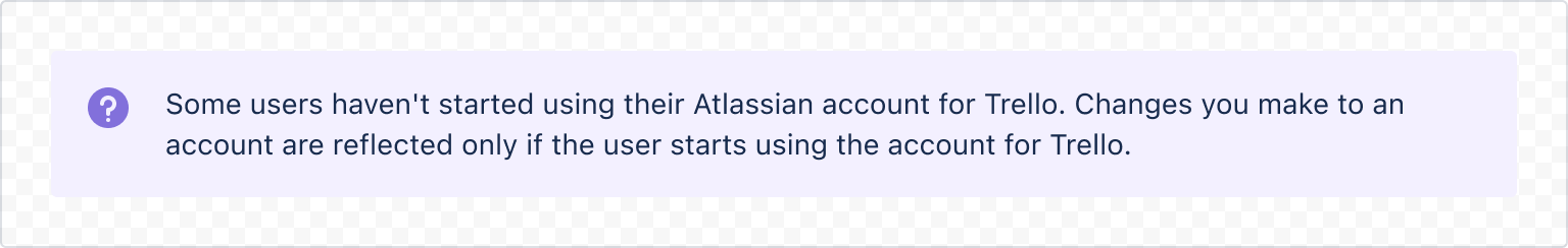
1
2const SectionMessageDiscoveryExample = () => (
  <SectionMessage appearance="discovery">
    <Text>
      Some users haven't started using their Atlassian account for Trello.
      Changes you make to an account are reflected only if the user starts using
      the account for Trello.
    </Text>
  </SectionMessage>
);
Message title
Use the title prop to add a title to a section message. This is useful for providing a brief summary of the message.
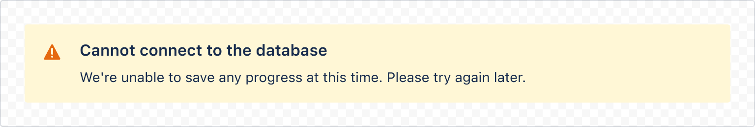
1
2const SectionMessageTitleExample = () => (
  <SectionMessage
    title="Can't connect to the database"
    appearance="warning"
  >
    <Text>We're unable to save any progress at this time. Please try again later.</Text>
  </SectionMessage>
);
Action
Use the actions prop to let people act on the content in the section message.
The SectionMessageAction component is designed to work with the actions prop.
An action will render a button if you supply an onClick handler, or a link if you supply an href.
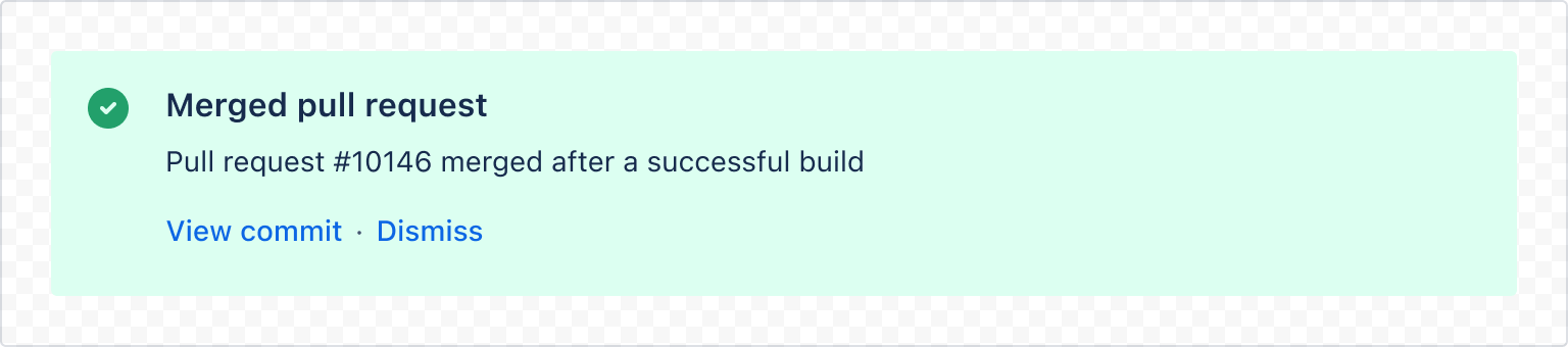
1
2const SectionMessageActionExample = () => (
  <SectionMessage
    title="Merged pull request"
    appearance="success"
    actions={[
      <SectionMessageAction href="#">View commit</SectionMessageAction>,
      <SectionMessageAction onClick={() => alert('Click')}>Dismiss</SectionMessageAction>,
    ]}
  >
    <Text>Pull request #10146 merged after a successful build </Text>
  </SectionMessage>
);
Accessibility considerations
When using the SectionMessage component, we recommend keeping the following accessibility considerations in mind:
- Don't rely on colour alone to convey the severity of the message. Ensure that the accompanying text clearly explains when the message is a warning or an error.
- For warning and error messages, always try to avoid dead ends and provide people with information on how to proceed to resolve the issue.
- Ensure that links accurately describe the destination. For example, say "About user permissions" rather than "Learn more".
Rate this page: