- ADF renderer
- Atlassian icon (Preview)
- Atlassian tile (Preview)
- Badge
- Bleed (Preview)
- Box
- Breadcrumbs (Preview)
- Button
- Button group
- Calendar
- Chart - Bar
- Chart - Donut
- Chart - Horizontal bar
- Chart - Horizontal stack bar
- Chart - Line
- Chart - Pie
- Chart - Stack bar
- Checkbox
- Checkbox group
- Code
- Code block
- Comment
- Comment editor
- Chromeless editor
- Date picker
- Dynamic table
- Empty state
- File card (Preview)
- File picker (Preview)
- Form
- Frame
- Heading
- Icon
- Image
- Inline
- Inline edit
- Link
- List
- Lozenge
- Modal
- Popup
- Pagination (Preview)
- Pressable
- Progress bar
- Progress tracker
- Radio
- Radio group
- Range
- Section message
- Select
- Spinner
- Stack
- Tabs
- Tag
- Tag group
- Text
- Text area
- Text field
- Time picker
- Tile (Preview)
- Toggle
- Tooltip
- User
- User group
- User picker
- XCSS
Last updated Jan 29, 2024
Spinner
To add the Spinner component to your app:
1
2import { Spinner } from '@forge/react';
Description
A spinner is an animated spinning icon that lets users know that content is being loaded.
Props
Name | Type | Required | Description |
|---|---|---|---|
appearance | "inherit" | "invert" | No | You can use this to invert the current theme. This is useful when you are displaying a spinner on a background that is not the same background color scheme as the main content. |
delay | number | No | Delay the intro animation of the spinner. This is not to be used to avoid quick flickering of the spinner. The spinner will automatically fade in and takes ~200ms to become partially visible. This prop can be helpful for long delays such as 500-1000ms for when you want to not show a spinner until some longer period of time has elapsed. |
label | string | No | Describes what the spinner is doing for assistive technologies. For example, "loading", "submitting", or "processing". |
size | 'xsmall' | 'small' | 'medium' | 'large' | 'xlarge' | number | No | Size of the spinner. The available sizes are xsmall, small, medium, large, and xlarge. For most use cases, we recommend medium. |
Examples
Default
The default form of the spinner.

1
2const SpinnerExample = () => <Spinner label="loading" />
Invert
Use the invert appearance when using the spinner on a dark background.

1
2const SpinnerInvertExample = () => <Spinner label="loading" appearance="invert" />
Sizes
The spinner can be set to different sizes. medium is the default size and is recommended for most use cases.
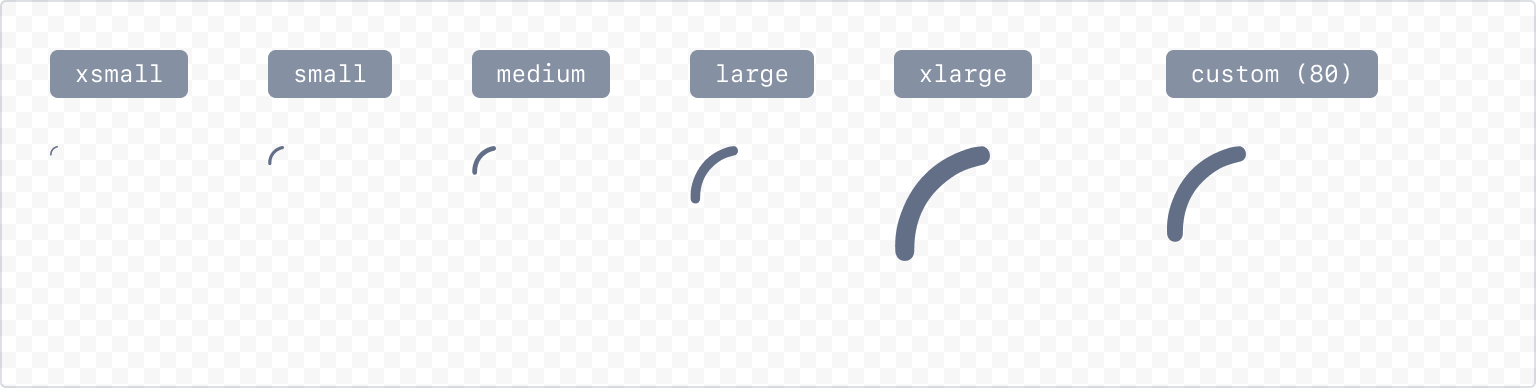
1
2const SpinnerSizeExample = () => {
  return (
    <Inline>
      <Spinner size="xsmall" />
      <Spinner size="small" />
      <Spinner size="medium" />
      <Spinner size="large" />
      <Spinner size="xlarge" />
      <Spinner size={80} />
    </Inline>
  );
}
Accessibility considerations
When using the Spinner component, we recommend keeping the following accessibility considerations in mind:
- Always use a label to add context for assistive technologies. Make sure the label accurately describes the type of process that's occurring. For example, "loading", "submitting", or "processing".
Rate this page: