- ADF renderer
- Atlassian icon (Preview)
- Atlassian tile (Preview)
- Badge
- Bleed (Preview)
- Box
- Breadcrumbs (Preview)
- Button
- Button group
- Calendar
- Chart - Bar
- Chart - Donut
- Chart - Horizontal bar
- Chart - Horizontal stack bar
- Chart - Line
- Chart - Pie
- Chart - Stack bar
- Checkbox
- Checkbox group
- Code
- Code block
- Comment
- Comment editor
- Chromeless editor
- Date picker
- Dynamic table
- Empty state
- File card (Preview)
- File picker (Preview)
- Form
- Frame
- Heading
- Icon
- Image
- Inline
- Inline edit
- Link
- List
- Lozenge
- Modal
- Popup
- Pagination (Preview)
- Pressable
- Progress bar
- Progress tracker
- Radio
- Radio group
- Range
- Router (Preview)
- Section message
- Select
- Spinner
- Stack
- Tabs
- Tag
- Tag group
- Text
- Text area
- Text field
- Time picker
- Tile (Preview)
- Toggle
- Tooltip
- User
- User group
- User picker
- XCSS
Comment
To add the Comment component to your app:
1
2import { Comment } from "@forge/react";
Description
A comment displays discussions and user feedback.
Props
| Name | Type | Required | Description |
|---|---|---|---|
actions | { onClick?: () => void | undefined; text: string; }[] | No | A list of CommentAction items rendered as a row of buttons below the content. |
author | { onClick?: () => void | undefined; text: string; } | No | A CommentAuthor element containing the name of the author. |
avatar | null | string | number | false | true | Iterable<ForgeElement> | Yes | The element to display as the avatar. It's best to use @atlaskit/avatar. |
children | string | No | Provides nested comments as children. |
content | string | number | boolean | ForgeElement | No | The main content for the comment. |
edited | string | No | A CommentEdited element which displays next to the time. Indicates whether the comment has been edited. |
errorActions | { onClick?: () => void | undefined; text: string; }[] | No | A list of CommentAction items rendered with a warning icon instead of the actions. |
errorIconLabel | string | No | Text to show in the error icon label. |
headingLevel | "1" | "2" | "3" | "4" | "5" | "6" | No | Use this to set the semantic heading level of the comment. The default comment heading has an h3 tag. Make sure that headings are in the correct order and don’t skip levels. |
highlighted | boolean | No | Sets whether this comment should be highlighted. |
id | string | No | An ID to be applied to the comment. |
isError | boolean | No | Indicates whether the component is in an error state. Hides actions and time. |
isSaving | boolean | No | Enables "optimistic saving" mode which removes actions and displays text from the savingText prop. |
restrictedTo | string | number | boolean | No | Text for the "restricted to" label. This will display in the top items, before the main content. |
savingText | string | No | Text to show when in "optimistic saving" mode. |
shouldRenderNestedCommentsInline | boolean | No | Controls if nested comments are rendered at the same depth as the parent comment. |
time | { onClick?: () => void | undefined; text: string; } | No | A CommentTime element containing the time to display. |
type | string | No | The type of comment. This will be rendered in a lozenge at the top of the comment, before the main content. |
Examples
Default
The simplest form of a comment contains an avatar and text.
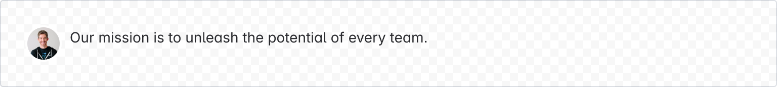
1
2import { Comment, Text, User } from "@forge/react";

export const CommentDefaultExample = () => {
  return (
    <Comment
      avatar={<User accountId="1234" hideDisplayName />}
      content={
        <Text>Our mission is to unleash the potential of every team.</Text>
      }
    />
  );
};
Full
Many features are available to customize the display of the comment.
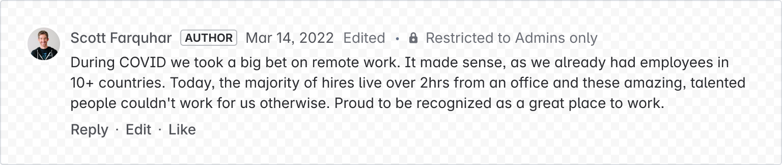
1
2import { Comment, Text, User } from "@forge/react";

export const CommentFullExample = () => {
  return (
    <Comment
      avatar={<User accountId="1234" hideDisplayName />}
      author={{ text: "Scott Farquhar" }}
      type="author"
      edited={"Edited"}
      restrictedTo="Restricted to Admins Only"
      time={{ text: "Mar 14, 2024" }}
      content={
        <Text>
          During COVID we took a big bet on remote work. It made sense, as we
          already had employees in 10+ countries. Today, the majority of hires
          live over 2hrs from an office and these amazing, talented people
          couldn't work for us otherwise. Proud to be recognized as a great
          place to work.
        </Text>
      }
      actions={[
        { text: "Reply", onClick: () => console.log("Reply") },
        { text: "Edit", onClick: () => console.log("Edit") },
        { text: "Like", onClick: () => console.log("Like") },
      ]}
    />
  );
};
Nested
Comments can be nested inside of each other by passing comments as children.
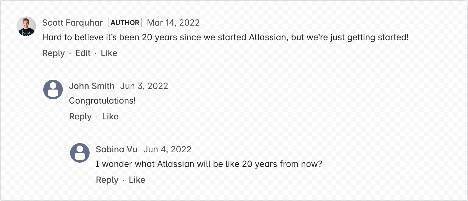
1
2import { Comment, Text, User } from "@forge/react";

export const CommentNestedExample = () => {
    return (
    <Comment
        avatar={<User accountId="123" hideDisplayName />}
        author={{ text: "Scott Farquhar" }}
        type="author"
        time={{ text: "Jun 3, 2022" }}
        content={
            <Text>
            Hard to believe it’s been 20 years since we started Atlassian, but
            we’re just getting started!
            </Text>
        }
        actions={[
            { text: "Reply", onClick: () => console.log("Reply") },
            { text: "Edit", onClick: () => console.log("Edit") },
            { text: "Like", onClick: () => console.log("Like") },
        ]}
        >
        <Comment
            avatar={<User accountId="456" hideDisplayName />}
            author={{ text: "John Smith" }}
            time={{ text: "Jun 3, 2022" }}
            content={<Text>Congratulations!</Text>}
            actions={[
            { text: "Reply", onClick: () => console.log("Reply") },
            { text: "Like", onClick: () => console.log("Like") },
            ]}
        >
            <Comment
            avatar={<User accountId="789" hideDisplayName />}
            author={{ text: "Sabrina Vu" }}
            time={{ text: "Jun 4, 2022" }}
            content={
                <Text>
                I wonder what Atlassian will be like 20 years from now?
                </Text>
            }
            actions={[
                { text: "Reply", onClick: () => console.log("Reply") },
                { text: "Like", onClick: () => console.log("Like") },
            ]}
            />
    </Comment>);
}
Saving
An "optimistic saving" mode can be enabled using isSaving, which hides actions and lets people know the comment is saving, by showing text from the savingText prop.
Using the optimistic UI technique means that people receive a fast, responsive experience even on limited connections.
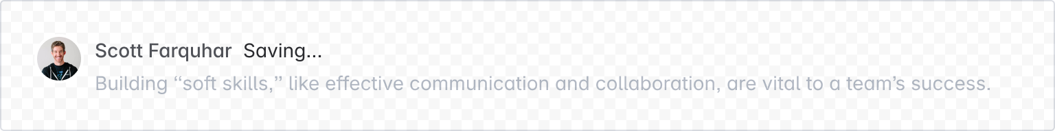
1
2import { Comment, Text, User } from "@forge/react";

export const CommentSavingExample = () => {
  return (
    <Comment
      isSaving={true}
      savingText="Saving..."
      avatar={<User accountId="62f3edc4f15eecaf501058fd" hideDisplayName />}
      author={{ text: "Scott Farquhar" }}
      time={{ text: "Mar 14, 2024" }}
      content={
        <Text>
          Building “soft skills,” like effective communication and
          collaboration, are vital to a team’s success.
        </Text>
      }
      actions={[
        { text: "Reply", onClick: () => console.log("Reply") },
        { text: "Edit", onClick: () => console.log("Edit") },
        { text: "Like", onClick: () => console.log("Like") },
      ]}
    />
  );
};
Edited
Mark a comment as edited by passing in the edited prop.
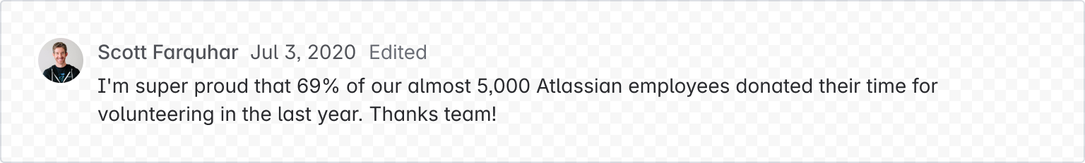
1
2import { Comment, Text, User } from "@forge/react";

export const CommentEditedExample = () => {
  return (
    <Comment
      avatar={<User accountId="1234" hideDisplayName />}
      author={{ text: "Scott Farquhar", onClick: () => console.log("Clicked") }}
      edited="Edited"
      time={{ text: "Jul 3, 2020", onClick: () => console.log("Clicked") }}
      content={
        <Text>Our mission is to unleash the potential of every team.</Text>
      }
    />
  );
};
Restricted
Display a message in the comment header by using the restrictedTo prop.
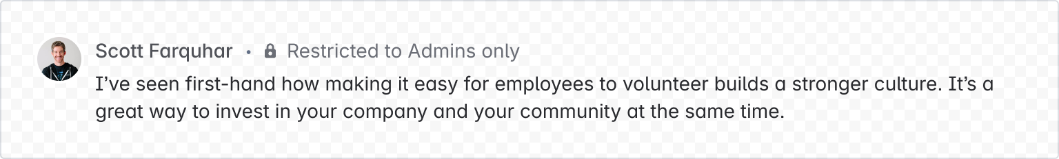
1
2import { Comment, Text, User } from "@forge/react";

export const CommentRestrictedExample = () => {
  return (
    <Comment
      avatar={<User accountId="1234" hideDisplayName />}
      author={{ text: "Scott Farquhar" }}
      restrictedTo="Restricted to Admins Only"
      content={
        <Text>
          I’ve seen first-hand how making it easy for employees to volunteer
          builds a stronger culture. It’s a great way to invest in your company
          and your community at the same time.
        </Text>
      }
    />
  );
};
Highlighted
Highlight a comment using the highlighted prop.
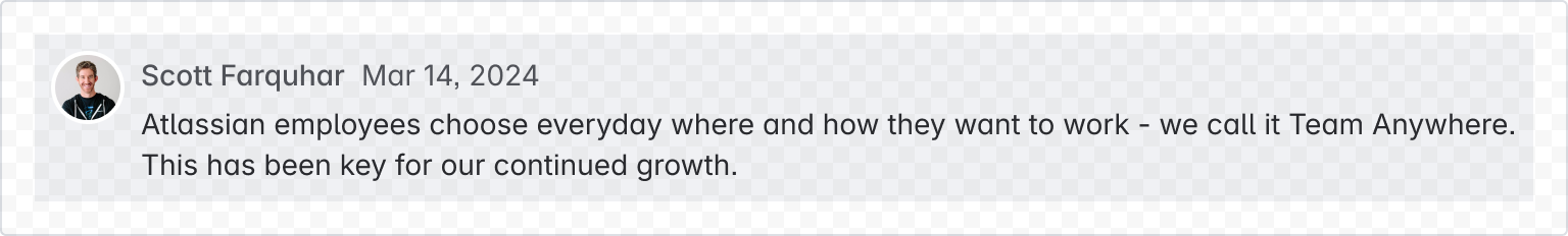
1
2import { Comment, Text, User } from "@forge/react";

export const CommentHighlightedExample = () => {
  return (
    <Comment
      avatar={<User accountId="1234" hideDisplayName />}
      author={{ text: "Scott Farquhar" }}
      highlighted={true}
      time={{ text: "Mar 14, 2024" }}
      content={
        <Text>
          Atlassian employees choose everyday where and how they want to work -
          we call it Team Anywhere. This has been key for our continued growth.
        </Text>
      }
    />
  );
};
Custom heading level
Change the heading level using the headingLevel prop. The default heading has an h3 tag. Make sure that headings are in the correct order and don’t skip levels. For example, an h3 should follow an h2 or lower, never an h1.
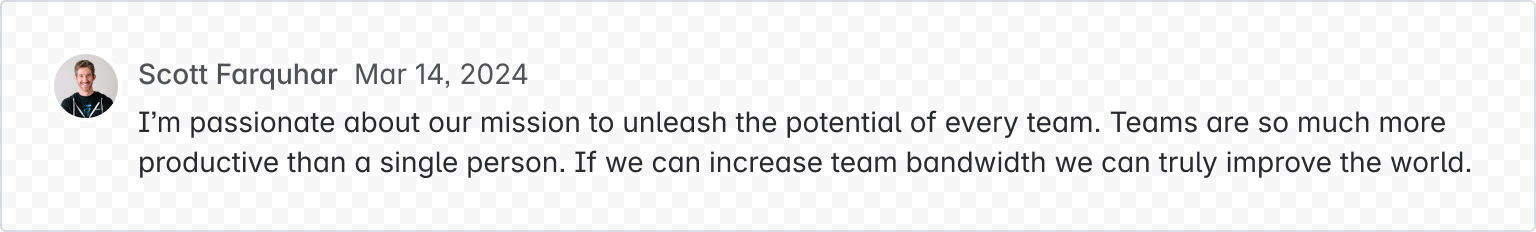
1
2import { Comment, Text, User } from "@forge/react";

export const CommentHeadingLevelExample = () => {
  return (
    <Comment
      avatar={<User accountId="1234" hideDisplayName />}
      author={{ text: "Scott Farquhar" }}
      headingLevel="5"
      time={{ text: "Mar 14, 2024" }}
      content={
        <Text>
          I’m passionate about our mission to unleash the potential of every
          team. Teams are so much more productive than a single person. If we
          can increase team bandwidth we can truly improve the world.
        </Text>
      }
    />
  );
};
Accessibility considerations
When using the Comment component, we recommend keeping the following accessibility considerations in mind:
- Including headings with comments is recommended. Use the
headingLevelprop to configure the heading level. The default heading has anh3tag. Make sure that headings are in the correct order and don’t skip levels. For example, anh3comment should follow anh2section heading, or anotherh3comment, but never anh1. - Use flat comments sections for areas where the conversation is likely to be short and focused.
- Use nested comments when broad discussions can happen among multiple participants, and people are more likely to need to differentiate between conversation threads.
Rate this page: