- ADF renderer
- Atlassian icon (Preview)
- Atlassian tile (Preview)
- Badge
- Box
- Button
- Button group
- Calendar
- Chart - Bar
- Chart - Donut
- Chart - Horizontal bar
- Chart - Horizontal stack bar
- Chart - Line
- Chart - Pie
- Chart - Stack bar
- Checkbox
- Checkbox group
- Code
- Code block
- Comment
- Comment editor
- Chromeless editor
- Date picker
- Dynamic table
- Empty state
- File card (EAP)
- File picker (EAP)
- Form
- Frame
- Heading
- Icon
- Image
- Inline
- Inline edit
- Link
- List
- Lozenge
- Modal
- Popup
- Pressable
- Progress bar
- Progress tracker
- Radio
- Radio group
- Range
- Section message
- Select
- Spinner
- Stack
- Tabs
- Tag
- Tag group
- Text
- Text area
- Text field
- Time picker
- Tile (Preview)
- Toggle
- Tooltip
- User
- User group
- User picker
- XCSS
Lozenge
To add the Lozenge component to your app:
1
2import { Lozenge } from '@forge/react';
Description
A lozenge is a visual indicator used to highlight an item's status for quick recognition.
Props
| Name | Type | Required | Description |
|---|---|---|---|
appearance | "default" | "inprogress" | "moved" | "new" | "removed" | "success" | No | The appearance type. |
children | string | No | Elements to be rendered inside the lozenge. This should ideally be just a word or two. |
isBold | boolean | No | Determines whether to apply the bold style or not. |
maxWidth | string | number | No | Max-width of lozenge container. Default to 200px. |
Examples
Default
Use default lozenges for a general status. For example: "to do", "unavailable", "minor", or "not started".
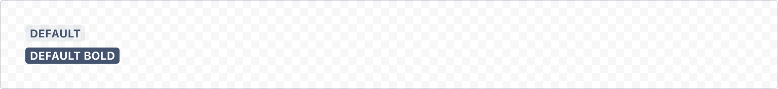
1
2const LozengeDefaultExample = () => (
  <Stack space='space.050' alignInline='start'>
    <Lozenge>Default</Lozenge>
    <Lozenge isBold>Default bold</Lozenge>
  </Stack>
);
Success
Use success lozenges to represent a constructive status. For example: "available", "completed", "approved", "resolved", or "added".
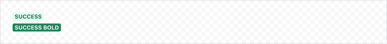
1
2const LozengeSuccessExample = () => (
  <Stack space='space.050' alignInline='start'>
    <Lozenge appearance="success">Success</Lozenge>
    <Lozenge appearance="success" isBold>
      Success bold
    </Lozenge>
  </Stack>
);
Removed
Use removed lozenges to represent a critical or problematic status. For example: "error", "declined", "deleted", or "failed".
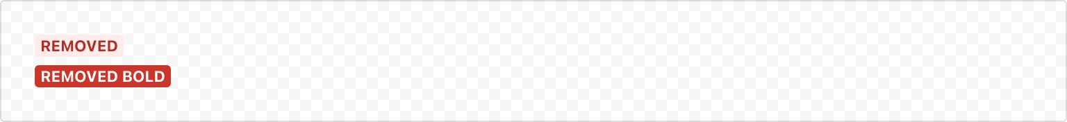
1
2const LozengeRemovedExample = () => (
  <Stack space='space.050' align='start'>
    <Lozenge appearance="removed">Removed</Lozenge>
    <Lozenge appearance="removed" isBold>
      Removed Bold
    </Lozenge>
  </Stack>
);
In progress
Use inprogress lozenges to represent an in progress or current status. For example: "in progress", "open", or "modified".
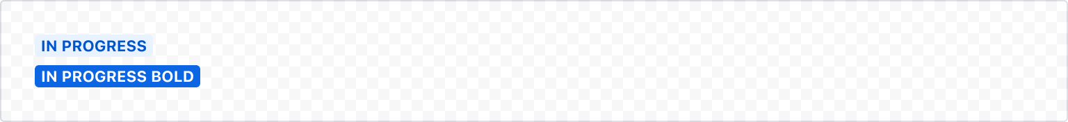
1
2const LozengeInProgressExample = () => (
  <Stack space='space.050' alignInline='start'>
    <Lozenge appearance="inprogress">In progress</Lozenge>
    <Lozenge appearance="inprogress" isBold>
      In progress bold
    </Lozenge>
  </Stack>
);
New
Use new lozenges to represent a new status. For example: "new", "created", or "help".
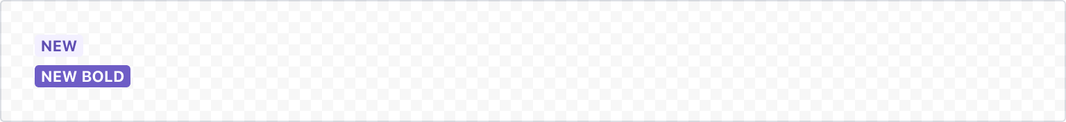
1
2const LozengeNewExample = () => (
  <Stack space='space.050' alignInline='start'>
    <Lozenge appearance="new">New</Lozenge>
    <Lozenge appearance="new" isBold>
      New bold
    </Lozenge>
  </Stack>
);
Moved
Use moved lozenges to represent a status for items that have changed and require attention. For example: "busy", "blocked", "missing", or "warning".
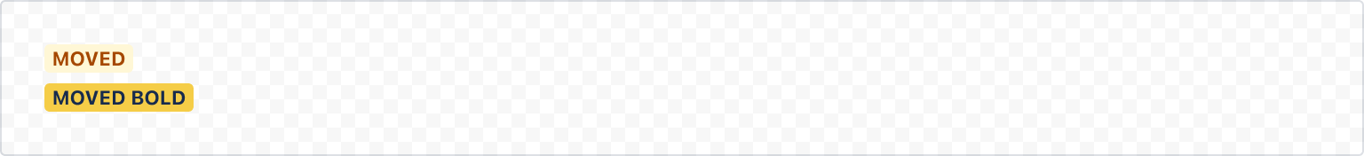
1
2const LozengeMovedExample = () => (
  <Stack space='space.050' alignInline='start'>
    <Lozenge appearance="moved">Moved</Lozenge>
    <Lozenge appearance="moved" isBold>
      Moved bold
    </Lozenge>
  </Stack>
);
Max width
When the text in the lozenge exceeds the maximum width, it will be truncated with an ellipsis. By default, the maximum width of a lozenge is 200px. You can use the maxWidth prop to customize the width of the lozenge.
Avoid truncation wherever possible by using shorter text in lozenges. The truncated text is not focusable or accessible.
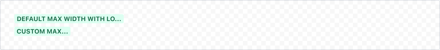
1
2const LozengeMaxWidthExample = () => (
  <Stack space='space.050' alignInline='start'>
    <Lozenge appearance="success">
      default max width with long text which truncates
    </Lozenge>
    <Lozenge appearance="success" maxWidth={100}>
      custom max width with long text which truncates
    </Lozenge>
  </Stack>
);
Accessibility considerations
When using the Lozenge component, we recommend keeping the following accessibility considerations in mind:
- Don't use color alone to signify an important state. Instead, use an accurate label. For example: for a critical status, use words like "Error" or "Warning".
- Don't use lozenges for long text. Lozenges are not focusable, so any text that gets truncated after 200 pixels (or the custom
maxWidthvalue) will not be accessible.
Rate this page: