- ADF renderer
- Atlassian icon (Preview)
- Atlassian tile (Preview)
- Badge
- Box
- Button
- Button group
- Calendar
- Chart - Bar
- Chart - Donut
- Chart - Horizontal bar
- Chart - Horizontal stack bar
- Chart - Line
- Chart - Pie
- Chart - Stack bar
- Checkbox
- Checkbox group
- Code
- Code block
- Comment
- Comment editor
- Chromeless editor
- Date picker
- Dynamic table
- Empty state
- File card (EAP)
- File picker (EAP)
- Form
- Frame
- Heading
- Icon
- Image
- Inline
- Inline edit
- Link
- List
- Lozenge
- Modal
- Popup
- Pressable
- Progress bar
- Progress tracker
- Radio
- Radio group
- Range
- Section message
- Select
- Spinner
- Stack
- Tabs
- Tag
- Tag group
- Text
- Text area
- Text field
- Time picker
- Tile (Preview)
- Toggle
- Tooltip
- User
- User group
- User picker
- XCSS
Box
To add the Box component to your app:
1
2import { Box } from '@forge/react';
Description
A box is a generic container that provides managed access to design tokens.
Props
| Name | Type | Required | Description |
|---|---|---|---|
backgroundColor | Background color tokens | No | A token alias for background color. See: Design tokens for a list of available colors. When the background color is set to a surface token, the current surface CSS variable will also be set to this value in the Box styles. |
padding | Space tokens | No | A shorthand for paddingBlock and paddingInline together. |
paddingBlock | Space tokens | No | The logical block start and end padding of an element. |
paddingBlockEnd | Space tokens | No | The logical block end padding of an element. |
paddingBlockStart | Space tokens | No | The logical block start padding of an element. |
paddingInline | Space tokens | No | The logical inline start and end padding of an element. |
paddingInlineEnd | Space tokens | No | The logical inline end padding of an element. |
paddingInlineStart | Space tokens | No | The logical inline start padding of an element. |
role | string | No | Accessible role. |
xcss | XCSSProp | No | Apply a subset of permitted styles, powered by Atlassian Design System tokens. For a list of supported style properties on this component, see here. |
Examples
Basic
Box is a general-purpose container that allows for controlled use of design tokens. Use the given props to configure display behavior and styling that aligns with the Atlassian Design System. Use XCSS to style primitive components safely with tokens (and CSS for selected properties).
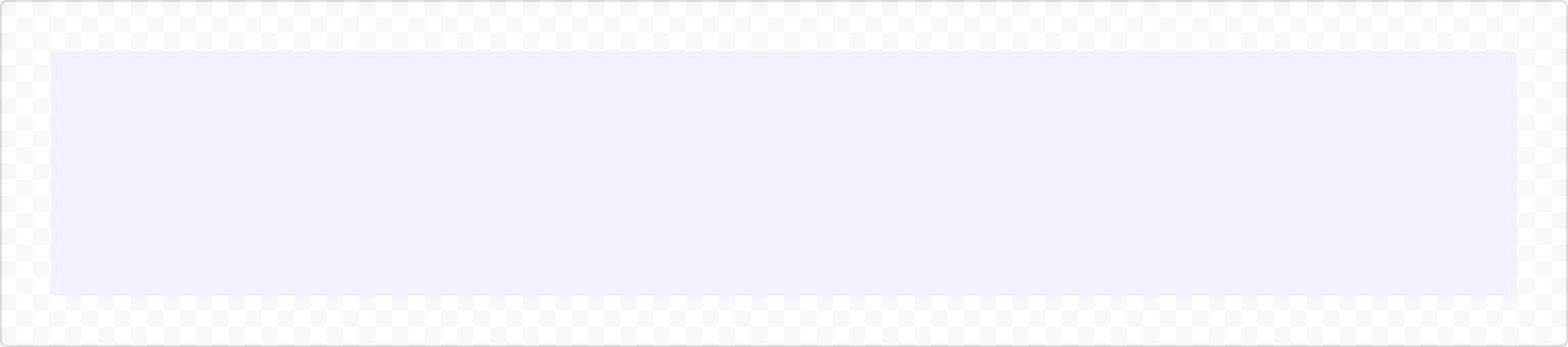
1
2import { Box, xcss } from '@forge/react';

export default () => {
  return (
    <Box
      padding='space.400'
      backgroundColor='color.background.discovery'
    />
  );
};
Background color
Box accepts a wide variety of background colors, referenced as semantic design tokens. For the full list of color tokens, visit the token list.
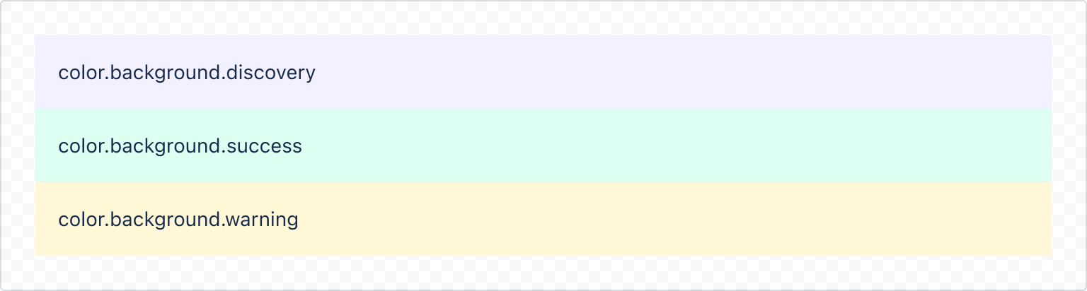
1
2export default () => {
  return (
    <>
      <Box
        padding='space.200'
        backgroundColor='color.background.discovery'
      >
        color.background.discovery
      </Box>
      <Box
        padding='space.200'
        backgroundColor='color.background.success'
      >
        color.background.success
      </Box>
      <Box
        padding='space.200'
        backgroundColor='color.background.warning'
      >
        color.background.warning
      </Box>
    </>
  );
};
Padding
Use padding props to access spacing design tokens and control internal layout. The following example demonstrates how each prop works with space tokens.
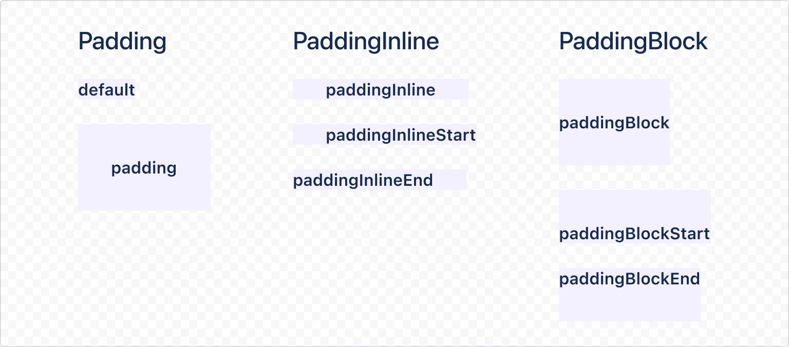
1
2import { Stack, Inline, Box } from '@forge/react';

export default () => {
  <Inline space="space.300">
    <Stack space="space.100" alignInline="start">
      <Box backgroundColor="color.background.discovery">default</Box>
      <Box backgroundColor="color.background.discovery" padding="space.300">
        padding
      </Box>
    </Stack>
    <Stack space="space.100" alignInline="start">
      <Box
        backgroundColor="color.background.discovery"
        paddingInline="space.300"
      >
        paddingInline
      </Box>
      <Box
        backgroundColor="color.background.discovery"
        paddingInlineStart="space.300"
      >
        paddingInlineStart
      </Box>
      <Box
        backgroundColor="color.background.discovery"
        paddingInlineEnd="space.300"
      >
        paddingInlineEnd
      </Box>
    </Stack>
    <Stack space="space.100" alignInline="start">
      <Box
        backgroundColor="color.background.discovery"
        paddingBlock="space.300"
      >
        paddingBlock
      </Box>
      <Box
        backgroundColor="color.background.discovery"
        paddingBlockStart="space.300"
      >
        paddingBlockStart
      </Box>
      <Box
        backgroundColor="color.background.discovery"
        paddingBlockEnd="space.300"
      >
        paddingBlockEnd
      </Box>
    </Stack>
  </Inline>
};
The nomenclature used by these props follows logical properties.
xcss
Box exposes an xcss prop. This prop accepts xcss function calls that contain a subset of permitted styles. Box is designed to be used in conjunction with the inline and stack components to create layouts. This example demonstrates how these can be used to create familiar components and patterns. See the dedicated xcss documentation for the range of properties available.
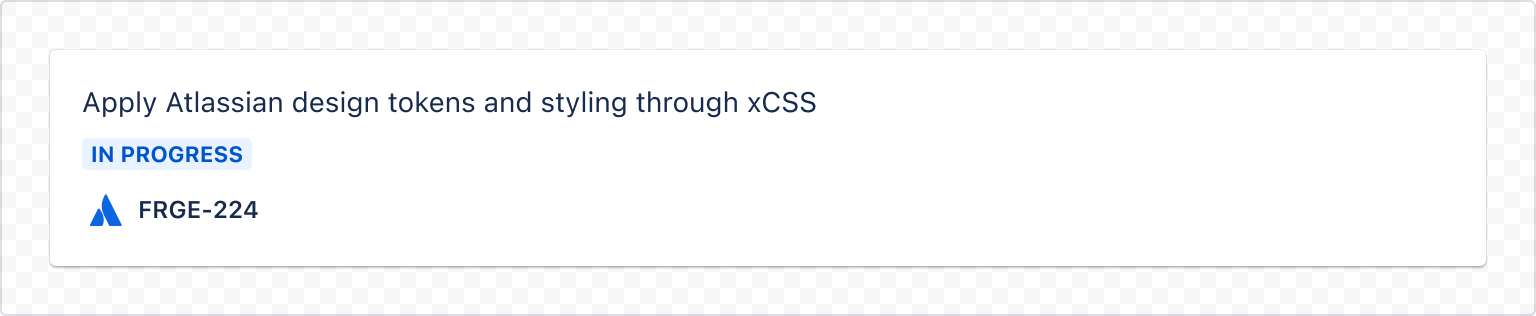
1
2import { Box, Inline, Stack, Text, Heading, Lozenge, Icon, xcss } from '@forge/react';

const containerStyles = xcss({
  backgroundColor: 'elevation.surface.raised',
  boxShadow: 'elevation.shadow.raised',
  padding: 'space.200',
  borderRadius: 'border.radius',
});

export default () => {
  return (
    <Box xcss={containerStyles} >
      <Stack space="space.100">
        <Text>
          Apply Atlassian design tokens and styling through xCSS
        </Text>
        <Box>
          <Lozenge appearance="inprogress">In progress</Lozenge>
        </Box>
        <Inline alignBlock="center" space="space.050">
          <Icon glyph="emoji-atlassian" label="Atlassian logo" />
          <Strong>FRGE-224</Strong>
        </Inline>
      </Stack>
    </Box>
  );
};
Rate this page: