- ADF renderer
- Atlassian icon (Preview)
- Atlassian tile (Preview)
- Badge
- Bleed (Preview)
- Box
- Breadcrumbs (Preview)
- Button
- Button group
- Calendar
- Chart - Bar
- Chart - Donut
- Chart - Horizontal bar
- Chart - Horizontal stack bar
- Chart - Line
- Chart - Pie
- Chart - Stack bar
- Checkbox
- Checkbox group
- Code
- Code block
- Comment
- Comment editor
- Chromeless editor
- Date picker
- Dynamic table
- Empty state
- File card (Preview)
- File picker (Preview)
- Form
- Frame
- Heading
- Icon
- Image
- Inline
- Inline edit
- Link
- List
- Lozenge
- Modal
- Popup
- Pagination (Preview)
- Pressable
- Progress bar
- Progress tracker
- Radio
- Radio group
- Range
- Router (Preview)
- Section message
- Select
- Spinner
- Stack
- Tabs
- Tag
- Tag group
- Text
- Text area
- Text field
- Time picker
- Tile (Preview)
- Toggle
- Tooltip
- User
- User group
- User picker
- XCSS
Button
To add the Button, LinkButton, or LoadingButton component to your app:
1
2import { Button } from "@forge/react";
1
2import { LinkButton } from "@forge/react";
1
2import { LoadingButton } from "@forge/react";
Description
A button triggers an event or action. They let users know what will happen next.
Props
Common props
| Name | Type | Required | Description |
|---|---|---|---|
autoFocus | boolean | No | Set the button to autofocus on mount. |
isDisabled | boolean | No | Disable the button to prevent user interaction. |
isSelected | boolean | No | Indicates that the button is selected. |
onBlur | (e: BlurEvent) => void | No | Handler to be called on blur. |
onClick | (e: MouseEvent ) => void | No | Handler to be called on click. The second argument can be used to track analytics data. |
onFocus | (e: FocusEvent) => void | No | Handler to be called on focus. |
spacing | 'compact' | 'default' | No | Controls the amount of padding in the button. |
shouldFitContainer | boolean | No | Option to fit button width to its parent width. |
type | 'submit' | 'reset' | 'button' | No | Pass type down to a button. |
Button props
The Button accepts all common props as well as the additional props below.
| Name | Type | Required | Description |
|---|---|---|---|
appearance | 'default' | 'danger' | 'primary' | 'subtle' | 'warning' | No | The button style variation. |
iconAfter | IconGlyph | No | Places an icon within the button, after the button's text. |
iconBefore | IconGlyph | No | Places an icon within the button, before the button's text. |
LinkButton props
The LinkButton accepts all common props (except for type) as well as the additional props below.
| Name | Type | Required | Description |
|---|---|---|---|
href | string | Yes | The prop |
target | '_self' | '_blank' | '_parent' | '_top' | No | Specifies where the link content opens when clicked. |
appearance | 'default' | 'danger' | 'primary' | 'subtle' | 'warning' | No | The button style variation. |
LoadingButton props
The LoadingButton accepts all common props as well as the additional props below.
| Name | Type | Required | Description |
|---|---|---|---|
isLoading | boolean | No | Conditionally shows a spinner over the top of a button. |
appearance | 'default' | 'danger' | 'link'| 'primary' | 'subtle' | 'subtle-link' | 'warning' | No | The button style variation. |
Examples
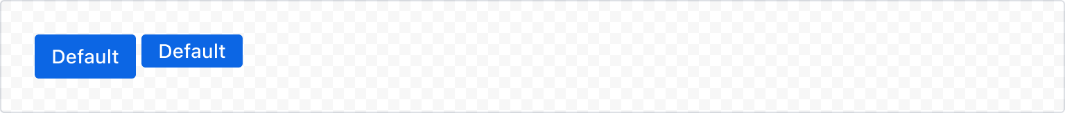
Default
Use default buttons for most actions that aren't the main call to action for a page or area. Default buttons are less prominent than primary buttons.

1
2const ButtonDefaultExample = () => {
  return <Button>Default button</Button>;
};
Appearance
Primary
Use a primary button to call attention to a form submission or to highlight the most important call to action on a page. Primary buttons should only appear once per area, though not every screen needs a primary button.
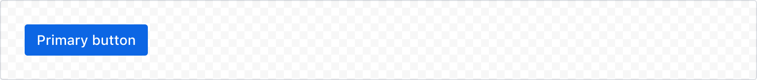
1
2const ButtonPrimaryExample = () => {
  return <Button appearance="primary">Primary button</Button>;
};
Subtle
Use a subtle button with a primary button for secondary actions, such as “Cancel.”
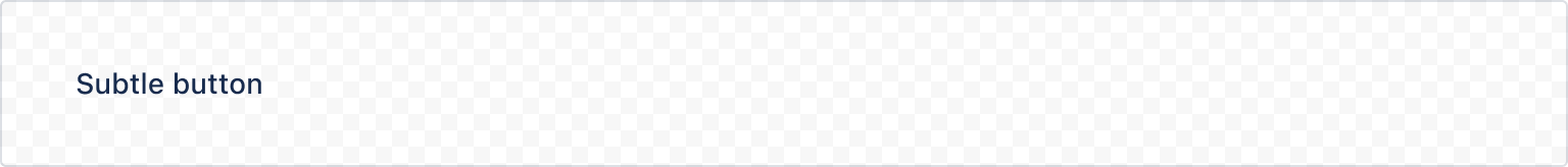
1
2const ButtonSubtleExample = () => {
  return <Button appearance="subtle">Subtle button</Button>;
};
Warning
Warning buttons confirm actions that may cause a significant change or a loss of data.
Typically, warnings alert people of a problem that might happen if they proceed. These appearances are often found in confirmation modals.
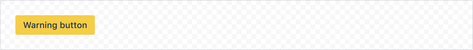
1
2const ButtonWarningExample = () => {
  return <Button appearance="warning">Warning button</Button>;
};
Danger
A danger button appears as a final confirmation for a destructive and irreversible action, such as deleting.
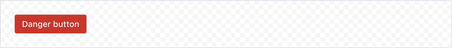
1
2const ButtonDangerExample = () => {
  return <Button appearance="danger">Danger button</Button>;
};
Link Button
The default form of a link button.
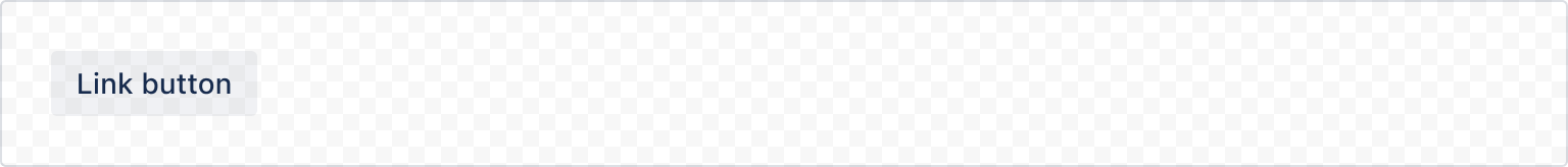
1
2const LinkButtonExample = () => {
  return <LinkButton href="https://atlassian.com/">Link button</LinkButton>;
};
Disabled link button
Standard buttons use the disabled HTML attribute, however this doesn't exist for anchor <a> tags, so link buttons are disabled by adding aria-disabled="true", adding role="link" and removing the href attribute.
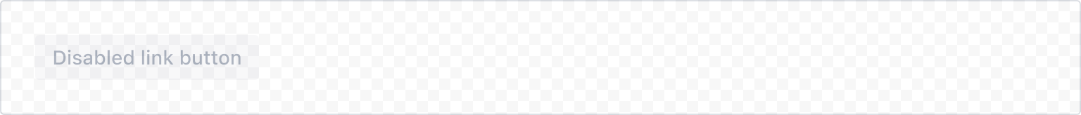
1
2const LinkButtonDisabledExample = () => {
  return (
    <LinkButton href="https://atlassian.com/" appearance="primary" isDisabled>
      Disabled link button
    </LinkButton>
  );
};
States
Disabled
Set isDisabled to disable a button that shouldn't be actionable. The button will appear faded and won't respond to user interaction.
Disabled buttons can cause accessibility issues (disabled elements are not in the tab order) so wherever possible, avoid using isDisabled. Instead, use validation or other techniques to show users how to proceed.
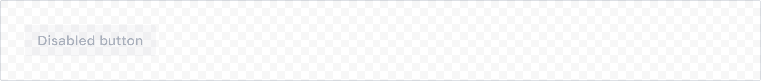
1
2const ButtonDisabledExample = () => {
  return (
    <Button appearance="primary" isDisabled>
      Disabled button
    </Button>
  );
};
Selected
Set isSelected to indicate the button is selected.

1
2const ButtonSelectedExample = () => {
  return <Button isSelected>Selected button</Button>;
};
Loading
Use the loading button and set isLoading to indicate the button is loading. The button text is hidden and a spinner is shown in its place, while maintaining the width that it would have if the text were visible.
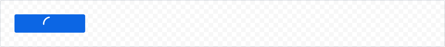
1
2const ButtonLoadingExample = () => {
  return (
    <LoadingButton appearance="primary" isLoading>
      Loading button
    </LoadingButton>
  );
};
Spacing
Button spacing depends on the surrounding UI. Default spacing is used for most use cases, compact for tables.
1
2import { ButtonGroup, Button } from "@forge/react";

const ButtonPaddingExample = () => {
  return (
    <ButtonGroup>
      <Button appearance="primary">Default</Button>
      <Button appearance="primary" spacing="compact">
        Compact
      </Button>
    </ButtonGroup>
  );
};
Full Width
Buttons can expand to full width to fill the parent container. This is sometimes done in login forms.
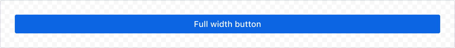
1
2const ButtonFullWidthExample = () => {
  return (
    <Button shouldFitContainer appearance="primary">
      Full width button
    </Button>
  );
};
Button with icon
Buttons may include an icon before or after the text label. Valid icons can be found in the Atlassian Design System Icon Library.
Atlassian has migrated to new icons
In alignment with Atlassian's visual refresh, some icons from UI Kit have been deprecated and new icons have been added. Deprecated icons will be removed on December 22, 2025.
See Atlassian Design System legacy icons for a list of deprecated icons, and which icons to migrate to.
Extract the glyph segment of the icon's import to get the valid icon name to pass into iconBefore or iconAfter. For example, the icon name for icon/glyph/star-filled is star-filled.
Icon before
1
2const ButtonIconBefore = () => {
  return (
    <Button
      appearance="primary"
      iconBefore="star-filled"
    >
      Icon before
    </Button>
  );
};
Icon after
1
2const ButtonIconAfter = () => {
  return (
    <Button
      appearance="primary"
      iconAfter="star-filled"
    >
      Icon after
    </Button>
  );
};
Accessibility considerations
When using the Button, LinkButton, and LoadingButton components, we recommend keeping the following accessibility considerations in mind:
Avoid disabling buttons
Avoid disabling buttons, especially in forms. Instead, keep the button pressable, and use validation and errors to explain what needs to be done to proceed.
Disabled buttons don’t explain why the button isn’t usable. They also aren’t reachable in the tab order and don’t receive hover, focus, or click events, making them entirely inaccessible to some people.
Never put tooltips on disabled buttons
Tooltips can't be reached on all devices or by some assitive technologies, and they should never appear on elements that aren't interactable.
Things to consider before using a tooltip:
- Is this information essential to the user experience? If so, never hide it behind a tooltip. Tooltips aren’t easy to discover and aren’t accessible at all on mobile devices. If it isn’t essential information, consider if you need to show it at all.
- Is this information actionable? Being shown things that you can’t use without any next steps can be frustrating or confusing. Consider only showing UI that a user can interact with.
- If the information is still necessary or helpful, consider using helper text or other more accessible text that has the same content instead of a tooltip. This gives you more options to provide a link to a next step or another action.
Rate this page: