- ADF renderer
- Atlassian icon (Preview)
- Atlassian tile (Preview)
- Badge
- Box
- Button
- Button group
- Calendar
- Chart - Bar
- Chart - Donut
- Chart - Horizontal bar
- Chart - Horizontal stack bar
- Chart - Line
- Chart - Pie
- Chart - Stack bar
- Checkbox
- Checkbox group
- Code
- Code block
- Comment
- Comment editor
- Chromeless editor
- Date picker
- Dynamic table
- Empty state
- File card (EAP)
- File picker (EAP)
- Form
- Frame
- Heading
- Icon
- Image
- Inline
- Inline edit
- Link
- List
- Lozenge
- Modal
- Popup
- Pressable
- Progress bar
- Progress tracker
- Radio
- Radio group
- Range
- Section message
- Select
- Spinner
- Stack
- Tabs
- Tag
- Tag group
- Text
- Text area
- Text field
- Time picker
- Tile (Preview)
- Toggle
- Tooltip
- User
- User group
- User picker
- XCSS
Calendar
To add the Calendar component to your app:
1
2import { Calendar } from '@forge/react';
Description
An interactive calendar for date selection experiences.
Props
| Name | Type | Required | Description |
|---|---|---|---|
day | number | No | The number of the day currently focused. Places border around the date. Enter 0 to highlight no date. |
defaultDay | number | No | Sets the default value for day. |
defaultMonth | number | No | Sets the default value for month. |
defaultPreviouslySelected | string[] | No | Sets the default value for previouslySelected. |
defaultSelected | string[] | No | Sets the default value for selected. |
defaultYear | number | No | Sets the default value for year. |
disabled | string[] | No | Takes an array of dates as string in the format 'YYYY-MM-DD'. All dates provided are greyed out and not selectable. |
locale | string | No | BCP 47 language tag (e.g. ja-JP) that ensures dates are in the official format for the locale. |
maxDate | string | No | The latest enabled date. All dates in the future after this date will be disabled. |
minDate | string | No | The earliest enabled date. All dates in the past before this date will be disabled. |
nextMonthLabel | string | No | The aria-label attribute associated with the next month arrow, to describe it to assistive technology. |
onBlur | (e: FocusEvent) => void | No | Function which is called when the calendar is no longer focused. |
onChange | (event: ChangeEvent) => void | No | Called when the calendar is navigated. This can be triggered by the keyboard, or by clicking the navigational buttons. The 'interface' property indicates the the direction the calendar was navigated whereas the 'iso' property is a string of the format YYYY-MM-DD. |
onFocus | (e: FocusEvent) => void | No | Called when the calendar receives focus. This could be called from a mouse event on the container, or by tabbing into it. |
onSelect | (event: SelectEvent) => void | No | Function called when a day is clicked on. Calls with an object that has a day, month and year property as numbers, representing the date just clicked. It also has an 'iso' property, which is a string of the selected date in the format YYYY-MM-DD. |
previouslySelected | string[] | No | Takes an array of dates as string in the format 'YYYY-MM-DD'. All dates provided are given a background color. |
previousMonthLabel | string | No | The aria-label attribute associated with the previous month arrow, to describe it to assistive technology. |
selected | string[] | No | Takes an array of dates as string in the format 'YYYY-MM-DD'. All dates provided are given a background color. |
tabIndex | 0 | -1 | No | Indicates if the calendar can be focused by keyboard or only programmatically. Defaults to "0". |
today | string | No | Value of current day, as a string in the format 'YYYY-MM-DD'. |
weekStartDay | 0 | 1 | 2 | 3 | 4 | 5 | 6 | No | Start day of the week for the calendar. The mapping between numbers and days of the week is as follows: - 0 Sunday (default value)- 1 Monday- 2 Tuesday- 3 Wednesday- 4 Thursday- 5 Friday- 6 Saturday |
year | number | No | Year to display the calendar for. |
Examples
Default
The calendar component provides a way to render dates for selection or presentation purposes.

1
2const CalendarExample = () => {
  return (
    <Calendar
      defaultPreviouslySelected={["2022-12-06"]}
      defaultSelected={["2022-12-08"]}
      defaultMonth={12}
      defaultYear={2022}
    />
  );
};
Disabled
Calendar provides a disabled prop that accepts an array of arbitrary dates to disable. Only disable dates where the reason for disabling dates is clear. For example, a calendar selection for booking appointments, where only the days that have available options are enabled.

1
2const CalendarDisabledExample = () => {
  return (
    <Calendar
      disabled={[
        "2022-12-05",
        "2022-12-06",
        "2022-12-07",
        "2022-12-21",
        "2022-12-22",
        "2022-12-23",
      ]}
      defaultMonth={12}
      defaultYear={2022}
    />
  )
};
Disabled ranges
To disable all dates before or after a certain date, use minDate or maxDate. These props disable all dates before or after a specific day respectively. Use a minDate and a maxDate together to create a range of days to choose from. The minimum and maximum dates are non inclusive, only the previous and next dates outside of these values will be disabled.

1
2const CalendarDisabledRangeExample = () => {
  return (
    <Calendar
      defaultMonth={12}
      defaultYear={2022}
      minDate={"2022-12-08"}
      maxDate={"2022-12-20"}
    />
  );
};
Localization
Use the locale prop to update the calendar language and formatting for different locales. You may also want to pair locale with the weekStartDay prop to change the day of the week the calendar starts with.
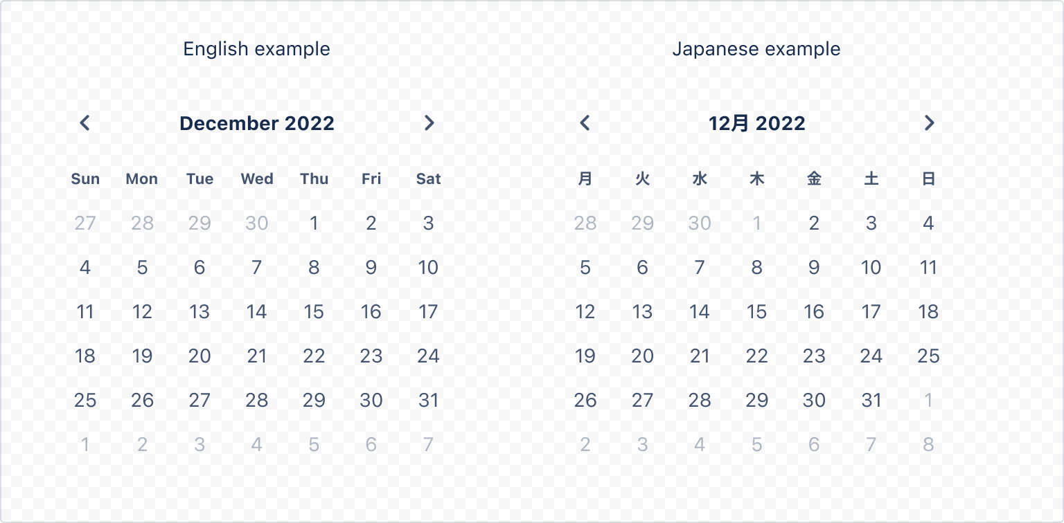
1
2const CalendarLocalizationExample = () => {
  return <Calendar defaultMonth={12} defaultYear={2022} locale="ja-JP" />;
};
Rate this page: