- ADF renderer
- Atlassian icon (Preview)
- Atlassian tile (Preview)
- Badge
- Box
- Button
- Button group
- Calendar
- Chart - Bar
- Chart - Donut
- Chart - Horizontal bar
- Chart - Horizontal stack bar
- Chart - Line
- Chart - Pie
- Chart - Stack bar
- Checkbox
- Checkbox group
- Code
- Code block
- Comment
- Comment editor
- Chromeless editor
- Date picker
- Dynamic table
- Empty state
- File card (EAP)
- File picker (EAP)
- Form
- Frame
- Heading
- Icon
- Image
- Inline
- Inline edit
- Link
- List
- Lozenge
- Modal
- Popup
- Pressable
- Progress bar
- Progress tracker
- Radio
- Radio group
- Range
- Section message
- Select
- Spinner
- Stack
- Tabs
- Tag
- Tag group
- Text
- Text area
- Text field
- Time picker
- Tile (Preview)
- Toggle
- Tooltip
- User
- User group
- User picker
- XCSS
Last updated Jul 18, 2025
Checkbox group
To add the CheckboxGroup component to your app:
1
2import { CheckboxGroup } from "@forge/react";
Description
A Checkbox group is a list of options where one or more choices can be selected.
Props
| Name | Type | Required | Available in macro config | Description |
|---|---|---|---|---|
name | string | Yes | Yes | Sets the name prop on each of the Checkbox elements in the group. |
options | Array<{ label: string; value: string; isDisabled?: boolean; }> | Yes | Yes | An array of objects, each object is mapped onto a Checkbox element within the group. |
value | Array<string> | No | No | Once set, controls the selected value on the CheckboxGroup. |
defaultValue | Array<string> | No | Yes | Sets the initial selected value on the CheckboxGroup. |
isDisabled | boolean | No | No | Sets the disabled state of all Checkbox elements in the group. |
isRequired | boolean | Only available for macro configuration, cannot be used for other extension points | Yes | Set if the picker is disabled. |
onChange | (e: ChangeEvent) => void | No | No | Function that gets fired after each change event. |
Examples
Default
The default form of a Checkbox group.

1
2import { CheckboxGroup } from "@forge/react";

const options = [
  { value: "jira", label: "Jira" },
  { value: "confluence", label: "Confluence" },
];

const CheckboxGroupDefaultExample = () => {
  return <CheckboxGroup name="Products" options={options} />;
};
CheckboxGroup with Form
For required fields, use the ErrorMessage or ValidMessage components for displaying a validation message.
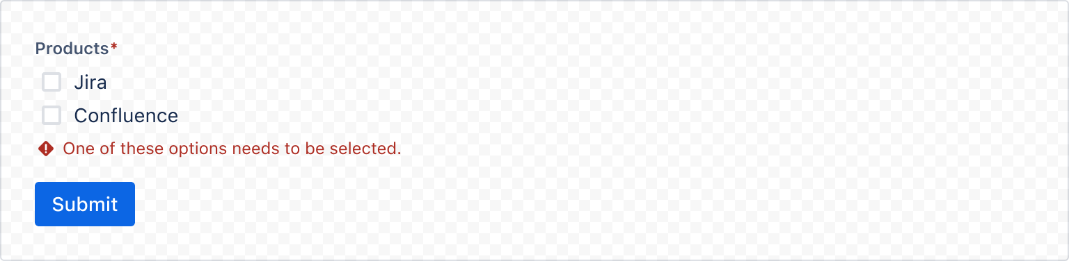
1
2import {
  Form,
  useForm,
  FormSection,
  FormFooter,
  Label,
  RequiredAsterisk,
  ErrorMessage,
  CheckboxGroup,
  Button,
} from "@forge/react";

const options = [
  { value: "jira", label: "Jira" },
  { value: "confluence", label: "Confluence" },
];

const CheckboxGroupRequiredExample = () => {
  const { handleSubmit, register, getFieldId, formState } = useForm();
  const login = (data) => {
    console.log(data);
  };

  return (
    <Form onSubmit={handleSubmit(login)}>
      <FormSection>
        <Label labelFor={getFieldId("myCheckbox")}>
          Products
          <RequiredAsterisk />
        </Label>
        <CheckboxGroup
          {...register("myCheckbox", { required: true })}
          name="myCheckbox"
          options={options}
        />
        {formState.errors.myCheckbox && (
          <ErrorMessage>
            One of these options needs to be selected.
          </ErrorMessage>
        )}
      </FormSection>
      <FormFooter align="start">
        <Button appearance="primary" type="submit">
          Submit
        </Button>
      </FormFooter>
    </Form>
  );
};
States
Disabled
isDisabled can be used to disable the entire Checkbox group.
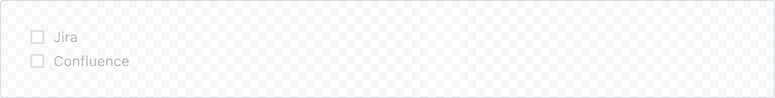
1
2import { CheckboxGroup } from "@forge/react";

const options = [
  { value: "jira", label: "Jira" },
  { value: "confluence", label: "Confluence" },
];

const CheckboxGroupisDisabledExample = () => {
  return <CheckboxGroup name="Products" options={options} isDisabled />;
};
Controlled
onChange
In a controlled checkbox, the checked state is managed by the React component. Set value to select the checkbox(es) and use theonChange handler to change the value.
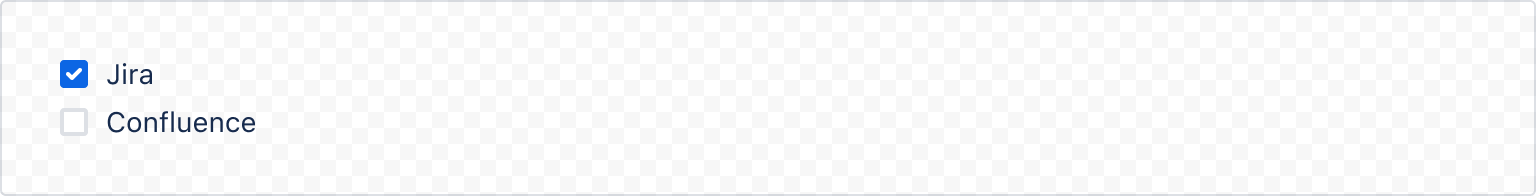
1
2import { CheckboxGroup } from "@forge/react";

const options = [
  { value: "jira", label: "Jira" },
  { value: "confluence", label: "Confluence" },
];

const CheckboxGroupControlledExample = () => {
  const [value, setValue] = useState(["jira"]);

  return (
    <CheckboxGroup
      name="Products"
      options={options}
      value={value}
      onChange={setValue}
    />
  );
};
Rate this page: