- ADF renderer
- Atlassian icon (Preview)
- Atlassian tile (Preview)
- Badge
- Box
- Button
- Button group
- Calendar
- Chart - Bar
- Chart - Donut
- Chart - Horizontal bar
- Chart - Horizontal stack bar
- Chart - Line
- Chart - Pie
- Chart - Stack bar
- Checkbox
- Checkbox group
- Code
- Code block
- Comment
- Comment editor
- Chromeless editor
- Date picker
- Dynamic table
- Empty state
- File card (EAP)
- File picker (EAP)
- Form
- Frame
- Heading
- Icon
- Image
- Inline
- Inline edit
- Link
- List
- Lozenge
- Modal
- Popup
- Pressable
- Progress bar
- Progress tracker
- Radio
- Radio group
- Range
- Section message
- Select
- Spinner
- Stack
- Tabs
- Tag
- Tag group
- Text
- Text area
- Text field
- Time picker
- Tile (Preview)
- Toggle
- Tooltip
- User
- User group
- User picker
- XCSS
Empty state
To add the EmptyState component to your app:
1
2import { EmptyState } from "@forge/react";
Description
An empty state appears when there is no data to display and describes what the user can do next.
Props
| Name | Type | Required | Description |
|---|---|---|---|
buttonGroupLabel | string | No | Accessible name for the action buttons group. |
description | string | No | The main block of text that holds additional supporting information. |
header | string | Yes | Title that briefly describes the page to the user. |
headingLevel | number | No | The value used to set the heading level of the header element. Must be in the range of 1 to 6. Defaults to 4. |
isLoading | boolean | No | Used to indicate a loading state. Will show a spinner next to the action buttons when true. |
primaryAction | ForgeElement | No | Primary action button for the page. |
secondaryAction | ForgeElement | No | Secondary action button for the page. |
tertiaryAction | ForgeElement | No | Tertiary action button for the page. |
width | "narrow" | "wide" | No | Controls how much horizontal space the component fills. Defaults to wide. |
Examples
Default
The only required property of an empty state is the header.

1
2export const EmptyStateExample = () => {
  return <EmptyState header="You don't have access to this issue" />;
};
Custom header level
The headingLevel rendered by default is 4. To make sure that the empty state is accessible, headers must follow a logical order. If the empty state does not follow a h3 or h4 in the reading order, then you will need to modify the heading order to the next logical heading level.

1
2export const CustomHeadingLevelEmptyStateExample = () => {
  return (
    <EmptyState header="You don't have access to this issue" headingLevel={1} />
  );
};
Description
Descriptions should add useful and relevant additional information.
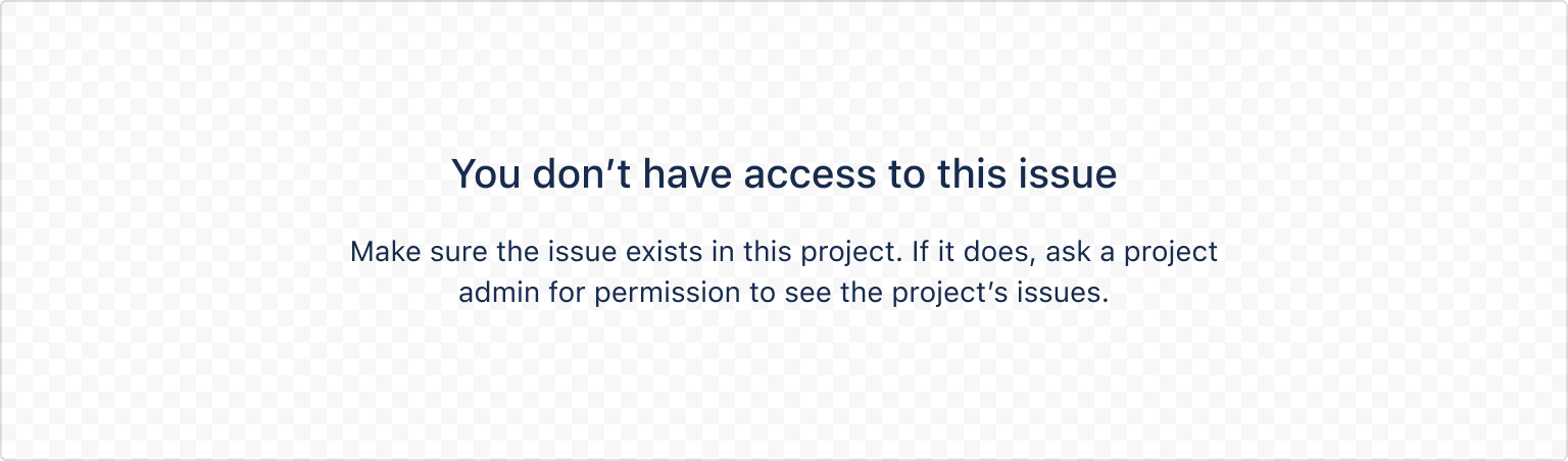
1
2export const EmptyStateWithDescriptionExample = () => {
  return (
    <EmptyState
      header="You don't have access to this issue"
      description="Make sure the issue exists in this project. If it does, ask a project admin for permission to see the project's issues."
    />
  );
};
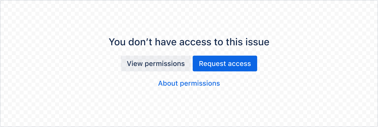
Actions
Primary
Use a primary action button to recommend the best next step that people can take.

1
2export const EmptyStateWithOneActionExample = () => {
  return (
    <EmptyState
      header="You don't have access to this issue"
      primaryAction={<Button appearance="primary">Request access</Button>}
    />
  );
};
Secondary
Use a secondary action button to recommend an alternate step that people could take. This will render on the left side of the primary action button.

1
2export const EmptyStateWithTwoActionsExample = () => {
  return (
    <EmptyState
      header="You don't have access to this issue"
      primaryAction={<Button appearance="primary">Request access</Button>}
      secondaryAction={<Button>View permissions</Button>}
    />
  );
};
Tertiary
Use tertiary action buttons to link to external resources or documentation to further explain how to resolve the empty state. This will render below the primary and secondary action buttons.
1
2export const EmptyStateWithAllActionsExample = () => {
  return (
    <EmptyState
      header="You don't have access to this issue"
      primaryAction={<Button appearance="primary">Request access</Button>}
      secondaryAction={<Button>View permissions</Button>}
      tertiaryAction={
        <LinkButton appearance="link" href="/">
          About permissions
        </LinkButton>
      }
    />
  );
};
Loading State
Use the isLoading prop to indicate a loading state. This will show a spinner next to the action buttons when true.

1
2export const LoadingStateEmptyStateExample = () => {
  return (
    <EmptyState
      header="You don't have access to this issue"
      primaryAction={<Button appearance="primary">Request access</Button>}
      isLoading={true}
    />
  );
};
Width
Narrow
The horizontal space that an empty state takes up can be controlled with the width prop. It can be set to either narrow or wide, where the default is wide.
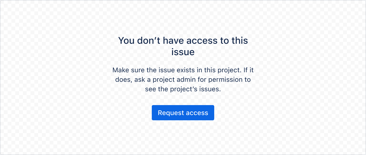
1
2export const NarrowEmptyStateExample = () => {
  return (
    <EmptyState
      header="You don't have access to this issue"
      description="Make sure the issue exists in this project. If it does, ask a project admin for permission to see the project's issues."
      primaryAction={<Button appearance="primary">Request access</Button>}
      width="narrow"
    />
  );
};
Rate this page: