- ADF renderer
- Badge
- Box
- Button
- Button group
- Calendar
- Chart - Bar
- Chart - Donut
- Chart - Horizontal bar
- Chart - Horizontal stack bar
- Chart - Line
- Chart - Pie
- Chart - Stack bar
- Checkbox
- Checkbox group
- Code
- Code block
- Comment
- Comment editor
- Chromeless editor
- Date picker
- Dynamic table
- Empty state
- File card (EAP)
- File picker (EAP)
- Form
- Frame
- Global (EAP)
- Heading
- Icon
- Image
- Inline
- Inline edit
- Link
- List
- Lozenge
- Modal
- Popup
- Pressable
- Progress bar
- Progress tracker
- Radio
- Radio group
- Range
- Section message
- Select
- Spinner
- Stack
- Tabs
- Tag
- Tag group
- Text
- Text area
- Text field
- Time picker
- Tile (Preview)
- Toggle
- Tooltip
- User
- User group
- User picker
- XCSS
Global
EXPERIMENTAL
EXPERIMENTAL: The Global component and Global UI Kit features are currently in an experimental phase. The APIs and features are subject to change without notice and are not recommended for production use. Use these components for testing and feedback purposes only.
The Global component provides a dedicated navigation experience for full-page Forge apps. It delivers a complete layout with sidebar navigation, header, and main content areas that align with the native Atlassian product experience.
This component is currently only available in full page modules (confluence:fullPage and jira:fullPage).
Get started
Component structure
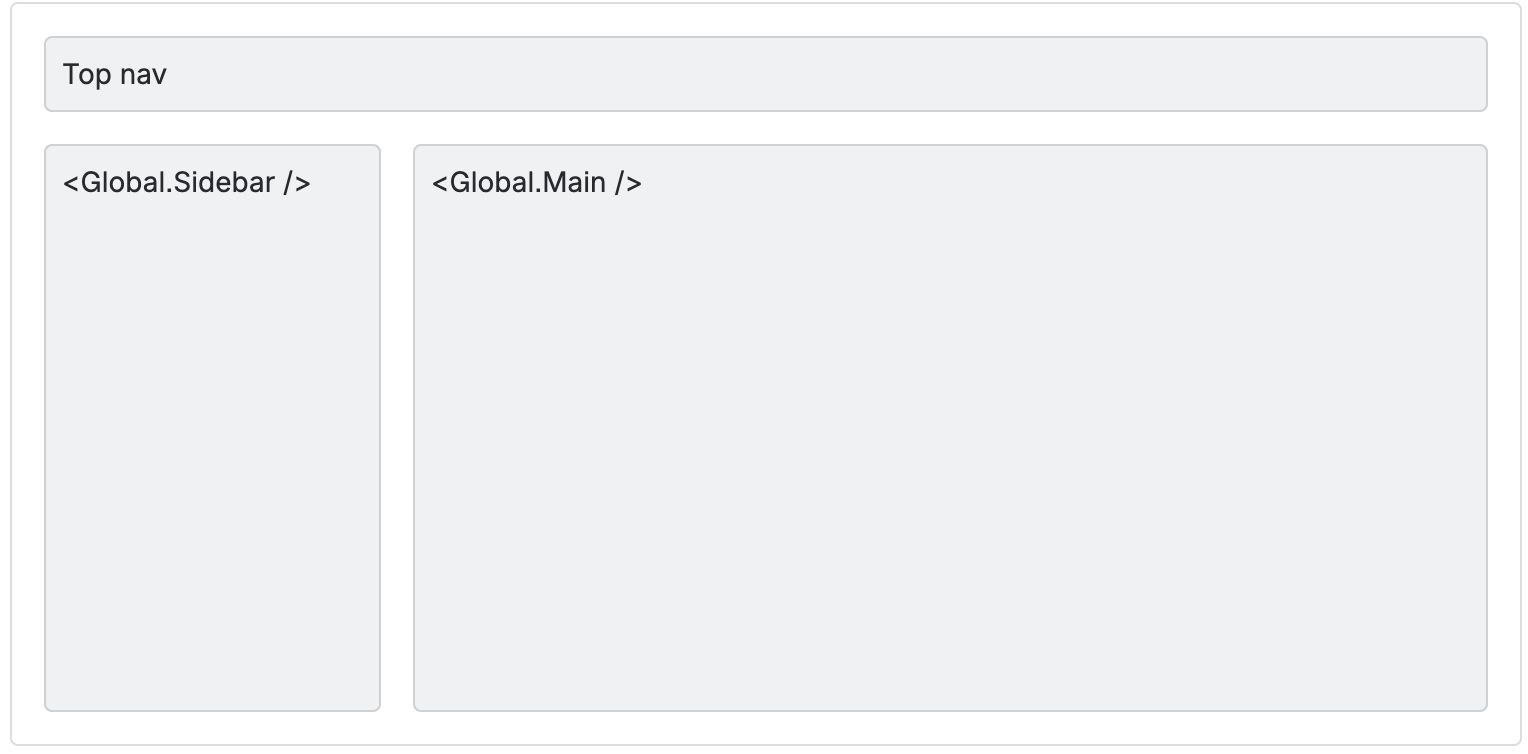
The Global component encompasses three primary areas that work together to create a complete full-page experience:
- Header — Automatically rendered with app branding, search, settings, and notifications
- Sidebar — Left navigation panel with link and expandable menu items
- Main content — Central area for your app's primary content
To add the Global component to your app:
1
2import { Global } from '@forge/react';
Component hierarchy
1
2<Global>
├─ <Global.Sidebar>
│  ├─ <Global.LinkMenuItem />
│  └─ <Global.ExpandMenuItem>
│     └─ <Global.LinkMenuItem />
└─ <Global.Main>
   └─ {Your app content}
The two fragments must be used together, and there is an additional header that is rendered. The full page layout with all areas rendered has the structure depicted below.
Props
Global
| Property | Type | Required | Description |
|---|---|---|---|
children | ForgeElement | Yes | Must contain <Global.Sidebar> and <Global.Main> components as direct children. |
Layout areas
Header
The header is rendered automatically with no configuration required. It provides a consistent navigation experience across your global app.
Header elements:
- App name and logo — Displays your app's title and icon from the manifest. Clicking navigates to the root route (
/) - Search — Global search bar for indexing content from Atlassian products. If the app is installed on Confluence, Search will index content in Confluence. If the app is installed on Jira, Search will index content in Jira.
- Settings — Settings dropdown where site admins can access the manage apps console. Only accessible by app admins.
- Notifications — Notification center for viewing Atlassian product notifications
Manifest properties
The following manifest properties are used for the app logo and navigation:
| Name | Type | Required | Description |
|---|---|---|---|
title | string | No | The title that is shown in the top header, next to your provided logo. Also appears in the apps menu. |
icon | string | No | A reference to a local resource (icon cannot be a URL). In small viewports: only the icon is displayed in the header. This will always display as a 24x24px icon. In large viewports: the app icon and the app name next to it is displayed. |
Global.Sidebar
The sidebar renders on the left side of the screen and provides navigation for your app.
| Property | Type | Required | Description |
|---|---|---|---|
forYouUrl | string | No | Defines the href for the For You tab. If defined, the For You tab will appear in the sidebar. Do not add / in front of the string. Example: <Global.Sidebar forYouUrl="for-you"> |
children | ForgeElement | Yes | Must contain <Global.LinkMenuItem> and/or <Global.ExpandMenuItem> components. |
Sidebar menu items:
Sidebar items must be defined as nested components. There are two available types of menu item components:
Global.LinkMenuItem
A clickable navigation link in the sidebar.
| Name | Type | Required | Description |
|---|---|---|---|
label | string | Yes | The menu item text. |
href | string | Yes | A location for the item to navigate to. Do not add / in front of the string. Example: <Global.LinkMenuItem href="link-one"> |
Global.ExpandMenuItem
An expandable menu item that reveals nested links when clicked.
| Property | Type | Required | Description |
|---|---|---|---|
label | string | Yes | The text that will be displayed for the menu item. |
children | LinkMenuItem[] | Yes | A single-dimension array of nested LinkMenuItem components. |
Global.Main
This component wraps your app's main content area.
| Property | Type | Required | Description |
|---|---|---|---|
children | ForgeElement | Yes | Your app's main content. |
Requirements and limitations
Component requirements
- Only
<Global.Main>and<Global.Sidebar>should be direct children of<Global> - Both
<Global.Sidebar>and<Global.Main>are required - This component is only available in full page modules (
confluence:fullPageandjira:fullPage)
Sidebar menu structure
Allowed:
<Global.Sidebar>can only have<Global.LinkMenuItem>and<Global.ExpandMenuItem>as its children- Sidebar can contain any number of
LinkMenuItemcomponents ExpandMenuItemcan only containLinkMenuItemcomponents
Not allowed:
LinkMenuItemcannot have childrenExpandMenuItemcannot be nested within anotherExpandMenuItem(cannot nest<Global.ExpandMenuItem>inside<Global.ExpandMenuItem>)<Global.ExpandMenuItem>can only have<Global.LinkMenuItem>as its children
Examples
1
2import { Global } from '@forge/react';
import ForgeReconciler, { Text } from '@forge/react';

export const App = () => {
  return (
    <Global>
      <Global.Sidebar forYouUrl="for-you">
        <Global.LinkMenuItem label="Home" href="" />
        <Global.LinkMenuItem label="Dashboard" href="dashboard" />
        <Global.ExpandMenuItem label="Settings">
          <Global.LinkMenuItem label="Profile" href="settings/profile" />
          <Global.LinkMenuItem label="Preferences" href="settings/preferences" />
        </Global.ExpandMenuItem>
      </Global.Sidebar>
      <Global.Main>
        <Text>Your app content here</Text>
      </Global.Main>
    </Global>
  );
};

export default ForgeReconciler.render(<App />);
Related resources
Rate this page: