- ADF renderer
- Atlassian icon (Preview)
- Atlassian tile (Preview)
- Badge
- Bleed (Preview)
- Box
- Breadcrumbs (Preview)
- Button
- Button group
- Calendar
- Chart - Bar
- Chart - Donut
- Chart - Horizontal bar
- Chart - Horizontal stack bar
- Chart - Line
- Chart - Pie
- Chart - Stack bar
- Checkbox
- Checkbox group
- Code
- Code block
- Comment
- Comment editor
- Chromeless editor
- Date picker
- Dynamic table
- Empty state
- File card (Preview)
- File picker (Preview)
- Form
- Frame
- Heading
- Icon
- Image
- Inline
- Inline edit
- Link
- List
- Lozenge
- Modal
- Popup
- Pagination (Preview)
- Pressable
- Progress bar
- Progress tracker
- Radio
- Radio group
- Range
- Section message
- Select
- Spinner
- Stack
- Tabs
- Tag
- Tag group
- Text
- Text area
- Text field
- Time picker
- Tile (Preview)
- Toggle
- Tooltip
- User
- User group
- User picker
- XCSS
Popup
To add the Popup component to your app:
1
2import { Popup } from "@forge/react";
Description
A popup displays brief content in an overlay.
Props
| Name | Type | Required | Description |
|---|---|---|---|
autoFocus | boolean | No | This controls whether the popup takes focus when opening.
The default is true. |
content | () => React.ReactNode | Yes | Render content that is displayed inside the popup. |
fallbackPlacements | Placement[] | No | This is a list of backup placements for the popup to try. When the preferred placement doesn't have enough space, the modifier will test the ones provided in the list, and use the first suitable one. If no fallback placements are suitable, it reverts back to the original placement. |
id | string | No | ID that is assigned to the popup container element. |
isOpen | boolean | Yes | Use this to either show or hide the popup. When set to false the popup will not render anything to the DOM. |
label | string | No | Refers to an aria-label attribute. Sets an accessible name for the popup to announce it to users of assistive technology.Usage of either this, or the titleId attribute is strongly recommended. |
onClose | (event: Event) => void | No | Handler that is called when the popup wants to close itself. This happens either when clicking away from the popup or pressing the escape key. You'll want to use this to set open state accordingly, and then pump it back into the isOpen prop. |
placement | "auto" | "auto-start" | "auto-end" | "top" | "bottom" | "right" | "left" | "top-start" | "top-end" | "bottom-start" | "bottom-end" | "right-start" | "right-end" | "left-start" | "left-end" | No | Placement of where the popup should be displayed relative to the trigger element. The default is "auto". |
role | string | No | Use this to set the accessibility role for the popup. We strongly recommend using only menu or dialog.Must be used along with label or titleId. |
rootBoundary | "viewport" | "document" | No | The root boundary that the popup will check for overflow. The default is "viewport" but it can be set to "document". |
shouldDisableFocusLock | boolean | No | This allows the popup disable focus lock. It will only work when shouldRenderToParent is true.The default is false. |
shouldFitContainer | boolean | No | This fits the popup width to its parent's width. When set to true, the trigger and popup elements will be wrapped in a div with position: relative.The popup will be rendered as a sibling to the trigger element, and will be full width. The default is false. |
shouldFlip | boolean | No | Allows the popup to be placed on the opposite side of its trigger if it doesn't fit in the viewport. The default is true. |
shouldRenderToParent | boolean | No | The root element where the popup should be rendered. Defaults to false. |
shouldUseCaptureOnOutsideClick | boolean | No | This controls if the event which handles clicks outside the popup is be bound withcapture: true. |
strategy | "absolute" | "fixed" | No | This controls the positioning strategy to use. Can vary between absolute and fixed.The default is fixed. |
titleId | string | No | Id referenced by the popup aria-labelledby attribute.Usage of either this, or the label attribute is strongly recommended. |
trigger | () => React.ReactNode | Yes | Render props used to anchor the popup to your content. Make this an interactive element, such as an @atlaskit/button component. |
Examples
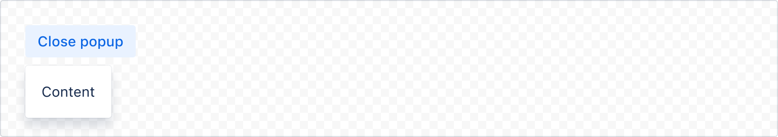
Default
This is the simplest form of a popup. The popup opens from a trigger element.

1
2import React, { useState } from "react";
import { Popup, Button, Box, xcss } from "@forge/react";

const contentStyles = xcss({
  padding: "space.200",
});

const PopupExample = () => {
  const [isOpen, setIsOpen] = useState(false);

  return (
    <Popup
      isOpen={isOpen}
      onClose={() => setIsOpen(false)}
      placement="bottom-start"
      content={() => <Box xcss={contentStyles}>Content</Box>}
      trigger={() => (
        <Button
          appearance="primary"
          isSelected={isOpen}
          onClick={() => setIsOpen(!isOpen)}
        >
          {isOpen ? "Close" : "Open"} popup
        </Button>
      )}
    />
  );
};
Placement
Use the placement prop to set a preferred position (auto, top, right, left, or bottom). The popup will move automatically if it's near the edge of the screen.
Using the auto placement will place the popup on the side with the most space available.
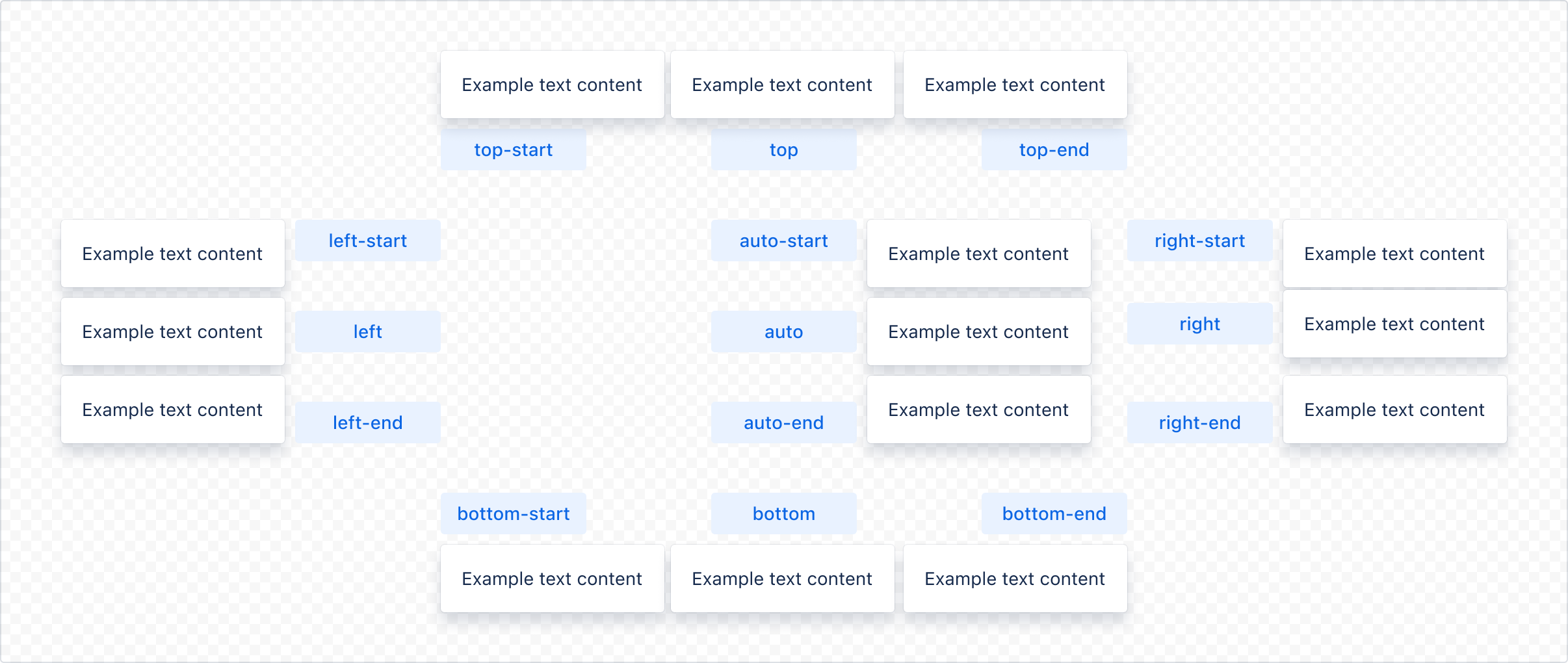
All available placement values: "auto" | "auto-start" | "auto-end" | "top" | "bottom" | "right" | "left" | "top-start" | "top-end" | "bottom-start" | "bottom-end" | "right-start" | "right-end" | "left-start" | "left-end"
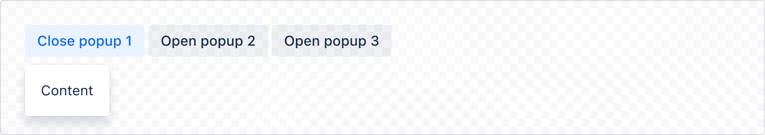
Multiple
You can use popups multiple times on the same page.
1
2import React, { useState } from "react";
import { Popup, Button, Box, xcss, ButtonGroup } from "@forge/react";

const contentStyles = xcss({
  padding: "space.200",
});

const PopupExample = ({ index }) => {
  const [isOpen, setIsOpen] = useState(false);

  return (
    <Popup
      isOpen={isOpen}
      onClose={() => setIsOpen(false)}
      placement="bottom-start"
      content={() => <Box xcss={contentStyles}>Content</Box>}
      trigger={() => (
        <Button
          appearance="primary"
          isSelected={isOpen}
          onClick={() => setIsOpen(!isOpen)}
        >
          {isOpen ? "Close" : "Open"} popup {index + 1}
        </Button>
      )}
    />
  );
};

const PopupMultipleExample = () => (
  <ButtonGroup label="Open required popup">
    {Array.from(Array(3)).map((_, index) => (
      <PopupExample index={index} />
    ))}
  </ButtonGroup>
);
Role
Use the role prop to set a role for the popup content. We do not forbid passing any of the aria roles, but we strongly recommend using only menu or dialog. When the role="dialog" property is passed, one of the following properties must also be added: label or titleId.
1
2import React, { useState } from "react";
import { Popup, Button, Box, xcss } from "@forge/react";

const contentStyles = xcss({
  padding: "space.200",
});

const PopupRoleExample = () => {
  const [isOpen, setIsOpen] = useState(false);

  return (
    <Popup
      isOpen={isOpen}
      onClose={() => setIsOpen(false)}
      placement="bottom-start"
      role="dialog"
      content={() => <Box xcss={contentStyles}>Content</Box>}
      trigger={() => (
        <Button
          appearance="primary"
          isSelected={isOpen}
          onClick={() => setIsOpen(!isOpen)}
        >
          {isOpen ? "Close" : "Open"} popup
        </Button>
      )}
    />
  );
};
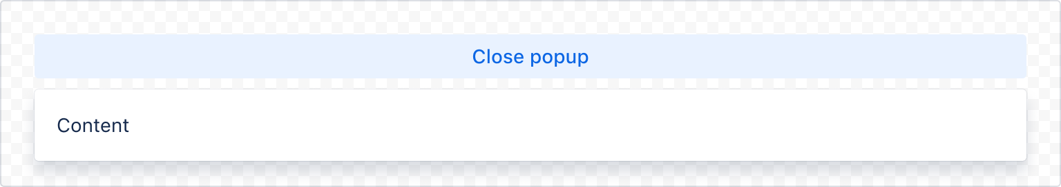
Full width
Use shouldFitContainer to fit the popup width to its parent's width. When set to true, the trigger and popup elements will be wrapped in a div with position: relative. The popup will be rendered as a sibling to the trigger element, and will be full width.
1
2import React, { useState } from "react";
import { Popup, Button, Box, xcss } from "@forge/react";

const contentStyles = xcss({
  padding: "space.200",
});

const PopupFullWidthExample = () => {
  const [isOpen, setIsOpen] = useState(false);

  return (
    <Popup
      isOpen={isOpen}
      onClose={() => setIsOpen(false)}
      placement="bottom-start"
      shouldFitContainer
      content={() => <Box xcss={contentStyles}>Content</Box>}
      trigger={() => (
        <Button
          shouldFitContainer
          appearance="primary"
          isSelected={isOpen}
          onClick={() => setIsOpen(!isOpen)}
        >
          {isOpen ? "Close" : "Open"} popup
        </Button>
      )}
    />
  );
};
Accessibility Considerations
- Don’t make popups that scroll. There isn't enough visual affordance to show that there's hidden content.
- Avoid nesting popups wherever possible.
- Use role to indicate what type of interactive element the popup is going to be. - Usually the popup will be a menu or dialog. When the popup is used as a dialog, make sure it has a label or titleId that gives the dialog an accessible name.
Rate this page: