- ADF renderer
- Atlassian icon (Preview)
- Atlassian tile (Preview)
- Badge
- Box
- Button
- Button group
- Calendar
- Chart - Bar
- Chart - Donut
- Chart - Horizontal bar
- Chart - Horizontal stack bar
- Chart - Line
- Chart - Pie
- Chart - Stack bar
- Checkbox
- Checkbox group
- Code
- Code block
- Comment
- Comment editor
- Chromeless editor
- Date picker
- Dynamic table
- Empty state
- File card (EAP)
- File picker (EAP)
- Form
- Frame
- Heading
- Icon
- Image
- Inline
- Inline edit
- Link
- List
- Lozenge
- Modal
- Popup
- Pressable
- Progress bar
- Progress tracker
- Radio
- Radio group
- Range
- Section message
- Select
- Spinner
- Stack
- Tabs
- Tag
- Tag group
- Text
- Text area
- Text field
- Time picker
- Tile (Preview)
- Toggle
- Tooltip
- User
- User group
- User picker
- XCSS
Stack
To add the Stack component to your app:
1
2import { Stack } from '@forge/react';
Description
A stack manages the vertical layout of direct children using flexbox.
Props
| Name | Type | Required | Description |
|---|---|---|---|
alignBlock | "start" | "center" | "end" | "stretch" | No | Used to align children along the main axis. |
alignInline | "start" | "center" | "end" | "stretch" | No | Used to align children along the cross axis. |
grow | "hug" | "fill" | No | Used to set whether the container should grow to fill the available space. |
space | "space.0" | "space.025" | "space.050" | "space.075" | "space.100" | "space.150" | "space.200" | "space.250" | "space.300" | "space.400" | "space.500" | "space.600" | "space.800" | "space.1000" | No | Represents the space between each child |
spread | "space-between" | No | Used to distribute the children along the main axis. |
Examples
The following example uses this ExampleBox component in their code blocks.
1
2const ExampleBox=  () => {
  return (
    <Box
      xcss={{
        backgroundColor: 'color.background.discovery',
        borderRadius: 'border.radius',
        borderStyle: 'solid',
        borderWidth: 'border.width',
        borderColor: 'color.border.discovery',
        padding: 'space.200'
      }}
    />
  )
}
Basic
Use a stack component to efficiently lay-out a group of elements vertically.
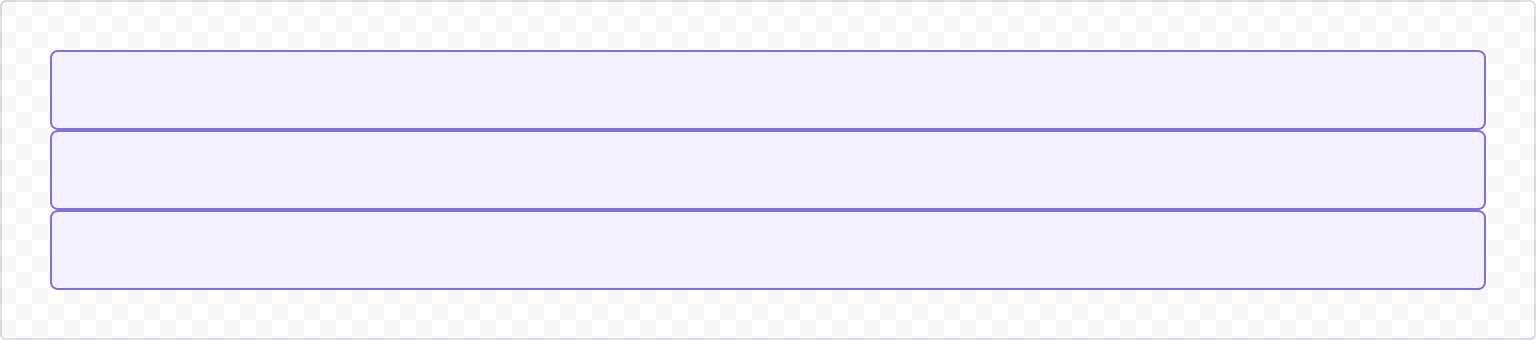
1
2const StackBasicExample = () => {
  return (
    <Stack>
      <ExampleBox />
      <ExampleBox />
      <ExampleBox />
    </Stack>
  );
}
Space
Control spacing between items with the space prop.
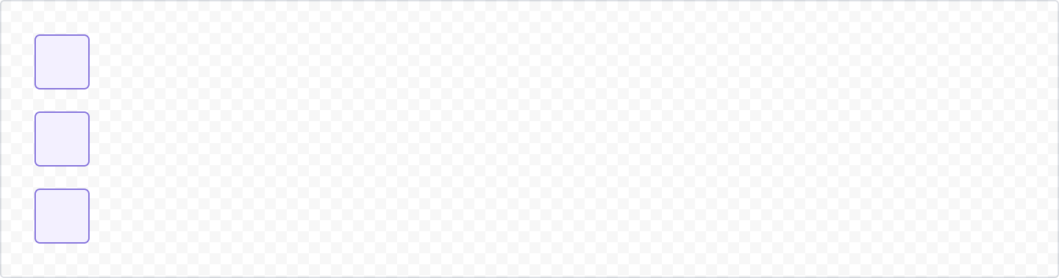
1
2const StackSpaceExample = () => {
  return (
    <Stack alignInline="start" space="space.200">
      <ExampleBox />
      <ExampleBox />
      <ExampleBox />
    </Stack>
  );
}
Alignment
Block alignment
Control the alignment of items using the alignBlock props which control alignment in the vertical axis.
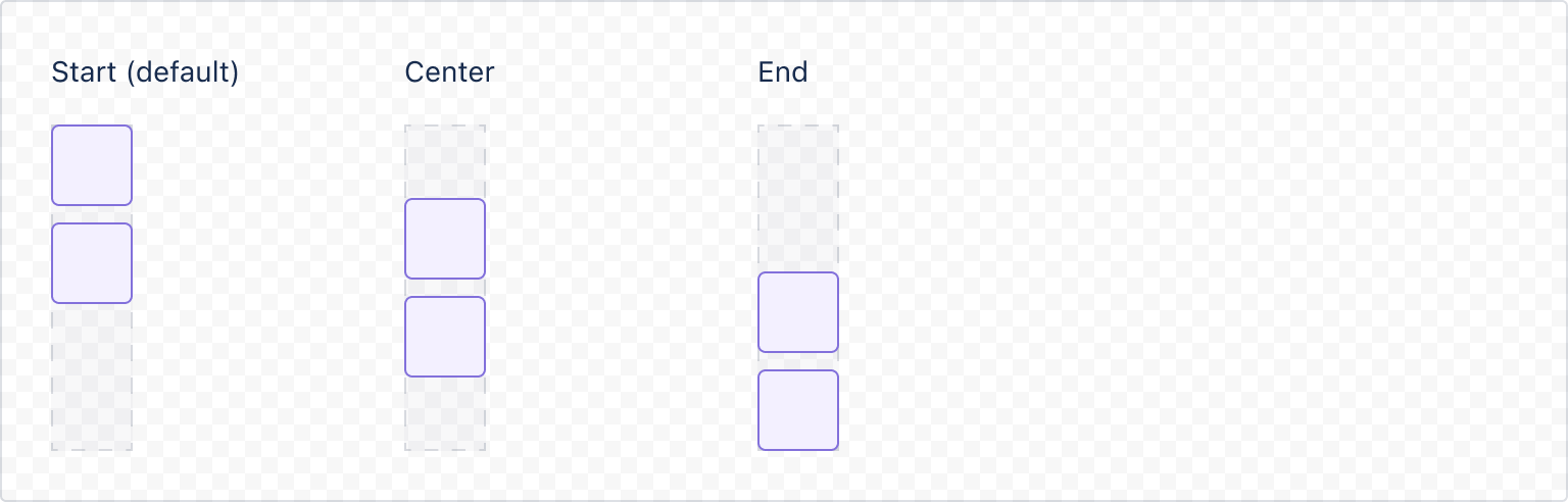
1
2const StackStartBlock = () => {
  return (
    <Inline space="space.200" alignBlock="stretch">
      <Stack space="space.050" alignBlock="start">
        <ExampleBox />
        <ExampleBox />
      </Stack>
      <Box
        xcss={{
          height: '200px',
        }}
      />
    </Inline>
  );
}

const StackCenterBlock = () => {
  return (
    <Inline space="space.200" alignBlock="stretch">
      <Stack space="space.050" alignBlock="center">
        <ExampleBox />
        <ExampleBox />
      </Stack>
      <Box
        xcss={{
          height: '200px',
        }}
      />
    </Inline>
  );
}

const StackEndBlock = () => {
  return (
    <Inline space="space.200" alignBlock="stretch">
      <Stack space="space.050" alignBlock="end">
        <ExampleBox />
        <ExampleBox />
      </Stack>
      <Box
        xcss={{
          height: '200px',
        }}
      />
    </Inline>
  );
}
Inline alignment
Control the alignment of items using the alignInline props which control alignment in the horizontal axis.
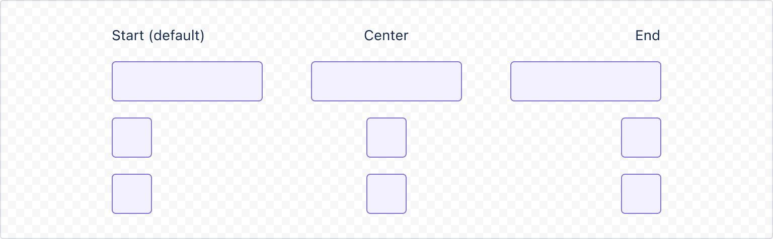
1
2const LongBox=  () => {
  return (
    <Box
      xcss={{
        backgroundColor: 'color.background.discovery',
        borderRadius: 'border.radius',
        borderStyle: 'solid',
        borderWidth: 'border.width',
        borderColor: 'color.border.discovery',
        padding: 'space.200',
        height: '120px'
      }}
    />
)}

export const StackStartInline = () => {
  return (
    <Stack space="space.050" alignInline="start">
      <LongBox/>
      <ExampleBox />
      <ExampleBox />
    </Stack>
  );
}

export const StackCenterInline = () => {
  return (
    <Stack space="space.050" alignInline="center">
      <LongBox/>
      <ExampleBox />
      <ExampleBox />
    </Stack>
  );
}

export const StackEndInline = () => {
  return (
    <Stack space="space.050" alignInline="end">
      <LongBox/>
      <ExampleBox />
      <ExampleBox />
    </Stack>
  );
}
Spread
Use the spread prop to set elements to stay together, spaced at the given value (default behavior) or spread equally in the space available.
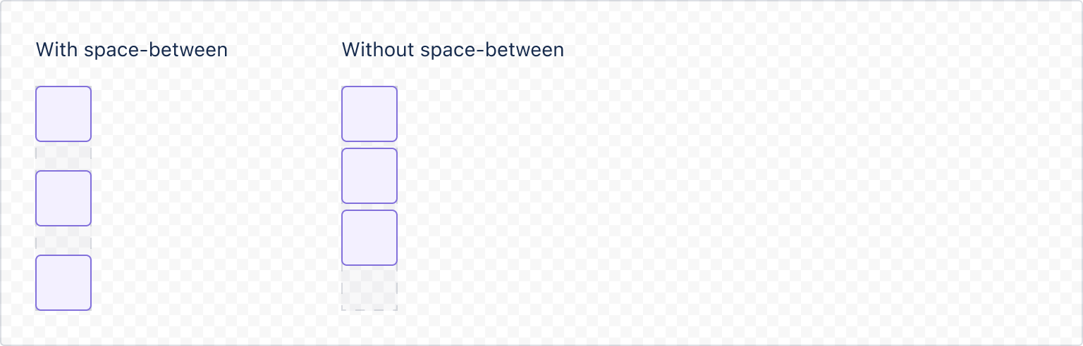
1
2const StackSpreadExample = () => {
  return (
    <Inline alignBlock="stretch">
      <Stack spread="space-between">
        <ExampleBox />
        <ExampleBox />
        <ExampleBox />
      </Stack>
      <Box xcss={{height: '140px'}} />
    </Inline>
  );
}
Width control
By default a Stack will have its width influenced by the context where it appears. To control the width use the grow prop with the values:
hug(default) to use space only as required by its children, orfillto take all space provided by the parent element.
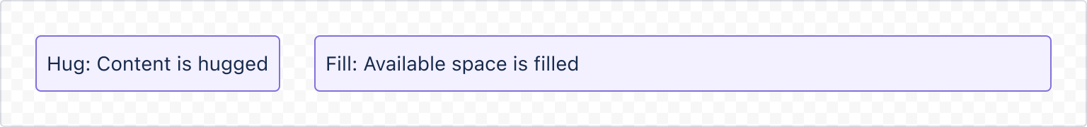
1
2const StackWidthControlExample = () => {
  return (
    <Inline space="space.200">
      <Stack grow="hug">
        <ExampleBox>This content is hugged</ExampleBox>
      </Stack>
      <Stack grow="fill">
        <ExampleBox>Available space is filled</ExampleBox>
      </Stack>
    </Inline>
  );
};
Rate this page: