- ADF renderer
- Atlassian icon (Preview)
- Atlassian tile (Preview)
- Badge
- Box
- Button
- Button group
- Calendar
- Chart - Bar
- Chart - Donut
- Chart - Horizontal bar
- Chart - Horizontal stack bar
- Chart - Line
- Chart - Pie
- Chart - Stack bar
- Checkbox
- Checkbox group
- Code
- Code block
- Comment
- Comment editor
- Chromeless editor
- Date picker
- Dynamic table
- Empty state
- File card (EAP)
- File picker (EAP)
- Form
- Frame
- Heading
- Icon
- Image
- Inline
- Inline edit
- Link
- List
- Lozenge
- Modal
- Popup
- Pressable
- Progress bar
- Progress tracker
- Radio
- Radio group
- Range
- Section message
- Select
- Spinner
- Stack
- Tabs
- Tag
- Tag group
- Text
- Text area
- Text field
- Time picker
- Tile (Preview)
- Toggle
- Tooltip
- User
- User group
- User picker
- XCSS
Last updated Mar 3, 2025
Tag
To add the Tag component to your app:
1
2import { Tag } from '@forge/react';
Description
A tag labels UI objects for quick recognition and navigation.
Props
Name | Type | Required | Description |
|---|---|---|---|
text | string | Yes | Text to be displayed in the tag. |
href | string | No | URI or path. If provided, the tag will be a link. |
appearance | "default" | "rounded" | No | Set whether tags should be rounded. |
color | "standard" | "green" | "lime" | "blue" | "red" | "purple" | "magenta" | "grey" | "teal" |"orange" | "yellow" | "limeLight" | "orangeLight" | "magentaLight" | "greenLight" | "blueLight" | "redLight" | "purpleLight" | "greyLight" | "tealLight" | "yellowLight" | No | The color theme to apply, setting both background and text color. Default is standard. |
elemBefore | Component | No | Component to be rendered before the tag. |
Examples
Default
The default form of a tag, where text is required. Tags with static text can be used as a flag or as a reference to an object or attribute.

1
2const TagDefaultExample = () => {
  return (
    <Tag text="Tag" />
  );
};
Tag link
A tag with an href can link to more information on the tagged item.

1
2const TagLinkExample = () => {
  return (
    <Tag
      href="https://www.atlassian.com"
      text="Tag link"
    />
  );
};
Removable
Once a tag has been removed, it cannot be re-rendered. Removable tags are visible in "edit" mode or in multi-select controls.

1
2const TagRemovableExample = () => {
  return (
    <Tag
      text="Removable tag"
      removeButtonLabel="Remove"
    />
  );
};
Removable link
A removable tag with an href can link to more information.

1
2const TagRemovableLinkExample = () => {
  return (
    <Tag
      text="Removable tag link"
      removeButtonLabel="Remove"
      href="/components/tag"
    />
  );
};
Color
The color theme for background and text.
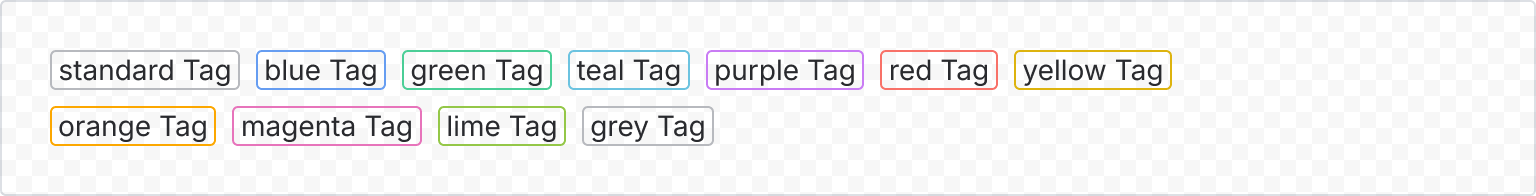
1
2const TagColorExample = () => {
  return (
    <TagGroup>
      <Tag text="standard Tag" color="standard" />
      <Tag text="blue Tag" color="blue" />
      <Tag text="green Tag" color="green" />
      <Tag text="teal Tag" color="teal" />
      <Tag text="purple Tag" color="purple" />
      <Tag text="red Tag" color="red" />
      <Tag text="yellow Tag" color="yellow" />
      <Tag text="orange Tag" color="orange" />
      <Tag text="magenta Tag" color="magenta" />
      <Tag text="lime Tag" color="lime" />
      <Tag text="grey Tag" color="grey" />
    </TagGroup>
  );
};
Text max length
The maximum width for a tag is 200px. If the text within the tag exceeds this width, it will be truncated and an ellipsis (...) will be added to indicate there is more text.

1
2const TagTextMaxLengthExample = () => {
  return (
    <Tag
      appearance="default"
      text="Croissant tiramisu gummies"
    />
  );
};
Rate this page: