- ADF renderer
- Atlassian icon (Preview)
- Atlassian tile (Preview)
- Badge
- Box
- Button
- Button group
- Calendar
- Chart - Bar
- Chart - Donut
- Chart - Horizontal bar
- Chart - Horizontal stack bar
- Chart - Line
- Chart - Pie
- Chart - Stack bar
- Checkbox
- Checkbox group
- Code
- Code block
- Comment
- Comment editor
- Chromeless editor
- Date picker
- Dynamic table
- Empty state
- File card (EAP)
- File picker (EAP)
- Form
- Frame
- Heading
- Icon
- Image
- Inline
- Inline edit
- Link
- List
- Lozenge
- Modal
- Popup
- Pressable
- Progress bar
- Progress tracker
- Radio
- Radio group
- Range
- Section message
- Select
- Spinner
- Stack
- Tabs
- Tag
- Tag group
- Text
- Text area
- Text field
- Time picker
- Tile (Preview)
- Toggle
- Tooltip
- User
- User group
- User picker
- XCSS
Text
To add the Text component to your app:
1
2import { Text } from "@forge/react";
Description
A typography component used to display body text.
It can also include inline components such as Badge and Lozenge.
Props
| Name | Type | Required | Description |
|---|---|---|---|
children | Any text or inline components, such as Badge or Lozenge) | Yes | The text and inline components to display. |
align | "center" | "start" | "end" | No | Text alignment. |
as | "em" | "p" | "span" | "strong" | "strike" | No | HTML tag to be rendered. Defaults to "p". |
color | Any valid token (e.g. "color.text" | "color.text.accent.lime" | "color.text.accentlime.bolder") or "inherit" | No | Token representing text color with a built-in fallback value. Defaults to "color.text". |
maxLines | number | No | The maximum number of lines before the text will be truncated. Text will be truncated with an ellipsis. |
size | "small" | "large" | "medium" | No | Text size. |
weight | "bold" | "medium" | "regular" | "semibold" | No | Font weight. |
Examples
Use a Text component for main content. Text typically appears after headings or subheadings as detailed descriptions and messages, but also as standalone text in components.
Size
The size prop expresses the visual appearance of the text element:
'large'is for long-form content. Use this size for a comfortable reading experience such as in blogs.'medium'is the default size in components or where space is limited, for detailed or descriptive content such as primary descriptions in flags.'small'should be used sparingly and is for secondary level content such as fine print or semantic messaging.
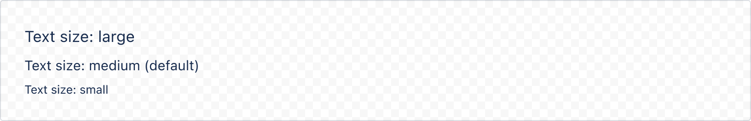
1
2import { Text } from "@forge/react";

export const TextExampleSize = () => {
  return (
    <Text size="large">Text size: large</Text>
    <Text>Text size: medium (default)</Text>
    <Text size="small">Text size: small</Text>
  );
};
Color
Text uses the color.text token which automatically switches colors to be legible across both light and dark modes.
Text will automatically apply the correct inverse color token if placed within a box component with a bold background color.
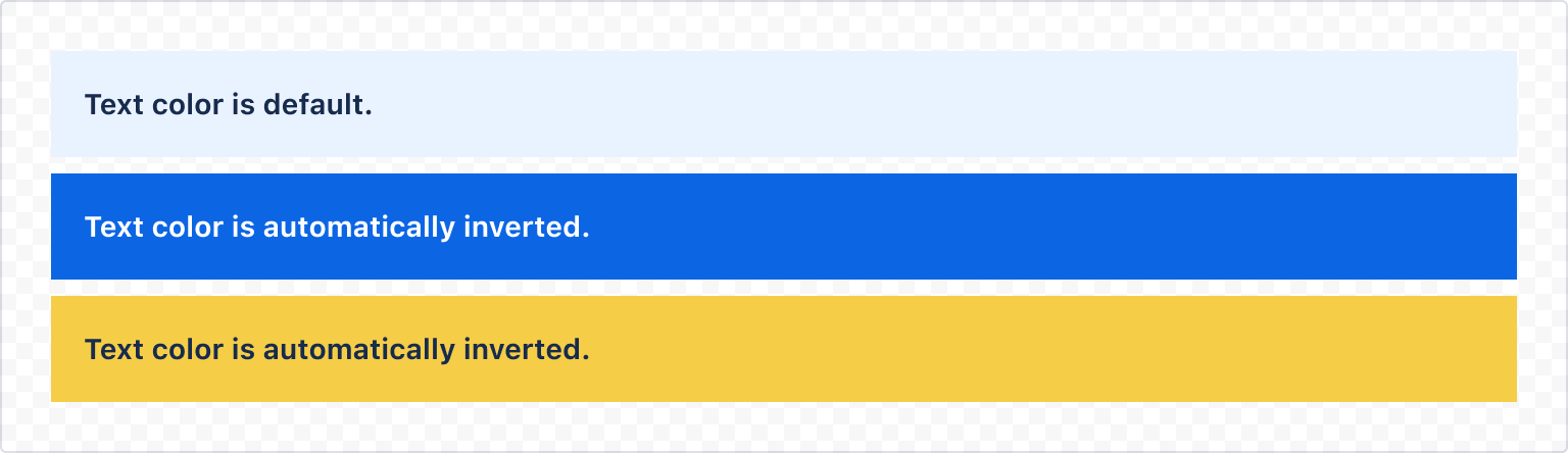
1
2import { Text, Stack, Box } from "@forge/react";

export const TextExampleColor = () => {
  return (
    <Stack space="space.100">
      <Box backgroundColor="color.background.information" padding="space.200">
        <Text weight="bold">Text color is default.</Text>
      </Box>
      <Box backgroundColor="color.background.brand.bold" padding="space.200">
        <Text weight="bold">Text color is automatically inverted.</Text>
      </Box>
      <Box backgroundColor="color.background.warning.bold" padding="space.200">
        <Text weight="bold">Text color is automatically inverted.</Text>
      </Box>
    </Stack>
  );
};
The color prop can be used with any text color token. If Text is nested inside another Text component, color will automatically inherit from its parent.
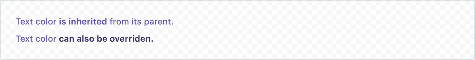
1
2import { Text, Stack } from "@forge/react";

export const TextExampleColorInheritance = () => {
  return (
    <Stack space="space.100">
      <Text weight="medium" color="color.text.discovery">
        Text color{" "}
        <Text as="span" weight="bold">
          is inherited
        </Text>{" "}
        from its parent.
      </Text>
      <Text weight="medium" color="color.text.accent.purple">
        Text color{" "}
        <Text as="span" weight="bold" color="color.text.accent.purple.bolder">
          can also be overriden.
        </Text>
      </Text>
    </Stack>
  );
};
Font weight
Font weight defaults to regular (400) and can be set using the weight prop. More information about the available weights can be found on the typography foundations page.
Text supports the semibold weight, however due to differences between font stacks across different operating systems, semibold text may render as bold. We recommend using regular, medium, and bold for the best results.
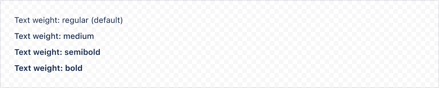
1
2import { Text, Stack } from "@forge/react";

export const TextExampleWeight = () => {
  return (
    <Stack space="space.100">
      <Text>Text weight: regular (default)</Text>
      <Text weight="medium">Text weight: medium</Text>
      <Text weight="semibold">Text weight: semibold</Text>
      <Text weight="bold">Text weight: bold</Text>
    </Stack>
  );
};
Alignment
Text can be aligned using the align prop.
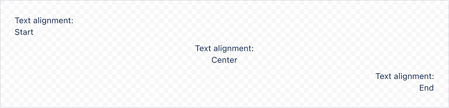
1
2import { Text, Stack } from "@forge/react";

export const TextExampleAlign = () => {
  return (
    <Stack space="space.100">
      <Stack space="space.0">
        <Text align="start">Text alignment:</Text>
        <Text align="start">Start</Text>
      </Stack>
      <Stack space="space.0">
        <Text align="center">Text alignment:</Text>
        <Text align="center">Center</Text>
      </Stack>
      <Stack space="space.0">
        <Text align="end">Text alignment:</Text>
        <Text align="end">End</Text>
      </Stack>
    </Stack>
  );
};
Rendered HTML element
Text renders a HTML <p> element by default. Use the as prop to change the rendered HTML element.
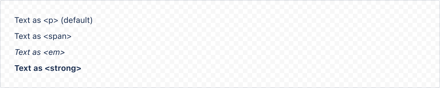
1
2import { Text, Stack } from "@forge/react";

export const TextExampleAs = () => {
  return (
    <Stack space="space.100">
      <Text as="p">Text as {"<p>"} (default)</Text>
      <Text as="span">Text as {"<span>"}</Text>
      <Text as="strong">Text as {"<strong>"}</Text>
      <Text as="em">Text as {"<em>"}</Text>
    </Stack>
  );
};
Arrangement with other text styles
Text does not apply any vertical margin or spacing. To control space between text and other content, use a stack component.
The available values for paragraph spacing are outlined in the Typography foundations page.
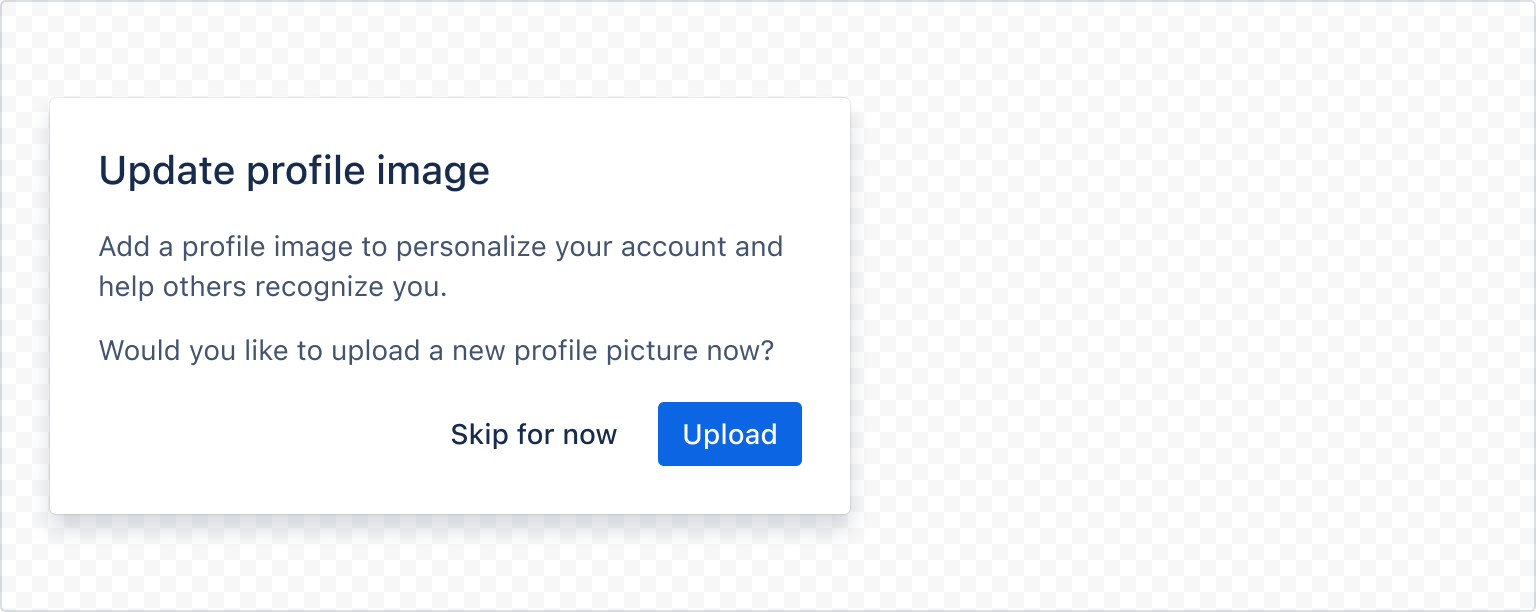
1
2import { Text, Stack, Box, Inline, Button } from "@forge/react";

export const TextExampleArrangement = () => {
  const cardStyles = xcss({
    borderRadius: "3px",
    boxShadow: "elevation.shadow.overlay",
    width: "400px",
  });

  return (
    <Box
      backgroundColor="elevation.surface.overlay"
      padding="space.300"
      xcss={cardStyles}
    >
      <Stack space="space.200">
        <Heading size="medium">Update profile image</Heading>
        <Stack space="space.200">
          <Text>
            Add a profile image to personalize your account and help others
            recognize you.
          </Text>
          <Text>Would you like to upload a new profile picture now?</Text>
        </Stack>
        <Inline space="space.100" alignInline="end">
          <Button appearance="subtle">Skip for now</Button>
          <Button appearance="primary">Upload</Button>
        </Inline>
      </Stack>
    </Box>
  );
};
Truncation
Truncation in Atlassian app experiences should be avoided.
However if truncation cannot be avoided, for example when displaying user-generated content, use the maxLines prop to indicate how text should be truncated.
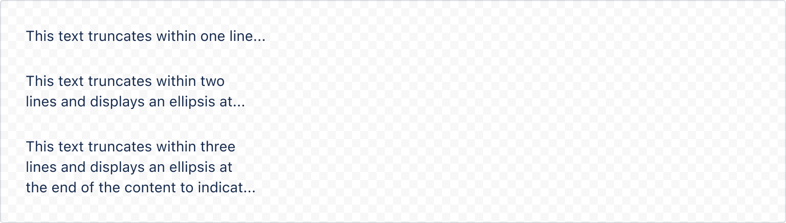
1
2import { Text, Stack, Box } from "@forge/react";

export const TextExampleMaxlines = () => {
  const boxStyles = xcss({
    width: "220px",
  });

  return (
    <Box xcss={boxStyles}>
      <Stack space="space.300">
        <Text maxLines={1}>
          This text truncates within one line and displays an ellipsis at the
          end of the content to indicate truncation has occurred.
        </Text>
        <Text maxLines={2}>
          This text truncates within two lines and displays an ellipsis at the
          end of the content to indicate truncation has occurred.
        </Text>
        <Text maxLines={3}>
          This text truncates within three lines and displays an ellipsis at the
          end of the content to indicate truncation has occurred.
        </Text>
      </Stack>
    </Box>
  );
};
Rate this page: