- ADF renderer
- Atlassian icon (Preview)
- Atlassian tile (Preview)
- Badge
- Bleed (Preview)
- Box
- Breadcrumbs (Preview)
- Button
- Button group
- Calendar
- Chart - Bar
- Chart - Donut
- Chart - Horizontal bar
- Chart - Horizontal stack bar
- Chart - Line
- Chart - Pie
- Chart - Stack bar
- Checkbox
- Checkbox group
- Code
- Code block
- Comment
- Comment editor
- Chromeless editor
- Date picker
- Dynamic table
- Empty state
- File card (Preview)
- File picker (Preview)
- Form
- Frame
- Heading
- Icon
- Image
- Inline
- Inline edit
- Link
- List
- Lozenge
- Modal
- Popup
- Pagination (Preview)
- Pressable
- Progress bar
- Progress tracker
- Radio
- Radio group
- Range
- Router (Preview)
- Section message
- Select
- Spinner
- Stack
- Tabs
- Tag
- Tag group
- Text
- Text area
- Text field
- Time picker
- Tile (Preview)
- Toggle
- Tooltip
- User
- User group
- User picker
- XCSS
Last updated May 11, 2026
Bleed (Preview)
To add the Bleed component to your app:
1
2import { Bleed } from '@forge/react';
Description
Bleed allows child elements to visually extend beyond the bounds of their parent container. This is useful for creating visual effects where a child needs to break out of its parent's padding or spacing.
Props
| Name | Type | Required | Description |
|---|---|---|---|
children | ForgeElement | ForgeElement[] | Yes | The child elements that will bleed beyond the parent container's bounds. |
all | string | No | Applies bleed on all sides. Accepts a spacing token (e.g. "space.100"). See the Atlassian Design System tokens for available values. |
inline | string | No | Applies bleed along the inline (horizontal) axis. Accepts a spacing token. |
block | string | No | Applies bleed along the block (vertical) axis. Accepts a spacing token. |
testId | string | No | A unique string that appears as a data-testid attribute in the rendered HTML. Used for testing. |
Examples
Inline
Use the inline prop to allow the child element to bleed along the horizontal axis, extending beyond the left and right bounds of its parent container.
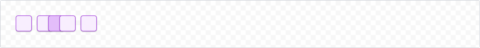
1
2import { Bleed, Box, Inline, xcss } from '@forge/react';

const borderStyles = xcss({
  borderColor: 'color.border.discovery',
  borderStyle: 'solid',
  borderWidth: 'border.width',
  borderRadius: 'radius.small',
  boxShadow: 'elevation.shadow.raised',
});

const ExampleBox = ({ backgroundColor = 'color.background.discovery' }) => (
  <Box
    backgroundColor={backgroundColor}
    padding="space.150"
    xcss={borderStyles}
  />
);

const BleedInlineExample = () => {
  return (
    <Inline space="space.100">
      <ExampleBox />
      <ExampleBox />
      <Bleed inline="space.200">
        <ExampleBox backgroundColor="color.background.discovery.pressed" />
      </Bleed>
      <ExampleBox />
      <ExampleBox />
    </Inline>
  );
};
Block
Use the block prop to allow the child element to bleed along the vertical axis, extending beyond the top and bottom bounds of its parent container.
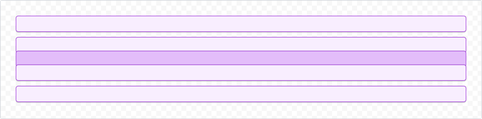
1
2import { Bleed, Box, Inline, xcss } from '@forge/react';

const borderStyles = xcss({
  borderColor: 'color.border.discovery',
  borderStyle: 'solid',
  borderWidth: 'border.width',
  borderRadius: 'radius.small',
  boxShadow: 'elevation.shadow.raised',
});

const ExampleBox = ({ backgroundColor = 'color.background.discovery' }) => (
  <Box
    backgroundColor={backgroundColor}
    padding="space.150"
    xcss={borderStyles}
  />
);

const BleedBlockExample = () => {
  return (
    <Stack space="space.100">
      <ExampleBox />
      <ExampleBox />
      <Bleed block="space.150">
        <ExampleBox backgroundColor="color.background.discovery.pressed" />
      </Bleed>
      <ExampleBox />
      <ExampleBox />
    </Stack>
  );
};
Accessibility considerations
When using the Bleed component, we recommend keeping the following accessibility considerations in mind:
Bleedis a layout primitive that affects visual presentation only. Ensure that any content inside aBleedremains accessible and readable regardless of how far it extends beyond its container.- Avoid using
Bleedin ways that cause content to overlap other interactive elements, as this can make it difficult for keyboard and screen reader users to navigate the page.
Rate this page: