- ADF renderer
- Atlassian icon (Preview)
- Atlassian tile (Preview)
- Badge
- Bleed (Preview)
- Box
- Breadcrumbs (Preview)
- Button
- Button group
- Calendar
- Chart - Bar
- Chart - Donut
- Chart - Horizontal bar
- Chart - Horizontal stack bar
- Chart - Line
- Chart - Pie
- Chart - Stack bar
- Checkbox
- Checkbox group
- Code
- Code block
- Comment
- Comment editor
- Chromeless editor
- Date picker
- Dynamic table
- Empty state
- File card (Preview)
- File picker (Preview)
- Form
- Frame
- Heading
- Icon
- Image
- Inline
- Inline edit
- Link
- List
- Lozenge
- Modal
- Popup
- Pagination (Preview)
- Pressable
- Progress bar
- Progress tracker
- Radio
- Radio group
- Range
- Router (Preview)
- Section message
- Select
- Spinner
- Stack
- Tabs
- Tag
- Tag group
- Text
- Text area
- Text field
- Time picker
- Tile (Preview)
- Toggle
- Tooltip
- User
- User group
- User picker
- XCSS
Last updated May 11, 2026
Pagination (Preview)
To add the Pagination component to your app:
1
2import { Pagination } from '@forge/react';
Description
Pagination allows you to divide large amounts of content into chunks across multiple pages.
Props
| Name | Type | Required | Description |
|---|---|---|---|
pages | number[] | Yes | An array of page numbers to display. For example, [1, 2, 3, 4, 5]. |
defaultSelectedIndex | number | No | The index of the page that is selected by default (uncontrolled). Defaults to 0. |
selectedIndex | number | No | The index of the currently selected page (controlled). Use alongside onChange to manage state externally. |
onChange | (page: number) => void | No | Called when the user navigates to a different page. Receives the selected page number as an argument. The page number is the value of the page in the pages array and not the index. |
max | number | No | The maximum number of page buttons to display at once. When there are more pages than the max, pages are truncated with ellipses. |
label | string | No | An accessible label for the pagination navigation landmark. |
nextLabel | string | No | An accessible label for the next page button. |
previousLabel | string | No | An accessible label for the previous page button. |
pageLabel | string | No | An accessible label applied to each page button. The page number is appended automatically. |
testId | string | No | A unique string that appears as a data-testid attribute in the rendered HTML. Used for testing. |
Examples
Default
The default pagination with a list of pages.
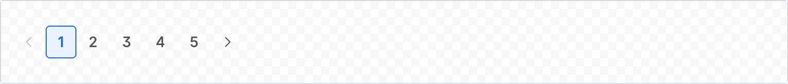
1
2const PaginationDefaultExample = () => {
  return <Pagination pages={[1, 2, 3, 4, 5]} />;
};
Selected index
Use defaultSelectedIndex to pre-select a page on initial render. The index is zero-based, so defaultSelectedIndex={2} selects the third page.
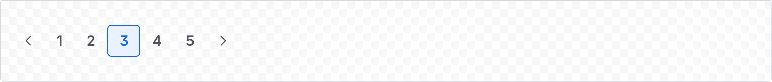
1
2const PaginationSelectedIndexExample = () => {
  return <Pagination pages={[1, 2, 3, 4, 5]} defaultSelectedIndex={2} />;
};
Accessibility considerations
When using the Pagination component, we recommend keeping the following accessibility considerations in mind:
- Use the
labelprop to provide a descriptive name for the pagination navigation region so that assistive technologies can distinguish it from other navigation on the page. - Use the
nextLabel,previousLabel, andpageLabelprops to provide meaningful accessible labels for the navigation buttons, especially in non-English apps.
Rate this page: