- ADF renderer
- Atlassian icon (Preview)
- Atlassian tile (Preview)
- Badge
- Box
- Button
- Button group
- Calendar
- Chart - Bar
- Chart - Donut
- Chart - Horizontal bar
- Chart - Horizontal stack bar
- Chart - Line
- Chart - Pie
- Chart - Stack bar
- Checkbox
- Checkbox group
- Code
- Code block
- Comment
- Comment editor
- Chromeless editor
- Date picker
- Dynamic table
- Empty state
- File card (EAP)
- File picker (EAP)
- Form
- Frame
- Heading
- Icon
- Image
- Inline
- Inline edit
- Link
- List
- Lozenge
- Modal
- Popup
- Pressable
- Progress bar
- Progress tracker
- Radio
- Radio group
- Range
- Section message
- Select
- Spinner
- Stack
- Tabs
- Tag
- Tag group
- Text
- Text area
- Text field
- Time picker
- Tile (Preview)
- Toggle
- Tooltip
- User
- User group
- User picker
- XCSS
File card (EAP)
UI components for Forge Object Store are now available as part of our Early Access Program (EAP). These components can also be used for remote object store back-ends. To start testing, sign up here.
By signing up for this Early Access Program (“EAP”), you acknowledge that use of the Forge Object Store UI Components is governed by the Atlassian Developer Terms. The Forge Object Store UI Components are considered “Early Access Materials”, as set forth in Section 10 of the Atlassian Developer Terms and is subject to applicable terms, conditions, and disclaimers.
For more details, see Forge EAP, Preview, and GA.
Supported Modules
This is supported in Bitbucket, Confluence, Jira, and Jira Service Management modules during EAP.
To add the FileCard component to your app:
1
2import { FileCard } from "@forge/react";
Description
A file card displays information about a file, including name, type and size. This can be used to manage selected files and displaying upload progress.
You can use this component to display information and upload progress for files selected through the file picker.
Example app
We published a sample app to demonstrate the basics of implementing object storage features in a Forge app. This sample app uses the Forge Object Store as its backend and available Forge UI components for its frontend. Refer to the app's README for additional guidance on exploring and testing the code.
Props
| Name | Type | Required | Description |
|---|---|---|---|
error | string | No | Error message to display below the file name if there is an error. |
fileName | string | Yes | The name of the file to display. |
fileSize | number | No | The size of the file in bytes. |
fileType | string | No | The MIME type of the file, used for displaying the file type icon. |
isUploading | boolean | No | Whether the file is currently being uploaded. |
onDelete | () => void | No | Callback function triggered when the file is deleted. If provided, the delete button will be displayed. |
onDownload | () => void | Promise<Blob> | No | Callback function triggered when the file is downloaded. If provided, the download button will be displayed. Additionally, if the callback returns a Promise<Blob>, it will automatically trigger a browser download using the fileName. |
uploadProgress | number | No | Upload progress (from 0 to 1) when isUploading is true, used to show a progress bar. |
Examples
Default
The only required property of a file card is the fileName. The file card can provide action buttons for download and delete if onDownload and onDelete are specified.
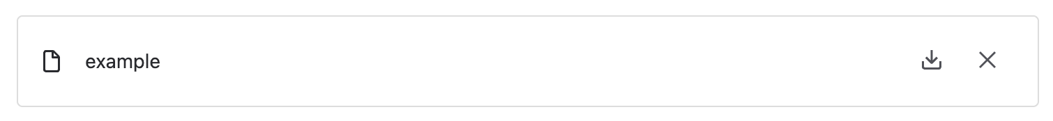
1
2export const FileCardExample = () => {
  return <FileCard fileName="example" onDownload={onDownload} onDelete={onDelete} />;
};
File Size
Use fileSize to specify the size of the file in bytes. This will be displayed below the file name.
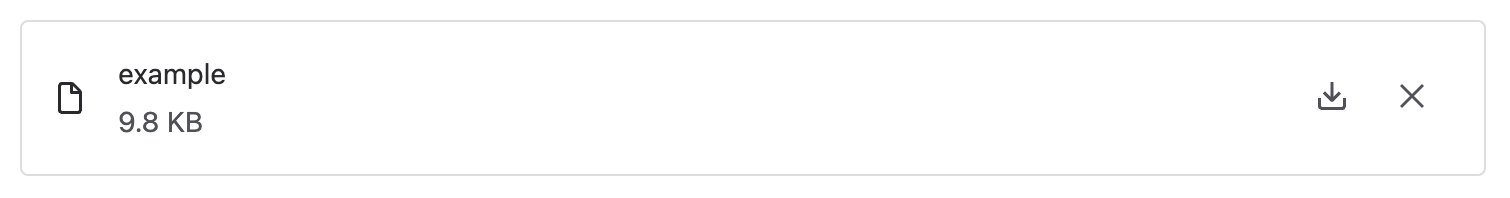
1
2const FileCardWithFileSizeExample = () => {
  return <FileCard fileName="example" fileSize={10000} onDownload={onDownload} onDelete={onDelete} />;
};
File Type
Use fileType to specify the MIME type of the file. If fileType is not provided, the component will try to determine this from the file name.
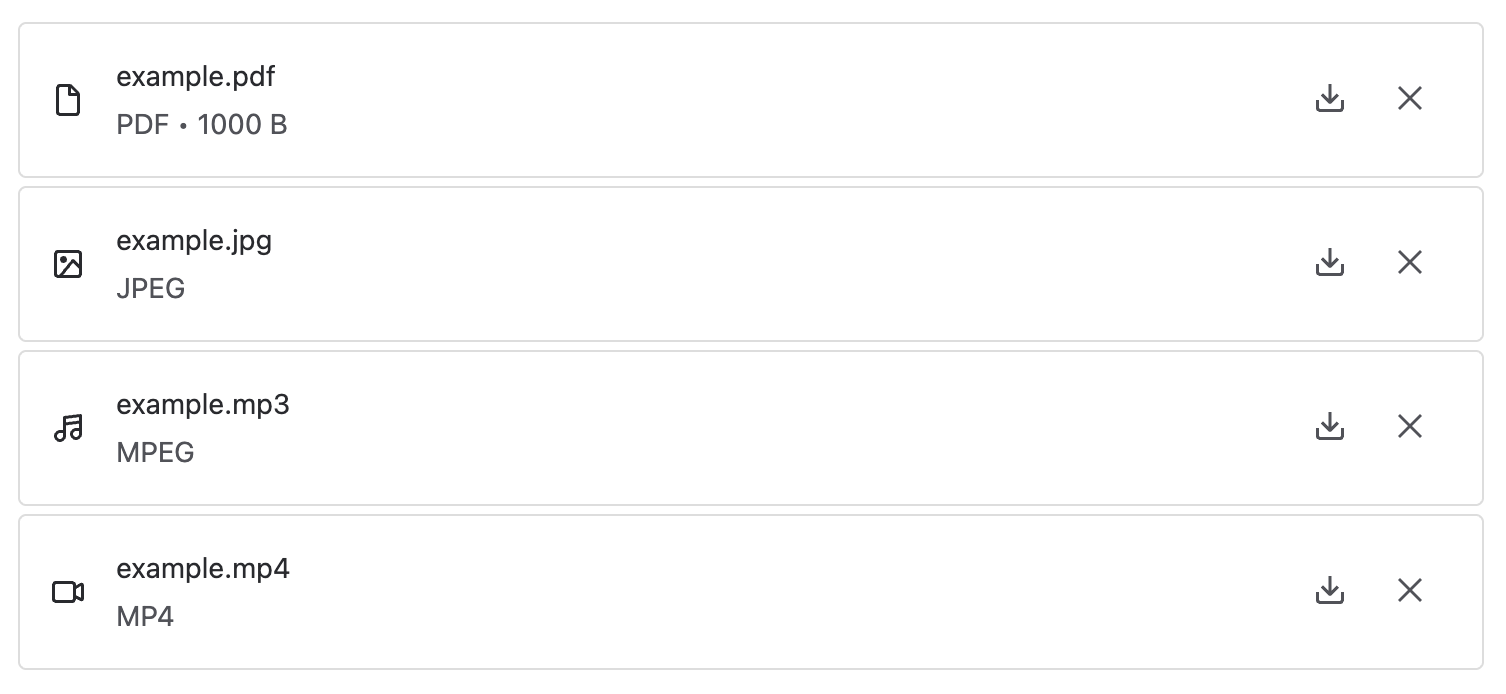
1
2const FileCardWithFileTypesExample = () => {
  return (
    <Stack space="space.050">
      <FileCard fileName="example.pdf" fileSize={1000} onDownload={onDownload} onDelete={onDelete} />
      <FileCard fileName="example.jpg" fileType="image/jpeg" onDownload={onDownload} onDelete={onDelete} />
      <FileCard fileName="example.mp3" fileType="audio/mpeg" onDownload={onDownload} onDelete={onDelete} />
      <FileCard fileName="example.mp4" fileType="video/mp4" onDownload={onDownload} onDelete={onDelete} />
    </Stack>
  );
};
Error
Use error to display a message when there is an error. This can be used to inform users of any issues with the file.
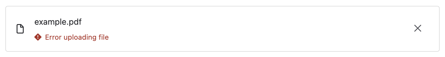
1
2const FileCardWithErrorExample = () => {
  return <FileCard fileName="example.pdf" error="Error uploading file" onDelete={onDelete} />;
};
Upload Progress
Use uploadProgress and isUploading to indicate upload status. This takes in a value from 0 to 1 which is used to display a progress bar.
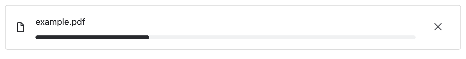
1
2const FileCardWithUploadProgressExample = () => {
  return (
    <FileCard
      fileName="example.pdf"
      isUploading={true}
      uploadProgress={0.3}
      onDelete={onDelete}
    />
  );
};
Rate this page: